Google Design’s Best of 2017
We’re taking a moment to look back on 10 noteworthy design projects at Google
At Google Design, we spend the majority of our year thinking about the what, why, and how of design. We connect with designers from both inside and outside of the company to learn about their triumphs and failures, and we aren’t afraid to get nerdy when diving into the nitty gritty details. 2017 was an exciting year for many design teams at Google. As we head into the new year, we’re taking a look back at some of the projects that counted most to our community, from launching new Material Design tools, to bringing our SPAN design and technology conference to more cities, to redesigning many popular Google products, and so much more. Dig in and enjoy!
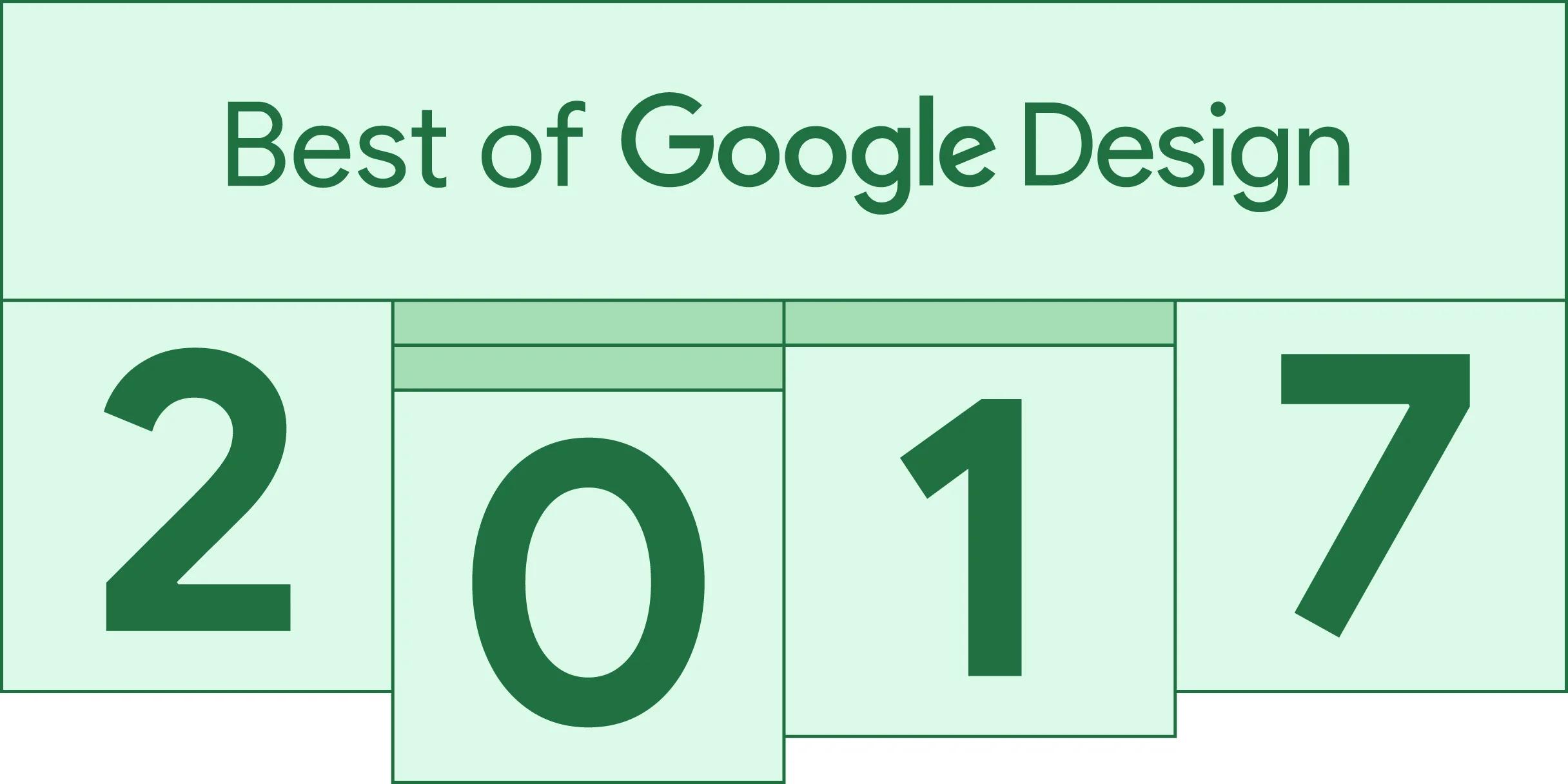
1. Super Selfie Sticker Sheet. Who invented the selfie? Who cares when you can make yourself into a cartoon...or at least have some machines do it for you. Allo launched what was arguably one of their most entertaining sticker sheets to date (and trust us, they’ve had a few) which uses a combination of neural networks and the work of artists to turn your selfie into a personalized sticker pack. Simply snap a selfie, and it’ll return an automatically generated illustrated version of you, on the fly, with customization options to help you personalize the stickers even further. The result: endless fun and very few filters or duckface to employ.
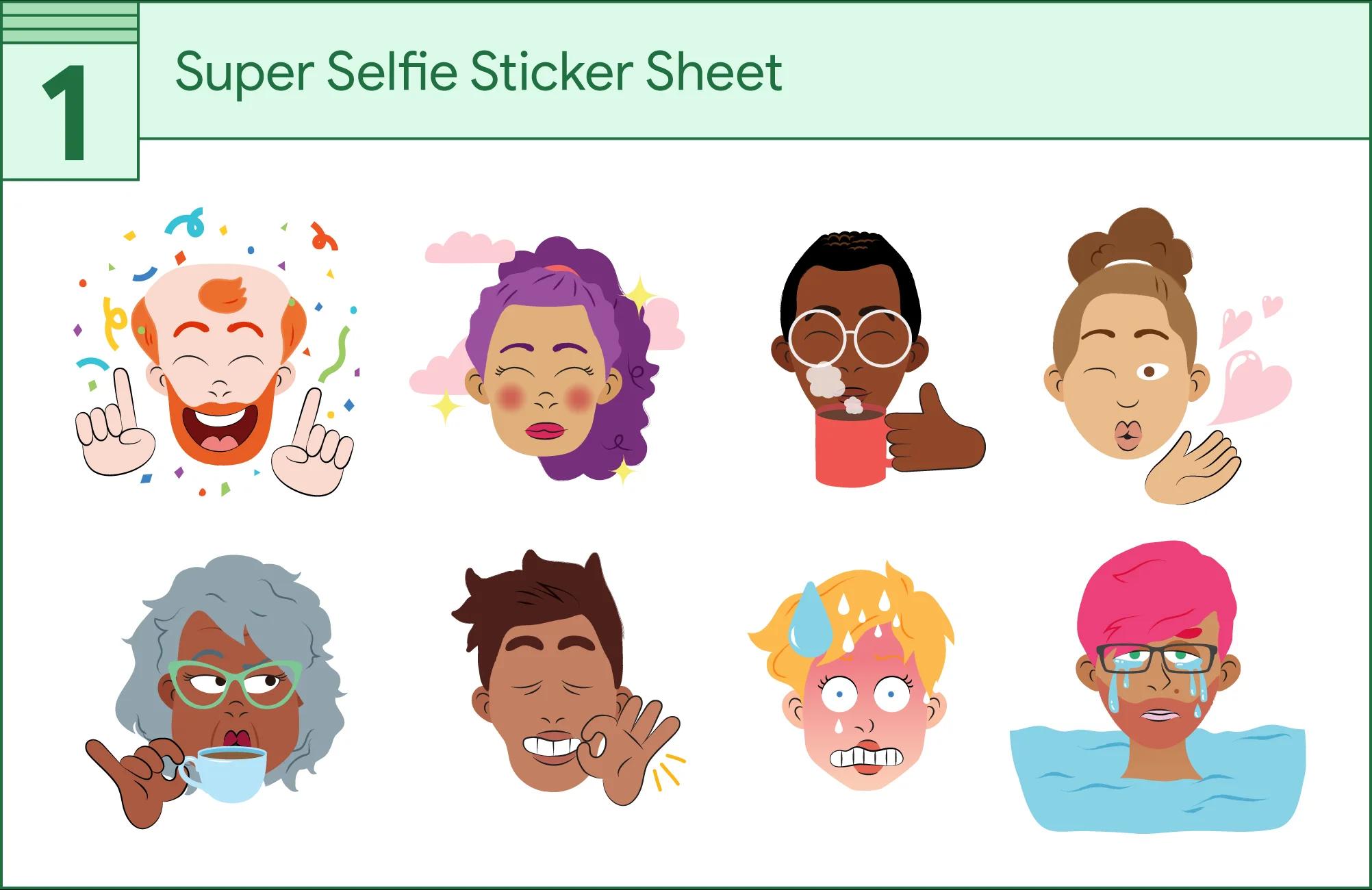
2. Trusty Tools for Making Material. Maybe millennial pink has finally given way to faded-out persimmon, or you’re just biding time until we know what 2018’s ‘It’ shade will be. In either case, the Material Design Color Tool dropped this year to rid you of your color woes and make it easy to create, share, and apply Material palettes to your projects. And you know what’s nifty? You can also use the tool to test the accessibility of text and color combos, which means more people can interact with your work. If color leaves you cold, then turn your attention to Material Components—a set of up-to-date, pixel-perfect components made for Android, iOS, and the web. Like building blocks, these open source tools give shape to sites like Google Design, and speed up the development process so you can build better and faster.

3. Spectacular SPAN Events. Our annual design and technology conference always takes us somewhere new. This year, a focus on cities redefining the intersection of art and industry brought SPAN to Pittsburgh, Newcastle-Gateshead, and Mexico City. We met talented folks who are giving shape to the future of design every day, through their work with robots, data viz, and in one case, waffles. We also learned the secret history of AI and picked up quite a bit of local slang—and you can too by catching up on talks from all three events and reading all our recaps, including a deep dive on the modular event identity, in our SPAN collection.
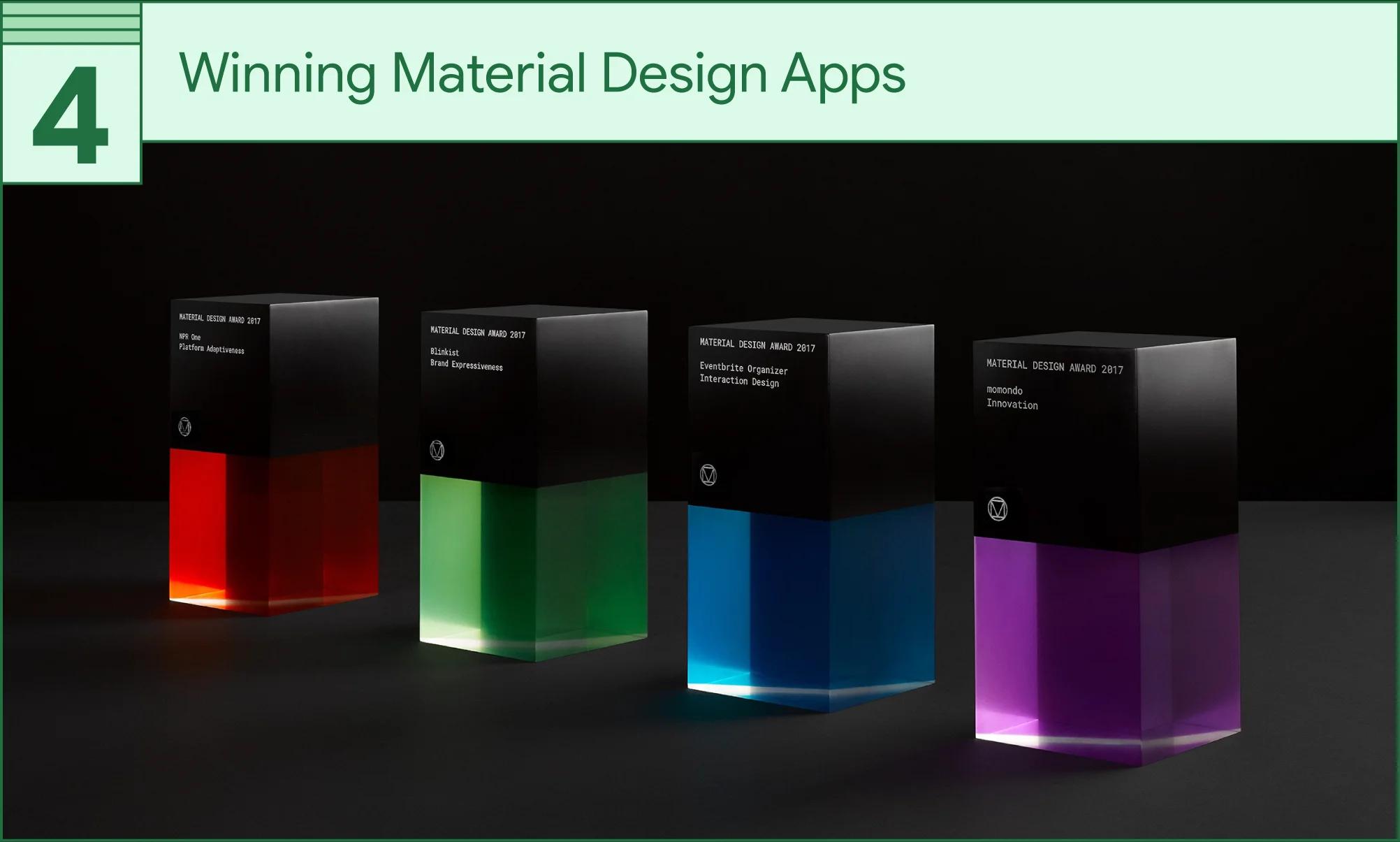
4. Winning Material Design Apps. For their third annual Material Design Awards, the Material Design team opened nominations to the public for the first time to find the very best examples of Material Design out in the wild. Teams from the winning apps—NPR One, Blinkist, momondo, and Eventbrite Organizer—congregated at Google Design’s annual SPAN conference (see #3 above) in Pittsburgh to accept their awards (fun fact: this year’s super slick trophies were designed by Ladies & Gentlemen Studio), and to record an episode of our Design Notes podcast, explaining why and how Material Design worked for their products.
5. Refreshing Redesigns. Everyone loves (or hates) a redesign, but these five Google products got shiny new updates that are worth a second look. That is, if you’re not already looking at them every day.
Google Calendar Though it can’t magically do away with meetings, the new Google Calendar is designed to help you get things done. Updated with a more modern palette and a responsive layout, new features allow you to get the deets on conference rooms, add docs or spreadsheets to your calendar invites (no more excuses for skipping out on meeting prep), and coordinate between multiple team members with side-by-side scheduling views. The Verge also called the redesign “infinitely prettier,” we simply call it Material.
Google Maps A clean new color scheme and icon set supercharged the visual hierarchy of Google Maps. The refresh also helps surface the most relevant on-screen information, like gas stations if you’re driving, or train stations if you’re mapping a route in transit mode.
Google News A timely update brought new UI and an uncluttered look to Google News on desktop. Though not a balm for this year’s fast-paced news cycle, the new layout deploys the use of cards, which make it easier to scan headlines and uncover different perspectives on the same story. There’s also a dedicated column for customizing updates based on your own interests—putting you in control of the news.
YouTube This year, YouTube got a brand new logo! Designed for a multi-screen world, the mark can be pared down to a simple red icon on smaller screens. Material Design principles dominate the latest desktop version, with a fresh and intuitive interface, that includes a cinematic dark theme. The YouTube mobile app also started rolling out new gesture controls, including a double-tap to fast-forward or rewind.
Google Design We’d be remiss if we didn’t give a shout out to our own newly redesigned site, which features a new news section, a handy collections feature that caters to specific topics or product areas of interest like fonts or designing for the next billion users. We’re particularly keen on how the new site gives readers an at-a-glance sense of what designers are up to at Google.
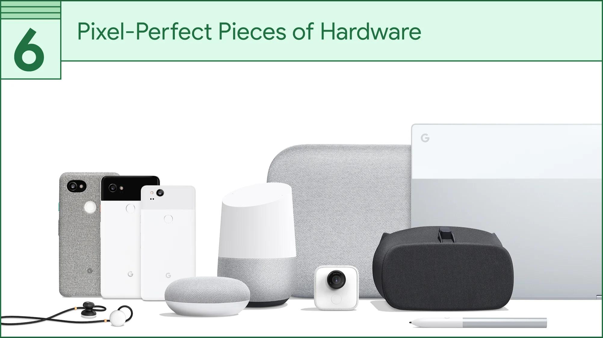
6. Pixel-Perfect Pieces of Hardware. Our hardware got smart in 2017. Bringing together beauty and brains, second gen Google devices are now powered by artificial intelligence—from the Pixel 2's camera to Pixel Buds, which can wirelessly translate 40 different languages in real time. Sensationnel! New Mini and Max versions of Google Home offer even more ways to conjure up the voice-controlled Assistant—and the Mini is smaller than a donut! You can use “Ok Google” on the new Pixelbook, too. We’re probably biased, but the Daydream View is the best and most comfortable mobile VR headset on the market. It’s soft, light, and comes in fog, charcoal, and coral fabrics. And have you seen the Google Clips camera yet? The last item in this pixel-perfect category, uses AI to automatically record silent motion photos that last a few seconds. Like GIFs, but starring your family or pets.
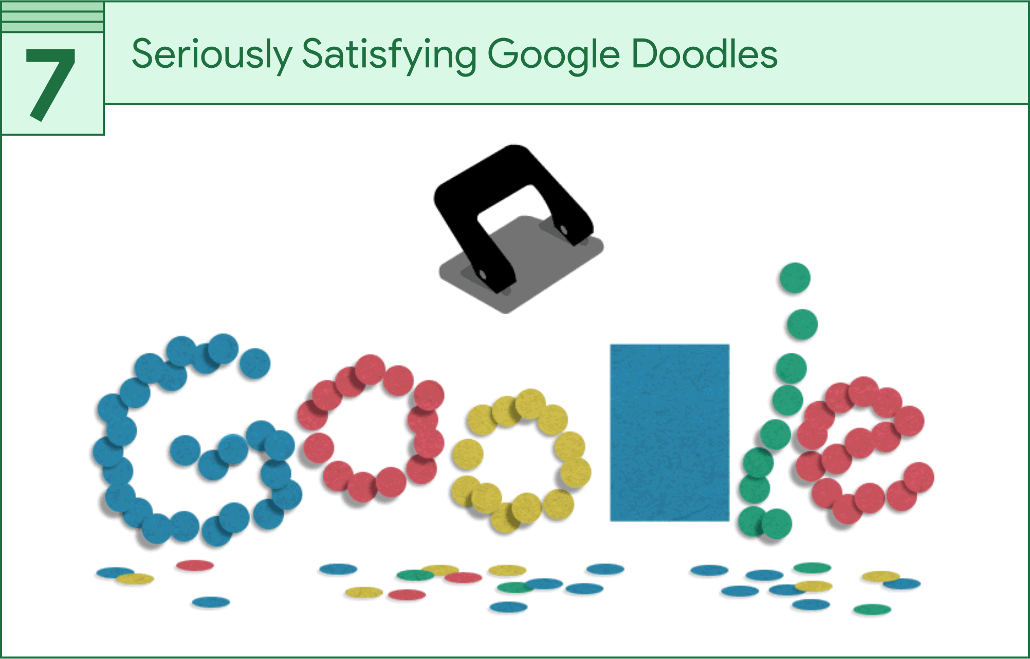
7. Seriously Satisfying Google Doodles. What started in 1998 as a sign that Google’s cofounders were OOO at Burning Man, has transformed into a beloved daily tradition of celebrating important people, places, and events on the Google homepage. In 2017, many of the most popular Doodles centered around music, including an homage to iconic performer Selena Quintanilla and the 44th anniversary of the Birth of Hip Hop. We were particularly inspired by the musical visualization machine honoring artist Oskar Fischinger. In the realm of design, notable Doodles celebrated Pritzker Prize-winning architect Zaha Hadid, groundbreaking designer Eiko Ishioka, the invention of the Traffic Light Man, and the 131st anniversary of the Hole Puncher.
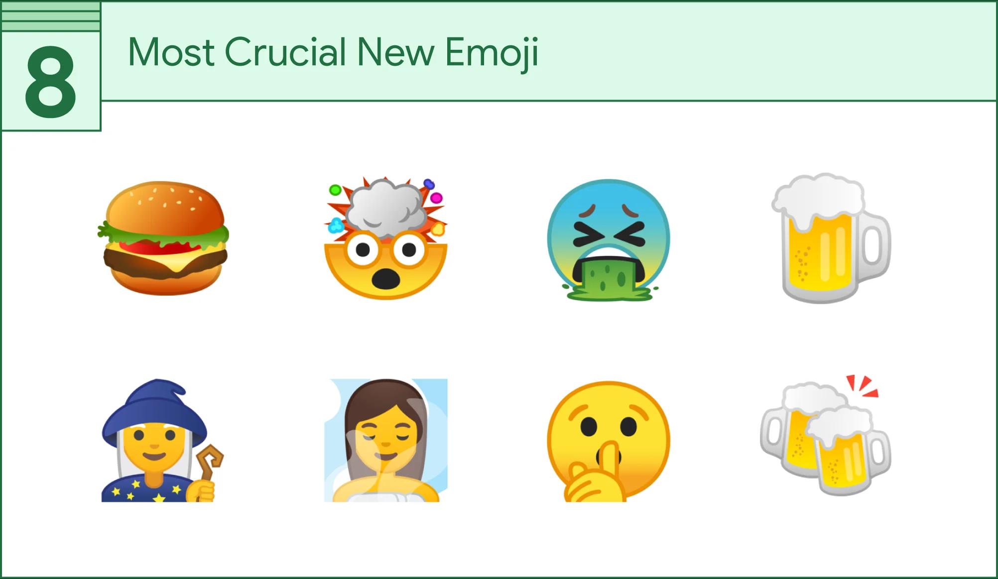
8. Most Crucial New Emoji. Picking a favorite emoji is a bit like choosing a favorite child, and Unicode blessed the internets with a full bounty this past year, making the task only more daunting. Who will be our next dark horse “hole in the ground,” who will match the semantic gymnastics achieved by trusty eggplant? It may be be too early to tell, but here’s a list of some of our favorite Android 8.0 updates:
Hamburger: Technically speaking, is this not a cheeseburger? Regardless, the years-old debate about Google’s inability to construct a hamburger properly has been put to bed with the 8.1 update. The cheese is now in its rightful resting place, atop the meat, and Android Burger Day at the Google cafes will never be the same.
Exploding head: Let’s just say this new lil character quickly became our official mascot for 2017.
Face vomiting: Have your friends reverted to posting spon-con on Instagram? Are you having a visceral reaction to someone’s vacation hashtag? Did you literally drink spoiled milk? Face vomiting emoji has you covered.
Beer mug / clinking beer mugs: Like the hamburger, the “beer” and “clinking beer” Android emoji has received its fair share of shade in recent years. As it’s literally impossible to have a heady foam atop pure air, the simple physics of the old emoji were improbable. The latest update closes that gap in our perception, though one could argue that a bit of the sloshy poetry has been lost.
Mage: Give props to a buddy or colleague for some wizardly feat by sharing “mage”—the new, wizened-old sage emoji that will undoubtedly hocus pocus its way into our hearts and daily D&D banter.
Person in steamy room: It’s called #selfcare and we all need more of it. Whether your sauna ladle is literal or proverbial, “person in a steamy room” is all about taking the waters, R&R, and the most important ROI—you.
Shushing face: At Google Design, one of our favorite pastimes is to talk behind each other’s backs on a shared chat. It’s funny because the person can read everything we’re writing. It’s basically the opposite of catty or cruel, and it most certainly is not a secret. This little character captures that spirit with an earnest shush that reads more like a wink.
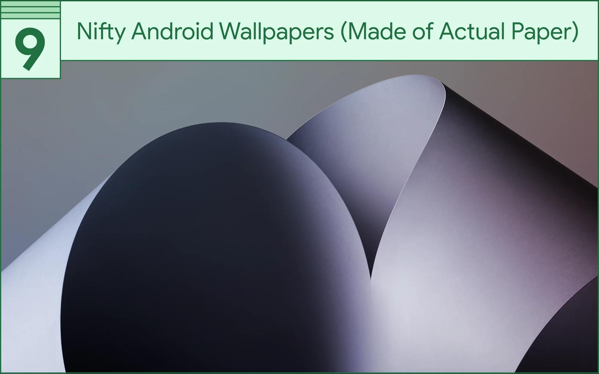
9. Nifty Android Wallpapers (Made of Actual Paper). As if the Pixel phone didn’t have enough bells and whistles, it launched with a set of exclusive wallpapers created by artists and designers. Staying true to the paper-inspired spirit of Material Design, fine art photographer Nicholas Alan Cope created his collection by photographing physical paper. Take a peek behind the scenes at his origami-obsessed snaps and check out Cope’s full collection, In the Shadows, on a Pixel near you.
10. Things We Learned. Nesting a top ten list within a year-end countdown could be considered blasphemy (or extra work), but we couldn’t resist this meta-reflection on all the weird, wonderful, and downright interesting things we learned on Google Design this year.
The difference between digital natives and digital adopters is as subtle as a tap versus a click.
You can foster good design vibes on any team through hard work, clear expectations, and a ‘Can’t Stop, Won’t Stop’ attitude.
“Designed in California” is the new “Made in Italy.”
8,640 was the number of new Cyrillic characters added during the expansion of a single font.
Designing a brand in VR requires more than a simple shift in perspective—it’s a whole new way of thinking.
If you want to design an app for people in emerging markets, consider everything from local financial systems to connectivity and cultural norms.
The Unicode Consortium is a non-profit organization that coordinates the development of the Unicode standard, including emoji.
The Maxim of Quantity isn’t a detailed to-do list, it’s a core rule of conversational design that’s important to bake into your chatbot, assistant, or app’s VUI.
Even machine learning systems make mistakes, but something called the “confusion matrix” can help set your AI straight.
Makers are now building Artificial Intelligence directly into DIY projects.