Scripting Cyrillic
Highlighting the design process behind expanded language support in Google Docs and Slides
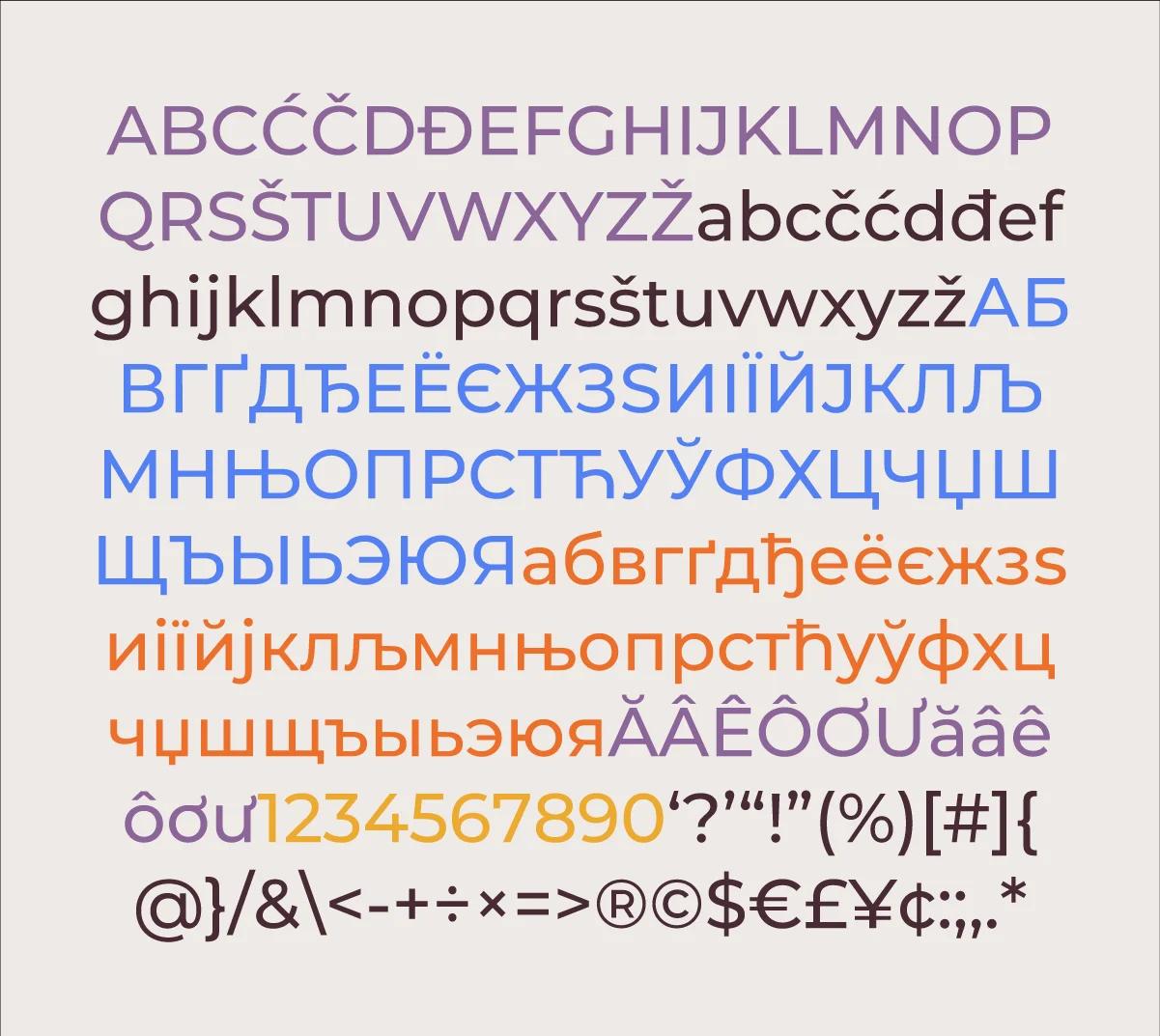
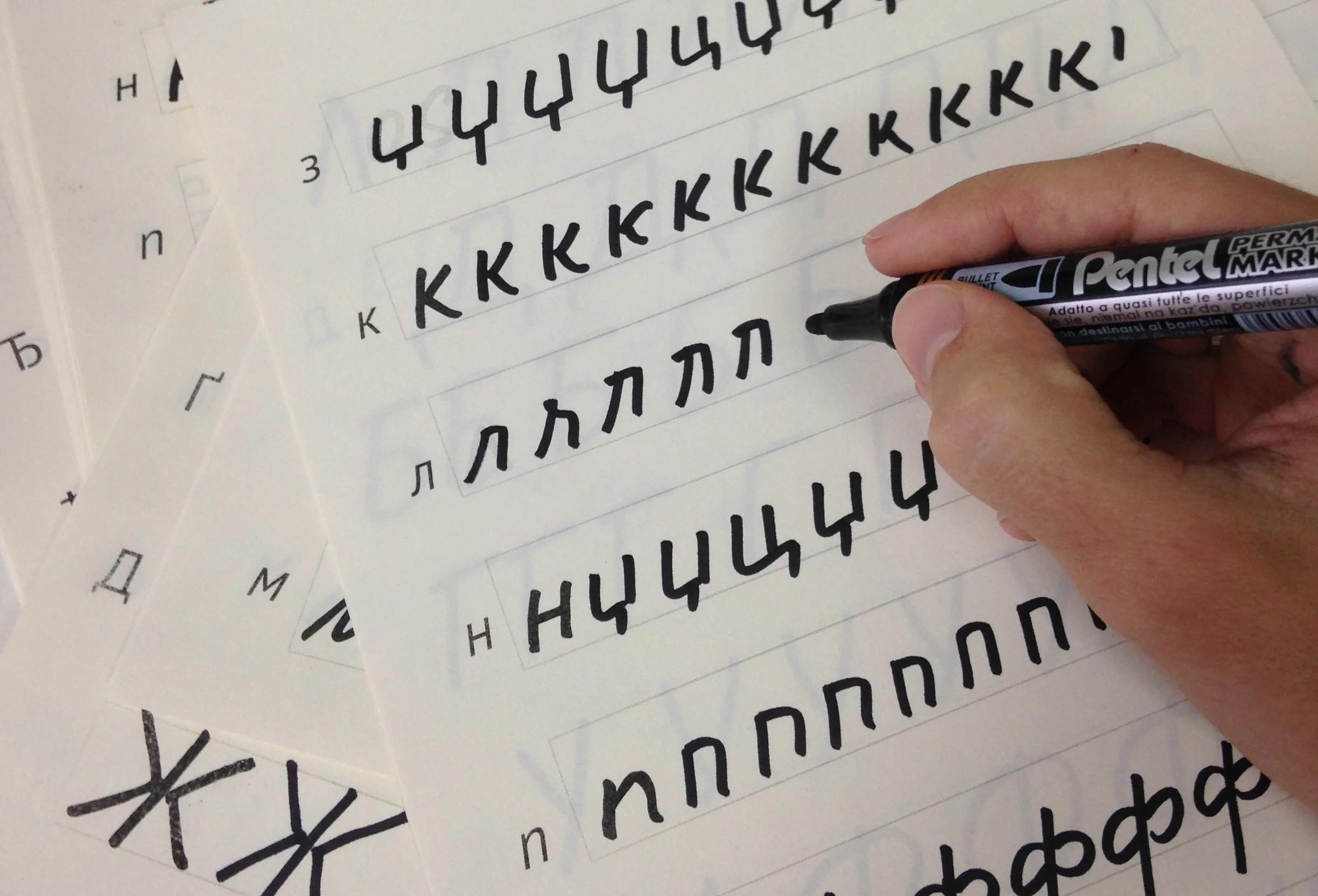
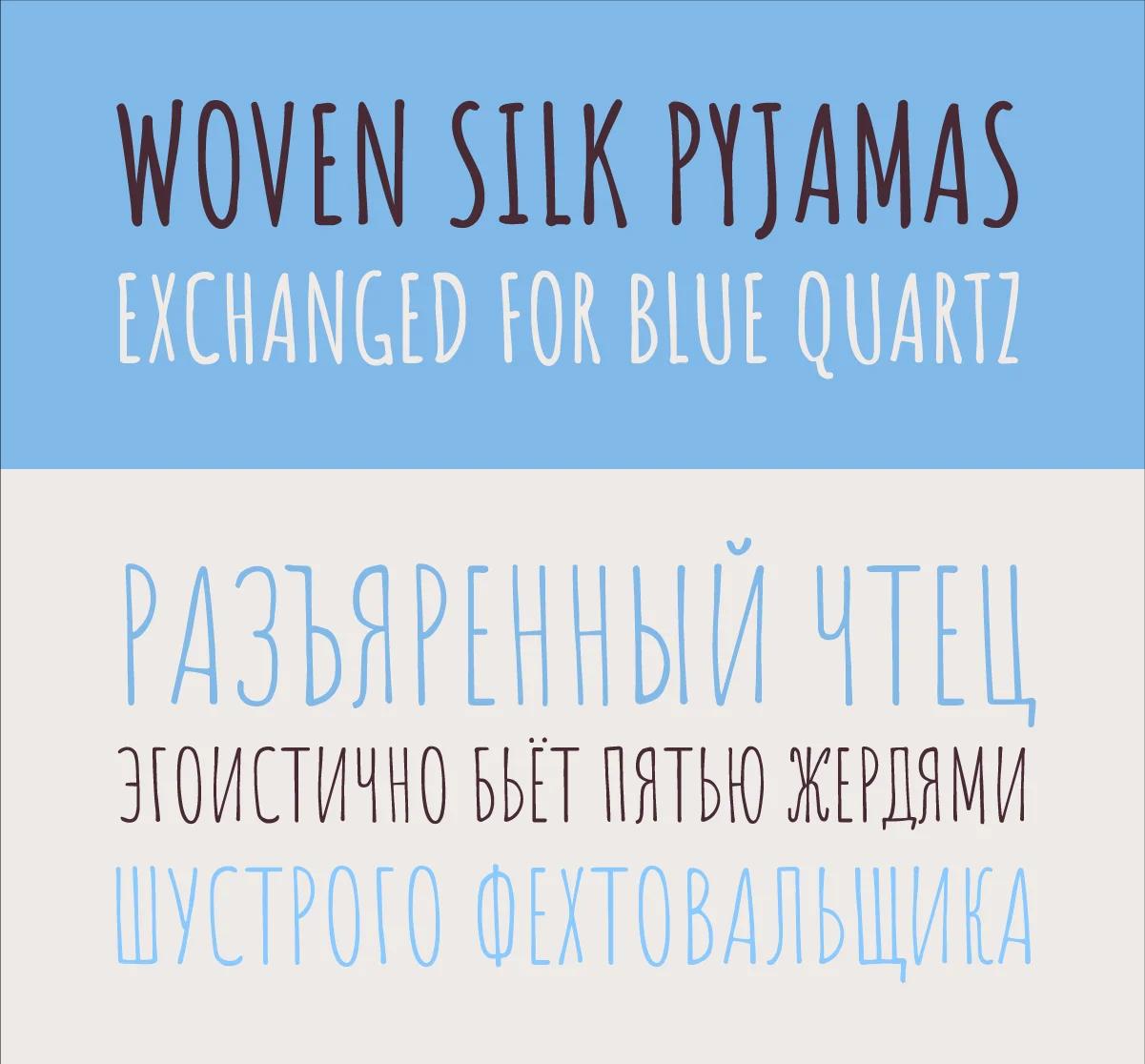
Cyrillic is among the most widely used scripts in the world, especially online. And there's good news for the quarter-billion people who read and write with the Cyrillic alphabet. We've expanded some of the most popular fonts in the Google Fonts collection—including Montserrat, Spectral, Merriweather, Amatic, Caveat, and Comfortaa—to include the full range of Cyrillic characters, plus language support in Google Docs and Slides. The push to design Cyrillic characters for each of these web fonts (and to do it well) involved over 20 type designers. They drew and fine-tuned over ten thousand individual letters while also assessing and reviewing each other’s work to ensure coherence, fidelity, and consistency between the Latin and Cyrillic versions of each type family. Read on to learn more about the expansion process, and get an inside look at designing Cyrillic characters for three type families from Google Fonts.
Montserrat: Finding Cyrillic forms in the Modernist lettering of Buenos Aires
Among the Cyrillic typefaces in the recent Google Fonts expansion, a notable highlight is Montserrat, a playful, geometric sans-serif that’s become increasingly popular among web designers in recent years. Montserrat was first designed by Julieta Ulanovsky in 2010 while she was a student in the Type Design master’s program at the University of Buenos Aires (known as CDT). A year later, she launched a successful Kickstarter campaign promising a typeface with “the spirit of Buenos Aires,” and the result is a perceptive homage to the historic Montserrat neighborhood where she lives and works today.
Ulanovsky drew her inspiration from the classic lettering on street signs, posters, painted windows, and cafe canopies in her neighborhood. But during the course of her studies in type design, as she collected and sketched the letterforms she found most fascinating, she noticed that these distinctive designs were not as common around the neighborhood as they once had been. With Montserrat, Ulanovsky hoped to “rescue the beauty of urban typography from the first half of the twentieth century,” by distilling the character of the city's classic lettering into a font that could be used all over the world.
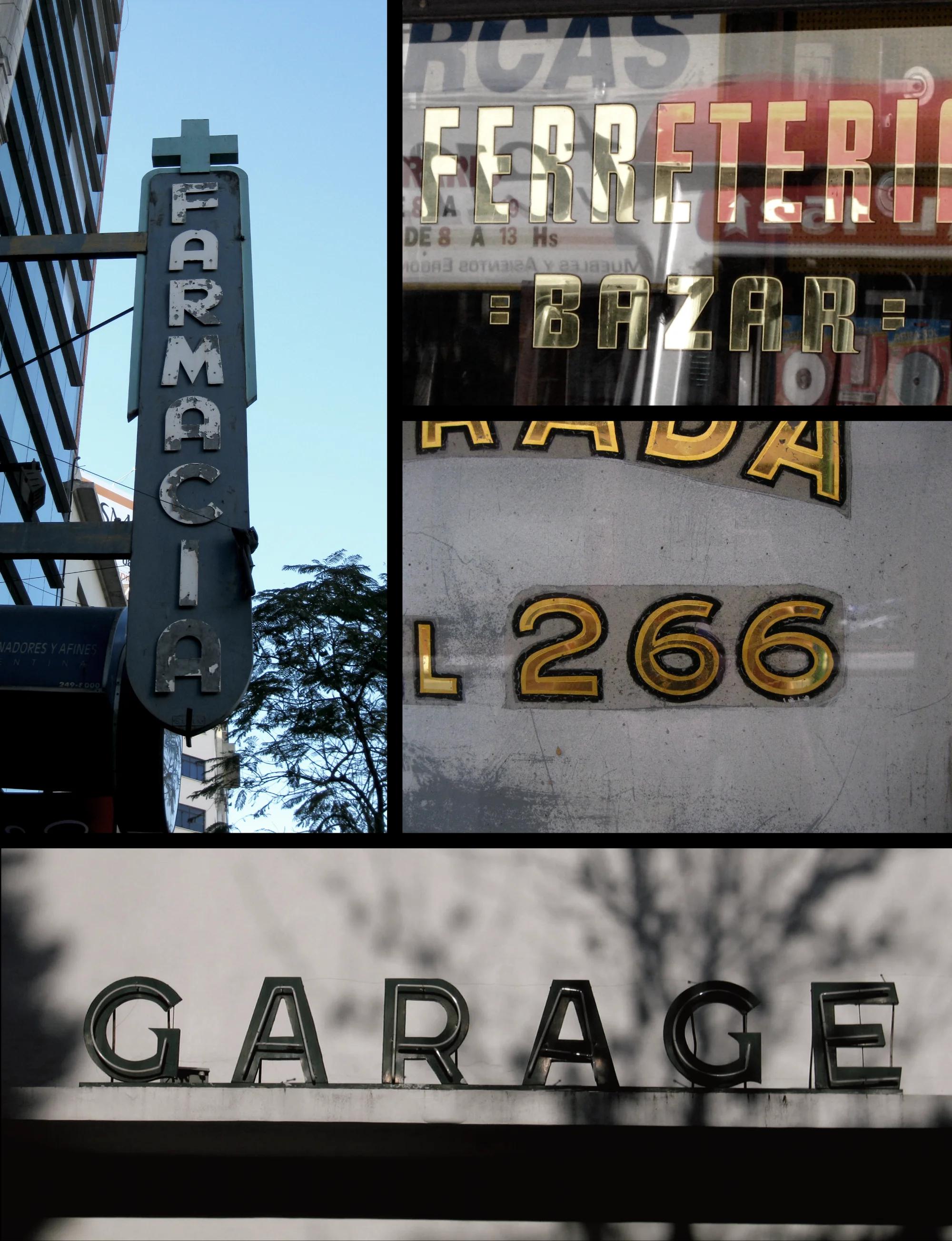
Street signage photographed by Ulanovsky during her research. She wanted Montserrat to evoke the classic modernist lettering of Buenos Aires—as a web font, Montserrat is now used on over four million websites.
“The main fonts are not just shapes,” says Ulanovsky. “They define something from one moment in the history of the city. It's about light, about industry. And maybe that's why the font has many users around the world—it's not just Buenos Aires. Monserrat also reminds people of other cities and old signs.”
The classic elegance and international appeal of the initial design prompted waves of expansion to the Montserrat family in recent years, culminating most recently in the addition of Cyrillic characters. Montserrat now has nine weights (from Thin to Black) in Roman and Italic, a set of alternate characters, and a distinctive Subrayada (underlined) variant. These expansions added versatility to the original design by using clever and distinctive details Ulanovsky found in archival photographs of Buenos Aires from the 1920-1950s.
This year's Cyrillic expansion culminated in 8,640 new characters for Montserrat. Ulanovsky’s collaborator, Sol Matas, said the greatest challenge was remaining faithful to the original Argentine inspiration while creating a design that looked natural in the Cyrillic context. Since neither Ulanovsky, Matas, nor their collaborator Juan Pablo del Perral were native readers of a Cyrillic language, the expansion work was closely reviewed by two Russian type designers, Maria Doreuli and Alexei Vanyashin. Vanyashin’s feedback to the Argentine design team included suggestions to bring a character “closer to its historical representation,” and to avoid using certain forms that could be mistaken for another character entirely.
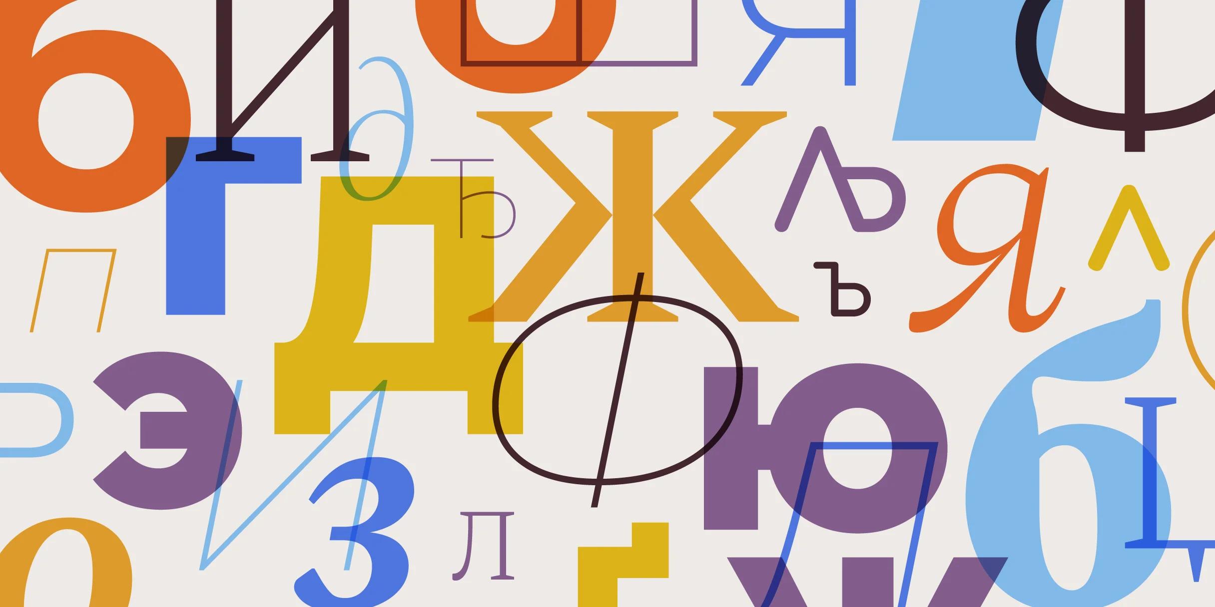
A specimen of Montserrat’s Latin and Cyrillic characters shows the visual coherence of this growing type family. Montserrat Cyrillic carries the aesthetic features of the original design into a new set of characters.
Caveat and Amatic SC: Crafting Calligraphic Expansions
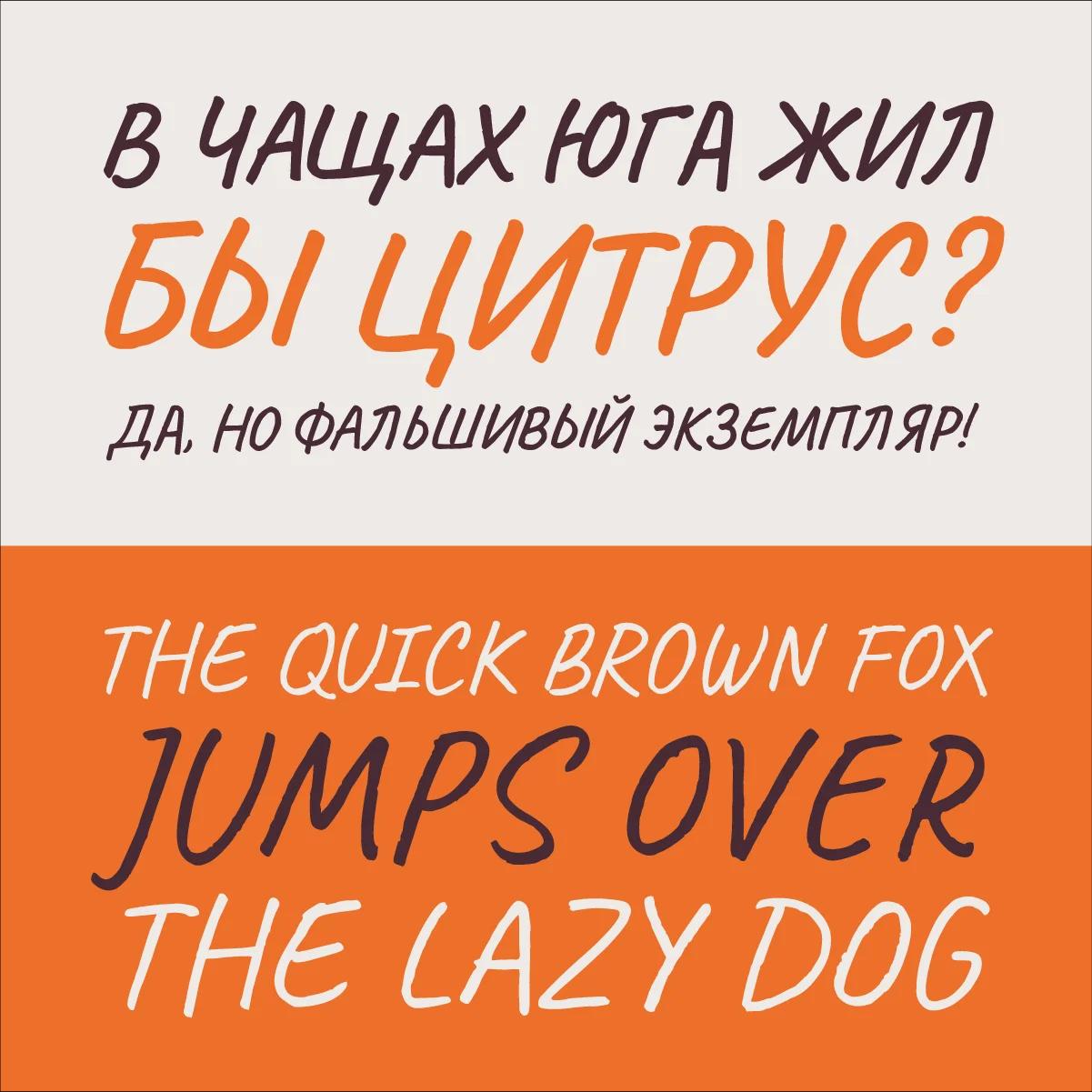
In addition to reviewing the quality of Cyrillic type produced by other designers, Vanyashin spearheaded the Cyrillic expansion of two calligraphic fonts, Caveat and Amatic SC. The process of extending and adapting fonts between different scripts is a matter of balance, and as Vanyashin describes it, the expansion of Caveat required a specific congruity between the intuitive appeal of quick handwriting and the grace of calligraphy.
Caveat has a spare, quick, even idiosyncratic design. One of its most distinctive features is that every character comes in three forms, also called contextual alternates, each with subtle differences to give the natural appearance of handwriting when combined.
Caveat’s new Cyrillic characters appear as though they were drawn not only by the same hand, but with the same pen as the original Latin characters.
Caveat’s new letters were initially drawn on paper by the Ukrainian calligrapher Eugene Spizhovy, who began by experimenting with a variety of different pens to find the right instrument for Caveat’s source sketches—an experience he describes quite vividly. “To make a Cyrillic expansion I passed each letter through my own hands,” he explains, making him feel as if he could “physically feel the font.”
The calligrapher Eugene Spizhovy tested many different pens, and many subtle variations on each letter to find the right form for Caveat’s Cyrillic expansion.
Slight variations in the stroke width of Caveat seem to hint at the weight of the hand through the course of its movement, with occasional tics and quirks—a momentary tilt along a line, a loop that just misses its end point, or a swash that signals movement forward.
Luckily, a number of characters in Latin and Cyrillic share a common root in Greek—A, B, E, K, M, H, O, P, C, T, and X—so these designs required minimal adjustment and make extending a type family from Latin to Cyrillic a little easier.
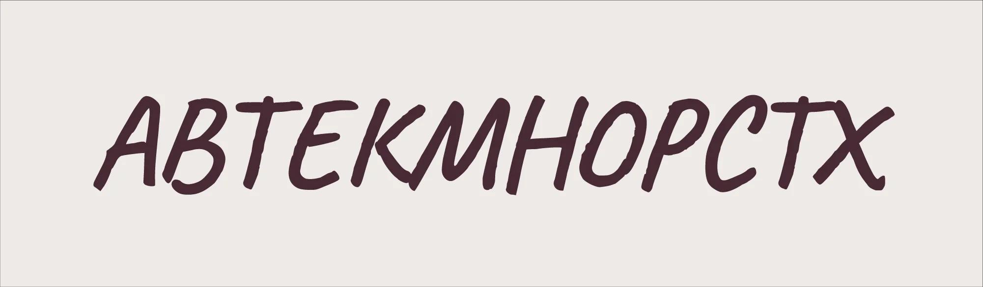
“A good starting point for Cyrillic is creating ‘free’ glyphs from Latin components,” says Vanyashin. The process of extending a type family like Caveat is made easier because Latin and Cyrillic share a common root in Greek.
In the course of designing these new characters for Caveat, Vanyashin also found that certain features of typographic design for Latin glyphs are “naturally congruent” with their Cyrillic counterparts, like the perpendicular stroke at the peak of an ascender. Other Cyrillic characters could be formed by combining elements from existing Latin characters. For instance, the ф was initially formed by merging Caveat’s d and p to help Spizhovy get started, before he began working on his hand-drawn designs in earnest.
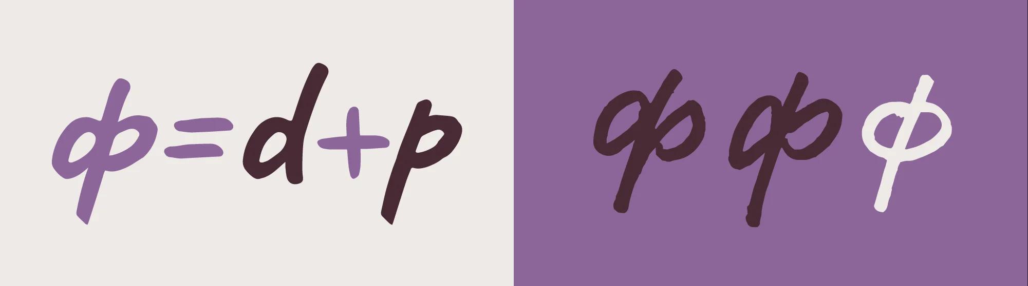
(Left) An early exploration of the Cyrillic ф combined the d and p from Caveat’s original Latin characters. (Right) As the ф was refined, the final form departed from that early study as it became closer to Cyrillic handwriting.
Vanyashin describes this process as an “algorithm for making Cyrillic extensions,” meaning that the intricate, complicated process of moving between Latin and Cyrillic forms can be streamlined by following a set of sensible steps.
Only a few Cyrillic glyphs required unique accommodation, like the Ж (often romanized as ž or zh), which can cause problems for the consistency of typographic color since the character tends to appear heavy on the page compared to simpler letterforms. In total, only 13 of Caveat’s glyphs needed to be reimagined from scratch in order to complete the Cyrillic expansion of the font.
The Ж character also required rethinking and readjustment in the Cyrillic expansion of Amatic SC, a font that was first designed by the English type designer Vernon Adams in 2011. Amatic suggests a casual, unhurried hand. Its letterforms are clear and legible even though each line wobbles and wanders a little. In the process of expanding a font, it's these idiosyncratic details—nearly impossible to detect with the naked eye—that often get the most attention.
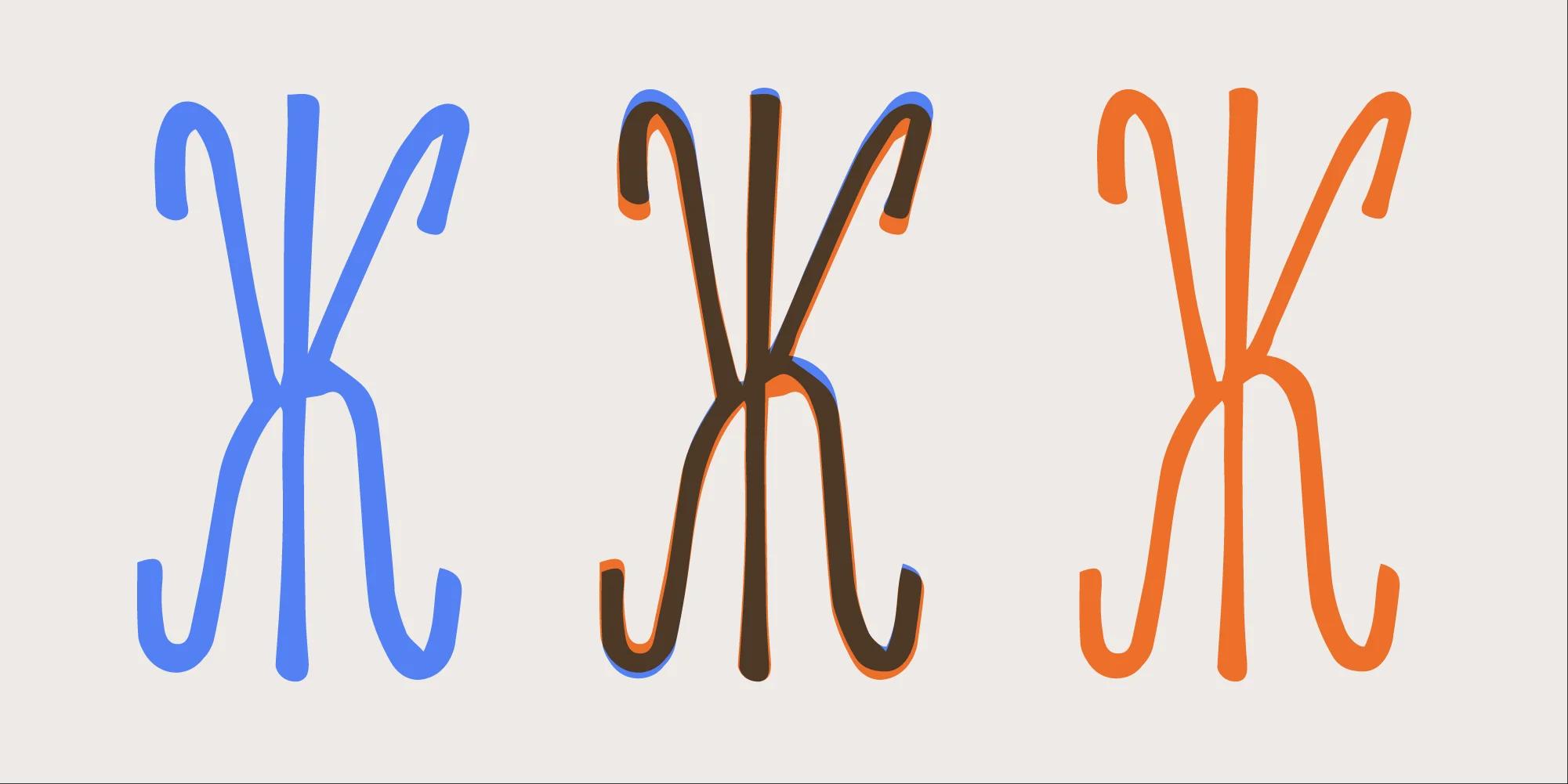
A composite of the left and right version of Amatic’s Ж reveals subtle points that were refined in this character over time. Curves and terminal points have shifted slightly, but the most striking change was thinning the ink traps where several strokes join at the center of the letter.
In the original design of Amatic, Adams wanted to create narrow handwritten characters that were useful for headlines and optimized for the web. Over the course of working on Amatic SC, Vanyashin noticed that bolding the font seemed to shift its character in a striking way. According to Vanyashin, Amatic itself projects a certain calm with its “elongated arms” and “nudged serifs,” whereas Amatic Bold seems “expressive and chaotic.”
Several Cyrillic characters were particularly challenging to redraw for Amatic, such as the Abkhazian O, which is used only in a small region of the Caucasus along the Black Sea coast. Beyond the letterforms themselves, designers also work with subtle typographic considerations like the spacing between characters, also known as metrics and kerning, which must be carefully tuned alongside the original Latin characters so the entire family will “match” if placed side by side.
Amatic’s Latin and Cyrillic letters share the same casual, calm, and friendly appearance.
While Vanyashin’s procedure for extending a Latin typeface to Cyrillic may begin with an algorithm, it ends only after careful, often collaborative assessment of the aesthetic balance between the original design and the new script.
“In a few past expansion projects, I found myself carried away from the original typeface spirit while chasing correct Cyrillic shapes,” Vanyashin says, reflecting on his recent experience. “The goal is to achieve harmony between the two scripts and choose appropriate Cyrillic forms.”
For a type designer who reads and works in several different languages, achieving coherence in a growing type family is a painstaking process, but the resulting improvements are considerable. Better Cyrillic web fonts provide better web typography—for people all over the world.
—
GSuite now supports over 800 font families, 62 languages, and 19 distinct scripts. To start using any of the fonts mentioned in this article—simply choose “More fonts” from the fonts dropdown menu in Google Docs or Slides (scroll to the very bottom of the list). Suggested fonts will appear based on your document’s language.