
Speaking Volumes
Best practices for designing a brand in VR
It took years for early filmmaking pioneers to develop the visual language of cinema. Techniques like jump cut, montage, and cutaway are now fundamental to the medium, but at one point were completely revolutionary. Designers in VR are only starting to develop their shared vocabulary through a similar period of exploration and discovery. We spoke to Joshua To, a design director for Daydream, to better understand how designers can embrace VR's frontier spirit, the inherent challenges of a new medium, and to take a closer look at the lessons he's learned branding Google's mobile VR platform.
Be multidimensional
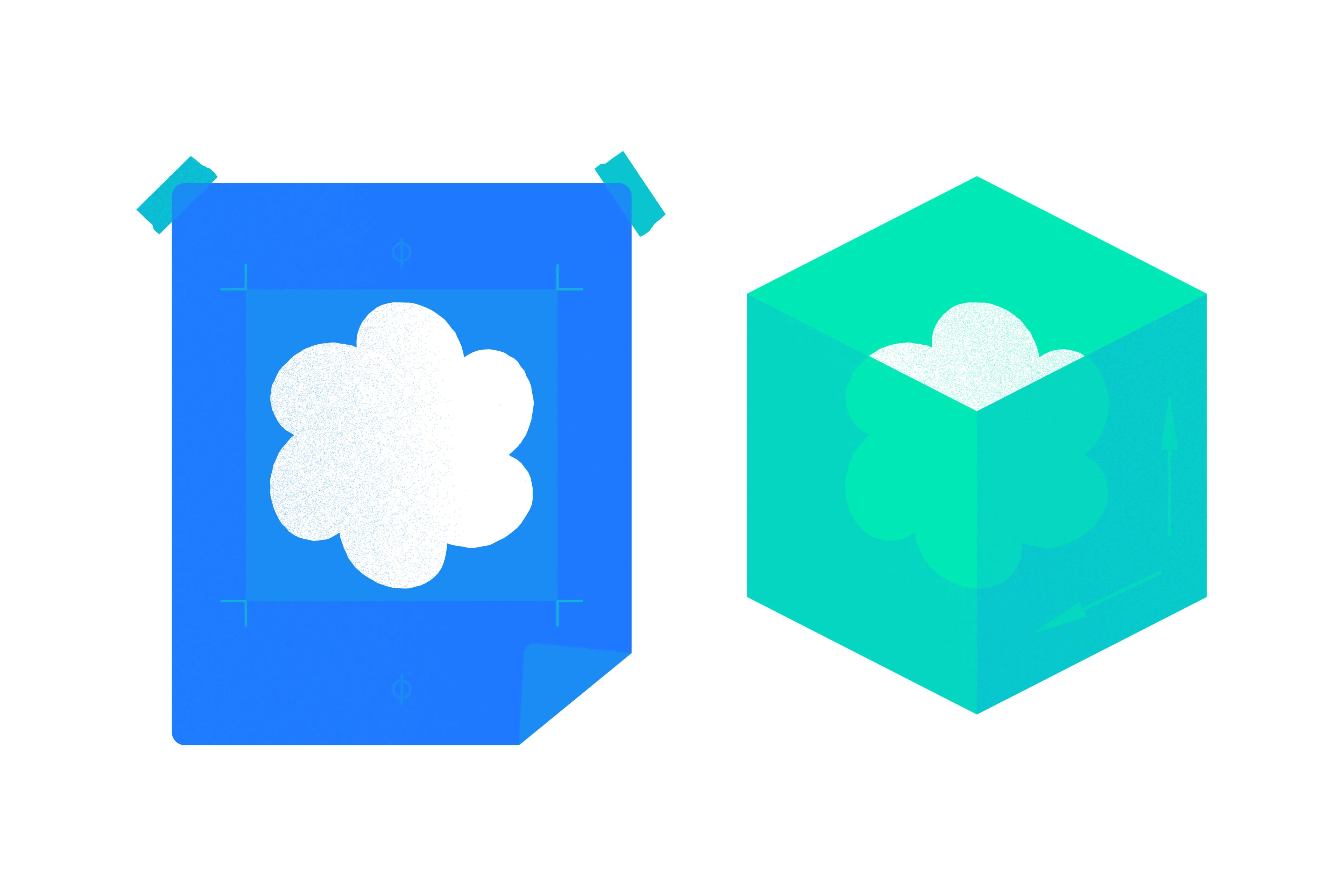
VR is an immersive, spatial, and volumetric medium. In many ways this allows for more creativity, but the constraints of any branding project still apply. Consider where and in what media your brand will appear. Does it need to coexist alongside other brands or elements, and is the brand experience unified across every platform? We decided early on to make one logo that worked for both flat surfaces and VR, because we wanted Daydream to be recognizable in any form whether it be a 360-degree experience, or an interaction with the headset’s packaging. This meant finding a graceful way for a 3D object to appear in 2D—not a trick, but a true representation of the logo. Start by choosing a characteristic that’s very identifiable. Shape really mattered to us, so this became the common factor with a simple shift in perspective. When looking at the Daydream mark on packaging or a flat screen, what you see is actually the 3D shape perfectly head-on.
Performance is another consideration, especially on mobile devices. A volumetric interface is more taxing to run, and adding anything additional like motion or animation quickly becomes less optimal. If you commit to making your logo always volumetric in 3D, for example, you have to consider the whole pipeline from production to execution and the amount of work involved to make that successful.
Consider biases
Designers working in the field right now are in a unique position to shape people’s initial experience of a new medium. Designing a brand in VR requires an awareness of how the platform is currently perceived and a willingness to shift or define that perception. With Daydream, we wanted to project an inclusive vision of VR and a favorable depiction of tech—one that’s welcoming, warm, and accessible to all. We chose to root Daydream’s brand in the natural world, countering the impression that VR is sometimes escapist, while also conveying a sense of the technology’s innate wonder and possibility.
We were deeply inspired by the mathematical forms that exist in nature. The logo’s underlying structure—six circumscribed and rotated tracings of the golden mean—was inspired by the natural geometry found in everything from butterfly flight patterns and sunflowers, to the arrangement of leaves, plant stems, and tree branches. A lot of work went into imbuing the form with motion to imply natural dimensionality even when it appears in 2D.

VR first
Commit to VR first, then build a bridge back to 2D. While your logo may initially be viewed more often in two dimensions, it needs to hold up in VR. To get to the final Daydream mark, we modeled the form in various 3D programs, then 3D-printed it in a lot of different sizes and colors to study the shape, linework, and lighting. The process mirrored some of the early paper studies that informed the Material Design system, where physical, paper mocks were used to manifest digital space. By comparing the digital model to physical versions made out of metal, cardboard, and plastic, we were able to refine the shape until it felt recognizable and balanced. After performing lighting studies with clear and solid substrates, we discovered that we didn’t want the logo to be completely solid. Instead, we used transparency and gradients to give the 2D logo a translucent quality, and decided to use drop shadows that deviate slightly from Material Design specifications (because they aren’t native to a 2D environment). Throughout the process, each dimension informed the other, but designing first for the most dynamic medium helped ensure legibility.
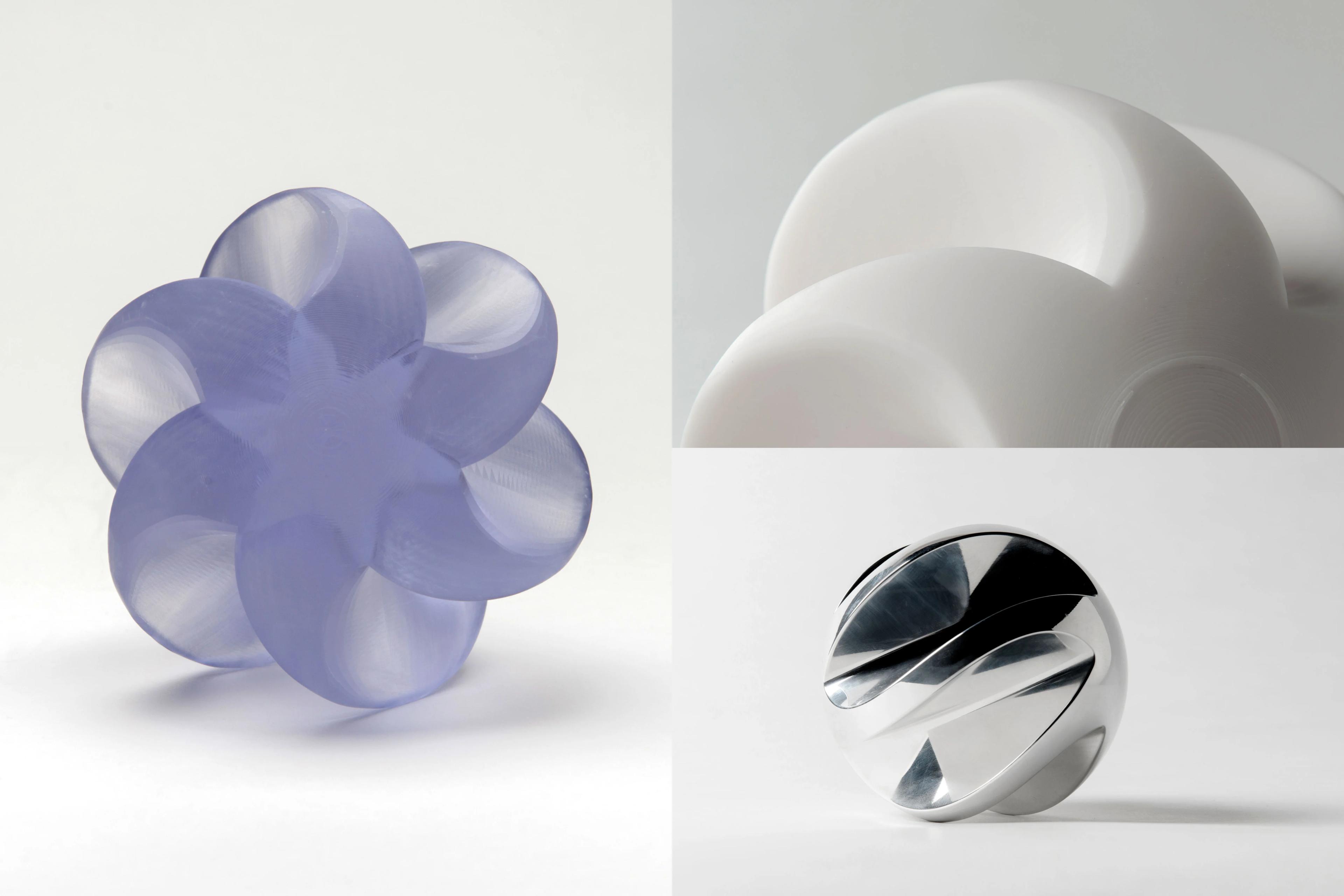
Testing the mark in various sizes and materials allowed Daydream to refine the shape and maximize legibility. Clockwise from left: 3D-printed PolyJet Clear, 3D-printed PolyJet White, machined aluminum.
Know your limits
In VR, it’s important to remember what works and what doesn’t, and the consequences if you get something wrong. Frame dropping or performance bugs can cause people to become physically sick, and the intimate nature of the technology requires careful navigation of personal space. If possible, you never want to break immersion or disrupt the illusion of a 360-experience for your users. Objects that have inconsistencies, such as a paper cup that has no depth when you look behind it, should be avoided. This rule applies equally to VR branding and should be considered carefully. Best practice is to consistently present your logo as volumetric in 3D, and your highest priority should always be getting the details right. But imagine your volumetric logo has to appear next to a brand partner that doesn’t yet have 3D assets. How do you deliver a consistent experience? Know the limits of the medium and be realistic about your ability to address them. If you can get ahead of problems and anticipate them early on, you’ll have a better chance of delivering a consistent and authentic experience to your audience.
Experiment freely
Experimentation is integral to working in a nascent medium like VR, both in terms of the technology itself and in the way it’s presented. Branding can articulate some of the possibility and potential, and new approaches can determine directions for further exploration. We’re constantly confronted with new forms of brand interaction. For example, how should people be able to interact with a volumetric logo—can it be picked up? Thrown across the room? Customized? These kinds of explorations raise new questions around a mark’s physical properties in different VR-environments, and about our personal relationships to brands themselves. Beyond what a logo looks like—what does it feel like? And how much does it weigh in the palm of your hand? Free from the bounds of an object’s physical properties, you can decide if a mark is buoyant or leaden, magnetic or repellant to other objects in its vicinity. A mark might even become functional, something to pick up and collect, or to use as a key to unlock something or access somewhere. Embracing experimentation as a methodology allows you to simultaneously define and push the medium.
The five lessons outlined here—be multidimensional, consider biases, VR first, know your limits, experiment freely—are simply starting points for your own explorations. What’s most exciting about designing a brand in VR at this particular moment is the limitless possibility of the medium, and the chance to break ground on new techniques and processes that haven’t yet been defined. We’re all pioneers when it comes to VR, so embrace your inner explorer and let’s get to work.