Designing SPAN 2017
An inside look at how we design and evolve the branding of our annual design and technology conference
One of the primary goals with SPAN, our annual design and technology conference, is to create meaningful connections in the places we visit—whether it’s connections between ideas, disciplines, or members of the local design community. This means that every SPAN is unique and requires a branding system that is flexible enough to successfully tie together threads across different cities, venues—even languages—and be applied to everything from the website to social posts, wall graphics, printed matter, and swag. As always, we aim to stay true to this spirit while making sure the system works at any size, on any surface.
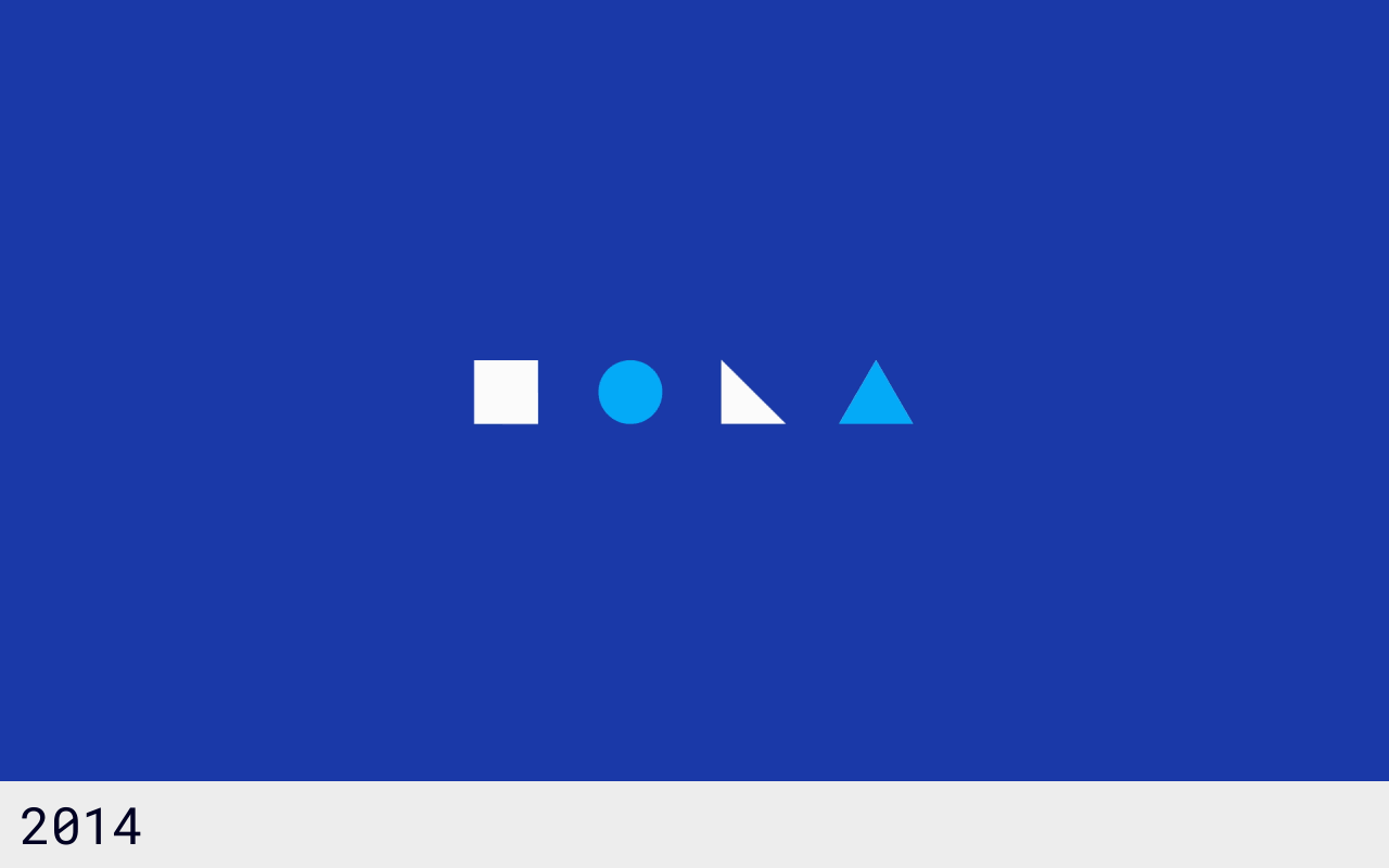
The branding for our conferences from 2014 through 2017 reveals a preference for simple, geometric shapes
Branding through abstraction
Though visually distinct year over year, every iteration of the SPAN brand shares an element of abstraction. To make sure the system works across a large number of surfaces and scales, we need to test these concepts against a consistent rubric. We ask ourselves questions like:
- How could this be a tweet?
- How might this display in a room?
- How could this be expressed in print?
- How do all these applications relate to each other?
- Is this too representational?
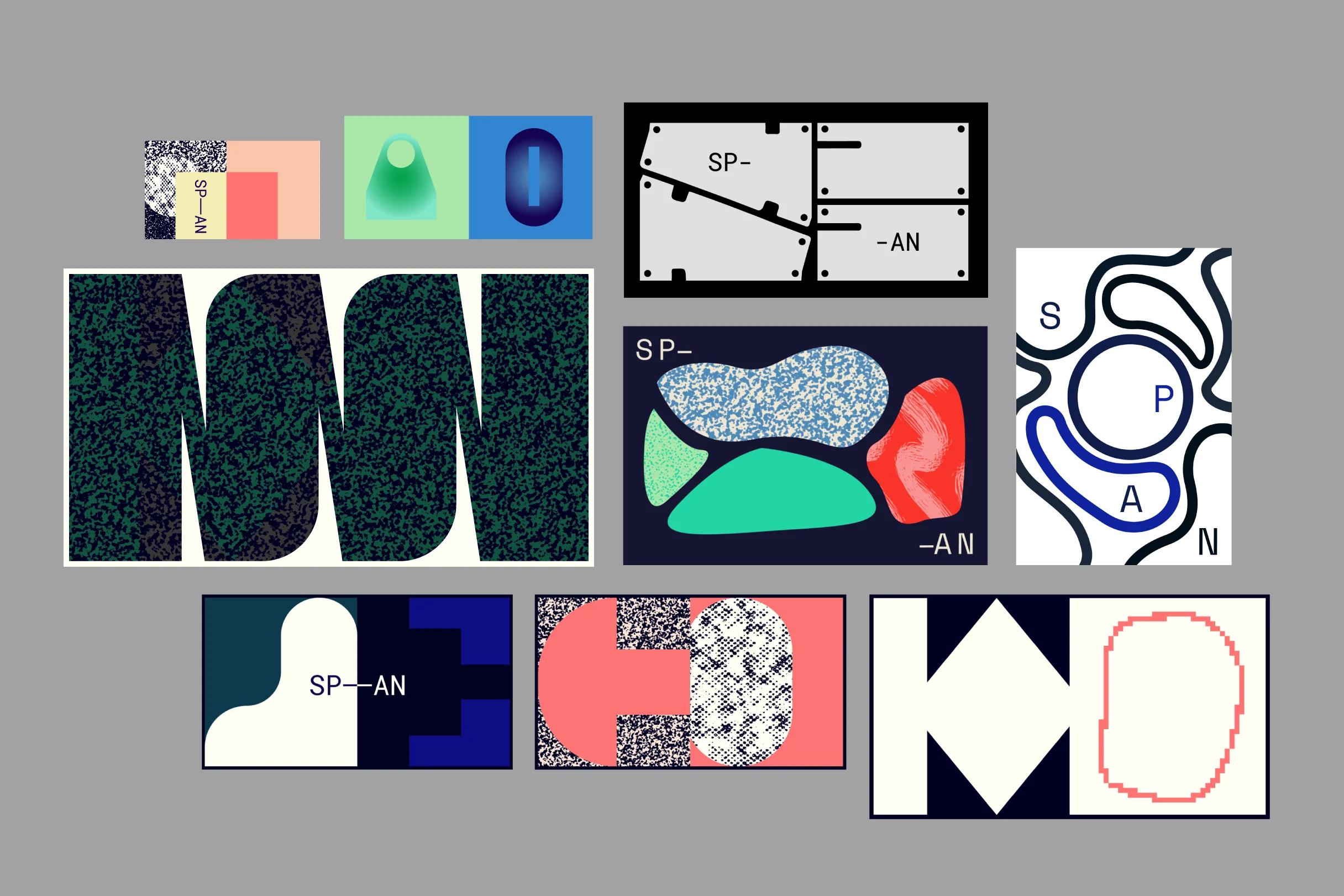
Process sketches show the range of visual explorations developed for SPAN 2017
For the 2017 conferences, we explored a number of directions that produced compelling artifacts but didn’t hold up to our criteria. Some of these sketches included computer-generated designs and concepts with strong patterns and texture. At large scales, many of these visuals became overwhelming. At small scales, they got muddled.
Building out the system
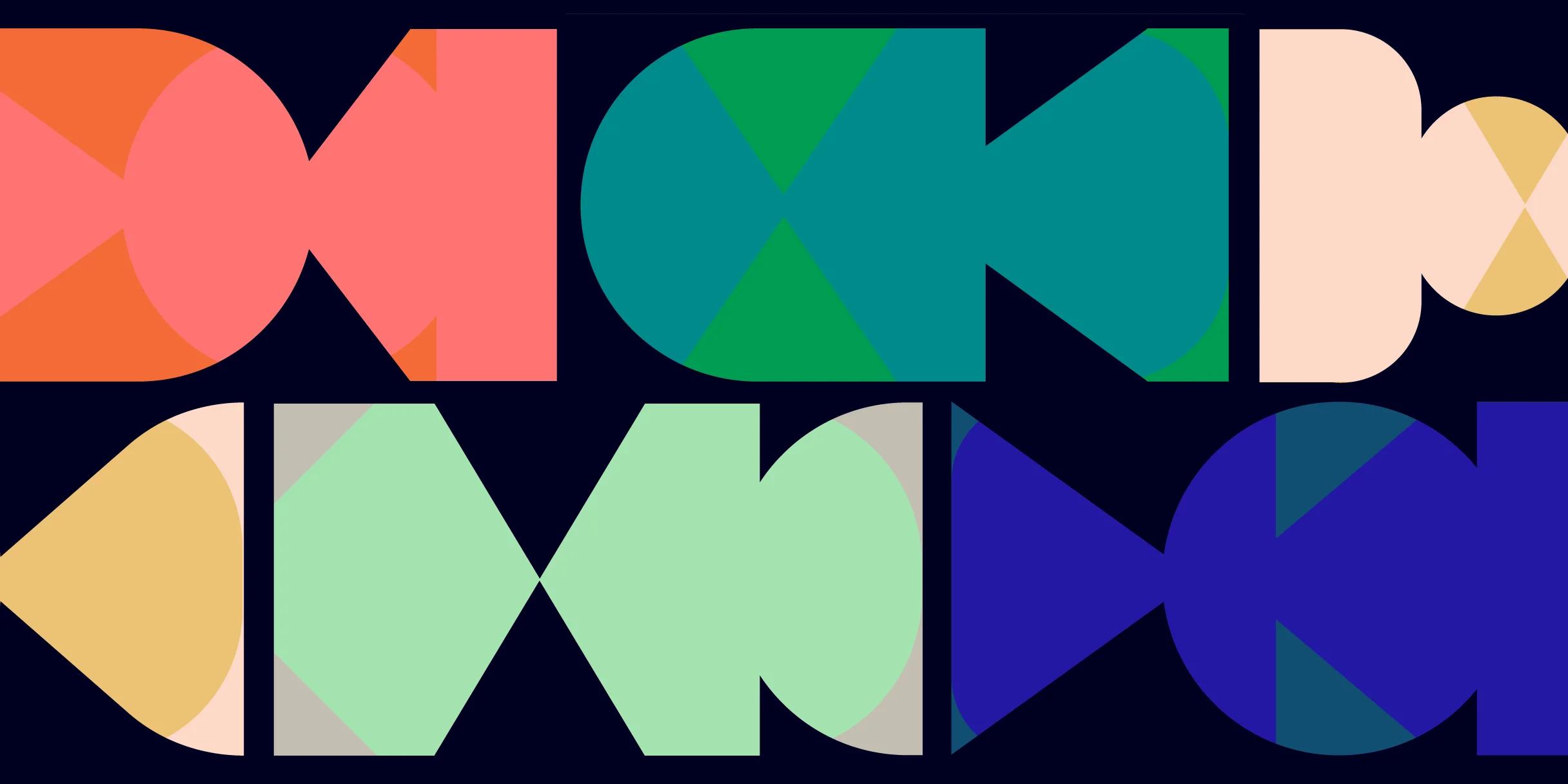
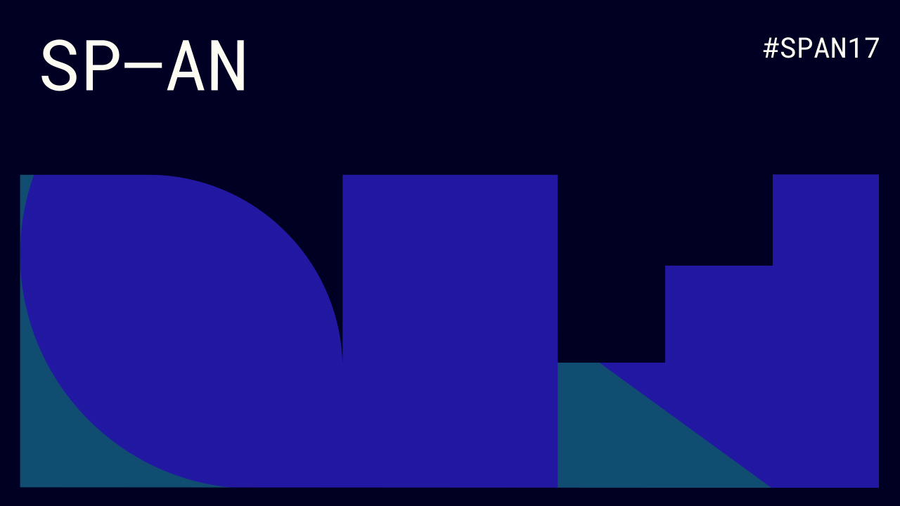
We eventually settled on a series of overlapping geometric shapes created from a standard rectangular grid, rendered in a palette of six color pairs.

Using the same fixed grid, our designers created a series of geometric shapes
We nicknamed our new shapes “vignettes” and layered them to create a highly variable brand system. We found that the vignettes worked best when empty of association and meaning, so if any resembled a thing we could name—a skyline, a desert landscape, or a person—we cut it.
In the end, we created more than 15 vignettes, which were layered to make over 225 abstract images.
A selection of abstract, layered shapes used for SPAN 2017
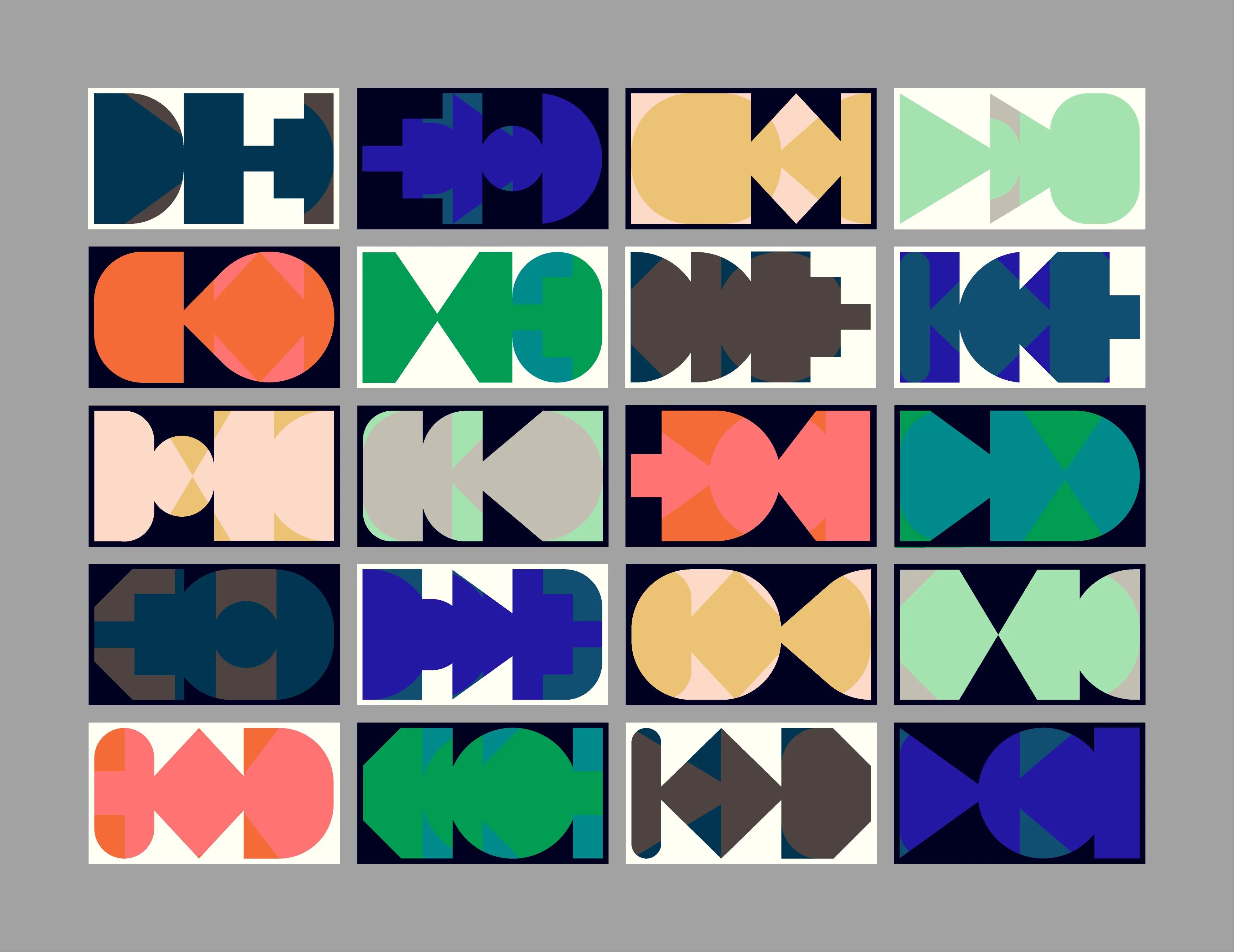
The color palette was chosen from explorations in low-contrast color pairs that held some kind of interesting visual tension—often through an unexpected combination of hues. Adding these colors to the overlapping shapes and a black or white frame expanded the set of potential images to roughly 2,700.
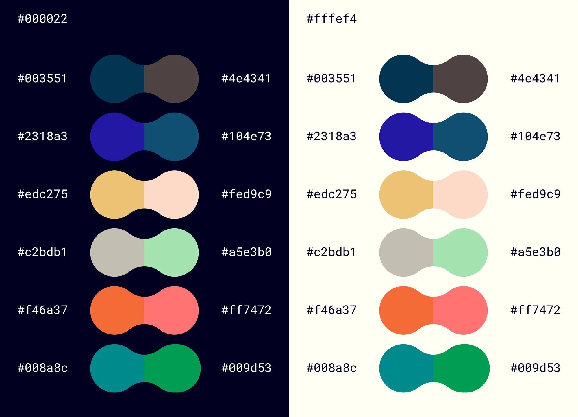
The SPAN 2017 palette is comprised of six color pairs layered on top of a dark or light background
We’ve used Roboto Mono as our primary SPAN typeface every year since 2015. We like how using a monospace typeface bridges the design and engineering realms—software engineers work with monospace characters in developer environments, and designers often use it as a display typeface.
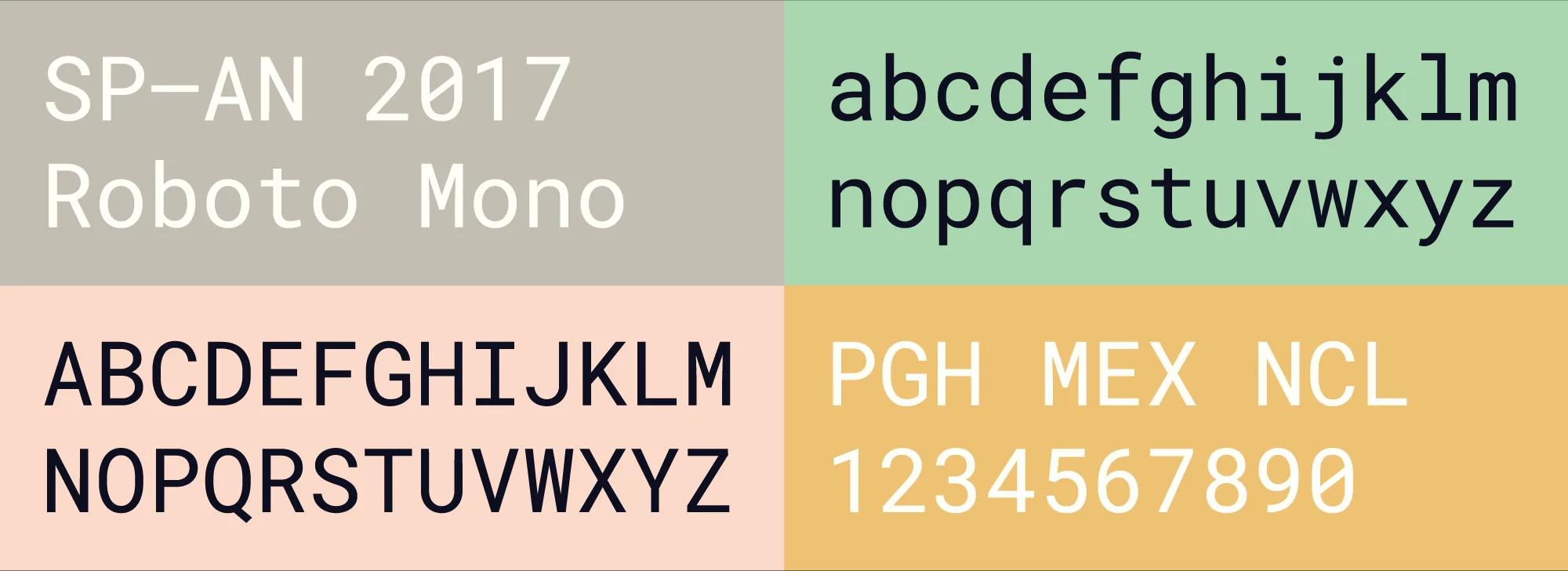
Some specimen examples of our SPAN typeface, Roboto Mono
Motion design played a large role in leveraging the full arsenal of our shape and color combinations, enabling us to digitally display the brand’s full range of expression. Consistently sliding the vignettes from left to right helped create a sense of continuity, while a slight lag in the motion of layers 2 and 3 gave them an organic, elastic feel.
An animation highlights SPAN 2017's "elastic" motion design, achieved by using three layers that move from right to left at slightly different speeds
Applying the brand across cities and scales
Our Pittsburgh conference offered some engaging examples of the branding in situ, with vignettes applied to the walls, sliding across the screens in the plenary, and even influencing the curved partitions of our two workshop rooms. One-of-a-kind posters painted by a custom-built machine from Deeplocal gave a new materiality to the vignettes through layers of paint on thick art paper. The combination of 15 vignette stencils and six color pairs resulted in more than 550 unique designs.
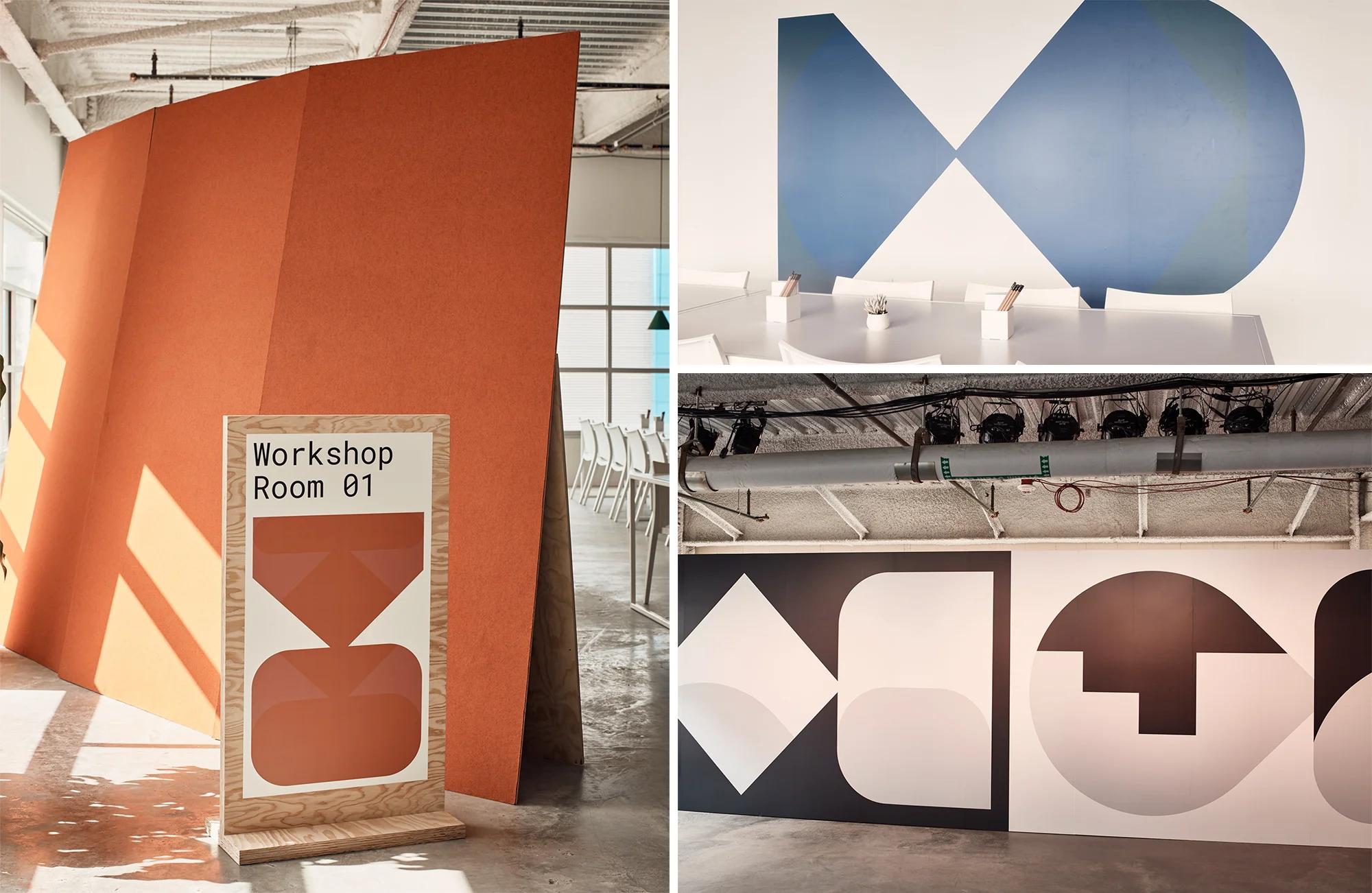
SPAN vignettes used for signage and large-scale wall graphics in the event space
At SPAN Newcastle-Gateshead, the brand was given a new form in a set of large-scale banners flanking the stage, as well as a poster insert into this year's SPAN Reader, as well as city-specific vignettes on the conference swag. At our SPAN event in Mexico City, the vignettes were used to punctuate architectural features in the space. They took the form of vinyl decals covering Deco-era interiors, as well as in the design of a 12-foot sculptural sign in the double-height registration area.
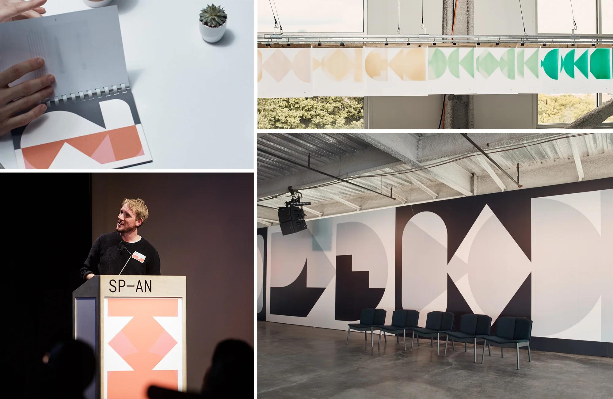
The SPAN Reader, Pittsburgh posters and vinyl graphics, as well as the stage/podium branding in Newcastle-Gateshead show how we were able to express the branding system across different form factors and venues.
Even 2,700 shapes later, we know there’s still room to expand and play with the system. You can check out all the 2017 events and speakers on our site, and learn more by reading our articles on Pittsburgh's burgeoning tech and design scene, our data viz workshop at Newcastle-Gateshead, as well as Ross Mantle's SPAN Pittsburgh photo essay.
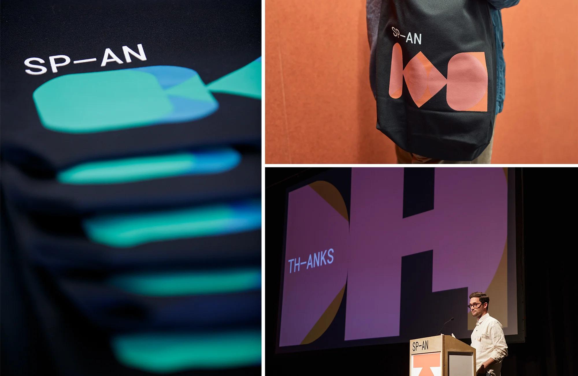
Different SPAN vignettes used on the swag bags for Pittsburgh, Newcastle-Gateshead, and Mexico City. These designs also feature prominently in presentation slides at all three events