Choosing Web Fonts: A Beginner’s Guide
Take the mystery out of font selection with our step-by-step guidance
If you get it right, typography can be incredibly powerful. Turn to the writings of Robert Bringhurst, whose Elements of Typographic Style has served as a sage reference text for decades, and you’ll find a high-minded articulation of the craft. Typography “exists to honor content,” according to Bringhurst, and when it’s done well it “reveals every element, every relationship between elements, and every logical nuance of the text.”
Whether you find these words inspiring or intimidating, the plain fact is that the right typographic choice always reflects the specific needs of the project itself. These needs are not only aesthetic, but also technical and functional—and there’s only so much you can tell from snippets of text as you scroll through a dropdown menu from Alegreya to Zapf Dingbats. Certain fonts work best in headlines, while others read well in paragraphs. Some font families are large enough to include international scripts and special characters. And if the font comes in a range of different styles (like italics or small caps) and weights (from hairline to ultra-black), it’ll offer more tools to fine-tune the design as the project comes together.
There’s a lot to think about, sure, but some of the most important considerations are the practical and functional features of the project. By starting with what you already know, then thinking through the following considerations, you’ll find a font that meets your needs.
Start with your project’s scope
Are you starting something that could go on for a few months or even years, like a magazine, or is it a one-off project, like a slide deck, logo, or presentation?
Chances are that a large, long-term project (like a periodical or newsletter) will have a variety of different typographic needs over time. Your best bet for covering those different needs is to choose a large type family that includes a variety of weights, styles, and variants like small caps and ligatures. Large families make branding easier because sticking to a single font over time ensures that you'll be able to handle different situations without having to add another font into the mix. Try these examples: Alegreya, Alegreya SC, Merriweather, Merriweather Sans, Roboto, Roboto Condensed, Work Sans
But if this is a short-term project (like a poster, album cover, or logo) you might not need extra weights, or the condensed and extended versions of a font. You could even choose a font with a single weight if you think it’s right for this particular task. Just bear in mind that the versatility of a large type family could still be useful as you make fine adjustments to the text in a short-run project. Try these examples: Bubblegum Sans, Graduate, Scope One, Space Mono
What do you want your font to say?
While the scope of your project could narrow your search by ruling out fonts that don’t have the range you need, or guiding you toward those that do, remember that there are no hard and fast rules to determine the font with the right aesthetic. That’s a matter of the font’s personality, but to some extent personality depends on familiarity.
Many apps and websites still use a small selection of the most common fonts—a holdover from a time when this was the most practical approach to digital typography. It was once the case that using system fonts would be the safest choice because you could count on them to be in working order and available across most devices. Today, there’s no need to compromise by selecting a commonplace “workhorse” font. Web fonts tend to be just as reliable as system fonts, but with a greater variety to choose from. Try these examples: Proxima Nova, Helvetica, Museo, Futura, Brandon Grotesque (popular); Arial, Times New Roman, Courier New, Helvetica, Times, Courier, Verdana, Georgia (system); Gibson, Gotham, Classic Grotesque, Montserrat (web fonts)
But if you’re still keen on finding an uncommon font to help your project stand out, there are dozens of commercial type foundries that sell proprietary fonts for either a flat fee or monthly rate. If you want a totally unique, bespoke typeface—and who wouldn’t—it can be expensive and time consuming, so start by reaching out to foundries for quotes. On the bright side, whomever you hire will probably handle many of the concerns listed in this guide. Among your free options, you could always look for a less commonly used web font. As a general rule, choosing a newer release means it won’t be in widespread use—at least not yet. We’re of course partial to Google Fonts. Take a spin through the directory to get a sense of just how many free web fonts are out there, and use the family specimen pages to view each font’s usage across the web.
How much text are you typesetting?
“Designers provide ways into—and out of—the flood of words,” writes design critic Ellen Lupton, “by breaking up text into pieces and offering shortcuts and alternate routes through masses of information.” Beyond the personality of your font choice, well-designed layouts also use visual cues, regularity, and variation to guide readers naturally. And choosing type according to the length of the text can give readers lots of cues and shortcuts to help with navigation.
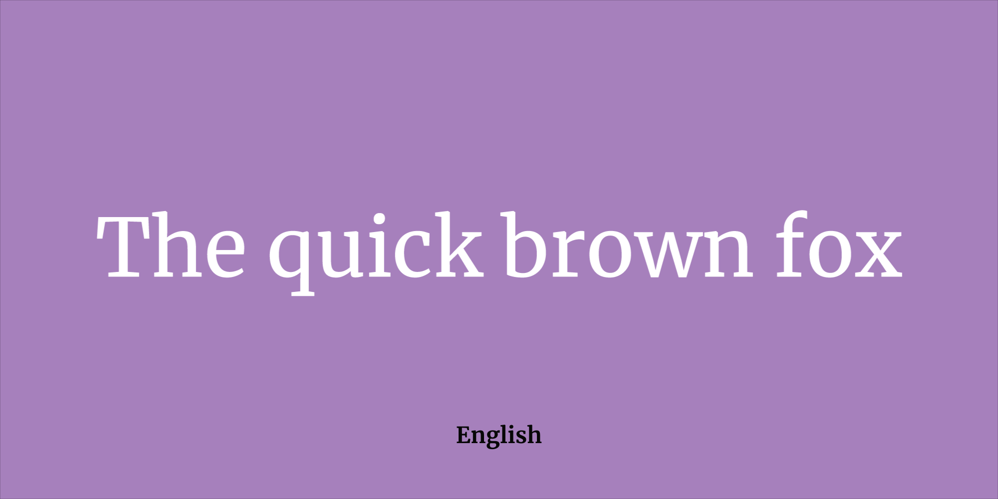
For headlines and subheads, you can choose an expressive, unique, even idiosyncratic font—including Display, Decorative, Handwritten, and Script styles. These unconventional, high-contrast designs tend to work well in this context because their details and visual complexity help to attract the eye. If you’d like to use a sans serif font for short bits of text, especially in large sizes, the regular weight tends to look a little out of place. Consider using the bold and compressed styles instead. If you prefer serifs, hairline serif fonts like Playfair Display or Rufina tend to work well in short lines because their high stroke contrast tends to grab the reader’s attention.
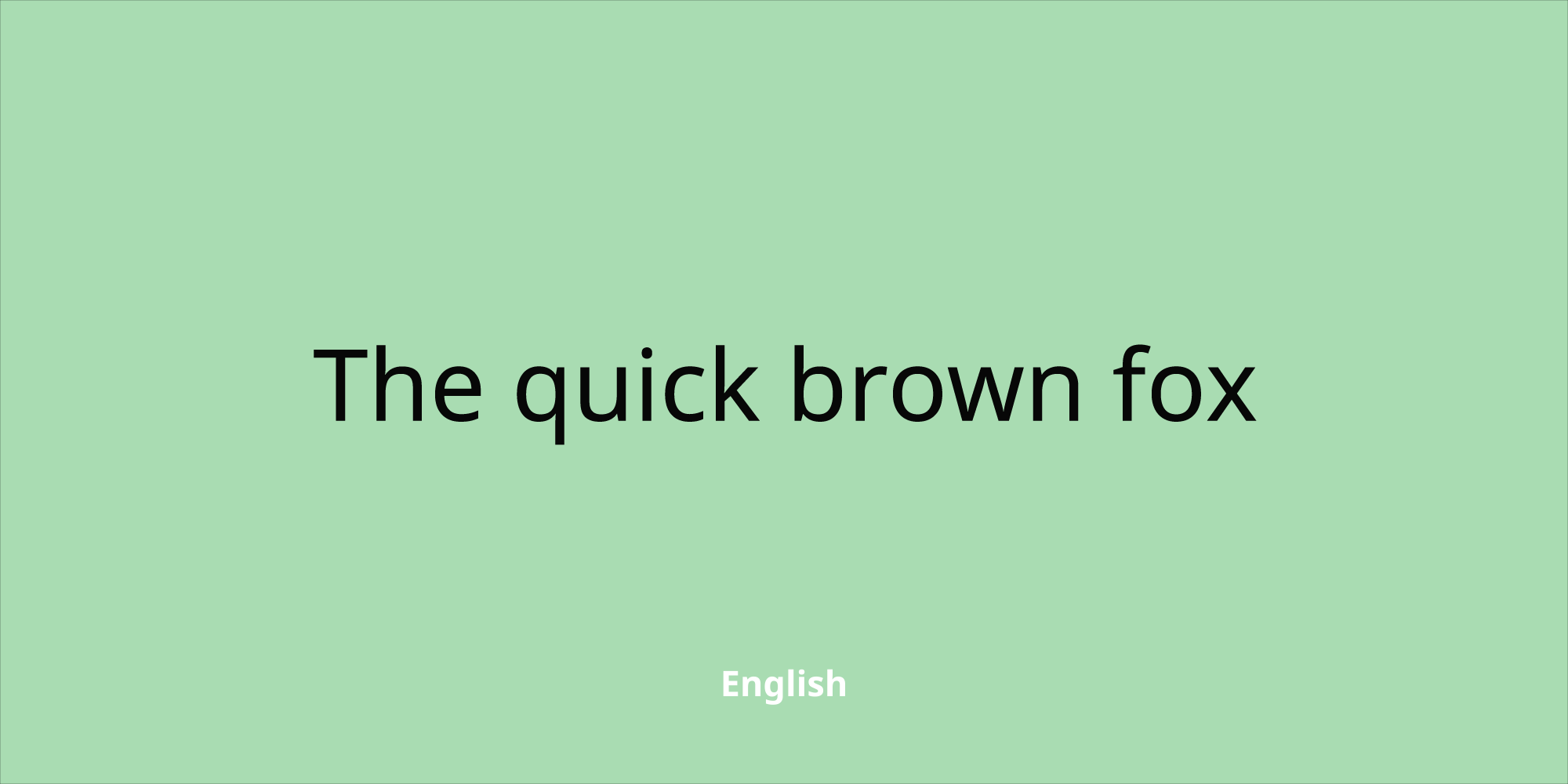
Medium-length text, defined loosely as three to four paragraphs, is actually pretty flexible, which means you’ve got options. If you’re leaning toward a serif font, opt for something in the old style like Quattrocento, a transitional style like Libre Baskerville, or a slab serif like Arvo. Prefer a sans serif? Then the best choice would be something in the Humanist or Grotesque style like Cabin or Raleway, but even some geometric styles like Montserrat will work. Experiment by trying out a few of these and see what works best in layout.
When typesetting longer sections of text—exceeding five paragraphs—a serif typeface is recommended. This is the traditional choice for book typography, but it also works well on-screen. Old Style or Transitional serif fonts, like EB Garamond or Libre Baskerville, tend to be easy on the eyes for longer reading like news and magazine articles. While it’s possible to use a Humanist sans serif font for long stretches of body text, the safer bet is a familiar serif design that readers can process quickly.
What matters when it comes to point size?
When choosing web fonts, you often have to weigh several considerations together. While the length of your text helps determine which font you select, the size at which you’re setting type is another important factor. At relatively small sizes, up to 16pt, try sans serif options like Roboto, Montserrat and Raleway. Compared to serif designs, those without (or sans) serifs tend to have a taller “x-height,” defined as the distance between the baseline and midline of an alphabet and the height of the letter “x,” which makes a design more legible at small sizes. Sans serifs also tend to have relatively low stroke contrast and a more even stroke weight, which gives them an even “color” when scaled down and packed into a small space.

“For a paragraph, which needs to be highly legible, you shouldn’t use something with ambiguous shapes,” says type designer Octavio Pardo. Decorative fonts like Comfortaa (shown above) can be difficult to read at length, so for long texts stick to highly legible “workhorse“ fonts like Alegreya or Bellefair.
You can also get a sense of the overall quality of a font by examining the letters that tend to demand more time from a type designer—or just fall lower on their priority list. “Look at the shapes of the ‘a’, ‘g’ and the numerals,” says type designer Octavio Pardo. “Risky font choices reveal themselves in those glyphs. They should be daring but also legible. You can allow extravagant designs in low frequency glyphs like ‘v’ ‘w’ ‘x’ ‘y’ and ‘z’ as well as italics.”
At medium sizes—such as subheads, pull quotes, or smaller titles ranging from 16pt to 24pt—consider using a sans serif font in the Geometric, Grotesque, or Humanist style. Montserrat, Lato, and Quattrocento Sans are good examples. Avoid extreme weights, neither too thick nor too thin, to keep text easy to read at a glance. If instead you’d like a serif font that’s contemporary and not too bookish, look for something without too much stroke contrast, like the slab serif fonts Arvo, Sanchez, and Slabo.
Fonts designed to be used at large sizes, greater than 24pt, are called Display fonts. These tend to have striking features that stand out at higher point sizes, whereas at smaller sizes these same features tend to hinder legibility. Still, nearly any typographic genre is fair game for large text, just as long as the feelings evoked by the typeface are appropriate for the context. This is the ideal time to use a decorative or handwritten font with swashes and very high-stroke contrast, like Lobster or Berkshire Swash. Try something highly geometric, retro, or even grungy if it strikes the right tone. Just avoid fonts with large counters (the enclosed, interior spaces of letters like B or q) and tall x-heights, since these features are meant to aid the eye with smaller text and tend to look out of place when they’re scaled up.
Who’s your audience and what languages do they speak?
Remember that your app or website will probably reach users all over the world. Even if you’re providing content in a single language, many people use a translate feature in browser so that content appears in their native language.
“Auto-translation as a service makes the chances of someone seeing your content in another language a near certainty,” says type designer Eben Sorkin, whose Merriweather (shown above) has been expanded in recent years to support more European languages, as well as those using the Cyrillic script. “Having the glyphs needed for their language available will help make the user feel catered to,” says Sorkin. “The more global your customers, the more you will probably care about this.”
In other words, if the font you’ve chosen has only basic Latin letters, auto-translate takes the typography of your project out of your hands—shifting your layout into some other font for those letters, giving it a “ransom note effect” where individual, accented letters change and stick out. Choosing a font that includes characters for other languages, guarantees that the design of your site will remain consistent for a broader swath of your readership. This may sound like a losing battle, but there are plenty of font families that include multiscript support.
If your principle concern is for a font to remain consistent across the greatest number of scripts possible, consider using the Noto font family (shown above).
Even with basic Latin fonts, you’ll want to check whether the font includes the “Extended Latin” characters used in specific European languages. Consider characters accented with diacritic marks like the circumflex (â), grave (á), umlaut (ä), overring (å), or ogonek (ą). There are many more, but choosing a font with an Extended Latin character set will ensure that accented letters don’t mistakenly default to the unaccented version.
A type family should appear consistent, even harmonious across different scripts—which is no small feat. Designers matching two or more scripts for a font must balance separate histories and writing traditions. If you expect to use two different scripts side-by-side, test a few sets of sample text to see if you think the two scripts sit comfortably together.
Web fonts like Alegreya, Merriweather, Nunito, Roboto, and Quattrocento include a large range of characters, weights, and styles that qualify them as “superfamilies,” and these five superfamilies now support Cyrillic characters as well. One caveat: just like Latin, there are certain Cyrillic characters used only in a few languages, such as Serbian and Bulgarian. To provide for these languages, make sure the font has “Extended Cyrillic” support.
Other web fonts support a wider range of writing systems. Depending on the project, it might be a priority for your font to have matching Arabic, Greek, or Hebrew characters. You can also find web fonts to support a range of South Asian scripts like Bengali, Devanagari, Gujarati, and Tamil, as well as Southeast Asian languages like Thai. To see your options in Google Fonts, filter by language with the dropdown menu.
How do you weigh a font’s functionality versus its design features?
The stylistic range of a type family breaks down into two parts: its functionality and design features. Functionality refers to the range of styles available to modify the overall appearance of the font. A functional font should have italics and a range of weights from thin to black. Try these examples: Barlow, Poppins, Libre Franklin
A font’s design features are narrowly tailored variations on specific characters. These include small caps, contextual alternates, and different numbering styles. Small caps can be useful for titles and headers in certain contexts. They can lend sophistication to the text by adding variety and creating a sense of visual hierarchy. Try these examples: Carrois Gothic SC, Cormorant SC, Patrick Hand SC
And while it’s uncommon for contextual alternates to be considered essential for a font to work well, they can add variety in several ways that might be very desirable for your project (see Montserrat Alternates). If you’re using a cursive or script font, its alternates could make the text appear more “natural” by adding the variety that would appear in actual handwriting (Caveat, Sriracha). On the other hand, the alternate characters in a serif or sans font may add a touch of distinction that stands out from normal text.
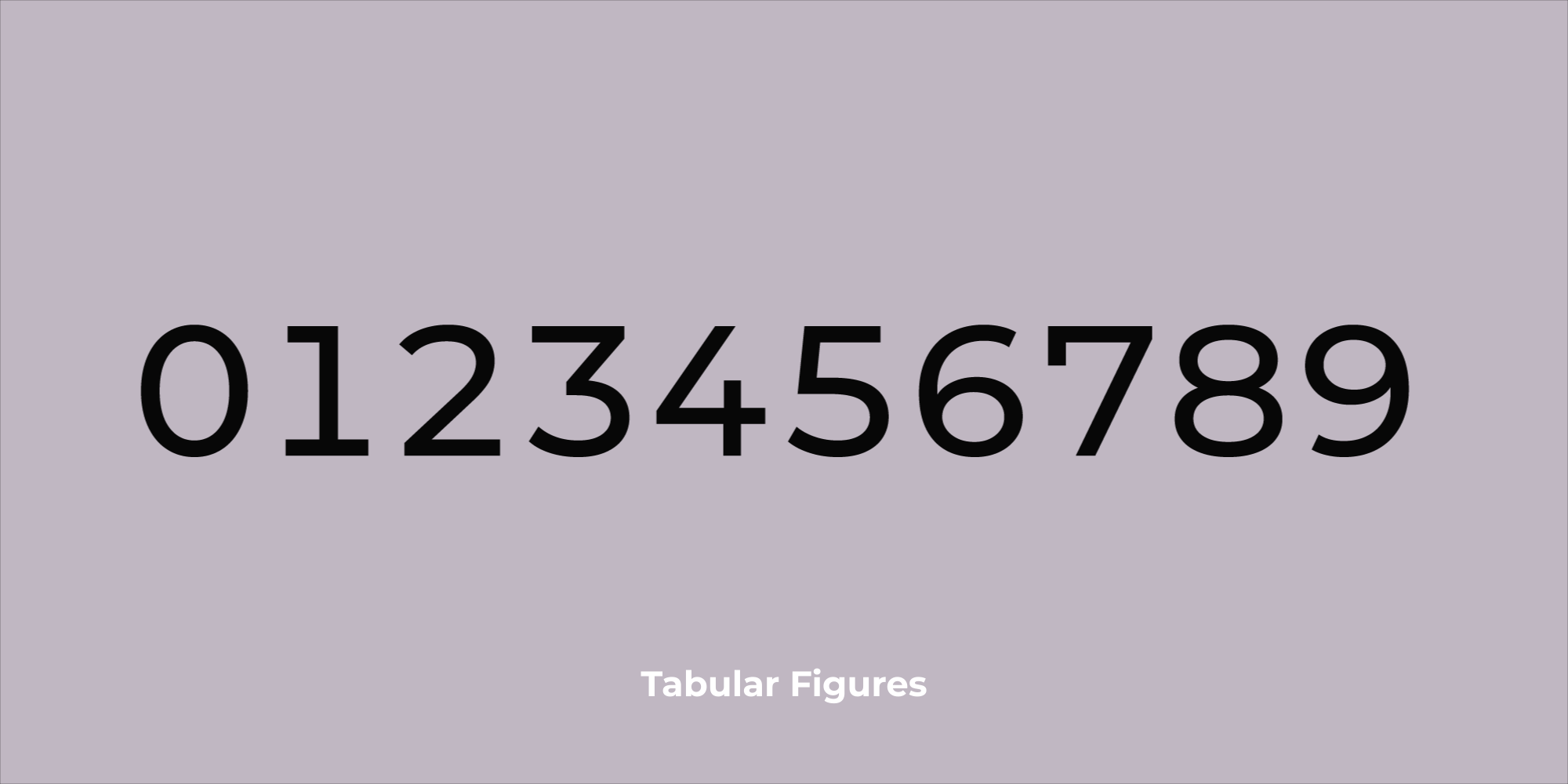
Depending on what’s needed for your project, remember to compare the styles of your font’s figures. The difference between Oldstyle and Tabular styling (shown above), will affect your layout and formatting choices. Tabular figures are often used in tables because each number has the same character width, while Oldstyle figures read more comfortably in paragraphs.
If you expect to use a lot of numbers, bear in mind that they come in several different styles intended for different contexts. Oldstyle figures are preferable for blocks of text like paragraphs. If you look closely, you will notice that some numbers are aligned below the baseline that orients the rest of the text. This helps with the readability of numbers within long strings of text. Tabular figures are vertically centered and monospaced horizontally. This helps them to appear more regular and consistent in tables, hence the name. Also bear in mind that only some fonts include proper fraction signs. Ditto the hundred-odd currency symbols used all over the world. Try these examples: Alegreya, Exo, Montserrat, Roboto, Spectral, Google Fonts with OpenType features
What if you want to use more than one font?
With the basics out of the way, you can safely move on to more complicated decisions like font pairing. Pairing can be a fairly nuanced and complicated matter, even for type experts, but that doesn’t mean it should be avoided altogether. “There are endless combinations, and finding the right pairing can take a long time,” says designer Yuin Chen, who led last year’s Google Fonts update. There’s pleasure in trying out different combinations, so embrace the process and test as many options as you can—what works best might surprise you.
Some pairings work well due to their contrast, while other pairings thrive on similarity. Stark differences can make a layout appear more dynamic, while using different styles from a superfamily adds visual cohesion. If you’ve chosen a unique and striking display font for titling, try something toned-down and familiar for the body text. A classic choice would be to use the sans serif style for titling and the serif style for body text. Try these examples: Alegreya and Alegreya Sans (similar), Libre Franklin and Libre Baskerville (contrast)
Pro tip: When browsing family specimen pages in the Google Fonts directory, you can try out and customize popular pairings.
Still undecided?
It’s worth making a short list and getting to know the fonts you’re considering. Review the full range of characters and styles for each option. Check out how they look in Cyrillic or Thai. Find a bio for the designer, and see how this font has been used in the past. Above all, you don’t want to underestimate your typographic needs or the needs of your readers. The more styles, characters, and scripts a font supports, the better prepared you’ll be.
Typography is a subtle art, but less elusive than its reputation might suggest. If you’ve already given some thought to the organization of your project, its scope, and its audience, you’re primed to make smart typographic choices.
Several designers lent their expertise to the construction of this guide: Yuin Chien, Joana Correia, Dave Crossland, Natanael Gama, Octavio Pardo, Eben Sorkin, and Eduardo Tunni.