YouTube Sans: The Making of a Typeface
How YouTube created a tailor-made font that doubles as a brand ambassador
When I first joined YouTube in the fall of 2014 as a design director, the company’s identity was somewhat disjointed, even to those of us on the inside. We had our full wordmark—a modified version of Alternate Gothic—and our shorthand “play icon,” but no clear direction on which to use or when. At the time, YouTube was also about to expand. The launches of YouTube Kids, YouTube Music, and YouTube Gaming were only a few months away, so building out a logo and typographical system that was clear and recognizable quickly became a priority for my team.
The logo(s) problem
Starting with the logo, we knew we needed to create something that embodied our new products as well as the numerous events and programs the company is involved in—something that could scale. We had to consider things like: YouTube Premium, Music, TV, Studio, Kids, Live, Gaming, Space, Learning and Music Foundry. It was clear to my team and confirmed through our research, that the play icon was very recognizable and therefore something we couldn’t walk away from. Instead of having it compete with the logomark, we decided to finally put it front and center as our logo icon. Now it was time to focus on the type.

The early version of the YouTube logo and “play icon” (2015)
The birth of a typeface
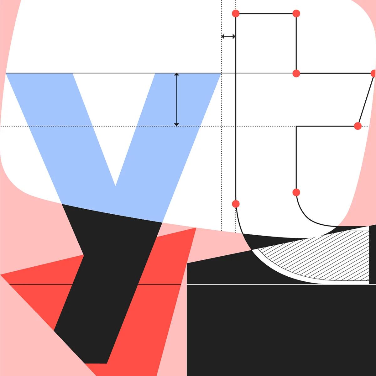
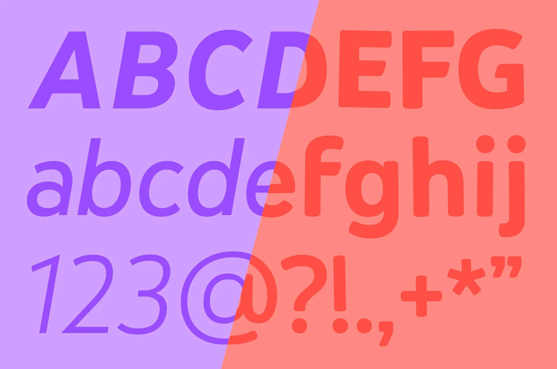
The team began by asking if we should license an existing typeface or use something open source. But the legal issues around either option and the simple ownability of it all, pushed us to create something ourselves, in-house. After exploring several different glyph sets (a glyph set includes all the characters and symbols in a given typeface) in a variety of styles, we settled on one that had every bit of YouTube in mind. It was built off the grid of our old play icon, which influenced the angle cuts in the ascenders and arms, and the curves in the collars and shoulders.
The grid from our logo icon inspired the design of each glyph
For example, you can see the angle cut in the arm of the lowercase t, and the influence of the curve in the t and i’s shoulders. We also built in a lot of quirks and personality to reflect our worldview: we ruled out Swiss type because we wanted it to feel more human; it had to be imperfect, unpredictable, and strong yet rough around the edges; more than a brand ambassador, it also had to be reflective of the community of creators who call our platform home. We called it YouTube Sans.
Two steps forward, one step back
We began working on YouTube Sans with the intention of using it in our new logo, but in the end we decided that YouTube Sans was just too far of a departure from our current logotype. Our original logo was created by YouTube co-founder Chad Hurley in 2005 and featured a modified Alternate Gothic, a font designed by Morris Fuller Benton in 1903. The juxtaposition of using something from the newsprint era for such a far-reaching cultural digital product appealed to us and felt like a nice nod to our past. So we began working on a second font, YouTube Logo, that referenced Alternate Gothic but was optimized for screens and legibility at small sizes. And we decided that what made YouTube Sans distracting as a logo, actually worked perfectly at a different scale.
The early YouTube logo transitions to the first YouTube Sans version (2016)
As a display face, YouTube Sans came to life. Not only did it look like it belonged to YouTube, it filled out our identity design system beyond the color red and the logo. Our products, such as Music and TV, now had a typeface they could pair with Roboto—the font developed by Google and in use as our system and body copy font—which brought a new vibrancy to our headlines. The marketing team also had something with a ton of personality they could use in all their communications that tied back to the brand and delineated YouTube from the rest of Google.
A strong debut
After six months of development and making adjustments, we shared YouTube Sans with our CEO and provided a preview to our creators. With the launch of YouTube TV in 2017, the world got to see the second version of YouTube Sans. That launch made it possible for us to see how the font performed across a wide range of devices. The TV product design team really embraced YouTube Sans as the main design element in the app, and it became the only typeface used across desktop, mobile, and television. The sheer prevalence of the font throughout the product, over time and with daily use, felt to my team like it overpowered the content. In our pursuit of encapsulating YouTube’s personality in a font, we had clearly gone too far. Our humanist-esque font with all its angle cuts on random ascenders, imperfect curves in letterform shoulders, irregular eyes, counters and terminals, added up to a font that felt like it was always shouting “look at me!”
Revisions to the font’s ascenders, apices, shoulders, tracking, and cap height were included in YouTube Sans V3.
Around this time Google also launched dark theme, which we noticed caused legibility issues at smaller sizes, especially in some of the irregular counters and the tracking. We shipped a small update, V3, to address some of these issues, and even though YouTube Sans had only been our display font for six months, we began planning a much larger overhaul.
Getting it right
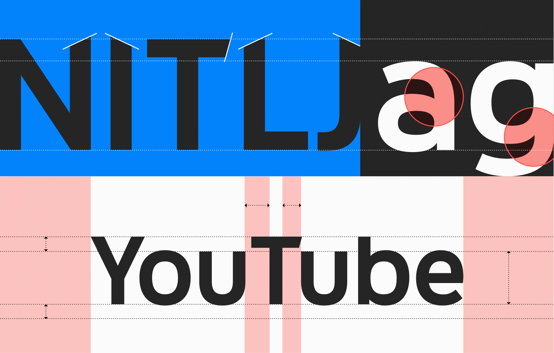
The team kicked off V4 of YouTube Sans in August 2018. We had gathered all the feedback and known issues internally, as well as notes from the external type community. Going through and addressing the feedback around curves, consistency, relationships of forms, legibility of glyphs at certain sizes, tracking and leading, and various other granular tweaks took several months. We redrew each glyph from scratch creating four masters, and even rethought the format to make both a traditional static font and a variable font. By moving to a variable font, YouTube could improve loading speed and decrease overall font file size, while also improving accessibility, legibility, and the responsiveness of our design.
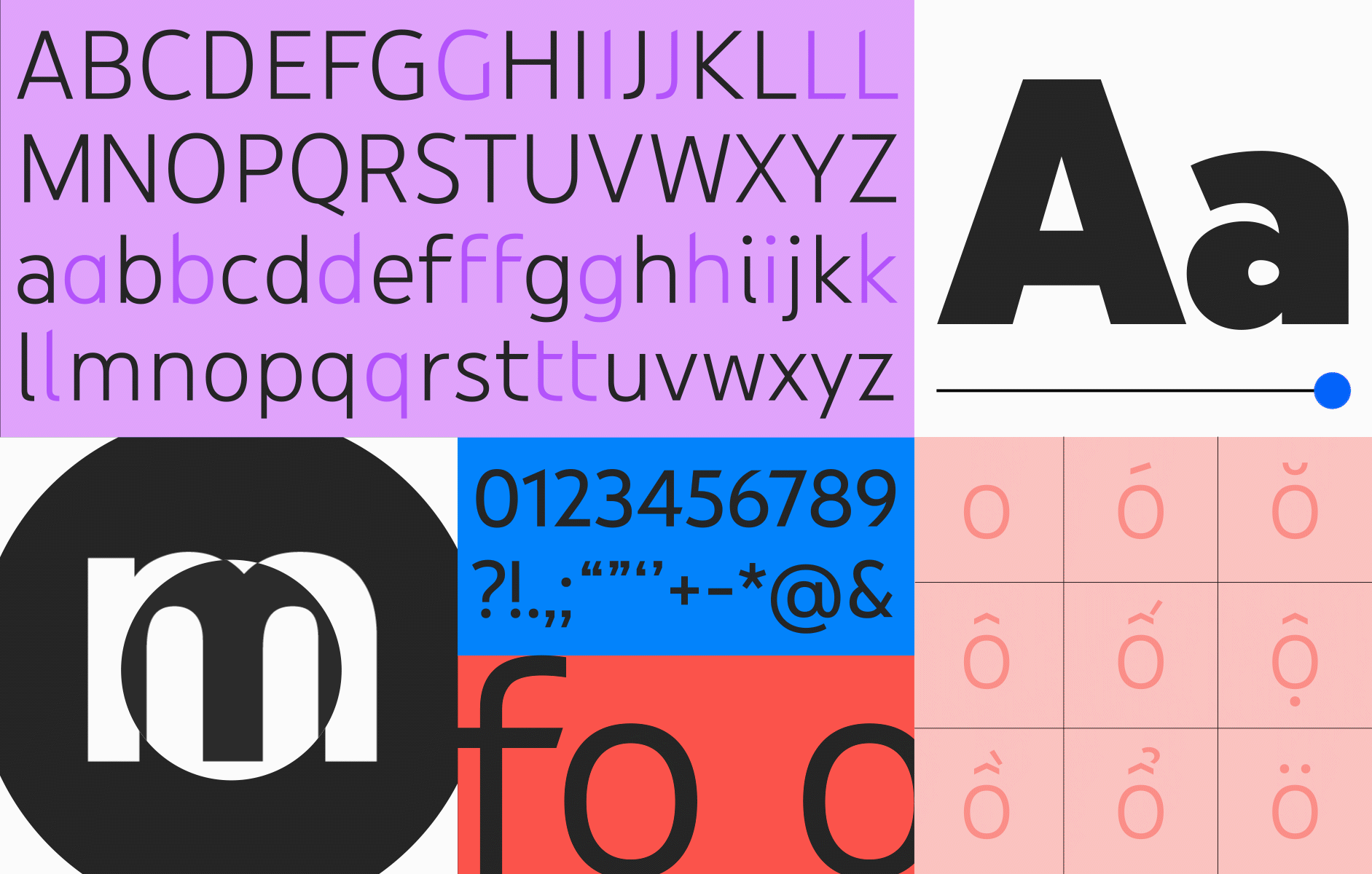
For YouTube Sans V4, the team addressed feedback around curves, consistency, relationships of forms, legibility of glyphs at certain sizes, tracking and leading, to deliver a vast update (highlights shown above).
To optimize kerning pairs and add personality, we created automatic substitution by pairing certain glyphs or contextual alternates. For example, there are several slight variants of the lowercase t that are selected automatically depending on the letter that precedes or follows.
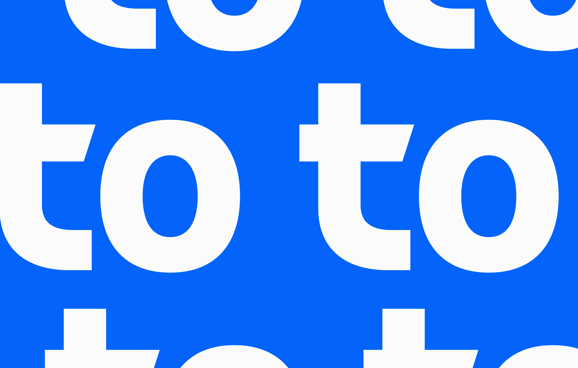
Contextual alternates adjust based on the letter that precedes or follows a character
Dark theme introduced a unique optical illusion that affected legibility, so we introduced grades in response. When you use a font in the same weight and size, white text on black looks blurry and larger than black text on white. By introducing three grades (standard, overlay, and dark) we can automatically adjust the glyphs themselves, the tracking, and the weight to make them easier to see and read no matter the background color. By using the “dark” version of the font when you have a black or dark background, the text is more legible (and optically resembles its mirror opposite of black text on white). Overlay works in the same way, but is optimized for use over imagery, like photography and video.
Grades, introduced in V4, optically adjust the font weight depending on the background color.
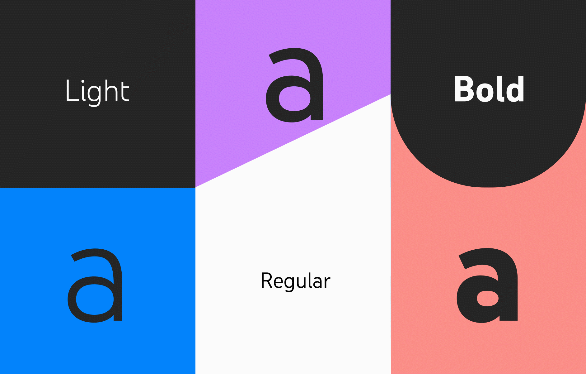
Beyond fixing known legibility issues and expanding to variable font technology, we also wanted to increase variability for certain areas of our products, like playlist covers for YouTube Music and marketing campaign work. This meant creating alternate glyphs for a new manually selectable stylistic set, and growing the family from three weights to seven. This allowed the font to do everything from “whisper” to “shout,” and gave teams the ability to make concurrent campaigns feel connected, yet typographically different.
By including more weights and alternate glyphs, YouTube Sans V4 gives designers more flexibility (highlights shown above).
Looking ahead
As we roll into 2020, the team is focused on getting V4 out into the world and expanding the number of languages we support (in addition to the 309 languages we already cover). We’re building out an italic as well as developing a special rounded version for use in YouTube Kids. We’re collaborating with our engineering teams to get the variable version of the font into our products, signaling a huge shift company wide. Moving a company of our size to a new technology is never easy, especially with the current limitations on mobile platforms, but the team is actively working with our engineering partners to find a solution.
YouTube Rounded and YouTube Italic
I’m thrilled that typography is growing at YouTube. When we started this project in 2014, there was no clear typographical guidance, and now we’ve built several custom, proprietary faces (no small feat) that we can use for everything from YouTube Music and YouTube TV to global ad campaigns.
It’s been an amazing project with tremendous impact that I’m proud to keep leading. My team has had the privilege of collaborating with our internal partners from engineering to the Google Fonts team, and externally with the creator community, brand agencies, and typographers. Along the way, we've made countless iterations within our products to bring YouTube Sans to life—to the benefit our users. More than just a typeface, it’s become our foremost brand ambassador. As a team, we’re excited to continue the hard work of expanding and improving on YouTube Sans—wherever that may take us. Stay tuned.
Special thanks to all those who’ve contributed to YouTube Sans over the years. Design: Alexei Vanyashin, Amy Yip, Dave Crossland, Jeff Stark, LetterJuice, Robyn Lee, Saffron Brand Consultants, URW Type; Engineering: Kelsey Mayfield, Maegan Clawges; Program management: April Ayala, Ash Qualischefski, Elizabeth Belg; Executive leadership: Danielle Tiedt, Fred Gilbert, Matias Duarte.