When We Had Two Weeks to Redesign Google
By Robert Wong
“It looked more Google than Google did”
Robert Wong was a founding member of Google Creative Lab, a special team launched in 2007 to foster experiments across marketing, design, and technology — finding ways to showcase Google’s products and capabilities in new and innovative ways.
As part of our celebration of a decade of Material Design, Robert describes how Google always had design in its company DNA, even before it had legions of designers. He explains how Creative Lab helped bring out the essence of Google to redesign the brand.
I was ridiculously intimidated when I got to Google in 2008. The things I was good at — design, brand stewardship, storytelling — were not things the company had previously needed to succeed. I was told by the head of UX that they only had one visual designer.
We started Creative Lab with about four designers and a few producers, without a clear idea of what we were supposed to do. When we asked Eric Schmidt, Google’s CEO at that time, he told us, “Remind the world what they love about Google.” That sounded pretty good to us, and we went from there. The first week of our existence, we conceived the little green Android logo, designed by Irina Blok, to help launch Android.
Our earliest projects were pretty random and humble — for example, Larry wanted us to redesign the employee badges. We gained more notoriety with our second big project, when we made the 2010 “Parisian Love” commercial, which made everyone cry — including the founders’ spouses, which won us a lot of points!
But then we got pulled into an assignment that surprised us. When Larry Page became CEO in April 2011, design was happening across the company in pockets. Larry wanted to create a more modern and unified look across all of our products. He came to Creative Lab and said, “Can you redesign Google? You have two weeks.”
We were nervous — we’re not traditional product designers — but you can’t say no to the CEO. Luckily for us, Larry liked our designs. That was when he brought in all the other product design and UX teams — from Search to Chrome to Gmail — so that they could collaborate and execute the plan.

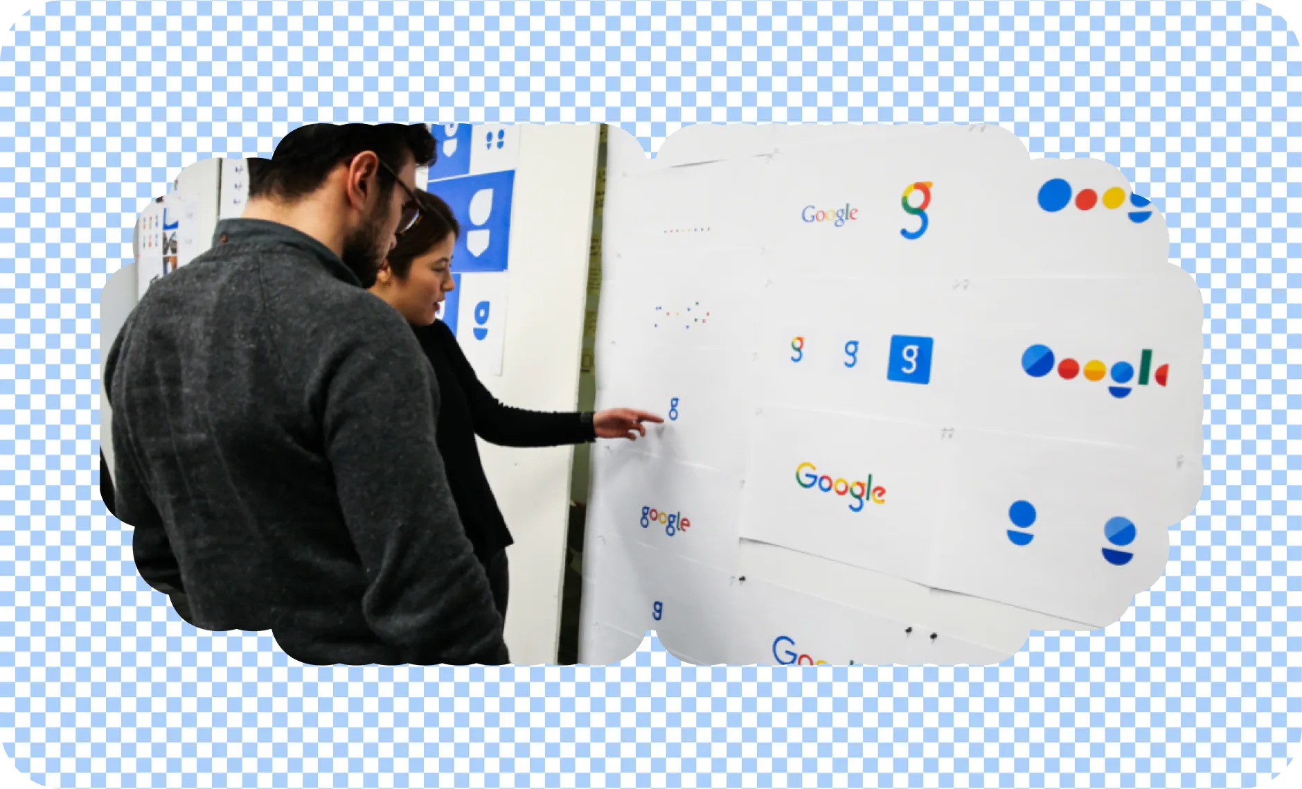
Designers critiquing logo options that eventually led to the 2015 rebrand.
When working on the redesign we had to ask ourselves: What is the true essence of Google? How can we evolve it and unify it through design? That was the start of the beautification and modernization of Google, which became Kennedy — which built the foundation for Material.
Redesigns are often slow and phased, especially for a company the size of Google, but Kennedy was swift, like turning on a light. Releasing the new G was similarly immediate. A day or two later, people had seemingly forgotten about the old logo. It was instant — the signage around all global campuses literally changed overnight. Google operates at such a scale that it reaches everyone that fast.
I think it was good design because it got out of the way. An engineer wouldn’t find it better or worse — but the aesthetics absolutely created value. It looked more Google than Google did. Design wasn’t done to it; design liberated its most ideal self.

Google’s logo evolution over the last 25 years.
Design ideas may not have been central to Google at the start, but I would argue that, from day one, Google has actually been a designed company. That stems from the mantra of “focus on the user and all else will follow.” Google always understood the humanity of the technology: from the big giant logo and sparsity of the homepage to the cheeky “I’m feeling lucky” button. So whether or not it had designers, design was deep in the DNA, it just had to be coaxed out.
Milan Kundera once said, “Happiness is the longing for repetition.” I think that for humans, the two biggest factors in decision-making are familiarity and novelty — a constant tug-of-war of opposing forces: the comfort of the known and the thrill of the new. The thing about brand design, especially in the dynamic realm of technology innovation, is that even as things change, people desperately need what they can hold onto. I believe in “forever the same, always new.” Our job is to make sure it’s always Google, but in a new, fresh, surprising way.

Design by Specht Studio x Google Design. Motion by Yanis Berrewaerts.