Volume Two
Explore the visual, virtual, and written culture of Tokyo and Los Angeles through the work of our SPAN 2016 speakers
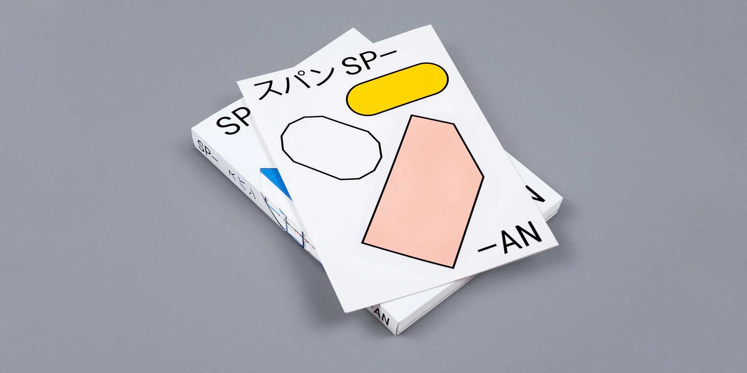
For this year’s edition of the SPAN Reader, we explore the visual, virtual, and written culture of Tokyo and Los Angeles through the work of our speakers. The structure of the book itself—with its exposed and brightly bound signatures, bold use of color, repeated graphic shapes and die-cuts—draws on the thematic and aesthetic ties between the two locations. To acknowledge the bilingual nature of this year’s events, a number of texts appear in both English and Japanese. Read our introduction (in English or Japanese below) and explore some of the design details from this year’s SPAN Reader, Vol. 2.
今年のSPANリーダーでは2016年のスピーカーの皆様の作品を通して、東京とロサンゼルスのヴィジュアル、ヴァーチャル、そしてライティングカルチャーを探ります。本自体の構造 ー カラフルな糸を露出させた製本、くっきりとした色づかい、様々な形のグラフィックスやダイカット(型抜き) ー これらは2つの都市を美的魅力というテーマで繋げています。開催された2カ国の言語に応えて、リーダーの中でも日本語と英語の説明文が見られます。今年のSPANリーダー第2巻から見えるデザインの世界、どうぞお楽しみください。
Google’s mission is to organize the world’s information and make it universally accessible and useful. It’s at once a tremendous pursuit and a humble aim—one that’s predicated on the idea that Google’s strength lies in its core function of connecting people and sharing knowledge.
Similarly, among many possible definitions, SPAN has come to represent design as a method of connection. The idea is suggested in the word “span” itself, either as a maker’s measure denoting the width of the hand between the thumb and littlest finger, or simply as the link between two points. To us, design is about connecting people through a visual means. It’s something we do through the visual framework of Material Design, through our efforts to share our own work and ideas and encourage the same from our colleagues, and it’s something we do in publishing a book like this one. As a technology company, we’re keenly aware of the lessons to be learned from studying design practices outside of our immediate focus.
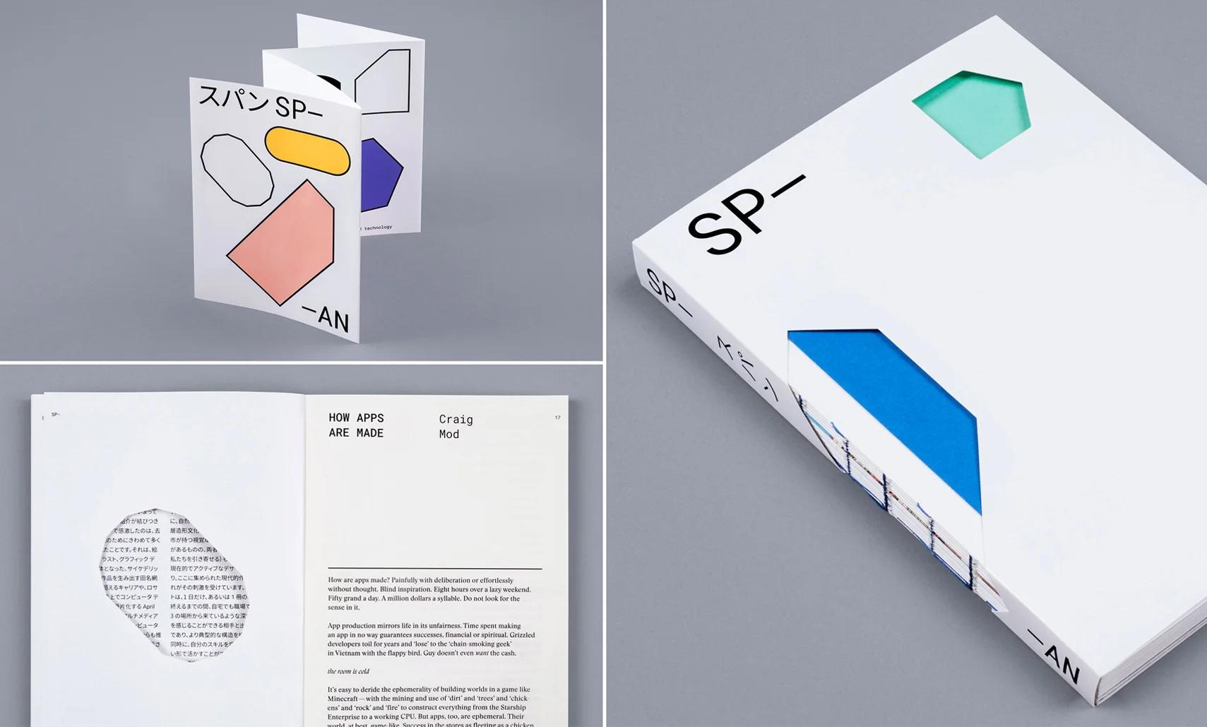
The branding for this year’s SPAN events used familiar shapes in distinct colorways for each city. These forms were expressed throughout the book as customizable stickers, chapter header graphics, and die-cuts that draw the reader through each entry in the collection. 今年のSPANでは様々な「形」を各都市で色別にブランディングし、使い分けました。本の中でもカスタマイズ可能なシールや各章にグラフィックスとして使用されています。コレクション内のエントリーごとに散りばめられたダイカット(型抜き)もお楽しみいただけます。
In their lesson on designing by hand and eye, craftsmen Jim Tolpin and George Walker elaborate in this volume on the idea of the hand span as a base unit for measuring, reminding us of the importance ancient tools hold in an age of mobile devices. They frame the urgency of their message around human potential: “We believe design by hand and by eye opens the door to the inherent abilities that each of us has, to create durable and beautiful designs that feel right […] by bringing an intuitive, informed grasp of proportion to your eye.” Lifelong artist, ceramacist, and Angeleno Peter Shire puts it a different way when reflecting on the computers that now run his kilns: “We’re engaged with technology, but by the same token, it seems to be very critical to continue with these analog techniques and make the bridge.” SPAN is a conference made by designers, for designers. It’s our opportunity to highlight some of the best in today’s interdisciplinary design practice, and to explore the ways in which design and technology shape our lives, everyday, around the world.
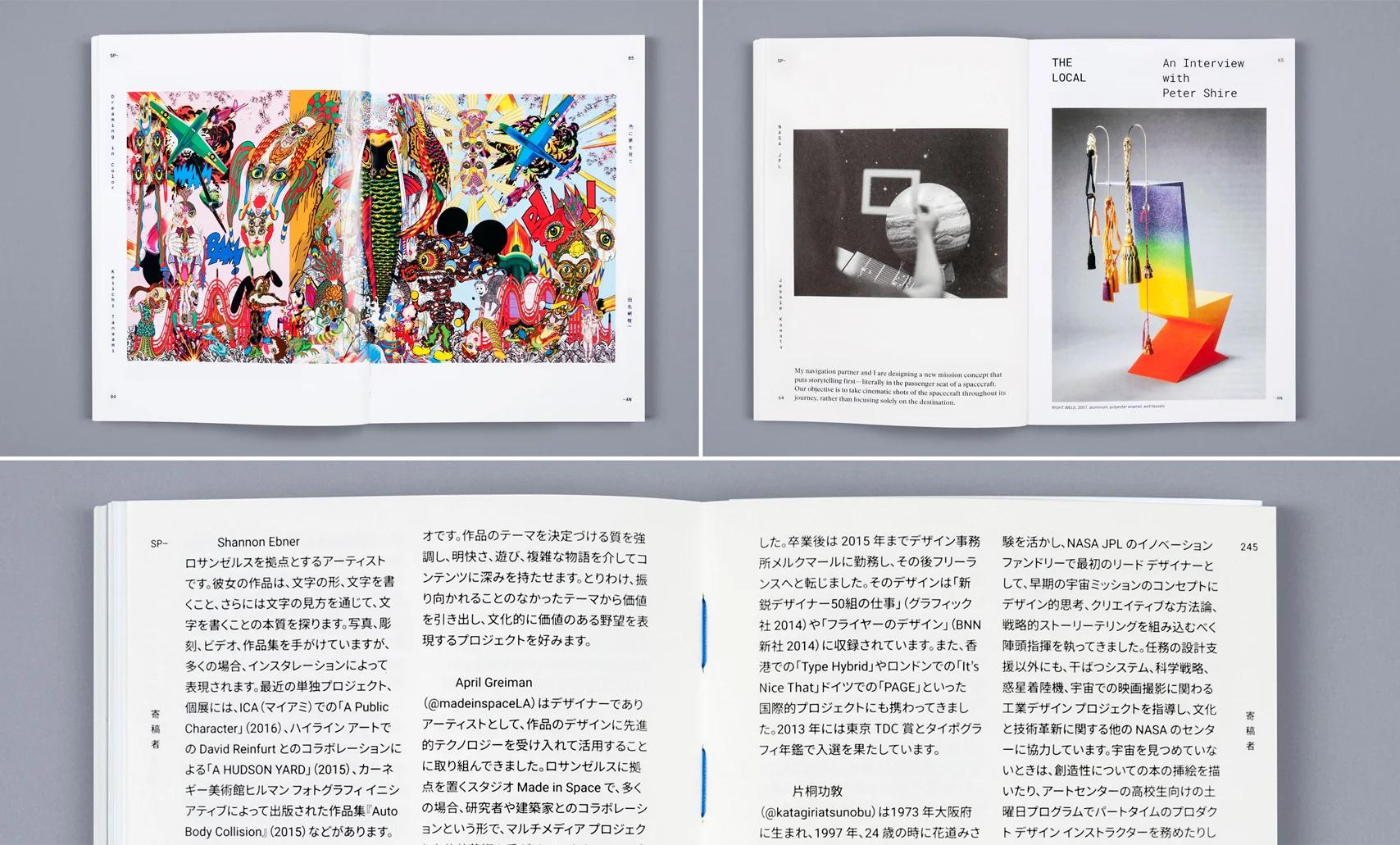
Bold colors were a hallmark for both Tokyo and Los Angeles-based contributors’ work, as well as in the design of the reader itself—the book’s exposed binding uses bright cerulean thread. From top left: a spread from the work of Keiichi Tanaami; the intro to our interview with Peter Shire; a detail of the blue binding thread. 東京、ロサンゼルスをベースにしたスピーカー達の作品はハッキリとした配色が特徴となり、この特色がまたリーダーそのものへ、カラフルなセルリアン糸を使用して行われた製本によって反映されています。左上より: 田名網敬一氏の作品、Peter Shire氏とのインタビューの1ページ目、青い糸を使った製本。
With that global awareness in mind, our project spans two cities and maintains a hyper-local focus on learning from and showcasing the design communities in each place. Last year we hosted events in New York and London. This year, we cross the Pacific with Tokyo and Los Angeles. We’ve found that by assembling a group of individuals, each with his or her own unique practice, we start to glean the broader undercurrent of visual culture inherent to each city. This is a territory where Shannon Ebner’s photographs of signage and type found throughout the landscape of places like LA, somehow connect with Bin Sugawara’s more human-scale, performative poetry, which he physically carries through the streets of Tokyo. Where Barbara Bestor’s personal history of how Los Angeles shaped her as an architect, joins critic Deyan Sudjic’s corporate history of how homegrown aesthetics and foreign influences shaped the iconic Japanese technology brand Sony. We were delighted by how much this collection, unlike last year’s, demanded color for its representation—in Keiichi Tanaami’s more than 60-year-career composing psychedelic, Pop art compositions that blend block printing, collage, illustration, and graphic design; or April Greiman’s color-saturated multimedia work, that fragments the aesthetics of computer technology both in print and on a metro station in downtown LA. The aesthetics of computation are lifted by other crosswinds as well—Mike Tyka’s visual explorations with machine intelligence and recurrent neural networks, resolve a radically different image from those of Casey Reas, an artist and professor at UCLA. There are even meditations on the linkage between the two cities, with a special collection of lost books, sourced by Folder Studio from dollar bins and second-hand stores in Tokyo and Los Angeles, alongside Alissa Walker’s essay on Pokémon Go as an unparalleled activator of public space and civic engagement worldwide.
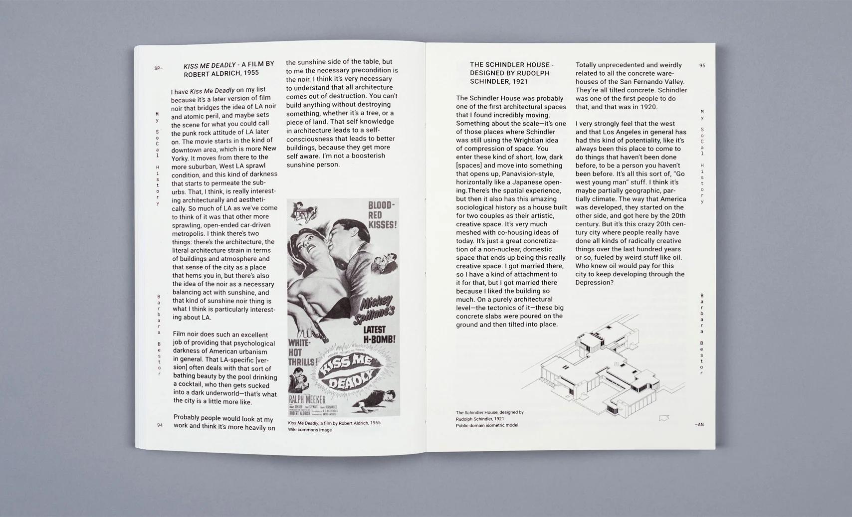
Spreads from Barbara Bestor’s ’’My SoCal History.’’ Barbara Bestor氏による「My SoCal History」
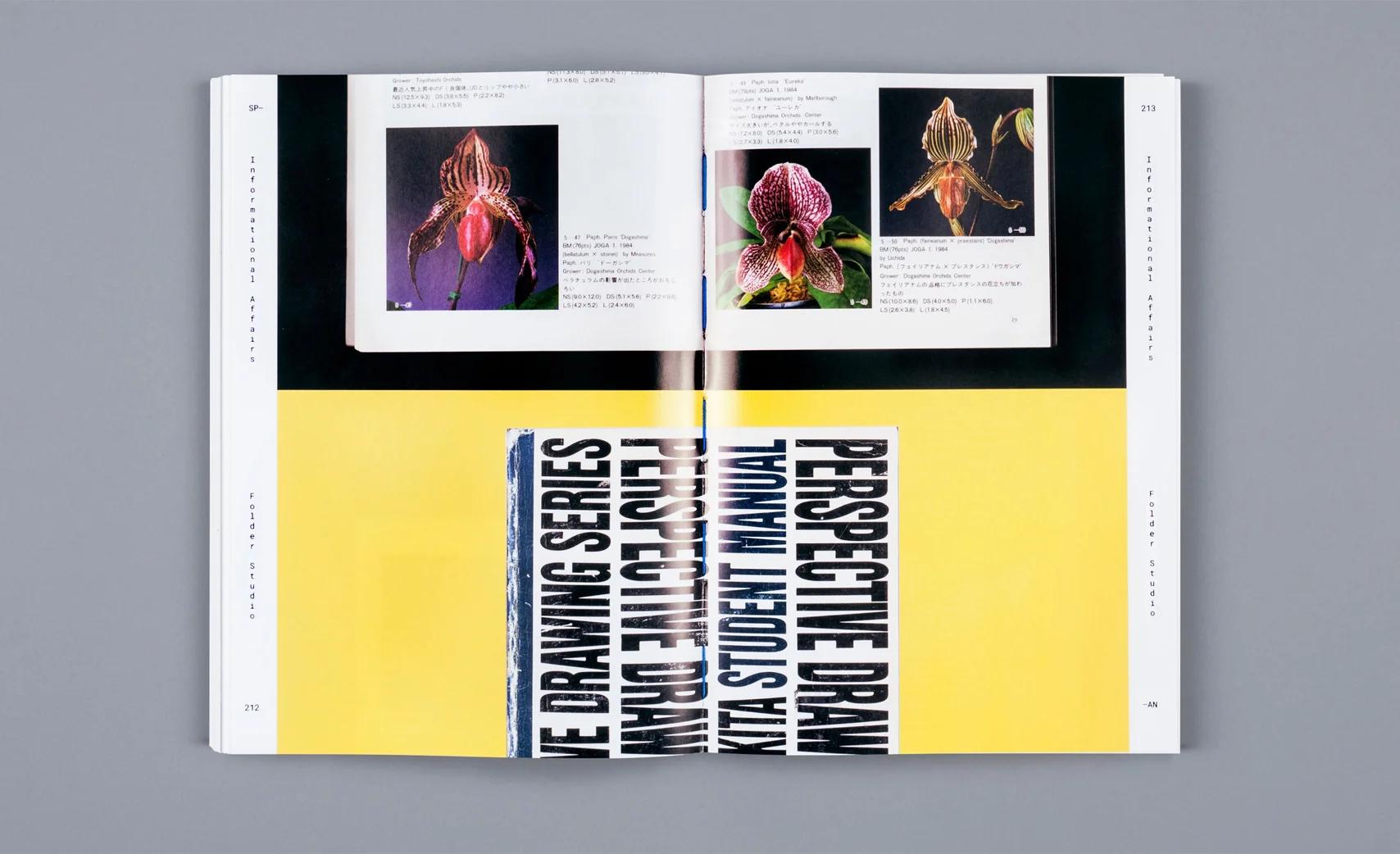
A selection of work from Folder Studio’s "Informational Affairs" Folder Studioの作品、「Informational Affairs」
These are some of the connections we’ve drawn in assembling this collection. Now we invite you to forge your own and establish new ones. Between Tokyo and LA we find a consistent thread of mutual admiration that resolves and heightens inherent distinctions. Both cities share deep and formative visual cultures, supremely influenced by nature and the landscape, along with photography, cinema, and the screen. And while the timeline for each city’s visual environment differs by centuries, the thing that unites them (and draws us to them), is this very current and active design inquiry that fuels each of the contemporary practices collected here. People with whom, for the length of a day, or even the span of a book, we can feel a deep connection that seems to come from a third place—a shared territory that reorganizes our more typical configurations and puts our skills to new use across cities and time.
SPAN Reader, Vol. 2, Table of Contents
- How Apps Are Made - Craig Mod
- How Pokémon Go Is Improving Your City - Alissa Walker
- DeepDream - Mike Tyka
- Message on a Bottle - Dmitri Siegel
- The Local: An Interview with Peter Shire - Amber Bravo
- NASA Jet Propulsion Laboratory - Jessie Kawata
- Dreaming in Color - Keiichi Tanaami
- My SoCal History - Barbara Bestor
- How Sony Found Its Voice - Deyan Sudjic
- Seeing and Reading, Reading and Seeing - Shannon Ebner
- Poems out on the Town - Bin Sugawara
- Design by Hand and Eye - Jim Tolpin and George Walker
- Foundation Studies - Casey Reas and Ben Fry
- Man and Flowers - Atsunobu Katagiri
- Preparing Designers for Jobs That Don’t Exist (Yet) - Anne Burdick
- Below the Line: Designing Her - Mekado Murphy
- Informational Affairs - Folder Studio
- Made in Space - April Greiman
- Bird, Wind, and the Disappearing Dinosaur - Toru Kase
Be sure to check out our Guides to SPAN Tokyo and Los Angeles, which include a full list of speakers and links to their work, as well as the first edition of our SPAN Reader.
はじめに
Google の使命は、世界中の情報を体系化して時と場所を選ばずアクセスできるようにし、すべての人に役立てることです。これは、途方もない探求であると同時に謙虚な目標でもあります。この前提となるのは、人々をつなげて知識を共有するという Google の核となる機能に強みがあるという考えです。
このことはデザインにも当てはまります。デザインという言葉はさまざまに定義できますが、スパンでは、デザインを「つながるための手段」と表現してきました。この考えは「span」という英単語に示唆されています。スパンとは、ヒトの親指の先から小指の先までの長さを示す単位であり、簡単に言うと 2 つの点を結びつけるものです。私たちにとって、マテリアルデザインとは、視覚的フレームワークを確立する、作品を共有してアイデアを表現するためのフォーマットをデザイナーに提供する、またはこのような書籍を出版するなどの視覚的手段を介して人々をつなげることです。テクノロジー企業としては、Google が専門とする領域外でのデザイン活動からどれだけの価値を得られるかについても目を向けています。
工芸家の Jim Tolpin 氏と George Walker 氏は、手と目を使った計測に関するレッスンで、手を基本単位として測るというアイデアを詳しく説明しています。このことは、モバイル端末の時代に古代の計測方法が持つ重要性を思い起こさせてくれます。2 人は、人間の持つ可能性についてのメッセージの緊急性を次のようにまとめています。「我々は、手と目を使ったデザインによって、一人一人の人間が本来持つ能力への扉を開けると信じています。いいと思える頑丈で美しいデザインを生み出すために、(中略)直感と知識に基づいて目分量を取り入れることです。」また、生涯にわたるアーティストであり陶芸家の Angeleno Peter Shire 氏は、現在彼の窯を動かしているコンピュータに関する考察で別の見方を示しています。「私たちはテクノロジーと関わり合っていますが、それに留まらず、テクノロジーはこのアナログな制作方法を続けていく上で非常に重要であり、そのための架け橋となっていると思います。」スパンは、デザイナーによるデザイナーのためのイベントであり、ジャンルの垣根を越えた現在の実践的デザインにおける最高レベルの作品に触れる絶好の機会です。このイベントでは、1 日をかけて、デザインとテクノロジーを世界中の人々の日常にどう結び付けていくかを探っていきます。
スパンはそのグローバルな意識を反映し、2 都市で開催されます。各都市のイベントでは、それぞれの地域のデザインのあり方や、2 都市間に存在する独特の精神とつながりを、各都市の独自の視点から研究し、紹介します。昨年の開催地はニューヨークとロンドンでした。今年は太平洋をはさむ東京とロサンゼルスで開催されます。これまでのイベントを通じてわかったことは、独自の視点や手法を持つ個人を集団化することで、それぞれの都市に通底する、表面に現れない視覚文化をより広く捉えられるようになるということです。ここでは、ロサンゼルスの象徴的な高速道路網の看板から選び出された Shannon Ebner 氏の連続写真が、どういうわけか、菅原敏氏が東京の街角に掲げる、より等身大のパフォーマティブなポスターのような詩とつながります。また、Barbara Bestor 氏が建築家としていかにロサンゼルスの影響を受けたかという個人史と、批評家 Deyan Sudjic 氏による、日本を象徴するテクノロジー ブランド「ソニー」がいかに日本的な美意識と外国からの影響とがあいまって形成されたかという社史紹介が結びつきます。このコレクションで感激したのは、去年とは異なり、表現のためにきわめて多くの色が必要とされたことです。それは、絵画、コラージュ、イラスト、グラフィック デザインが渾然一体となった、サイケデリックなポップアート作品を生み出す田名網敬一氏の 60 年を超えるキャリアや、ロサンゼルスの街中の路上でコンピュータ テクノロジーの美意識を断片化する April Greiman 氏の彩色豊かなマルチメディア作品に見ることができます。コンピュータを使うという美意識は、別の方向からも推進力を受けます。東京のイベントで提示される Mike Tyka 氏の機械知能と再帰型ニューラル ネットワークの視覚的探索は、アーティストであり UCLA(カリフォルニア大学ロサンゼルス校)で教鞭もとる Casey Reas 氏のそれとは根本的に異なる風景にたどり着きます。2 つの都市のつながりに関する瞑想や、Folder Studio による、東京とロサンゼルスの路上で見つけた紛失本のポップスピンのほか、Pokémon GO があらゆる町で巻き起こす、かつてない公共空間の活性化と市民参加活動に関する Alissa Walker 氏の主張も紹介します。
これらは、このコレクションをまとめるにあたって描き出したつながりの一部です。ご自身で独自のつながりを築き、新たなつながりを確立してください。東京とロサンゼルスの間には、互いを尊重するブレない一本の糸があり、それは本来の違いを解消する方向にも、強調する方向にも働きます。両都市は、写真、映画、スクリーンと共に、自然や景観の影響がきわめて強い深層造形文化を共有しています。また、各都市が持つ視覚環境の歴史には数世紀の差があるものの、両者を結びつける(そして私たちを引き寄せる)ものは、この非常に現在的でアクティブなデザインの探求であり、ここに集められた現代的作品のそれぞれがその刺激を受けています。このイベントは、1 日だけ、あるいは 1 冊の本を読み終えるまでの間、自宅でも職場でもない第 3 の場所から来ているような深いつながりを感じることができる相手と出会える場所であり、より典型的な構造を組み替えると同時に、自分のスキルを場所を超えて新しい形で活かすことができる共有の領域でもあります。
スピーカーのリストや作品リンクをご確認いただける東京とロサンゼルスのSPANガイドと、SPANリーダーの第一版はこちらから是非ご覧になってください。