The Goal Behind the Goal
Compassion comes first for the Google Fitbit UX team
Conversation

If you’ve never used a fitness wearable — or if you’re still using one from 1999 — you might think of it as a glorified step counter, a device that tracks your movement, shows you some numbers, and provides an incentive to reach a tangible goal.
But when the well-known wearable Fitbit joined Google in 2021, the UX team responsible for integrating it across Google’s health platforms asked themselves: what is the goal behind the goal? Why might you want to improve an aspect of your health? What do you really want to learn about yourself? And how can one device promote wellness in the broadest sense? In designing a series of apps for the Pixel Watch and the corresponding Fitbit mobile app — fully incorporating Fitbit into Google’s health ecosystem using their design system Flex — the team took a holistic, compassionate approach.
Designing with compassion is vital in the wellness space, because information simply doesn’t mean the same thing to every person at every time. Consider this: a racing heartbeat might be great news for a marathon runner, but is not necessarily positive for someone monitoring their blood pressure. To be effective, health insights need to be personal.
Whether through guided workouts, sleep scores, mindfulness exercises, nutrition information, or just checking in on those daily steps, glancing at a tracker on your phone or watch should make you feel cared for and motivated. Beyond accurate, reliable, and secure metrics, bringing Fitbit to Google is about encouraging people to be more in tune with their bodies.
In this roundtable conversation, the team opens up about designing for trust and compassion, encouraging health literacy, and what an art movement from the 1960s can teach us about personalized design. You’ll meet Erik Wong, leader of UX writing and content design; Sarah Wilson, UX Design Lead; Product and Brand Design Lead Mat Helme; UX Researcher Lisa Kaggen; and Judy Zhao, leader of the visual motion and systems team.
Google Design:
You’re all coming from very different backgrounds. What does it mean to enter the health and wellness space? What is unique about the priorities here?
Erik:
It started with this insight that there’s a lot more at stake when you’re building experiences that can influence people’s health goals: being more active, getting more sleep, improving your heart health, and making progress on these fundamental behaviors.
But you’re also looking at the goal behind the goal, which is—why are they trying to be healthier? And then you start to think about how you’re supporting people through life journeys and ups and downs and helping them make sense of information. It’s a pretty awesome opportunity and responsibility to get right.
Sarah:
It’s a unique opportunity, coming into Google and knowing that we’re scaling and solving problems for a global audience, making sure we’re reflective of a wide range of needs: a health, fitness, and wellness journey within one single product.
Erik:
Tonally, we can’t speak in the same way about an irregular heart rhythm as we would when we’re trying to cheer and coach toward getting steps in. So, quickly, that led us to think of health, wellness and fitness as a spectrum. We do that to understand how people are feeling in the moment so we can meet them in the moment.


Google Design:
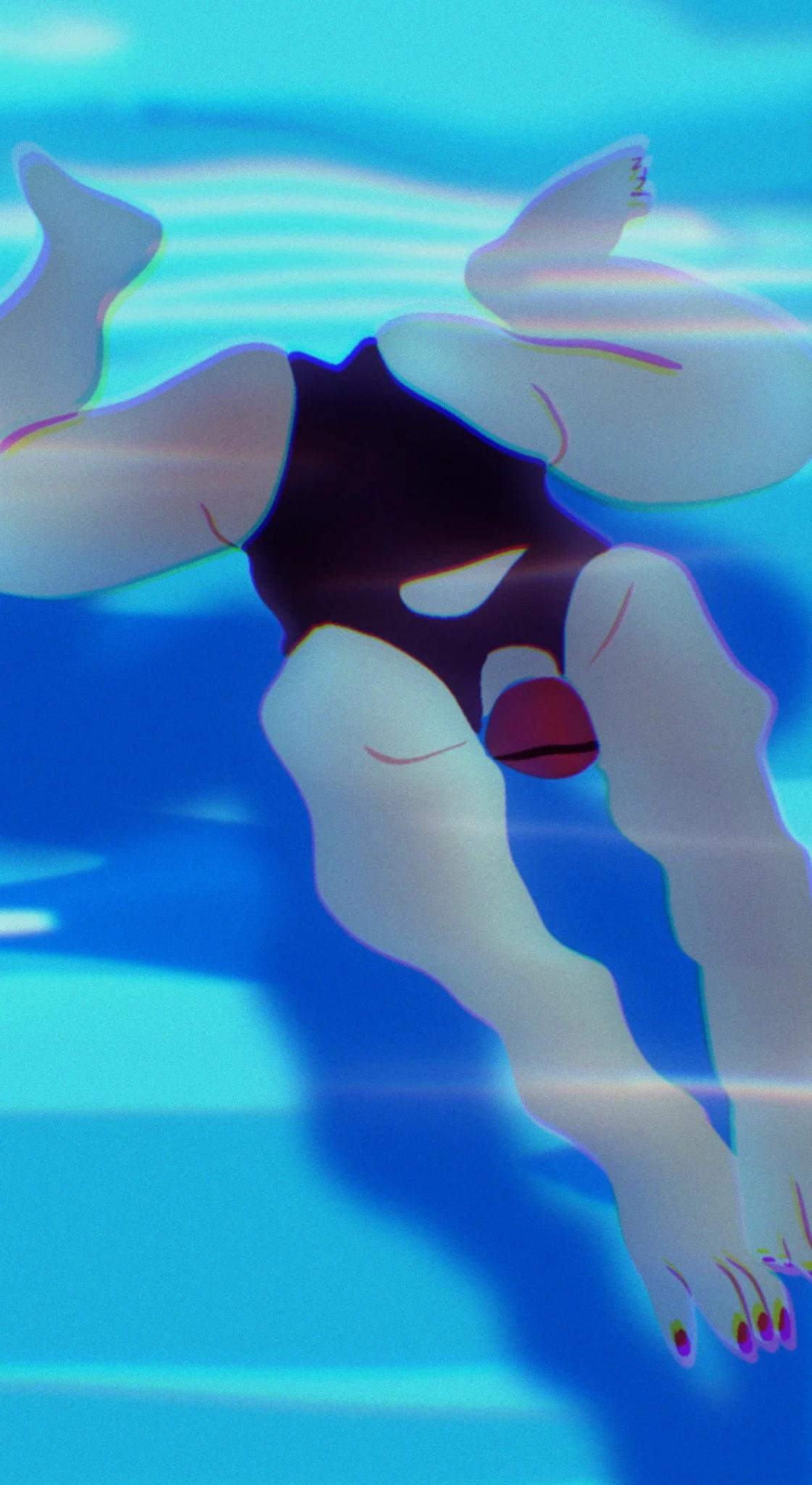
How did you manage to differentiate between health, fitness, and wellness in the design? I notice there are three different camera angles used to depict bodies in motion.
Mat:
Imagery was a unified effort between writing and visuals, both anchoring to a unified voice and tone approach. Erik’s really good at telling and I’m good at showing — S&T, show and tell. It’s all language.
Our creative approach is all about you in the moment. When it comes to things like data visualization, it can seem very technical, robotic, so we juxtapose that with an elegant, humanistic approach. When showing people in action, we use three different camera angles you mentioned, depending on the moment. For fitness, we have a low-angle shot for those heroic moments. For wellness, such as someone meditating, we have a top-down view to represent the wider goal you’re focused on. And for health, we chose a straight-on shot, as that messaging tends to be more serious.
Sarah:
When I’m at the doctor’s office, I want to be looked at in the eye. When I’m running, I want to feel heroic. It’s about how you see yourself in the world and how you want to be seen in moments of vulnerability and accomplishment.
Lisa:
We always want to be compassionate. We always want to instill trust. But when we’re talking about fitness, maybe we want to be more inspiring and playful.
Google Design:
There are many layers to trusting a system. In this case, someone has to trust that the data is accurate, that it’s being conveyed in a responsible way, and also that their information is safe. How do you foster that trust?
Sarah:
We have two trusted brands that we’re working with: Fitbit, which was one of the first major players to do fitness tracking. And then we have Google, which has a strong stance on innovation and privacy. We want to balance the best of both, so that you know your health information is in a safe and protected space, specific for health use cases. You’re getting the subject matter expertise from Fitbit and the innovation and privacy Google is known for.
Lisa:
We’ve navigated bringing along people loyal to Fitbit who find value in the approachability, comfort, and trust that they feel in the brand. Traditionally a lot of that has been achieved through colorful, bright imagery that wasn’t modern. We wanted to hold onto that approachability in the brand equity, but modernize and make it future-proof.


Google Design:
Exactly — how do you make the new software and hardware accessible to longtime users? I figure it means coming up with a cohesive design language that is easy to learn across platforms. Mat, we heard some of your light-filled circular forms were inspired by the installation artist James Turrell.
Mat:
Back to the timing of all of this, we started two years ago. Material You was being finalized and was not public-facing yet, but we knew Google’s Material Design was changing. We knew there was momentum around the concept of “form follows feeling,” we knew it was about personalization, and we knew it was all about you — that worked really well for celebrating the best of Google with Fitbit.
We also felt compelled to heavily distinguish the product aesthetically. This led us to our creative direction. We leaned into a unique style that emerged from the late 1960s in California, Light and Space, an art movement that rethought how individuals interpret art, how your environment and surroundings relate to you in that very moment. Light is everywhere. When you turn on the screen, it’s a portal of light that reflects you.
Judy:
What’s unique about the Pixel watch is that there are very few other devices that focus on optimizing a UI for the circular form. You’re used to seeing things designed for a rectilinear shape, with that sporty look and feel, using hard-lined neon colors; that could maybe lean a bit masculine. Having Fitbit lean into rounded forms and softer colors feels fairly unique, and the circular form factor is a big part of how we design for that uplifting and compassionate feeling. We’re able to do this because we’re combining multiple worlds into one holistic health journey experience.
Google Design:
How did you figure out how to represent complex data in a palatable way? That’s one of the biggest challenges in wearables.
Sarah:
We’re on a journey as a product team to become less about data collection and more about giving you insight and actionable information to take charge of your health journey. We might have hardcore cardio exercise fanatics who might know a lot of fitness jargon — but how do we take these concepts and simplify them so that they become more accessible for more people? How do you design with health literacy in mind? We've been exploring how charts and text can work together to provide more meaning and clearer takeaways.

Erik:
The role of content design is using language to create helpful experiences tuned to people’s needs. But then in the health space, what we also need to do is simplify language to allow people to really take action and do something with the information.
If you were just to spam people with all these numbers and metrics day after day, that’s not empowering. And it’s a lot of cognitive load. We’ve worked through content writing and design to carry out the goal of improving health literacy, which by definition means not just making information understandable, but actionable. That’s been a missing link. We can add meaning to our data visualizations.
Lisa:
We added chart headers, because we saw that people can comprehend a text-based insight much easier than a complicated chart. The visual pulls people in, and the text and the visuals work together as a system. I’ve tried to get people calling it “data design systems” instead of data visualization, but that’s not as catchy as data viz!


Google Design:
This is a system that has to work for the long-term, because users could be working with these metrics for their entire lives. And the more you use a wearable the more useful it gets. How do you think about the longevity of the product?
Sarah:
There’s a never-ending clip of evolution. And there’s not going to be fewer metrics over time, there will be more. It’s our responsibility to keep that complexity from feeling overwhelming. We have to have it solved on the backend and have the presentation of that information make sense and feel personalized.
Luckily, many other teams at Google have done great work in this area. We’ve been able to look across Google and say, okay, what’s worked? We’re not just building from scratch, we’re building upon the great work from other team members, which is something that’s cool at Google.
Erik:
One thought I had just now is that we’re talking about the importance of emotion and feeling, as if it’s special or unique to designing for health, and I think that is true. This isn’t file storage or advertising. But I’m wondering if we should all be looking for the goal behind the goal, and trying to understand what people are here to do with our products — how we can design for the feelings that people inevitably have. Even in the most basic products, people are trying to do something meaningful, and we should be trying harder to understand what that is.
Illustrations By:
Caroline Choi
Jame Noellert
Joe Dennis
Joyce Liu
Shir Pakman