Sounds Good
Designers should be listening to — and learning from — how music is made
Our digital ecosystem is the most complex it’s ever been — phones, tablets, laptops, desktops, screens, interfaces — and it only continues to grow and evolve. Establishing consistent design languages at scale is a crucial challenge.
How can designers adopt standards that are comprehensive enough to create cohesive experiences across products and platforms, but adaptable enough to allow for innovation? I believe we can look to an unlikely system for insight. Cue the music!
Tuning in to a universal system
Many of the contemporary issues we encounter in the design of products are similar to problems that musicians and composers encountered for millennia, due to a great divergence in musical instruments, tuning, and notation.
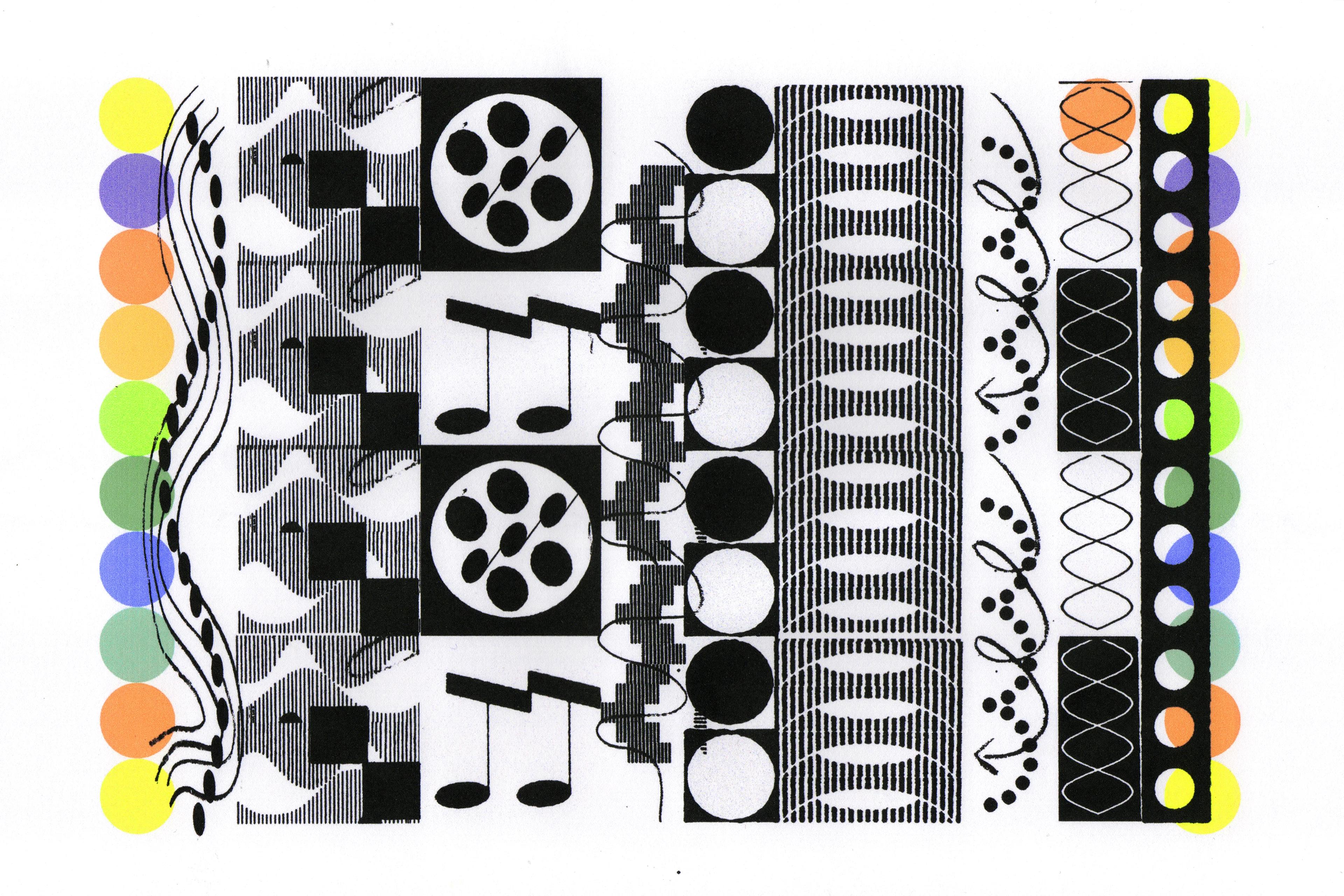
Until a few centuries ago, all instruments were tuned to pure tones — clear and distinct individual frequencies. This meant that one person’s piano might be tuned to A sharp, while another’s might be tuned to B flat. Every additional note on each instrument was calculated in relation to that one root note, and instruments were even physically shaped to support that specific scale. This tuning model, known as well temperament, allowed for true harmony in some situations — consider Bach’s Well-Tempered Clavier, an 18th-century epic of preludes and fugues, which he composed in keyboard pieces written for all 24 major and minor keys — but the rigidity and lack of consistency between instruments created serious restrictions. If a musician wanted to play their flute, lute, or flugelhorn in a different key? Too bad. They were stuck — or, they had to stop to retune between songs, or use multiple uniquely tuned instruments.
By the 19th century, this disparate approach was superseded in favor of a universal system of tuning known as equal temperament — an even distribution of 12 intervals between octaves that allowed compositions to shift between any key. It was foundational, it was revolutionary, and it changed Western music forever.
Equal temperament unites works from Claude Debussy’s “Clair de lune” to the chromatic exploration of bebop to Thelonius Monk’s improvisational jazz; from the crunch of garage bands like Nirvana to sample-heavy compositions by De La Soul and the Beastie Boys. They’re all derived from the same basic tuning principles. Equal temperament is a creative system — organized and transferable — yet its output is wild, unpredictable, and unrestricted. It is beautiful, accessible, simple, and complete.
Conducting a chorus of design experiences
Design requires a focus on generating distinct solutions for a forever-expanding field of formats and contexts. Consider one webpage: A designer might make a mockup of a small mobile phone in dark mode with German text, a tablet layout with a custom theme color set in light mode with Japanese language support, a screen-reader option, a desktop version, and on, and on, and on. This approach can result in inconsistencies from the designer, but also for the user; it’s as if each situation is tuned to its own root note.
To streamline this process, professionals today often design with modularity in mind. This kind of “sticker sheet” or “assembly line” approach prioritizes components and variants that can be easily copied and pasted into files for use across form and context. While it works pretty well to speed up workflows, the consistency it offers often comes at the expense of creativity. When everything is generic and interchangeable, it’s entirely possible that two different people would come up with the exact same design.
Looking to the history of tuning in general — and equal temperament specifically — might provide a means of framing system solutions that will set up both designers, and their designs, for success now and in the near- and far- future.
Pairing harmonious tones
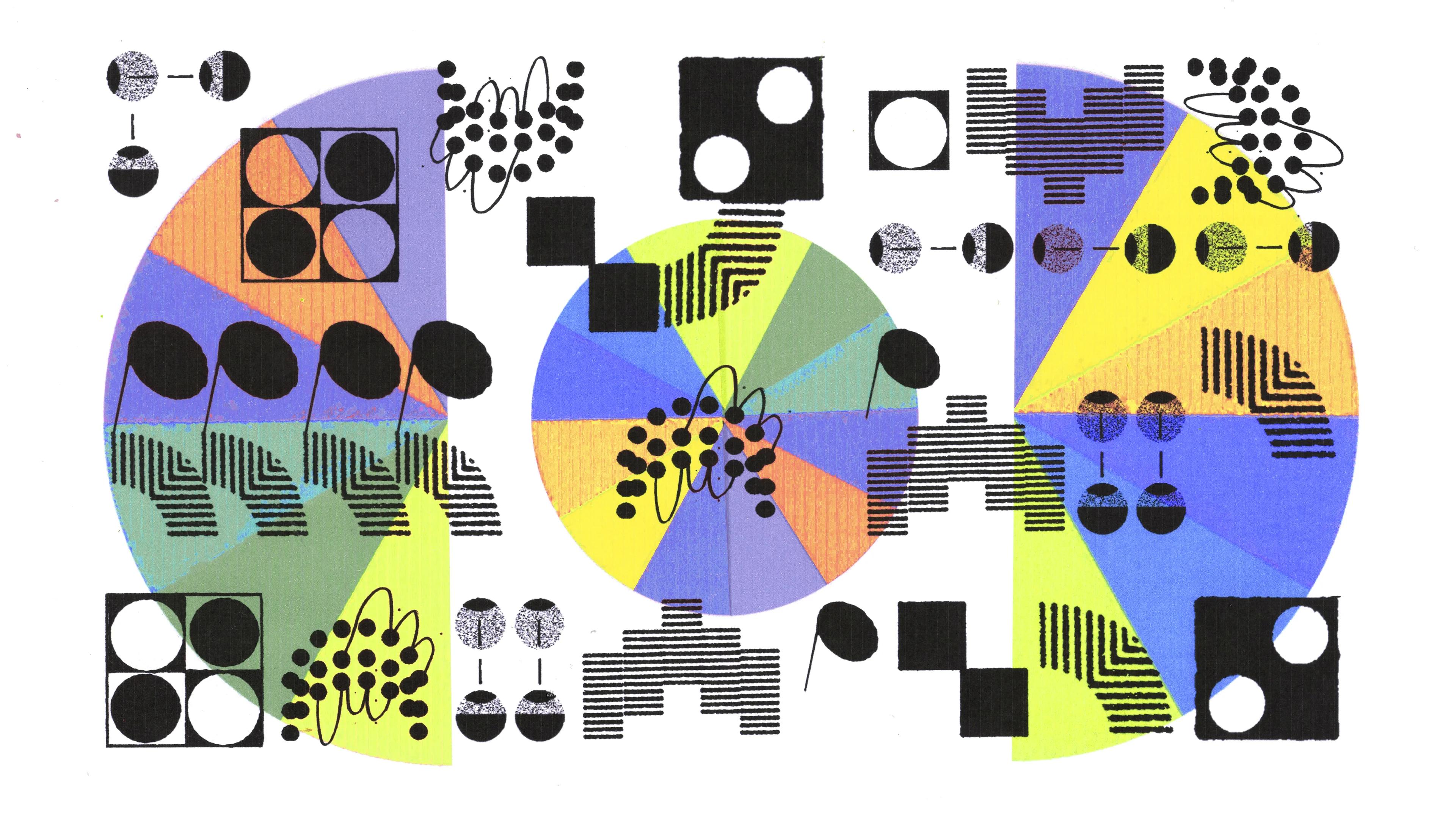
Material Design 3’s Dynamic Color system is a great example of what’s possible when this kind of product-, device-, and platform-agnostic foundation is established. In equal temperament, musical scales are subdivided equally into 12 notes, from lowest to highest; dynamic colors are subdivided equally into 13 tones, from lightest to darkest. Each of these semitones is then paired with a complementary tone — when used together, the result is clear and legible.
The system is set up to support an endless variety of user-driven color expressions. Anyone can manually select an input color, or choose one from their Pixel wallpaper, and Dynamic Color will apply it, and its complementary tone, throughout their device and app interfaces.
The timing is now
Design, and designers, are at a critical turning point. In this age of on-demand creativity, their resources are being used by a new generation of savvy users who want the ability to customize their digital experiences. While the rapidly expanding field of artificial intelligence offers quick, slick solutions, it often glosses over the need for thoughtful systems (or doesn’t adhere to any kind of system at all).
The bottom line is that we’re generating more stuff. Without a framework in place — one that is stable, yet also flexible — a lot of it will be digital waste.
Design, like music, is a universal language. Now is the moment to fine-tune our design systems — to make them efficient and smart without relying on generative tools. Establishing clear and concise rules, and the tools that support them, will allow current and future generations the freedom to bend, break, and push those boundaries and make beautiful compositions that will stand the test of time.