Sound and Vision
How the new Pixel phones find depth in the design details
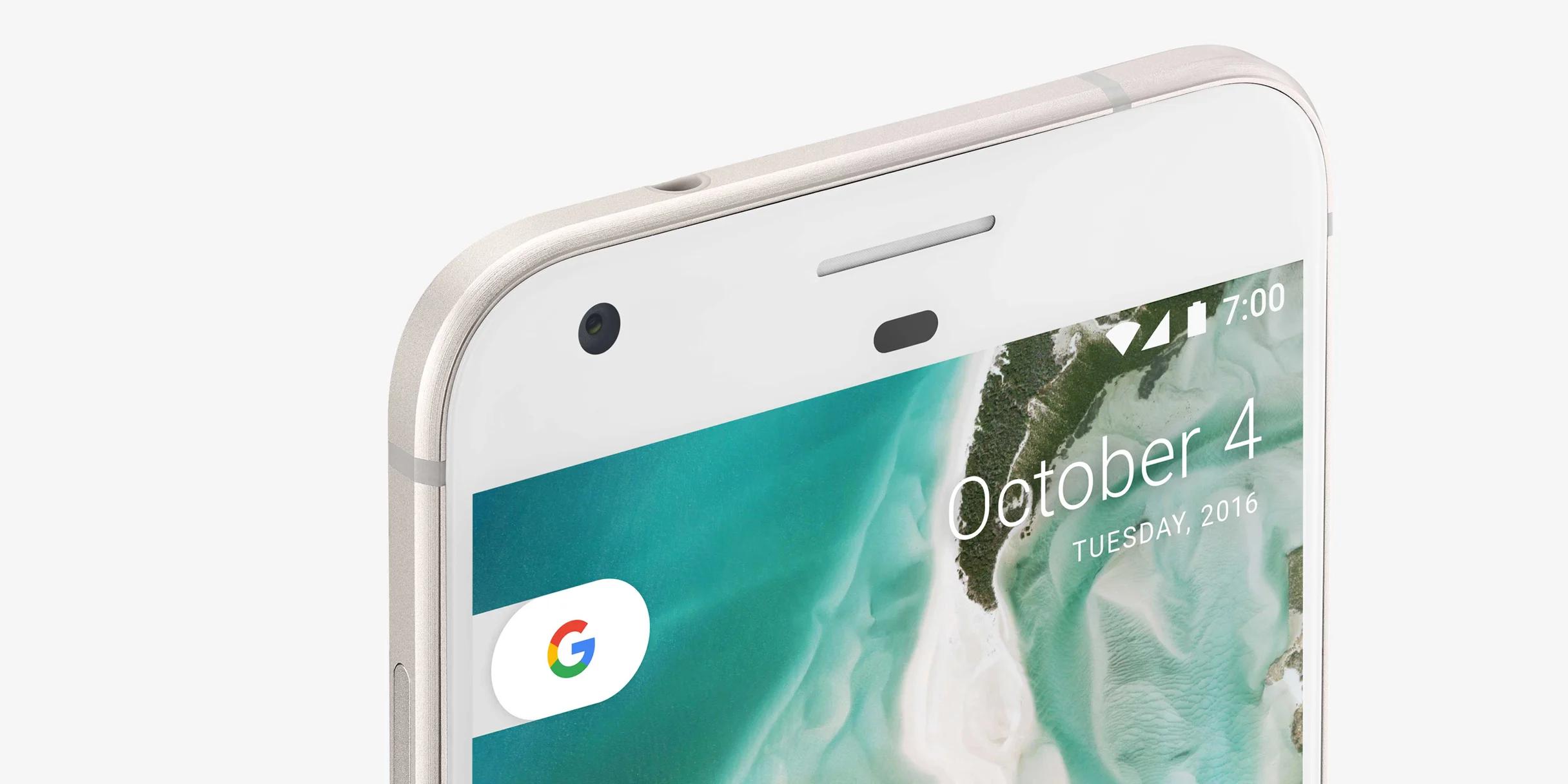
With the Pixel phone, the first in a new line of Google products released this fall, we made it our mission to ensure that every element of the user experience created a consistent tone—one that not only expressed the Google brand in new dimensions, but also stayed true to our core design principles of simplicity, intelligence, customization, and trustworthiness. By showcasing the best of what Google has to offer, we hoped to target a demographic interested in a premium Android device. The team decided to focus on two major areas of the Pixel experience—wallpapers and soundscape—to achieve this goal.
To ensure consistency across other products and areas of the company, we held working sessions with the Material Design team and Creative Lab, as well as other teams in San Francisco, LA, and New York. We developed concepts that utilized some of Google’s new and emerging technologies, while working within our meticulous engineering and performance benchmarks to emphasize intelligence, performance, high craft, and restraint.
Wallpapers
For a device wallpaper to be successful, it must clearly express the company’s brand while functioning as a passive layer behind the UI, and, most importantly, allow for the user’s self expression. By creating experiences that respond to and reflect the user’s context—transforming their surroundings into dynamic content and bringing a layer of intelligence to what is often a static background—we created a suite of wallpapers that go beyond those base requirements for success.

Models generated for Half Dome Yosemite, CA; Arches National Park, Utah; Whitehaven Beach, Queensland.
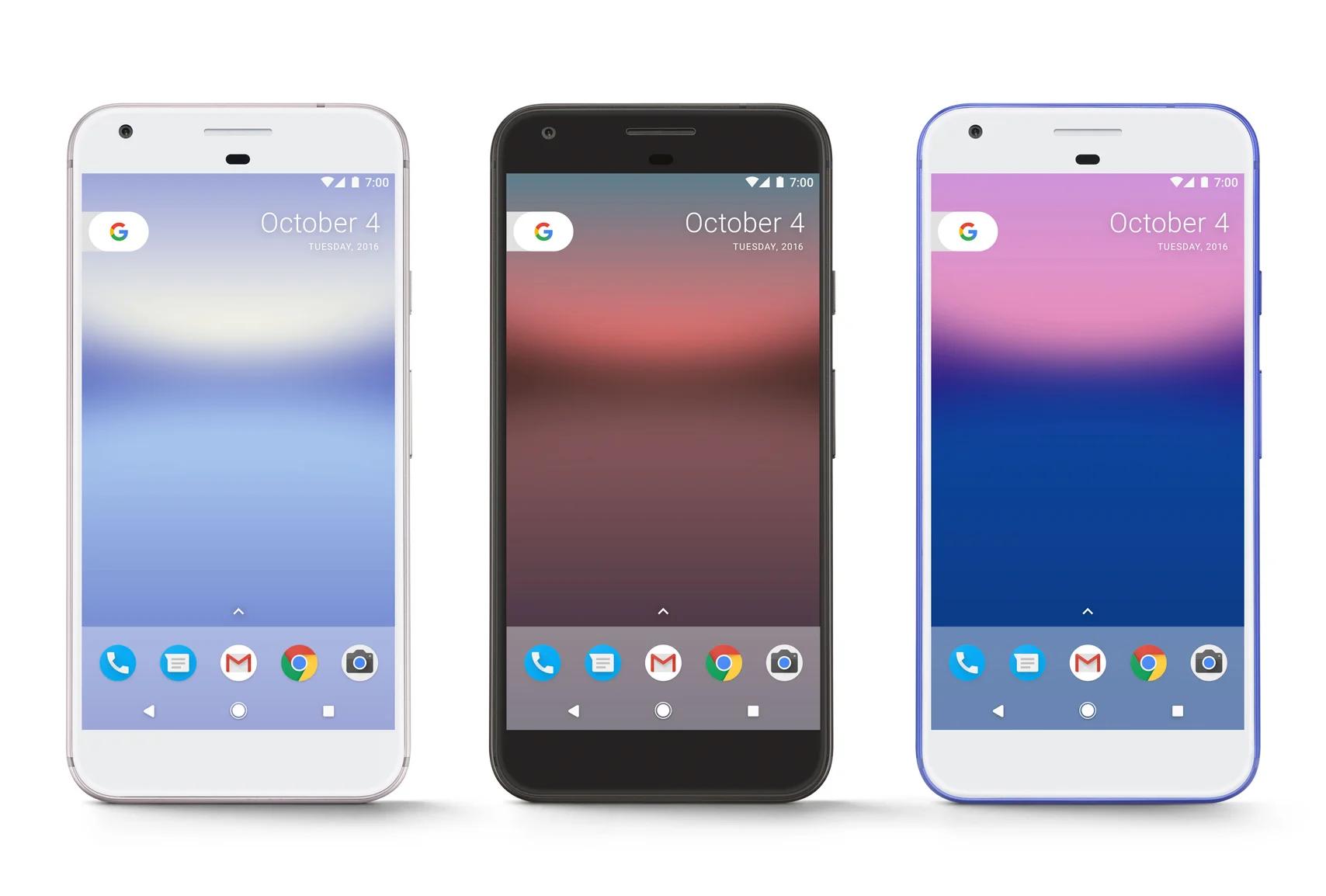
Pixel evolves the art direction established with earlier Nexus products—namely the abstracted color compositions and satellite imagery—and enhances the way those images interact with and respond to the user. To achieve this, we partnered with the Google Earth team to create models of iconic, global landmarks using Google’s 3D geometry technology. Incorporating 3D scenes rather than just flat imagery, showcases the depth and scale of these natural and manmade landmarks without draining battery or increasing data usage. For example, Your World provides a stunning, globe-level view of your location, and incorporates real-time data from daily life. Horizon, another wallpaper in this series, dramatizes the battery cycle of your phone from charge to recharge—as your battery drains, you’re presented with an increasingly glorious sunset that transitions into a rising moon—creating a live experience that is aesthetically pleasing, highly personalized, and imparts a bit of that Google magic. Expressing the user’s context as much as possible, offers simple beauty while hinting at deeper levels of data and information.
Aurora Timelapse utilizes location, time, and weather data.
Aurora Timelapse, the wallpaper that will be on every Pixel phone out of the box, uses current location, time, and weather conditions to create subtle but lush colorscapes that respond dynamically to your location. The composition of this wallpaper took hard work, as we wanted to ensure that the horizon would line up perfectly with the back-plate of the phone. We also needed to develop a robust color palette to show off our rich AMOLED screens while complementing our mostly primary-colored Google app icons. The final result is a set of live data wallpapers that balance simplicity and intelligence without creating unnecessary clutter and noise.
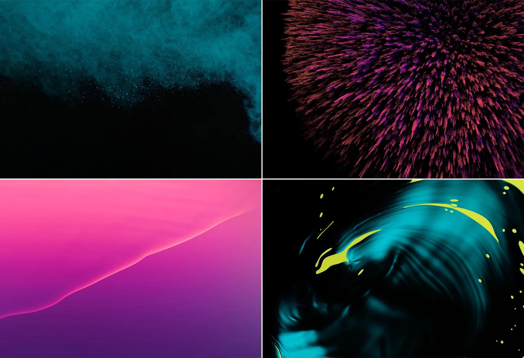
Jamie Chung’s New Elements collection.
To contrast and complement the geo-based wallpapers, we also expanded our work with artists and photographers whose style and range map thematically to Google’s brand—covering themes like exploration, science, and discovery. Jamie Chung’s exclusive Pixel series, New Elements, is an investigation into raw, elemental materials. He photographed water, vapor, iron ore, and ferrofluid to produce a striking range of imagery that is at once intelligent, graphic, and quirky. In contrast, Zack Seckler’s series, Sky High, observes stunning moments of coastal wildlife. Zack’s aerial shots of the South African marshlands build off of our past satellite imagery while adding a more emotional narrative.
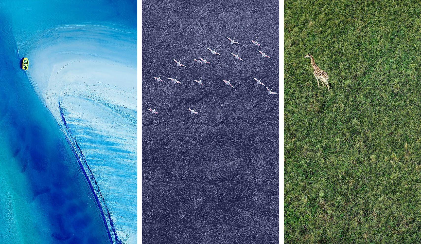
Zack Seckler’s Sky High collection.
Sound Design
Today, users are frequently bombarded with sound. By taking a more minimal approach to the arrangements and using a purer sound that resonates well on a device, there’s a greater ability to pop through everyday noise in order to get the user’s attention. What’s more, a device with a small speaker is not going to reproduce the rich sound and playback experience of a home stereo. Complex musical arrangements, big bassy sounds, or sounds that don’t take advantage of the resonance of the device can all be trouble areas on a small speaker.
So when it came to designing sound for Pixel, we carefully considered what its role should be, and how the simple, minimal Google brand could be expressed through sound—starting right when the Pixel powers up. As the playful dots animate into Google’s signature G, the subtle piano sound resolves into a G chord to match. This lightweight form of audible decoration can be heard at other moments too—from the device’s touch sound and the subtle click of the camera shutter, to the clear punctuations of ringtones and alerts.
Ringtones
For example, the Zen ringtone comes in as a minimal interruption and gets increasingly more attention-grabbing. This ringtone started out as a single notification sound, but we quickly recognized that there was room to further develop the pleasant introduction of the bells into a persistent ringtone. Ringtones don’t always have to be serious, so we also wanted to provide light-hearted options like Rrrring that would allow people to express themselves.
Alarms
Alarms are used to get the user’s attention or even wake them up. Of course, we want to do this in the most respectful way possible. That’s why Pixel offers a number of options that either ramp up gently or punctuate the air and then pause before resuming, giving users the option to gradually increase the volume on any alarm.
Notifications
With notifications, we needed to tread lightly between getting the user’s attention and being overly aggressive. The user will be hearing these sounds throughout the day, potentially often and in succession, in a variety of different environments. A notification sound should alert users that something needs their attention, but should do so in a way that respects the relationship they have with their devices. These sounds should be short, snappy, and audible but not invasive or overly decorative. A minimal approach works well to get “in and out” of the way, like Chime or Trill. As with ringtones, it’s important to provide notification options that incorporate humor or playfulness—like Flick—to show that we don’t take ourselves too seriously. Similar to the elemental exploration of the visuals, the Pixel soundscape draws inspiration from both digital and real-world sources, such as with Flow (alarm sound), Strum (notification), and Summer Nights (ringtone).
The introduction of Pixel marks a new chapter for Google hardware. Traditional user experience was only one facet of shipping a successful product line, and the challenge of expressing our brand in new dimensions was critical to our success. This initiative is the culmination of many designers’ work in a variety of different roles within our organization. As we move forward on this path, we hope Pixel will continue to deliver the simplicity and quality that our customers expect while undeniably reflecting our brand values—right down to the very last pixel.