Robinhood: Investing in Material
Improving the onboarding experience with motion and imagery
Building a robust financial app that allows people to view, buy, and sell stocks is a complex undertaking. Robinhood tackles this challenge with a slick onboarding experience that uses motion to help orient the user through the app’s core features. Swipe gestures enable quick navigation, and color updates users on critical changes in stocks and their personal portfolios. Robinhood’s smart, tasteful application of material design principles has helped garner the app a 4.65 average rating in the first half of 2016 and well over 9000 reviews. Robinhood was also awarded the 2016 Google Play Award for excellence in design.
Improving the onboarding experience with motion and imagery
Robinhood simplifies what could be a complex onboarding experience by coaxing users through a series of streamlined, animated transitions. Each prompt contains a card with uniform white illustrations set against a bright green background—creating a subtle and optimistic play on the color of money. Robinhood’s creative director Zane Bevan believes streamlining the visual design has helped simplify the app’s complex capabilities.
Additionally, touch ripples help boost confidence, especially when people are asked to share confidential, personal information; a low-profile progress bar lets people know that information is being processed without getting in the way.
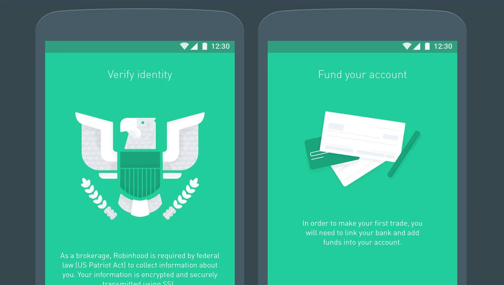
Robinhood uses contextual illustration to help users complete the task at hand. For instance, when the app asks to link a bank account it shows an image of a checkbook and credit card.
Using color to convey critical changes
Stock prices can fluctuate in a minute, and keeping users informed of the impact on their portfolio is critical to building trust. Color is a great way to visualize the trending price of stocks, allowing users to understand at a glance if the price has gone up or down. If the overall portfolio of stocks is performing well, the UI is a light green graph on a green background. Individual stock performance is also represented by a change from green to red, depending on how the price is tracking. A full-flood background color lets users know when the markets are open or closed—after trading hours, the background shifts from white to a dusky grey.
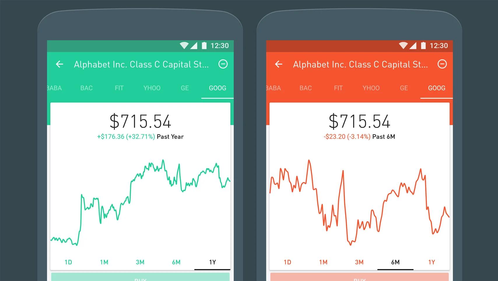
The color of the UI changes depending on the status of the market and the value of the stock.
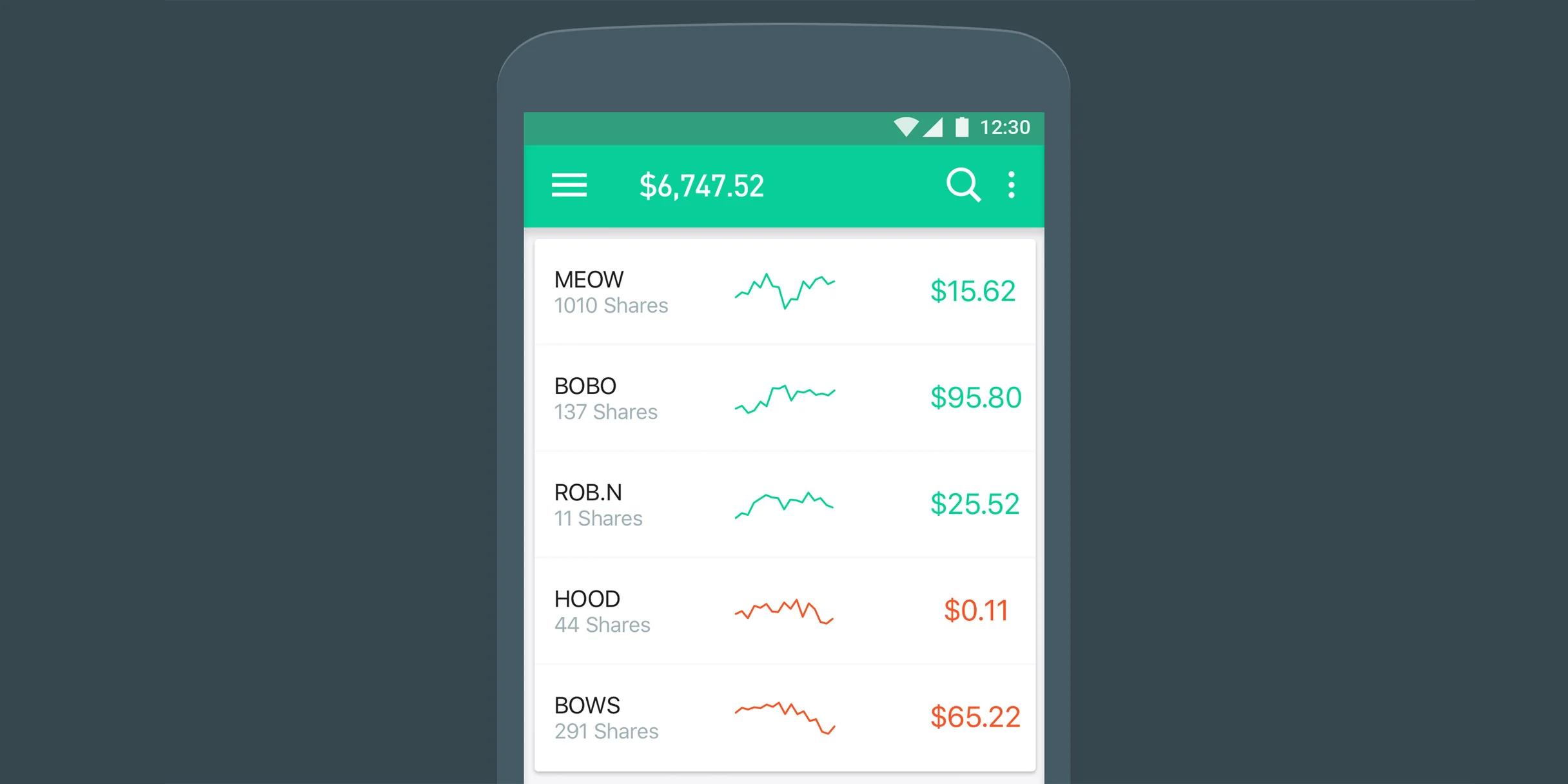
Increasing discoverability with cards
Cards are used for news updates and labeled with green badges to indicate the quantity of unread stories or messages. Users can easily dismiss cards with a simple swipe left.
More importantly, cards are used to represent each stock in a person’s portfolio. This allows users to organize related information easily. When pressed, the cards animate and transition to fill the screen from their point of origin. The value of the stock is represented by a large number and a graph, both of which animate when the stock value changes.
Stocks that are of interest to the user can be followed, unfollowed, and added to a person’s “Watchlist” for tracking and potential purchase. The search function uses reveal animation and autocomplete to make it easier for users to find more companies to add to their “Watchlist”. Finally, a snackbar informs users when a stock has been added or removed from their list.
Robinhood uses cards to group information such as share prices, recent news, and notifications.
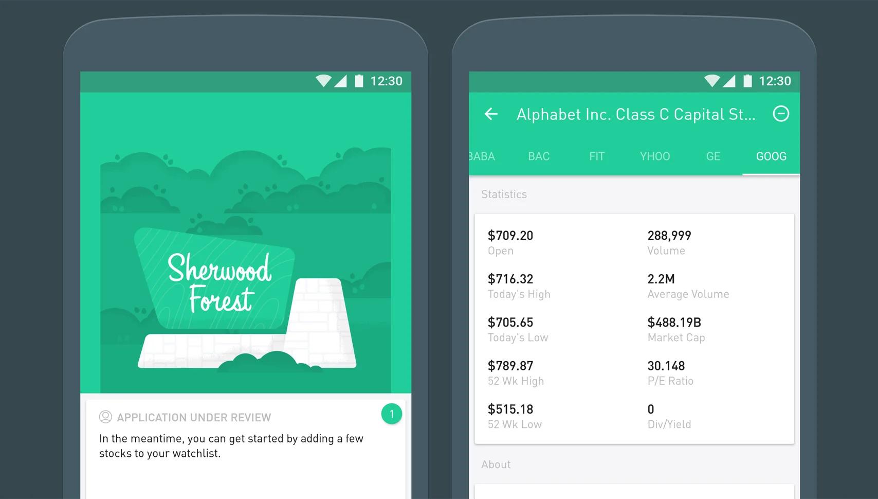
Getting positive feedback and engaging with users
The feedback from Robinhood’s users has been fantastic with a 4.65 average rating and well over 9,000 reviews. The design team thinks material design has played a huge role in making this possible: “Material design has been a very positive factor in their [users] app experience. We hear time and time again that our design is clean, easy to use, and beautiful to look at.” It’s this attention to detail and visual design that the Google Play team cited in their 2016 awards ceremony, proving Robinhood’s redesign is gold standard.