Modern Tiro Indic collection for classical South Asian texts
The beauty and challenges of bridging the old and the new
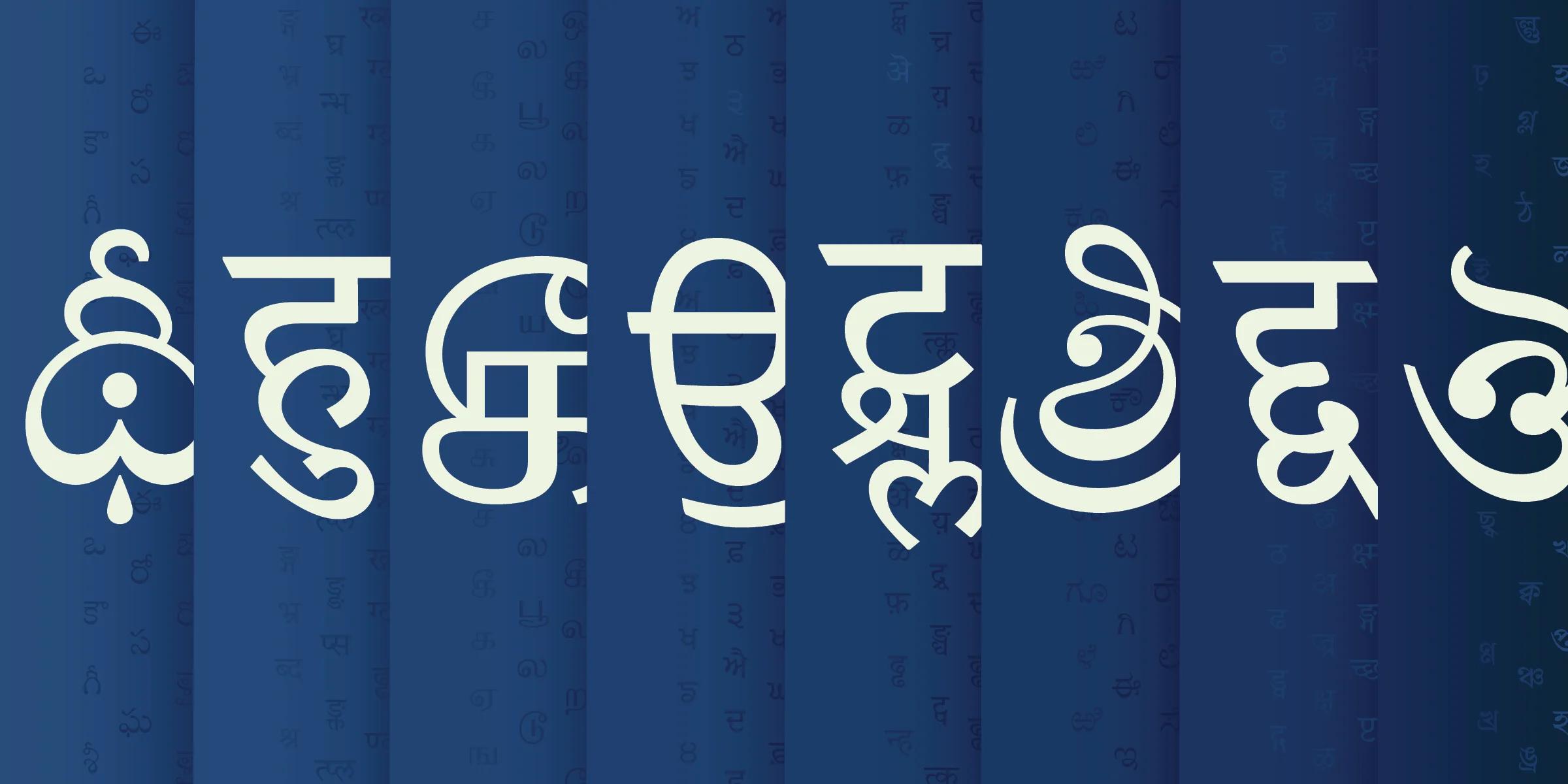
A cross-Atlantic collaboration created new Indic fonts with traditional text styles suitable for a variety of uses
Two type designers separated by an eight-hour time difference, an ocean, and pandemic travel bans collaborated over video calls and email to make a cohesive set of fonts in 8 South Asian languages. In 2012, Harvard University Press commissioned Fiona Ross and John Hudson, through Tiro Typeworks, to design typefaces for the Murty Classical Library of India book series. The publisher needed to reprint ancient Indian literary, historical, and religious texts, including Vedic and early Sanskrit works. Since these old texts had been printed using traditional letterforms and early Indian typography techniques, the new fonts needed to retain some of the traditional style of the old texts, yet be clear and legible in modern print and digital media.
In 2019 Google Fonts approached Tiro to make an extended and updated version of the Murty Fonts to be released as open source fonts in the Tiro Indic collection, offering users traditional text styles suitable for a variety of uses.
Study the classics and language structure
Before designing the typefaces, it was important to research classical texts and understand the unique characteristics of the languages.
“We looked at very lovely manuscripts or early Indian printed materials from the 18th or 19th Centuries,” said John Hudson.
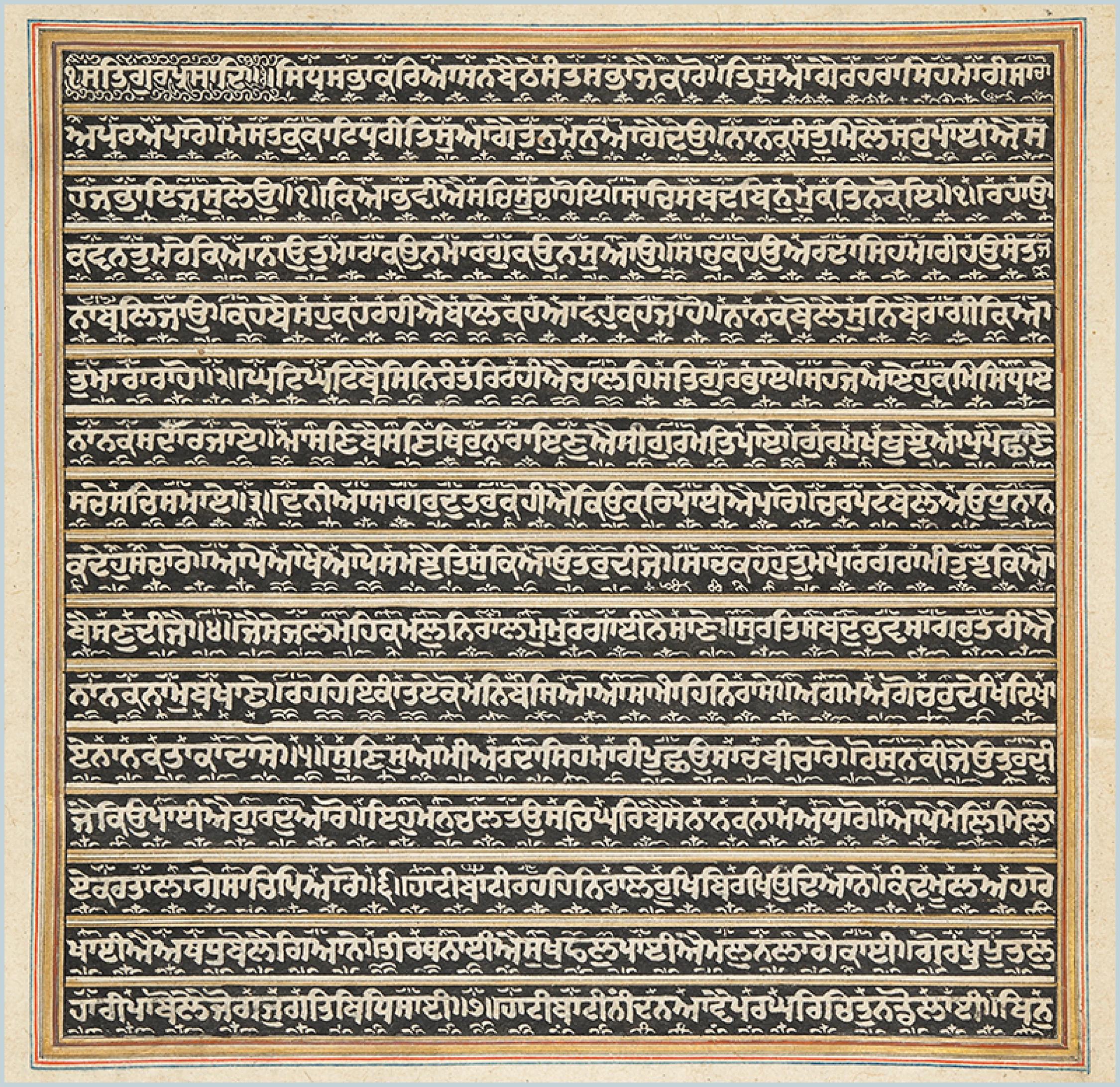
Folio from a prayer book prepared in the late 1820s for Mahārānī Jind Kaur, wife of Mahārājā Ranjīt Singh. This manuscript at the British Library inspired the design of the Tiro Gurmukhi typeface. © Image courtesy of the British Library Board, Ms Panj. D 4, f. 2r
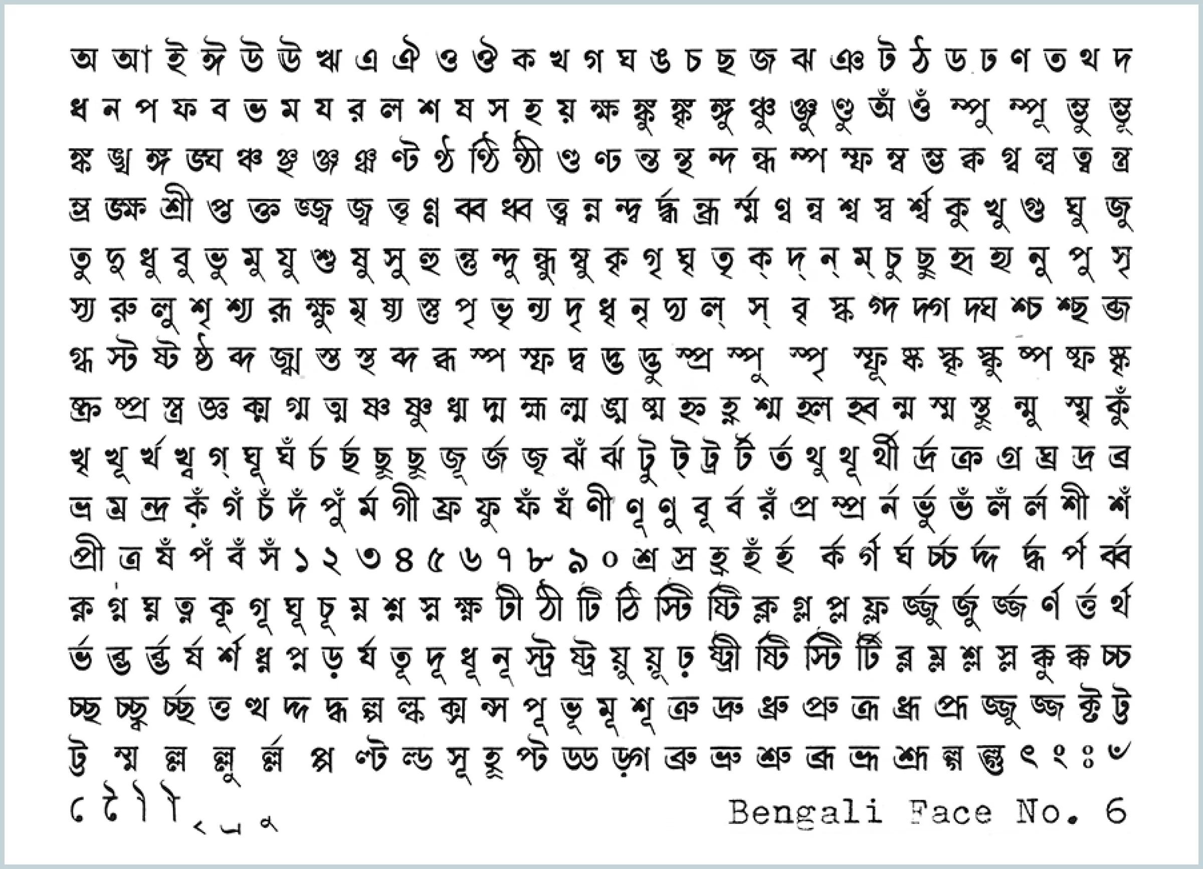
Character set of the Bengali No. 6 metal typeface, used by the Ananda Bazar Patrika publishing house in the pre-mechanized era of typography. This was among the historical sources that inspired the Tiro Bangla typeface design.
Alphasyllabary
The writing systems derived from the ancient Brahmi script are classified as alphasyllabaries (also called abugidas). An alphasyllabary uses a single letterform for a combination of a consonant and an inherent vowel. The writer can change the vowel by adding a mark to modify the base letter. Depending on the script and specific combination, the vowel mark merges graphically with the letter, sits to the left or right, or is in two parts, one on either side of the letter.
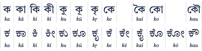
The consonant ka in Bangla (Bengali) and Kannada scripts, first (from left to right) the base form with inherent vowel—ক and ಕ—and then with different vowel signs. Some vowels are letter-like signs before and/or after the base, others are marks attached above or below the letter, and some form distinctive ligature shapes with the base letter. Image credit: Tiro Typeworks.
In these alphasyllabaries, combinations of one or more consonants without an intervening vowel form graphical clusters. There are different ways to indicate when the vowel is silent between consonants:
- A special “vowel killer” sign applied to the base letter
- Combining the two consonants with a ligature
- Writing the secondary consonant(s) as smaller signs below or after the base letter
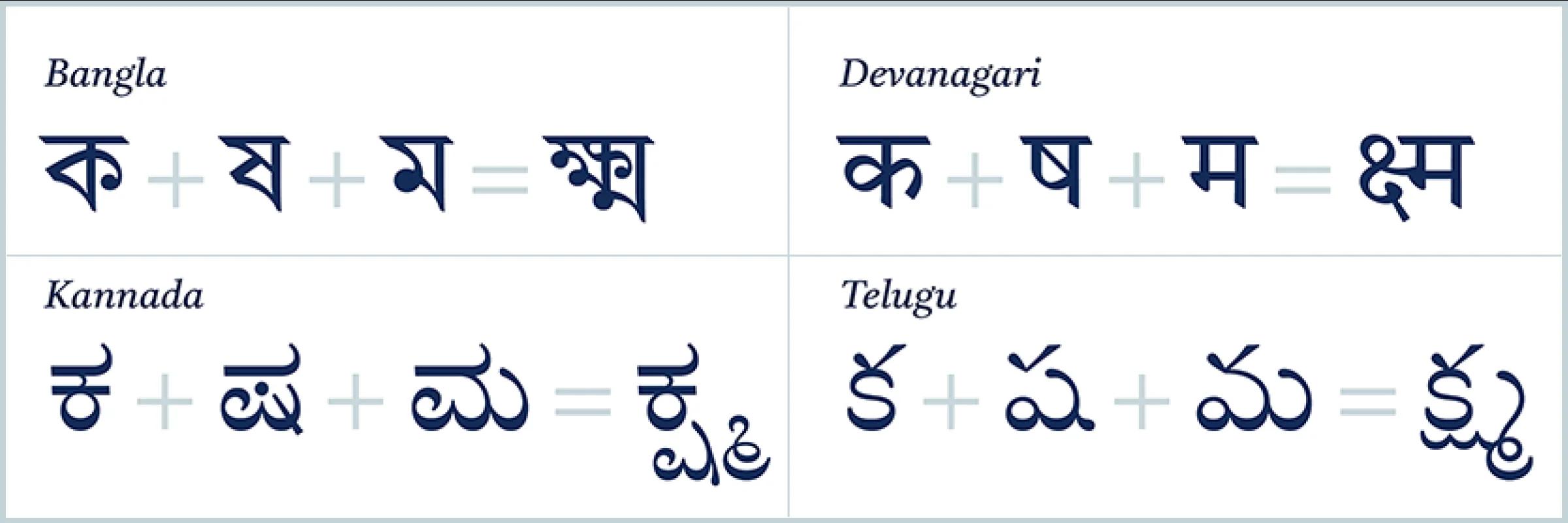
The conjunct kṣma in two northern Indian and two southern Indian scripts. Image credit: Tiro Typeworks.
The beauty and challenges in complexity
Making modern typefaces for eight languages is a mighty undertaking and involves thinking through some complex features of each script.
“These fonts have traditional proportions but have a modern take with less contrast than the early metal fonts,” explained Fiona Ross. “The strokes are more robust and have more generous counters than their typographic predecessors, creating more relaxed spacing which aids sustained reading.”
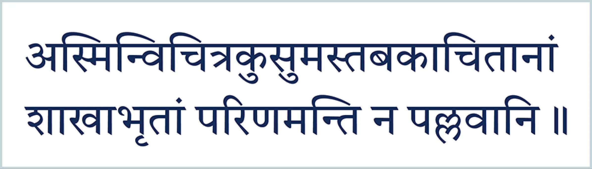
Tiro Devanagari Sanskrit, illustrating robust strokes and generous proportions. Chapter 5 verse 37 from the Sanskrit epic poem Arjuna and the Hunter. Image credit: Tiro Typeworks.
“Each of the scripts has some particular set of design and/or technical challenges,” explained John Hudson. “Unicode classifies them as ‘complex scripts’ because the encoding and display models are complex, involving dedicated script shaping engines (in operating systems, browsers, or other software) and font glyph processing layout features. In terms of type design and font production, these complexities present themselves in different ways for different scripts (or classes of script).”
Some of the scripts exhibit different letter shape preferences or cluster behavior depending on the language. The Tiro Devanagari typeface is available in three separate families: one for Hindi norms, one for Marathi literary texts, and one for the classical Sanskrit language. (Sanskrit can also be written in several of the other scripts in the collection).
The following examples from Sanskrit in Devanagari and Telugu scripts show some of the intricacies that the Tiro type designers needed to work through.
Devanagari (Northern India)
Sanskrit grammar produces combinations of consonant sequences (conjuncts) that may be unique to a particular text. To confirm that the Tiro Devanagari Sanskrit font was displaying consonant sequences correctly, the designers identified conjuncts that appeared in texts. They analyzed digital texts, searched through print editions, and consulted grammar books, scholarly articles, and with language experts.
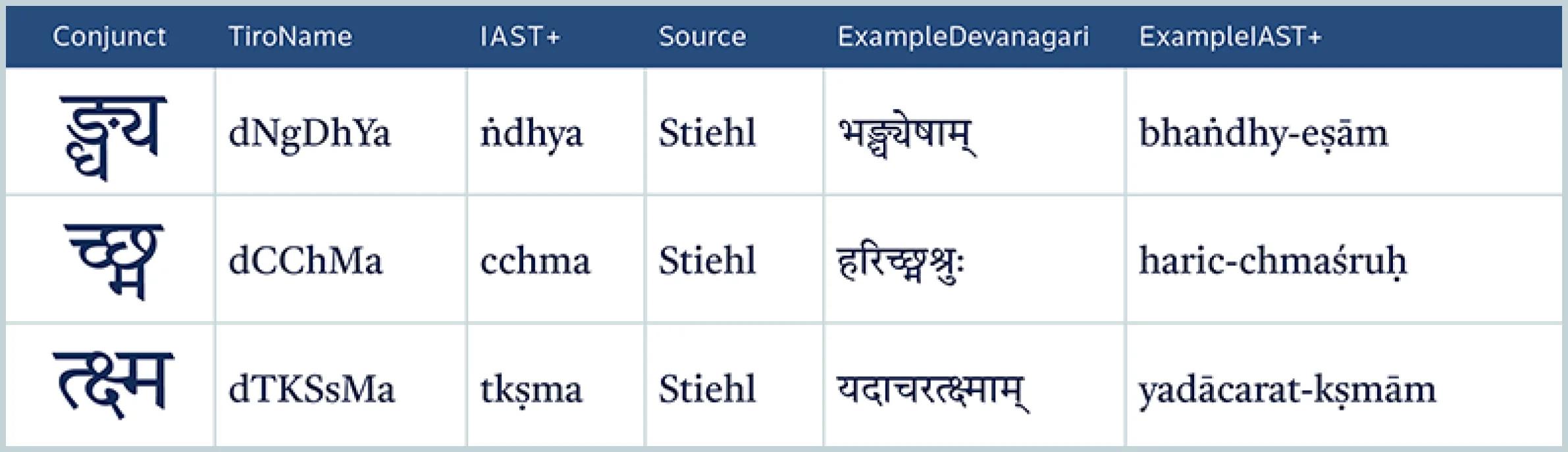
Sample entries in Tiro’s catalog of more than 850 attested Sanskrit conjuncts. Image credit: Tiro Typeworks.
Telugu (South Eastern India)
“The Telugu script is one of the most difficult technical challenges I have tackled in 27 years of font production,” said Hudson. “The script generates graphical clusters with sequences of base letters or ligatures, plus small and sometimes distinctive forms of consonants placed below (subscript) or after (postscript) the base letters/ligatures. The correct display of Telugu clusters involves reordering, ligation (connecting base letters to vowels or vowel killer signs), and making adjustments to the spacing and relative positioning of the various elements. The resulting kinds of interaction between different modes of positioning are the most difficult part of the OpenType Layout model used to implement complex scripts in fonts.”
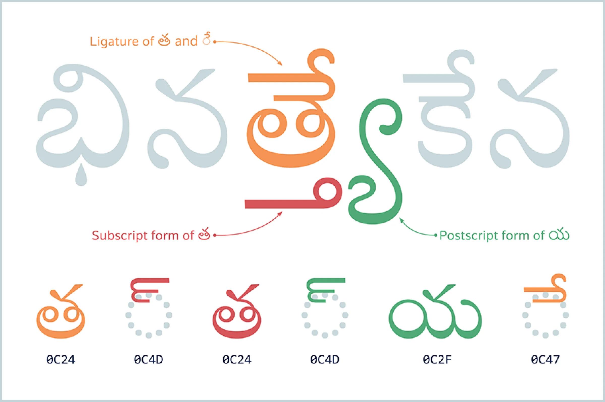
Analysis of a graphical cluster in the middle of a Sanskrit word in Telugu script, using color to map the relationship of the input Unicode character sequence (bottom), with the final display composed of a base letter plus vowel ligature (orange), a subscript consonant (red), and a postscript consonant (green). Image credit: Tiro Typeworks.
The Tiro Telugu font can display both simple and complex arbitrary graphical clusters, and can be used for texts in Sanskrit and Pali (the original language of many of the Buddhist scriptures) as well as the modern Telugu language.
Working across oceans
The fonts were not the team’s first international collaboration. Hudson and Ross first met in Leipzig, Germany, and have worked together for over 20 years combining their distinct expertise across linguistics, type design, and technology.
“For the Murty project, we met in person several times,” explained Hudson. They met at Harvard University Press, with their editorial and production teams and with the book designers. The team also met at the British Library and at the University of Reading, where Ross teaches.
Hearing a variety of languages and seeing books and artifacts in a range of scripts (Cyrillic, Japanese, Tibetan, and Latin with Hungarian or German diacritics) was common in Ross’ family home. After reading Siddhartha by Herman Hesse and Rudyard Kipling’s Just So Stories she studied Sanskrit at the University of Tübingen—the same German university where Hesse had studied Sanskrit—and then continued her Indological studies at the School of Oriental and African Studies (London University). She has over 40 years’ experience working with South Asian scripts.
John Hudson has 20 years of experience doing design and technical production for these scripts. “My interest in South Asian writing systems is part of a broader interest and professional practice in developing fonts for many scripts. Sometimes my involvement in projects is primarily technical, and sometimes involves design, either alone or in collaboration. I often occupy the ground between the script and language expertise of people like Fiona Ross and understanding of text encoding and layout technologies, helping people to realize their design ideas or language needs in digital fonts,” he said.
During the pandemic, they collaborated via video calls and shared documents. Hudson worked from his Canadian island home in the Salish Sea, off the coast of Vancouver, British Columbia. While he saw branches of cedar and fir trees out of his office window, Ross could see roaming cows from her 18th century stone house in a hamlet of 23 homes on the side of a valley in southwest England.
Despite geographical distance and pandemic travel restrictions, the Tiro team was able to bring modern technology to six scripts: Bangla (Bengali), Devanagari (separate fonts for Hindi, Marathi and Sanskrit languages), Gurmukhi, Kannada, Tamil, and Telugu each in a single weight plus an italic companion. Fernando Mello and Fiona Ross designed the Tamil font. There is a Latin subset included in each, also independently available in Google Fonts as Castoro.
Bios
John Hudson
John Hudson is a typeface designer and font maker, and co-founder of Tiro Typeworks (1994), a small foundry based in Canada that works with colleagues and clients worldwide. Much of his work involves development of custom fonts for multilingual publishing and computing. He has designed or collaborated on typefaces for more than 20 writing systems for clients including academic and commercial publishers, media and branding organizations, and major software companies. He is an invited expert contributor to the Unicode and World Wide Web consortiums, and writes and lectures on font technology topics.
Fiona Ross
Fiona Ross specializes in type design and typography primarily for Arabic, South Asian, and Thai scripts, with a background in languages and Ph.D. in Indian Palaeography (SOAS), where she studied Prakrit, Pali, and Vedic texts. She wrote her doctoral dissertation on Bangla typography. Throughout her career, Ross traveled from the United Kingdom to India many times. She is Professor in Type Design at the Department of Typography and Graphic Communication (University of Reading, UK). She works as a consultant, type designer, author, and lecturer and has co-curated seven international exhibitions. Her design work has been in collaboration with Tim Holloway, John Hudson, and Neelakash Kshetrimayum for clients such as Ananda Bazar Patrika, Adobe, Google, Microsoft, Monotype, and Harvard University Press. For her work in type design and education, Ross received the SoTA Typography Award (2014) and the Type Director’s Club Medal (2018). She leads the Women in Type research project.
More information on Tiro Typeworks and issues in South Asian font development: Tiro Typeworks TypeCon 2014 Problems of Adjacency TypeCon 2015 The Bee in the Lotus Flower Granshan 2015 conference video TYPO Labs 2016 Making fonts for the Universal Shaping Engine
Thank you to Marina Chellini of the British Library for her input and guidance on Gurmukhi typography.