Modernizing Arabic Type for a Digital Audience
Designers are finally doing justice to the complex, contextual alphabet with a fresh approach to Arabic fonts and digital typography
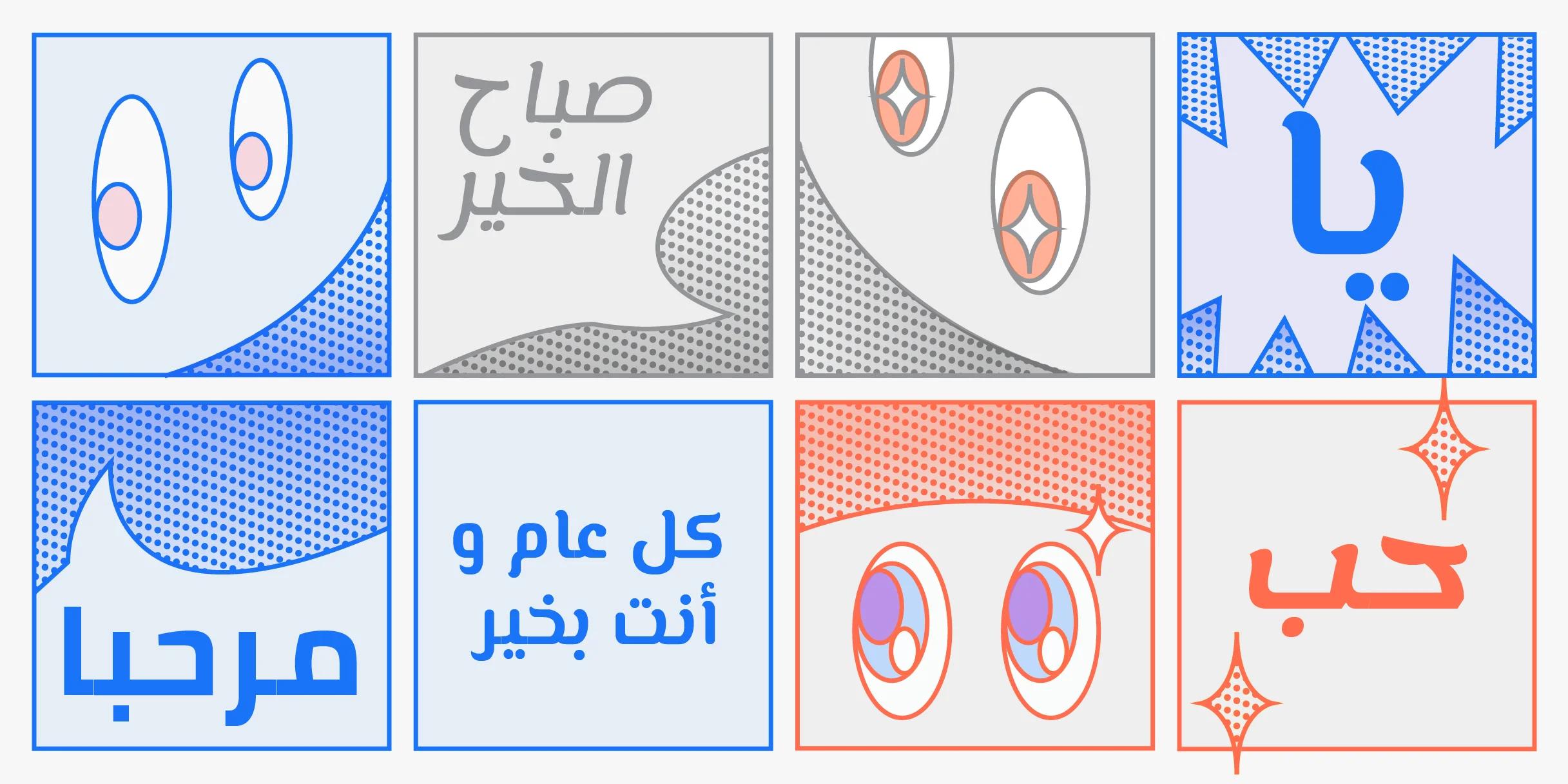
Arabic script is beautiful, and imbued with a rich history; the alphabet used today can be traced to classic texts that date back over a thousand years. The language itself has evolved over time, but modernizing Arabic typography—translating the intricacies of this uniquely complex, calligraphic style into a digital format—has been a major challenge. Arabic readers and writers deserve resources that allow them to communicate completely online, with font options that do justice to their written texts; designers like Mohamed Gaber and Khaled Hosny are working to fully realize the expression of this ever-growing group by ushering in a new era of Arabic type.
Context is everything: The specific challenges of digitizing Arabic type
The distinct qualities of written Arabic are rooted in calligraphy. Like the cursive writing many of us are taught in grade school, each letter changes based on the letters around it—these myriad combos, along with deceptively decorative features like ligatures and diacritic marks, are inherently complicated to mechanize, whether in metal type or in code.
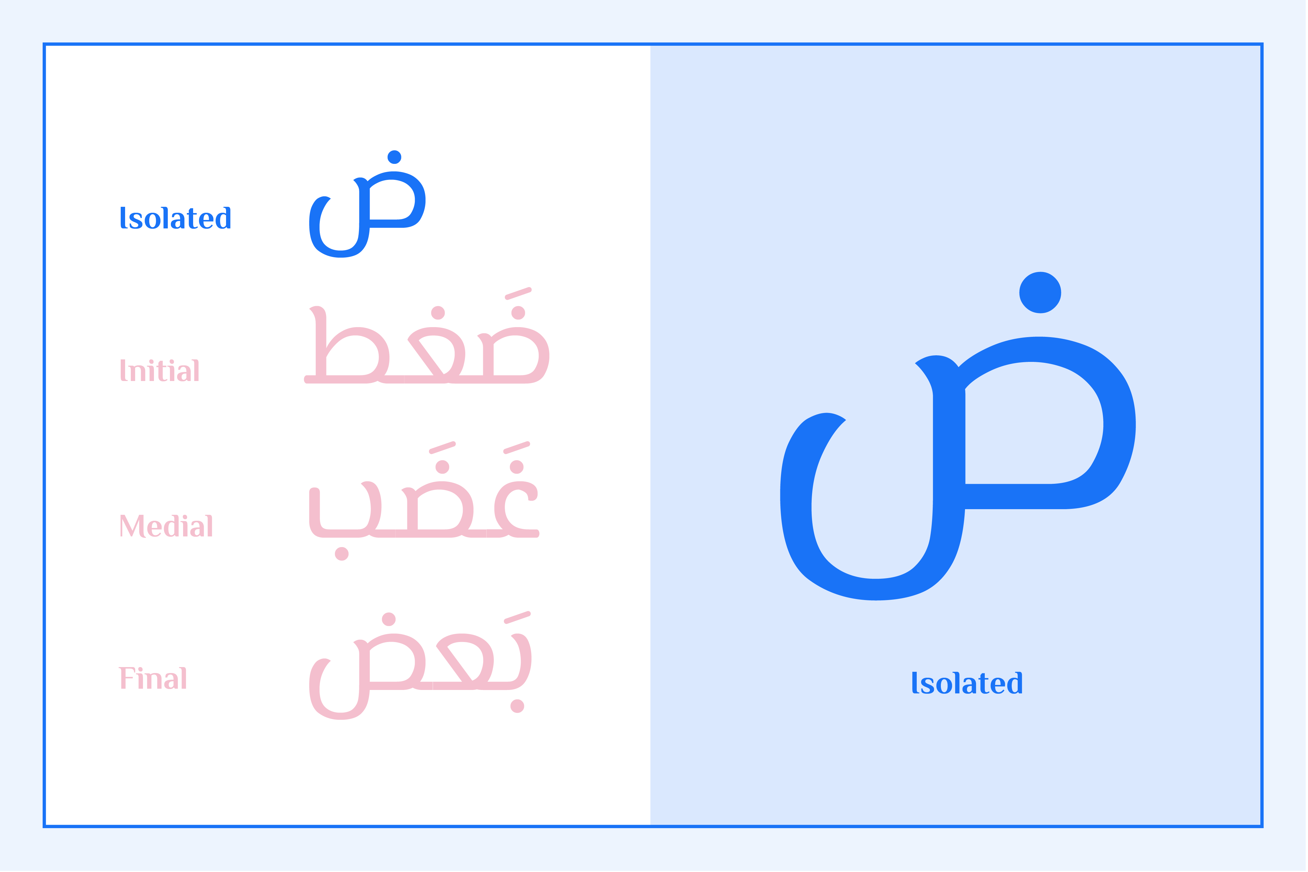
Arabic letters change form depending on their joining properties and adjacent letters. Here the letter ض (Ḍād) is shown in its isolated, initial, medial, and final forms.
“Arabic script has a great and extensive history of development and refinement, and this is reflected in how many forms a letter can take, depending on its context,” explains Egypt-based type designer Hosny. “There are lots of tricks to balance the black and white in the line, or even the page as a whole. But these things are hard to automate, and trying to emulate calligraphy in type often backfires.”
In the centuries when Latin typefaces were blossoming, Arabic printing was comparatively neglected. Foundries of the twentieth century developed just a few dozen Arabic typefaces compared to the many hundreds of Latin designs.
The challenge of Arabic type design continued into the digital age. The limited collection of Arabic fonts included in early desktop computers and web browsers were dull and clumsy—sometimes missing characters and often riddled with errors. As the Arab-speaking world came online, this gap in type design became even more conspicuous, and people responded by inventing an ad hoc vernacular, transliterating Latin to Arabic in emails, chats, and text messages; for example, “3” would be used to represent “ع”; and عين would be written as “3ain,” instead of the more formal transliteration of “Aain.”
Balancing Arabic identity and Latin language traditions
The number of web users in the Arab world was estimated by the UN to have grown from about 46 million users in 2007, to over 170 million as of last year. For Gaber, a type designer in Cairo, this rapid increase in readers fuels a clear mission: develop free web fonts that faithfully and expressively render Arabic online that everyone can use. His initial practice began with a focus on extending existing Latin designs to the Arabic script, and three of his projects are the most widely used Arabic typefaces in Google Fonts: El Messiri, Lemonada, and Cairo.
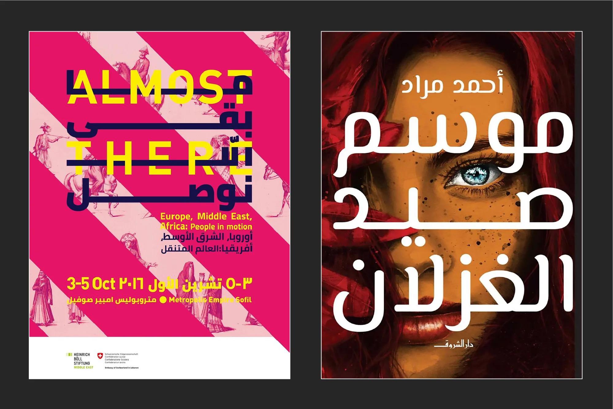
Left: This poster—announcing a film festival in Beirut—takes full advantage of Cairo’s harmonious design, interlocking the Latin and Arabic letterforms in a seamless bilingual statement of the festival’s title: “Almost There.” Right: This book cover, of a best-selling novel by one of the most famous writers in Egypt today, uses El Messiri.
Maintaining a sense of balance and consistency between each letter is a painstaking task, but ultimately necessary to the success of a type family. Gaber says the goal is “to create an Arabic typeface that matches the Latin without bending the Arabic letters or ‘Latinizing’ them—to maintain the classic rules of Arabic lettering while matching the Latin type.” Cairo’s Latin and Arabic characters are so neatly aligned that their strokes can be woven together and layered on top of one another, creating an elegant union of the two scripts to visually suggest that both languages are being spoken simultaneously.
Cairo’s crisp, minimal, sans-serif design is useful for many contexts. In lighter weights and smaller sizes, it’s highly legible as body text; at larger sizes and heavier weights it cuts a distinct form widely praised as a prime display font—check out the title text for the Almost There poster above—and was even named one of the best display typefaces of 2016 by Granshan, an organization founded to recognize excellence in non-Latin typography.
Ongoing improvements to Arabic web fonts range from removing overlaps to correcting tashkeel mark placement, and composing ligatures.
Even after a font is published, the work continues through refinement and expansion. Over the past year Gaber has reviewed the Google Fonts catalog of Arabic type to ensure their fidelity, coherence, and functionality—especially when it comes to subtle points like the placement of diacritic marks and ligatures—and these updates will be available soon.
The impact of OpenType on the future of Arabic typography
A decade ago the Arab world had no choice but to read and write digital text in inadequate, oversimplified web fonts. By leveraging all of the advanced features in the OpenType font format, designers today are proving that it’s possible to create fresh, efficient, and truly engaging digital Arabic typography. Hosny is quick to acknowledge that even the most thoughtful Arabic type design must harbor certain concessions and compromises, but the dream of achieving the delicate balance between hand-drawn heritage and software-centric progress is finally coming true—with more exciting developments to come.
Want to use more Arabic type? There are now more than fourteen Arabic type families available in Google Fonts, Docs, and Slides—each with matching Latin characters to ensure a consistent appearance in multilingual documents.