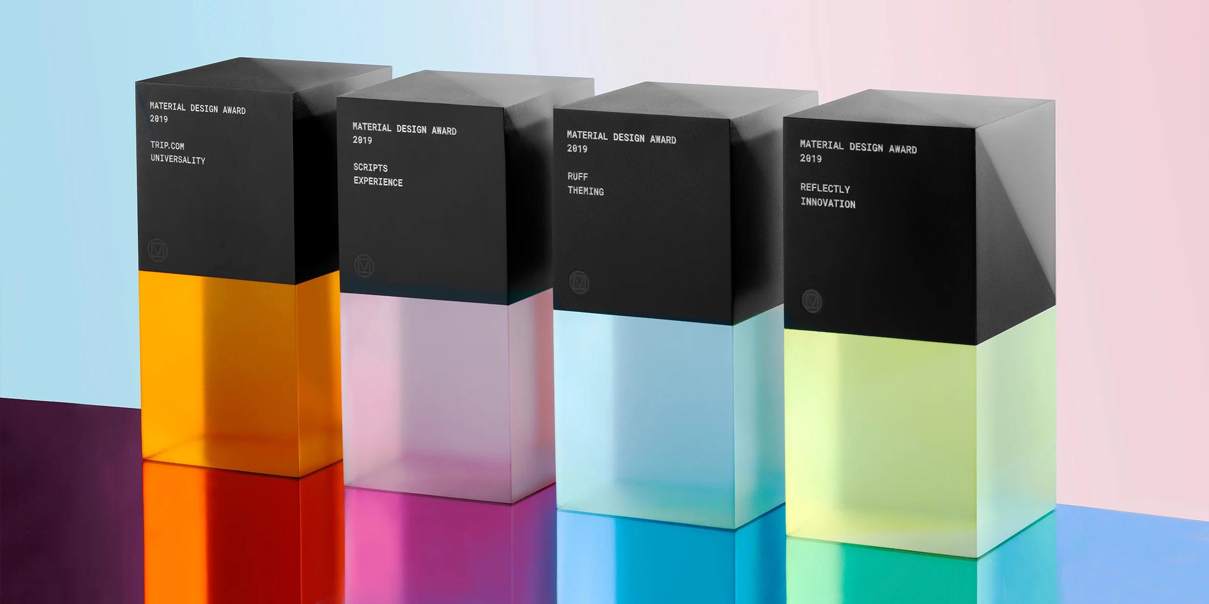
2019 Material Design Award Winners
Recognizing best-in-class designs from around the community
Each year, our Material Design Awards honor the product teams that bring Material to life. Useful, usable, and beautiful, these best-in-class apps use the design system as a starting point for crafting exemplary interfaces. The winners were selected from hundreds of open nominations, and each of this year’s honorees adapted Material in unique and inspiring ways—from expressive elevation to a novel use of backdrop.
We’re pleased to present the class of 2019, a group of apps that creatively employ Material Design across four distinct categories—theming, innovation, experience, and universality. We hope their work is as inspiring to the community as it is to us, and we look forward to seeing how you continue to make Material yours.
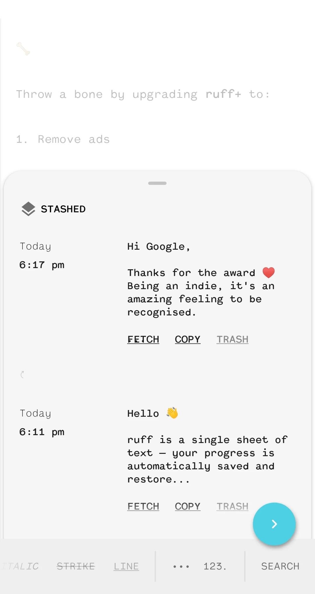
Ruff features a typography-forward UI that allows the user to focus on the task at hand—jotting down their notes.
Theming: Ruff
An expressive brand identity executed with Material Theming, including the consistent application of color, typography, and shape.
Ruff’s straightforward brand identity empowers the app’s note-taking users to quickly capture their thoughts in any style. Ruff makes great use of Material Components, especially the bottom sheet and backdrop (which serves as the app’s primary canvas). The blue floating action button and monospaced font add visual interest while taking a refined approach to theming. While the slightly rounded corners of the bottom sheet help communicate the component’s gestural behavior and let the user know that they can drag up for more content. The UI also allows for simple customization of type size and the choice of a light, dark, or black theme. Prioritizing function and clarity, Ruff’s consistent use of typography, shape, and color create an inviting themed experience.
Innovation: Reflectly
A demonstrated ability to build upon and extend the Material Design system in inspiring new directions.
Reflectly helps people manage stress and anxiety through the practice of daily journaling with prompts from a conversational, AI-powered UI. The app’s skillful onboarding experience applies smooth transitions and playful language to guide new users through setup. Besides the warm, approachable tone of its questions, Reflectly’s interface is full of artfully executed motion choreography (the way UI elements appear on screen, for instance), elevation adjustments (like raising the level of items in a carousel), and state changes that add up to a well-crafted user experience. The use of customized components, typography, shape, and elevation build on the principles of Material Design while creating a unique product that’s recognizable, usable, and an all-around joy.
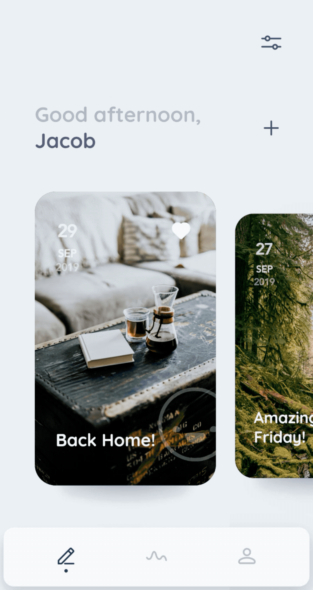
Reflectly’s conversational interface is supported by smooth transitions and a creative use of color.

In Scripts, users begin by tracing a letterform within clearly defined lines, to internalize the glyph’s stroke order and style.
Experience: Scripts
A creative and effective deployment of interaction, navigation, and content in service of an impactful user experience.
Scripts presents an ingenious solution to the challenge of learning new writing systems, through its clever use of touchscreen capabilities. The app’s step-by-step drawing interaction presents clear instructions—including stroke order—alongside small animations and haptic feedback, to deftly reinforce the correct technique. Small details like the well-designed system of gradients, consistent typography, and even the little bump indicating state in the bottom navigation bar combine to deliver a polished user experience. For some languages, Scripts incorporates background images as visual mnemonics, thoughtfully connecting a character’s form to the object it represents. Overall, the experience demonstrates a considered approach that naturally engages the user in active learning.
Universality: Trip.com
A thoughtful and inclusive design tailored to the needs of a wide range of users.
Trip.com created an excellent travel-booking experience for its global audience. The app’s layout and typographic scale construct a strong visual hierarchy that holds up across an impressive 19 supported languages. Cohesive iconography and playful colors (which all meet accessible contrast requirements) reinforce key actions and draw attention to important information. The bottom navigation provides multiple visual cues to display active destinations—icons transform from outline to fill, text labels increase in size, colors change. The imagery and illustrations reflect Trip.com’s diverse user base, just one of the many thoughtful details that make this an excellent universal app.
Trip.com’s clear visual hierarchy—from layout to imagery and typographic scale—work to put key information front and center.