Material Design Awards 2016
Recognizing best-in-class designs from around the community
A design system only comes to life when it’s used to create meaningful experiences. Last year, Google introduced the Material Design Awards to recognize best-in-class achievements in employing Material Design. This effort extends beyond our direct team as well—earlier this year, at Google I/O 2016, Robinhood was presented with the Google Play Award for Best Use of Material Design. With so much excellent work being done, we want to continue recognizing the makers who are helping to ensure the next generation of Material Design is even better.
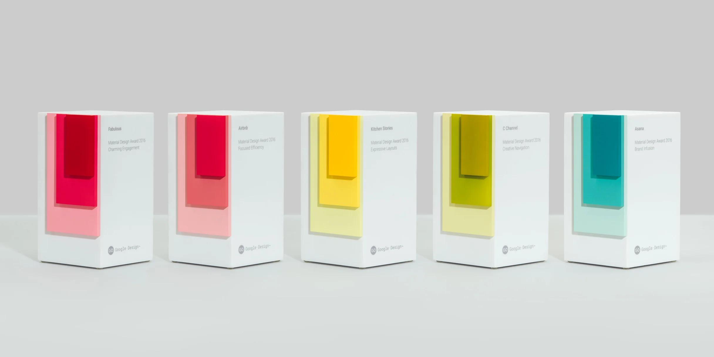
Today, we're proud to announce the winners of the second annual Material Design Awards. As with last year’s winners, we’re highlighting specific aspects of Material Design used in creating apps which satisfy their users while appropriately expressing their brand. The five winners, to be honored at the SPAN LA conference on October 27, represent the finest application of aspects of Material Design.
Brand Infusion: Asana: Team Tasks & Projects Charming Engagement: Fabulous - Motivate Me! Creative Navigation: C Channel (available in Japanese and Thai) Expressive Layouts: Kitchen Stories Focused Efficiency: Airbnb
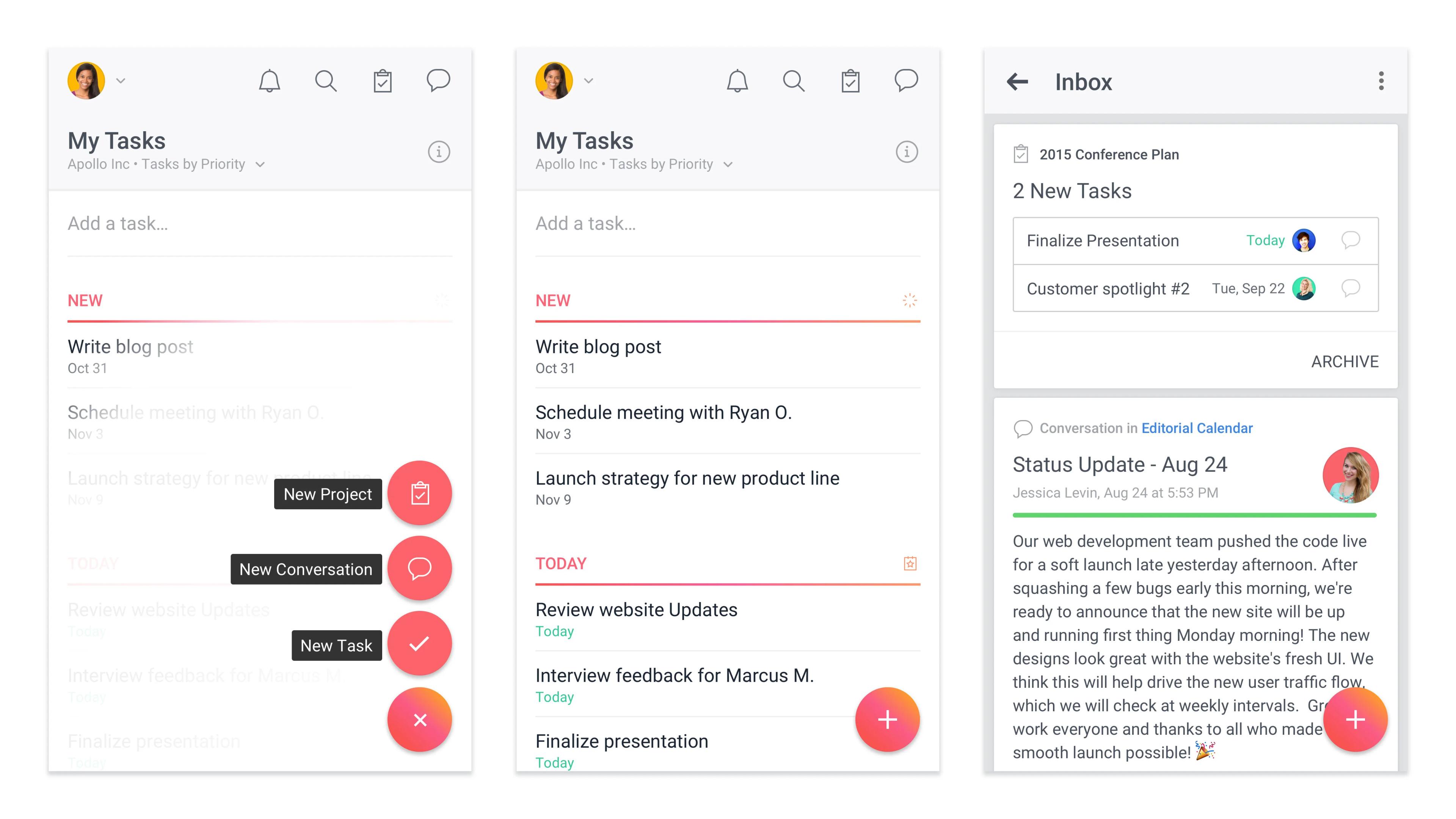
Asana deftly infuses its brand’s visual identity without distracting from the product’s core functionality. The app makes it easy to create new tasks by tapping a branded floating action button to begin a new project, conversation, or task. One-line summaries of new and current tasks make action items easy to scan. Tapping a task opens a communication view of the project.
Brand Infusion: Asana: Team Tasks & Projects by Asana, Inc
An app built on making teams more productive and collaborative needs to be visually focused and clear to keep users concentrated on getting work done. Asana achieves this by polishing short, frequently repeated interactions to make efficiency feel rewarding. Content is never overwhelmed by the wide range of available actions because they are organized intelligently and are easy to trigger.
With so much functionality built into the app, it would be easy for Asana’s visual identity to become diluted. But Asana’s design team thought through the brand experience at every turn. Subtle gradients are applied to the floating action button, as well as in moments of more casually paced user communication. The product logo is echoed in the circular outlines around icons that show up while editing a task.
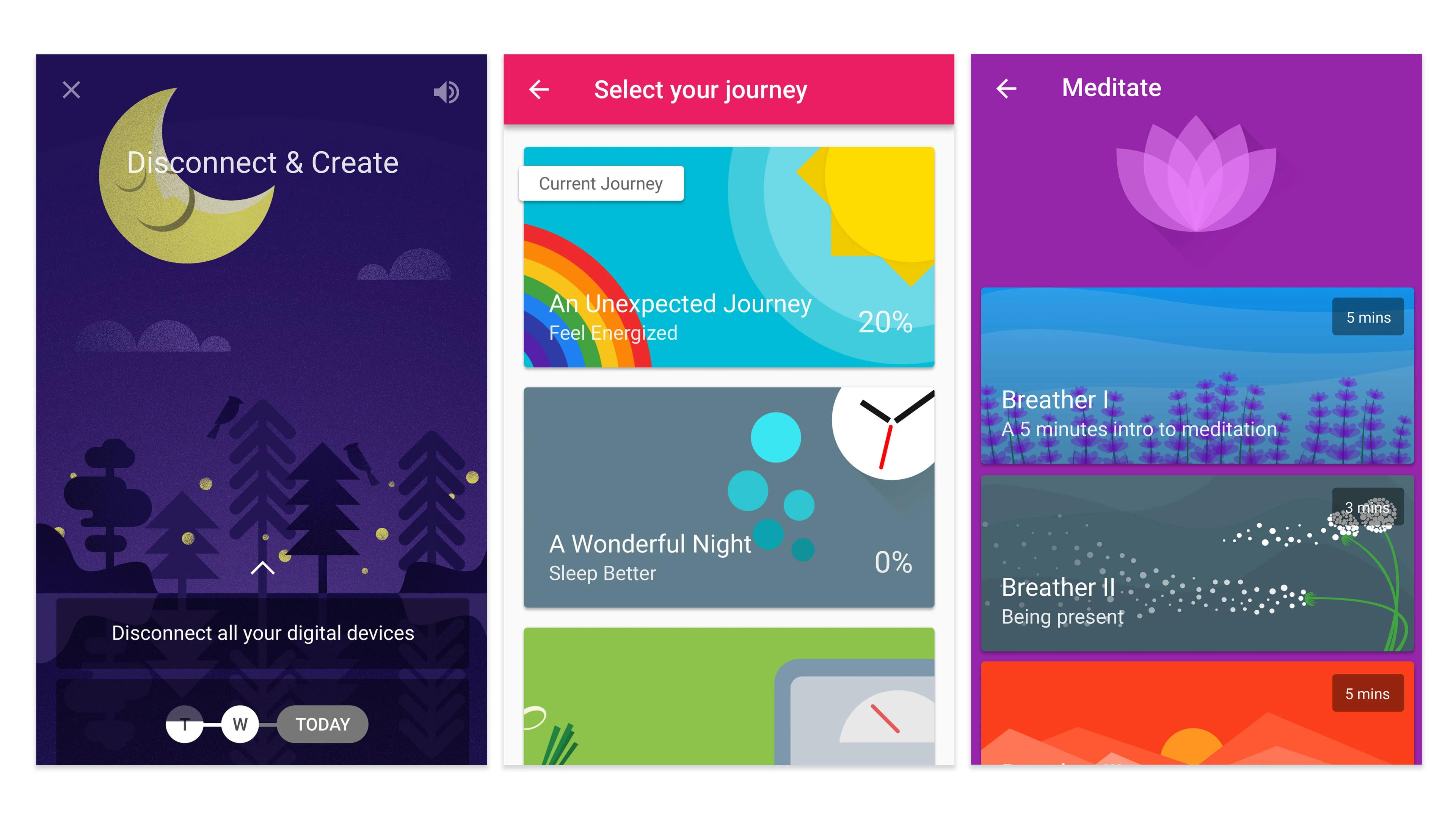
Fabulous entices the user along the path to self-improvement through illustration, animation, and playful voice. Brightly colored imagery delights the user, prompting them to accomplish habit-forming tasks like going offline. Colorful cards display the user’s goals and show the percentage of goal completion. For a goal like meditation, the app includes voice-guided mindfulness sessions of different durations.
Charming Engagement: Fabulous - Motivate Me! by TheFabulous
It’s hard to rewire your brain and adopt a new routine, but it can be made easier with an attentive coach by your side, encouraging you to achieve your goals through positive reinforcement. The Fabulous app is such a mentor, a self-described “happiness trainer” that makes positive choices habit-forming.
The app’s charming illustration style makes an immediate impression, inviting users into their first experience of goal-setting. The crisp state transitions and pleasing goal completion animations keep up motivation—even experiences beyond the in-app functionality are carefully considered, with bold notification styles, a well-developed soundscape, and email reminders that feel personal and direct.
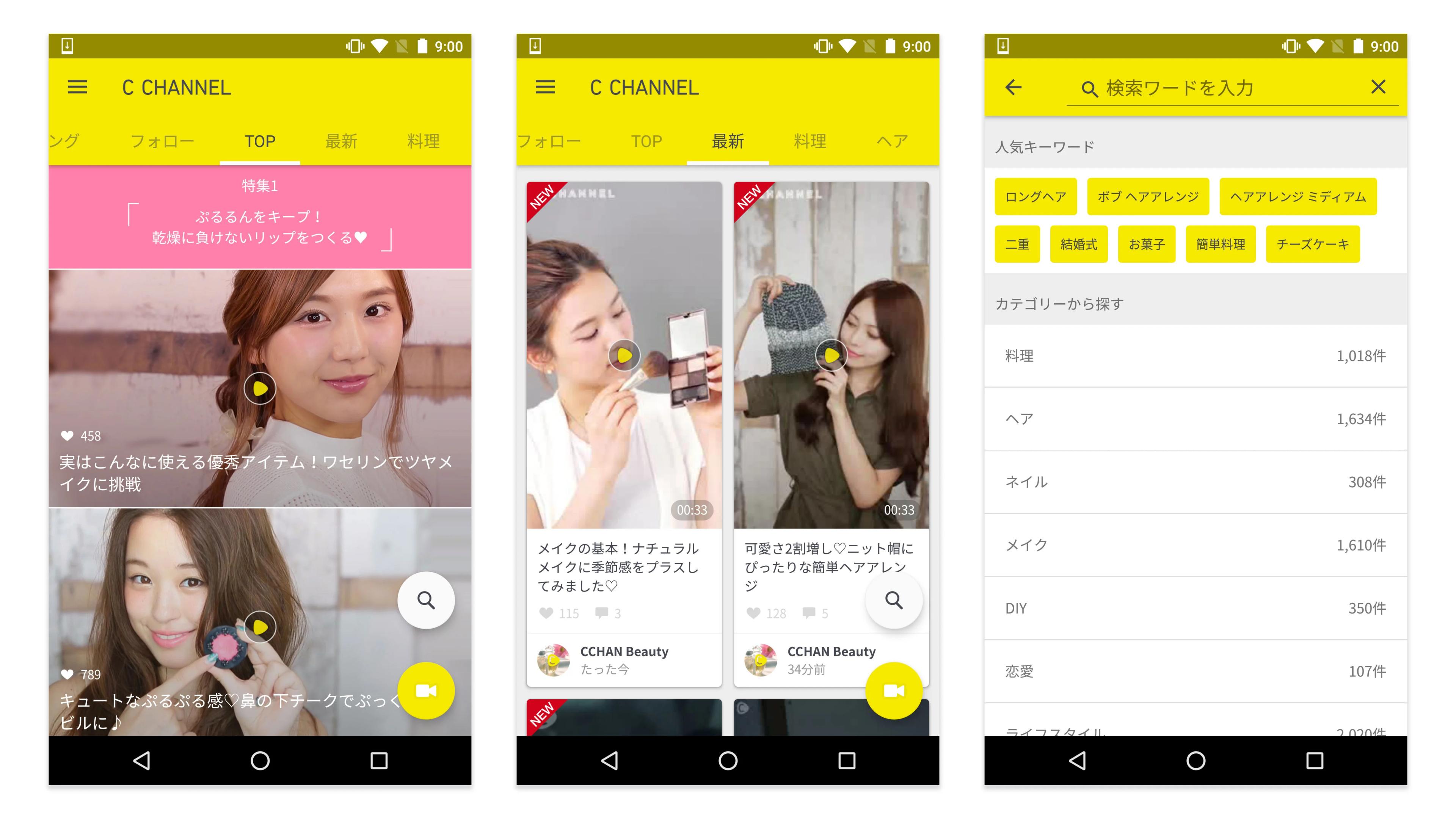
C Channel makes browsing a large collection of lifestyle advice videos simple, fluid, and engaging. With a swipe, users can scroll horizontally across the top nav or see additional videos in the category by scrolling down.
Creative Navigation: C Channel (available in Japanese, Thai) by C Channel Corporation
When it comes to designing an app’s navigation, more content usually means more problems. Search often becomes a primary mode of exploration, reducing the user’s exposure to items they might otherwise be interested in, if they’d only known they existed. The C Channel app neatly balances a blend of studio-created and user-submitted videos covering fashion, food, and more.
C Channel organizes content into a series of tabs that can be traversed easily with a simple swipe. This engaging, gestural journey through the product continues even when videos are playing, allowing users to advance seamlessly between clips with a vertical fling. The overall positive vibe of the app—there’s only a like button and no down voting—celebrates the ideas and trends within the community.
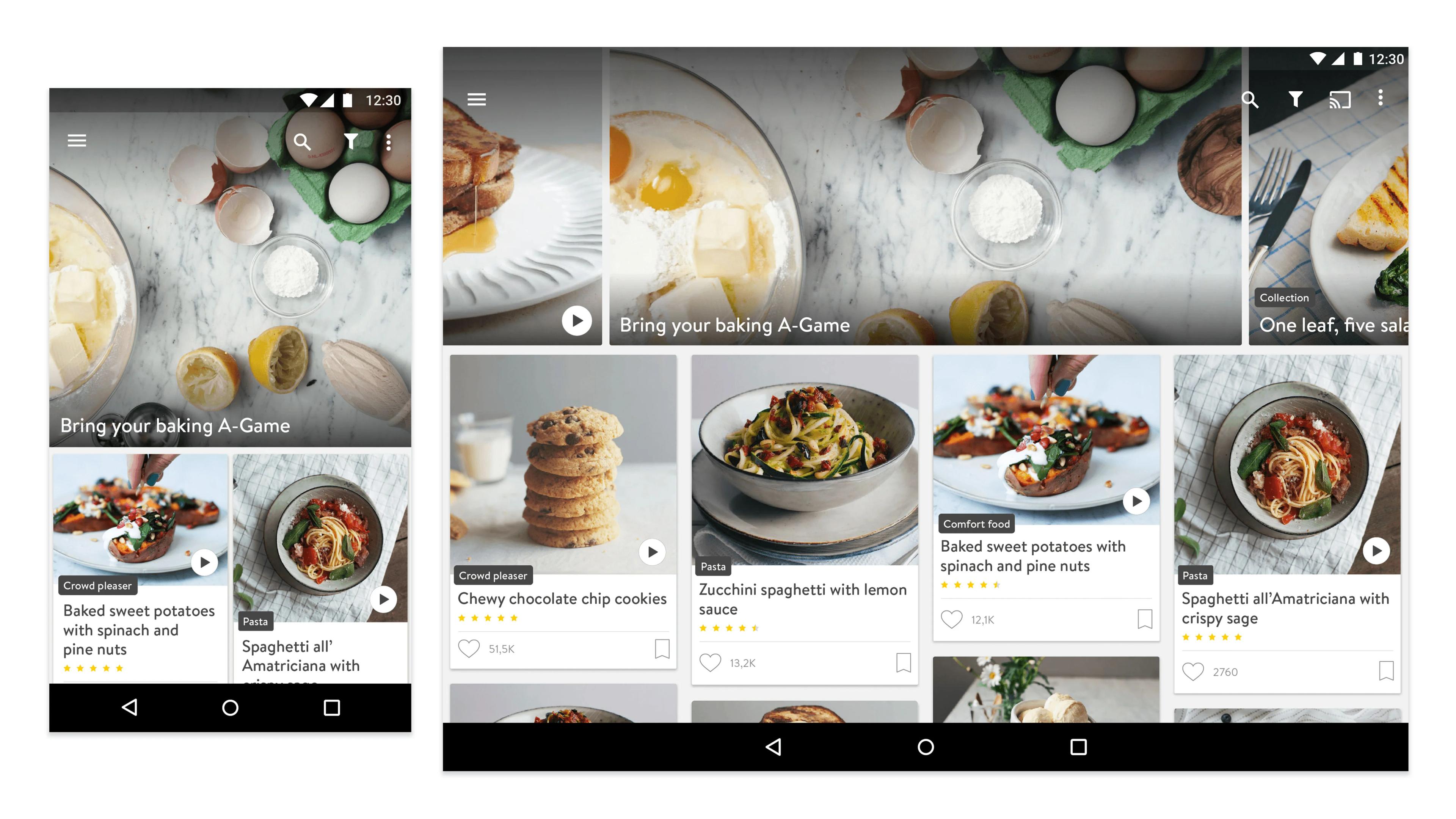
Kitchen Stories' recipe layouts work seamlessly across a variety of devices. The large and attractive photos entice the user to tap and learn a new recipe.
Expressive Layouts: Kitchen Stories by Kitchen Stories
Determining the layout of an experience isn’t a solitary decision—it’s the result of a series of small decisions, that combine to create a harmonious whole. When it works well, users may not even consciously notice it, but they certainly feel it when things go awry.
Kitchen Stories excels at creating effective, easy-to-scan layouts for recipes across a variety of screens and sizes. Home cooks will be happy to have their tablets in the kitchen: content is organized to minimize the number of times you’ll need to touch messy fingers to the screen. The attention to craft shines through at other moments in the app experience as well, from the precise positioning of type, to the playful use of the logo as a textural element on background surfaces.
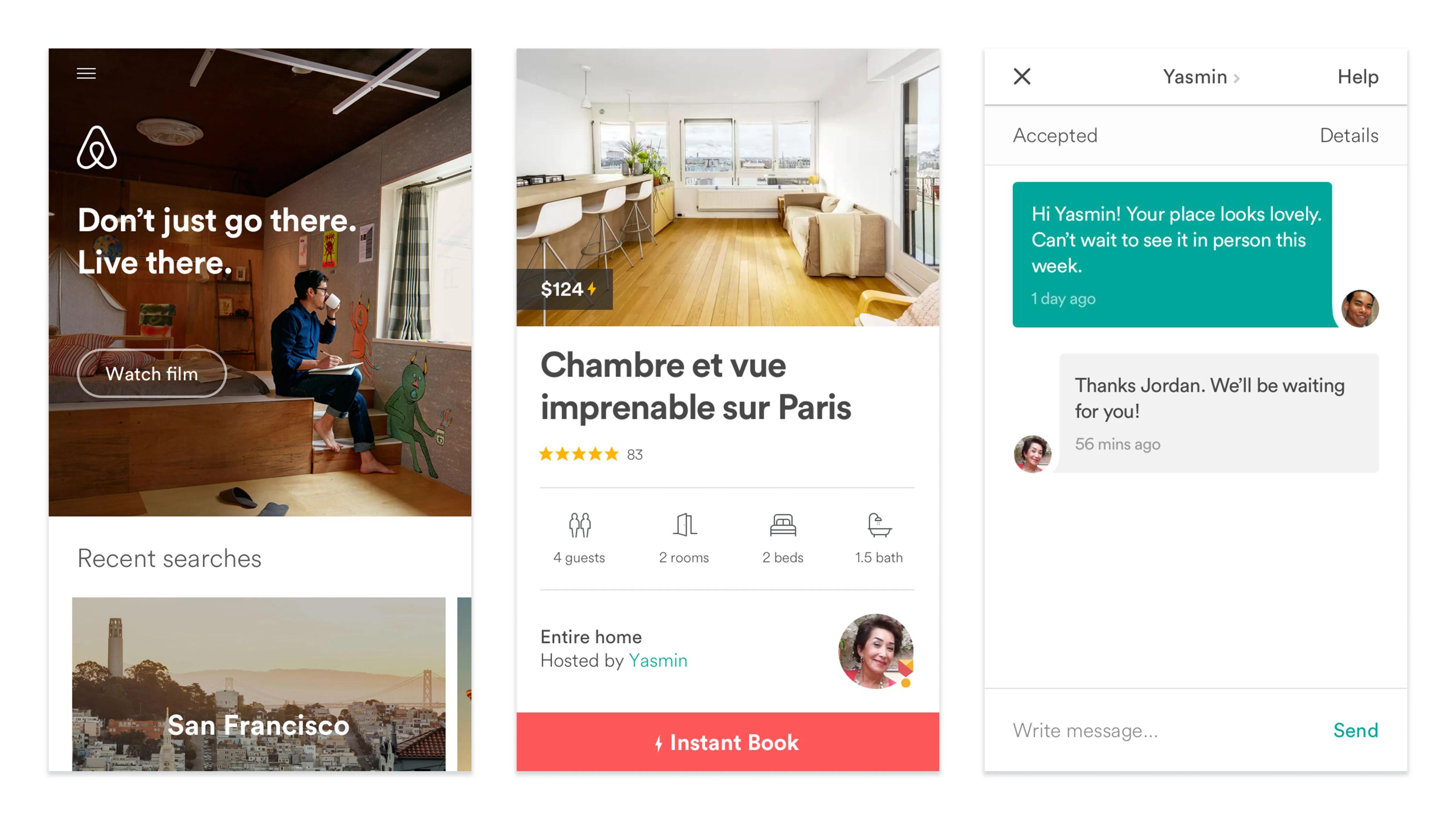
Airbnb’s comfortable design makes each step in the user’s journey—from choosing a location to finding a rental and communicating with their host—feel simple and obvious.
Focused Efficiency: Airbnb by Airbnb, Inc
One of Google’s Ten things we know to be true is “Fast is better than slow.” Airbnb clearly relates to this philosophy, and acts on it by showing respect for their users’ time. Essential tasks are satisfied through precise design, routing users clearly and briskly from sign in, to browsing, to booking a reservation. By neatly segmenting larger goals into smaller steps, Airbnb is able to sidestep the appearance of complexity, making the overall experience feel comfortable.
Happily, none of this efficiency comes at the cost of Airbnb’s visual appeal. Photography is a clear focus and communicates a sense of opportunity in each new destination. The considered typography and consistent but unobtrusive branding are equally successful for both the Android and iOS versions of the app.
Congratulations to all the honorees!