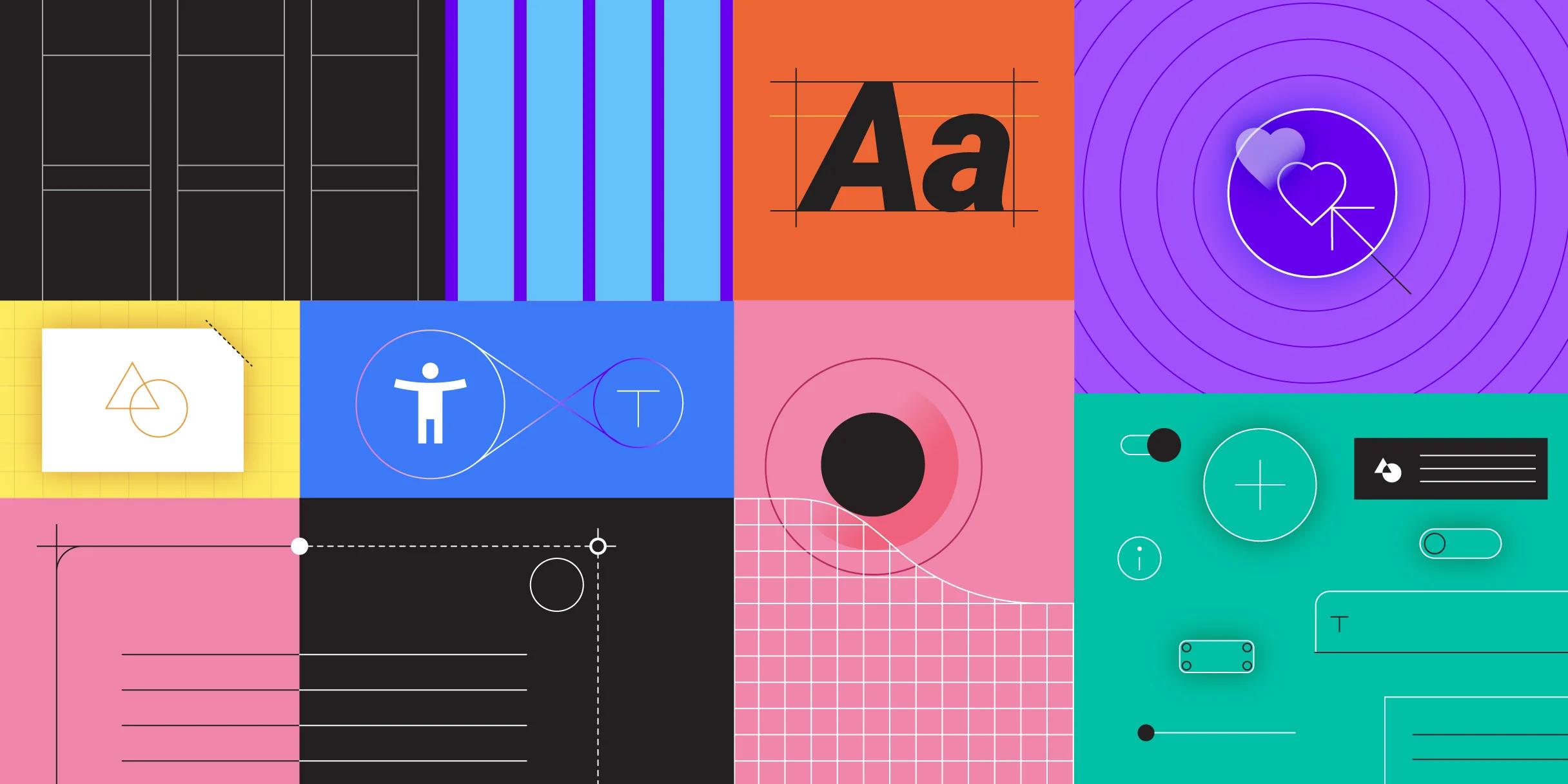
Making More with Material
Get to know Material Design’s new end-to-end features so you can design flexibly, develop across platforms, and customize more easily
Since its introduction in 2014, Material Design has grown beyond a shared set of principles, to become an adaptable, ever-expanding design system of guidelines, tools, and code used in millions of apps around the globe. But design is never done. For the last several years, the Material team has been hard at work on new solutions for the common challenges faced by designers and developers—everything from the frustrations of manual redlining to a wish for easier customization and more pre-built code. The latest update to Material offers enhanced and expanded design guidance, new tools geared toward solving the lags between design and development, and components that support customization, to help you build beautiful digital experiences even faster. Read on for a rundown of the most powerful new Material features and how they can help you and your team.
Make a bespoke-looking app in record time
Material Theming One of the most common frustrations faced by product teams is having to choose between building beautiful and building fast. But that’s where Material’s new killer feature comes in—Material Theming lets anyone systematically express their unique style across a product. When you make just a few decisions about color and typography, for example, it’s simple to apply the direction consistently throughout the environment. #MaterialTheming means that you and your team can use the same tried-and-true code for Material buttons, bottom sheets, and navigation patterns, but tailor and tweak it to fit your brand. Google’s already using a custom Material theme, and now anyone can create their own stylized flavor of Material.
Pro tip: Even if you’ve never heard of Crane, Shrine, or Reply, you’ll want to check out how these brands use Material Theming to address real-world design and product limitations.
Make collaborating easier for you and your team
Every team wants to work better together. These three new and enhanced Material tools were designed to streamline workflow and address common pain points across design and development.
Material Theme Editor It’s no secret that designers like to experiment with design choices. Sometimes you just don’t know how something is going to look until you try it, and then try it again (and ok, maybe one more time) in a different shade of blue or with even more white space. But making separate style adjustments to individual design elements can be tedious and inefficient. With the new Material Theme Editor, you can change one theme value, and it cascades throughout your design. It’s essentially a control panel that lets you apply global style changes to component color, typography, and shape. The editor also guides you through the process of making your own Material theme, with even more customizable systems in the works for release later this year. For now, Material Theme Editor integrates only with Sketch, and you can access it by downloading the Material Plugin. Watch how to get started making your own Material theme.
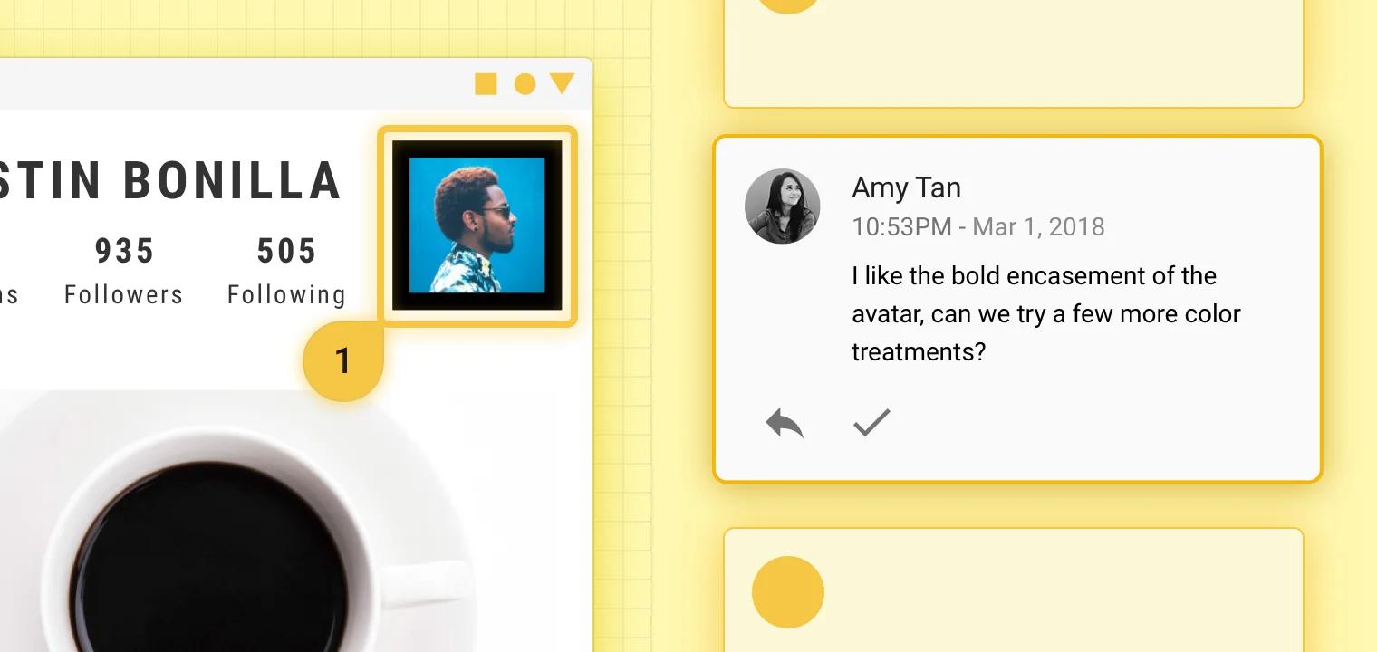
Gallery For anyone who’s ever named a file “FINAL_final_v2.png,” you know how annoyingly hard it is to track design changes and feedback. No more! Now anyone can use Material Gallery to review and comment on design iterations. This is the same tool that Google designers have used to collaborate for years, and now it’s open to all. Gallery isn’t only an intuitive platform for sharing designs—when it’s time to code, designs made with the Material Theme Editor (and uploaded to Gallery) display auto-generated redlines, and info on exactly which Material Component is in use, and how it’s been customized. So developers have an immediate resource for implementing pixel-perfect designs. Watch an intro to Gallery and all its new features.
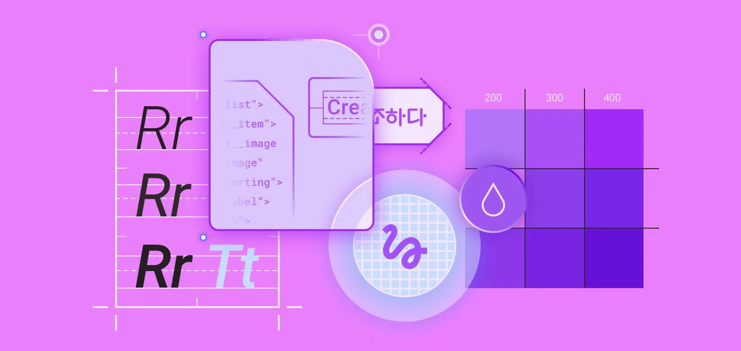
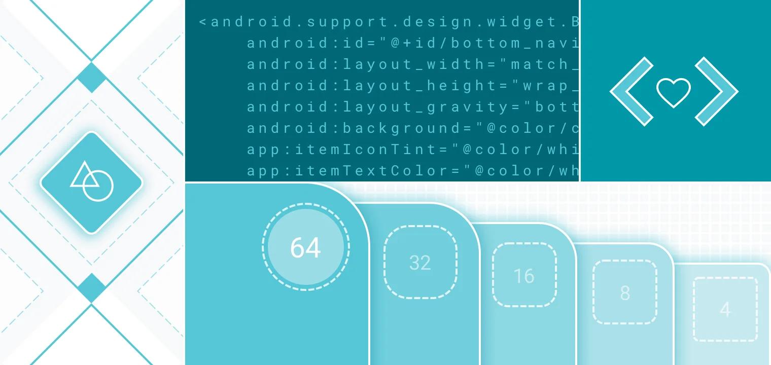
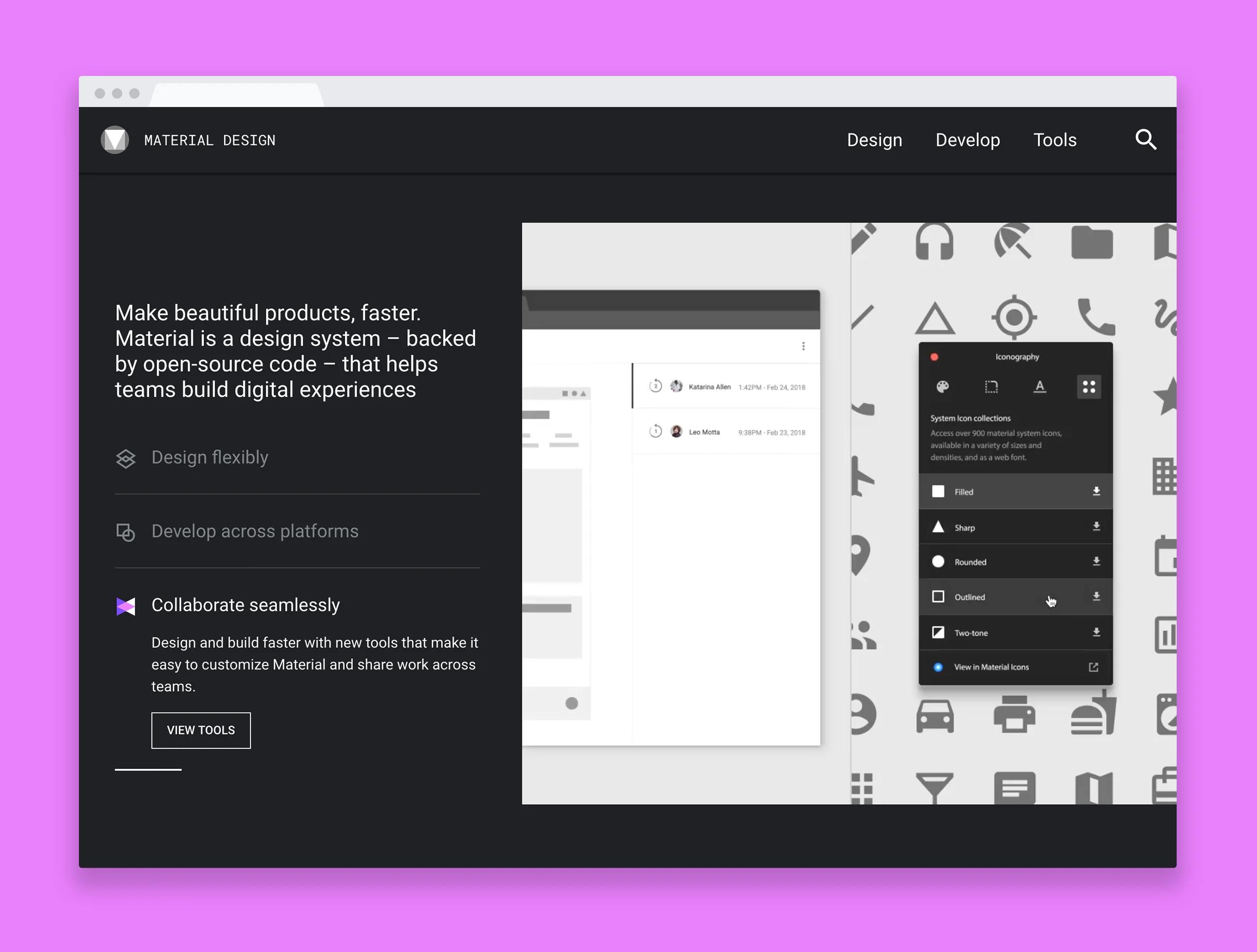
Material Icons Have you ever tried to customize hundreds of icons? Unique system icons can add polish and expression to a digital product, but painstakingly crafting each individual symbol is also a lot of work. From day one, Material's ready-to-download icons have been extremely popular with product teams looking for an elegant off-the-shelf solution. Now, even these tiny images pack a more expressive punch. Material Icons are available in five different themes, so you can choose from baseline, rounded, sharp, outlined, and two-tone styles.
Make great products with (even more) pre-built code
Material Components A common criticism of Material Design is that engineering support hasn't aways been strong enough—making it challenging to build products in line with Material guidance. With open-source Material Components, now you can customize key aspects of an app’s design, including color, shape, and type themes. These are the same components we use at Google to build our own apps. Even more Material Components and Material Theming options are on their way in 2018, but with the latest release, it’s easier than ever to implement Material on Android, iOS, Flutter, and the web.
Make Material yours (and bookmark Material.io for good measure)
Material.io To complement the breadth of this release, a redesigned Material.io puts resources for designers, developers, and product managers front and center. The new site has three main sections: Design, Develop, and Tools. The design section includes details on Material Theming, hundreds of new examples of Material in action (including Material partner studies and a deep-dive on the Google Material Theme), redlines and annotations, plus updated design guidance. Develop offers access to open-source components for Android, iOS, Flutter, and the web, as well as documentation on customizing Material. Tools is where you can find things like the Material Theme Editor, Gallery, and themed icon sets. Built-in tools are sprinkled throughout—see how quickly you can find the color palette generator, and a redline viewer for digging in to the design details—from padding measurements to typography sizes and hex values.
Material continues to evolve in order to solve more of the problems that product teams face—streamlining the designer-developer workflow, and ultimately making it easy for you to build beautiful, usable products fast. And of course, Material isn’t done yet. The system will continue to expand and roll out new features in the coming months, so stay tuned.