Clean and clear: making reading easier with Lexend
A key factor in reading problems might be hiding in plain sight. Learn how changing fonts can change comprehension.
A child struggles to read and understand their homework assignment. An adult re-reads a news article and still doesn’t understand what it’s about. Both readers end up frustrated and feeling like there is something wrong with them. Thankfully there might be a simple answer. Dr. Bonnie Shaver-Troup thinks fonts are part of the problem and the solution to many reading problems.
“We have a global reading crisis and we can change much of it by delivering fonts that are optimized for the visual field and for the individual. The answer is hidden in plain sight. It’s the font,” said Shaver-Troup.
Change the font, change the outcome
While working as an educational therapist in Silicon Valley, Shaver-Troup helped students with dyslexia and other reading problems to learn to read. She experimented by changing the spacing between certain letters in their reading assignments, and found that it improved their reading and comprehension. According to Shaver-Troup, the issue wasn’t in her students’ minds, it was with the letterforms they saw on the screen or paper.
“The majority of the reading problems, including dyslexia, are not cognitive or phonological. They are visual or perceptual. Our testing has a built-in design flaw. We use fonts to deliver text for reading that are too tight for efficient or successful visual processing. Then we get poor results, suggesting the reading issue is phonological or cognitive. If we change the font to the tested optimized font fit, then we change the outcome,” she explained
Clean and clear letters
Shaver-Troup’s upbringing led her to understand the importance of clarity and cleanliness. Since her mother was legally blind, Shaver-Troup knew that the house had to be clean and clear of any obstructions so that her mother could move around, without tripping or falling on shoes or toys in the hallways.
After experimenting with letter spacing in existing fonts, Shaver-Troup aimed to create her own. In 2004 she hired Linnea Lundquist, a type designer in San Francisco, to create the digital font Lexend.
Shaver-Troup knew that the letterforms had to be clear enough that readers wouldn't confuse one letter with another, such as the lowercase “i,” “l,” and “j.” It was also important for readers to understand not just individual letters, but also words. There had to be enough whitespace inside the letterforms and in between letters for smooth reading.

The oval dots above the "i" and "j" are distinct from the rectangular stem. The “l” is thicker than the lowercase “i.” To avoid confusion between the “i” and “l,” the "i" does not have a descender and the "j" has a hook on the descender.
To reduce the issues surrounding crowding and masking, Shaver-Troup created “hyper spacing” to add more white space.
"The biggest challenge is that when text is too tight, the letters are too close to one another and create crowding and masking problems. Crowding occurs when too many letters are too close to each other. Masking is when individual letters just seem to disappear. These are both perceptual phenomena and, for most people, these problems can be corrected by extra spacing," said Shaver-Troup.
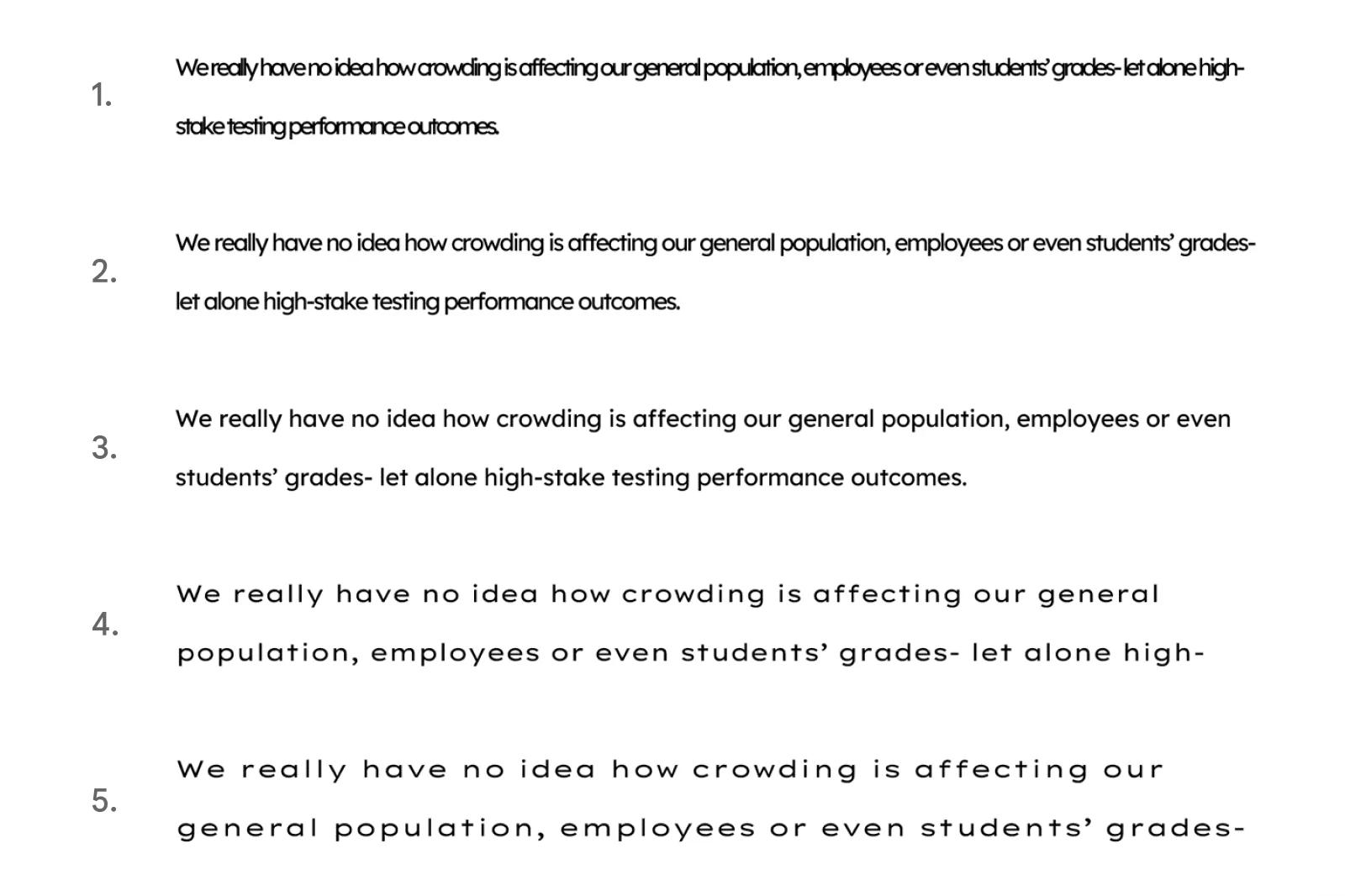
Different spacing can create and reduce crowding and masking. All five examples are in 14 pt. 1. Lexend Deca, character spacing condensed by 1.75 pt., 2. Lexend Deca, character spacing condensed by 1.0 pt., 3. Lexend Deca, normal spacing 4. Lexend Mega, normal spacing, 5. Lexend Zetta, normal spacing.
Path to publishing and distribution
Once the font was created in 2001, Shaver-Troup tested Lexend with students and found that it helped them improve their reading. She saw that it wasn’t just people with dyslexia or early reading problems who suffered from crowding and masking, but also those who were tired or ill, who didn’t identify as having reading problems.
While sharing her font and discoveries at Stanford and with various tech companies in Silicon Valley, she found support in the tech world. “The tech companies saw fonts as part of the future of tech. They were fascinated by the research,” Shaver-Troup explained.
In 2018, Google Fonts funded New York City-based type designer Thomas Jockin to digitize the latest Lexend version using the latest variable fonts technology, and to update some letterforms according to Shaver-Troup's insights into readability. Lexend is now available in seven families (Deca, Exa, Giga, Mega, Peta, Tera, Zetta).
In 2021, Font Bureau’s David Berlow, Santiago Orozco, and Héctor Gómez added nine weights from Thin to Black. Lexend Italic will be available Spring 2022 from Octavio Pardo. “Google publishing Lexend in August 2019 has really helped bring awareness and spread the message of [the importance of] making reading more accessible to a wider audience,” Shaver-Troup said.
Just like eyeglass prescriptions are different for each person, so is a reader’s font and type size preference. People sometimes change glasses depending on what they are doing (reading, working on a computer, or driving) or throughout the day as their eyes tire in the evening.
Shaver-Troup's research shows younger, struggling, and impaired readers perform better with Peta, Tera, and Zetta as they have the most spacing. Deca, Exa, and Giga have narrower spacing and are often a better fit for individuals who exhibit fewer reading issues, but might complain of tired eyes or eye strain—or even migraines or headaches—after extended periods of reading.
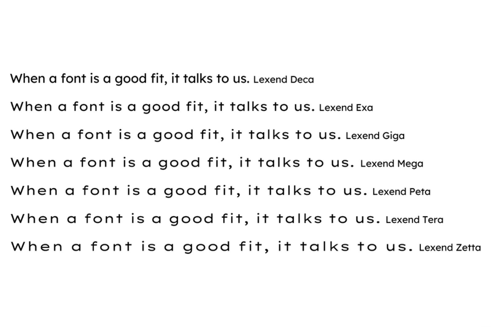
Spacing differences between Lexend Deca, Exa, Giga, Mega, Peta, Tera, and Zetta
As technology evolves, the variety of fonts available also increases. Offering Lexend on Google Fonts is part of the ongoing process of giving people more options to customize their reading experience.
With more and more people doing homework, reading books and news online, it’s important to find which type settings work best for each person. Try each of the Lexend fonts today and see which fits you best.
Lexend fonts are available on Google Fonts, in Google Docs and in Google Workspace. Watch this video to see how to add Lexend in Google Docs.
Dr. Bonnie Shaver-Troup is the creator of the Lexend project and is focused on making reading easier for everyone. She applied for a patent in 2003 for her type technology and did an EdD Education Leadership dissertation at Azusa Pacific University in California about font size and spacing-improved reading outcomes in second grade (elementary school) students. Learn more at lexend.com.
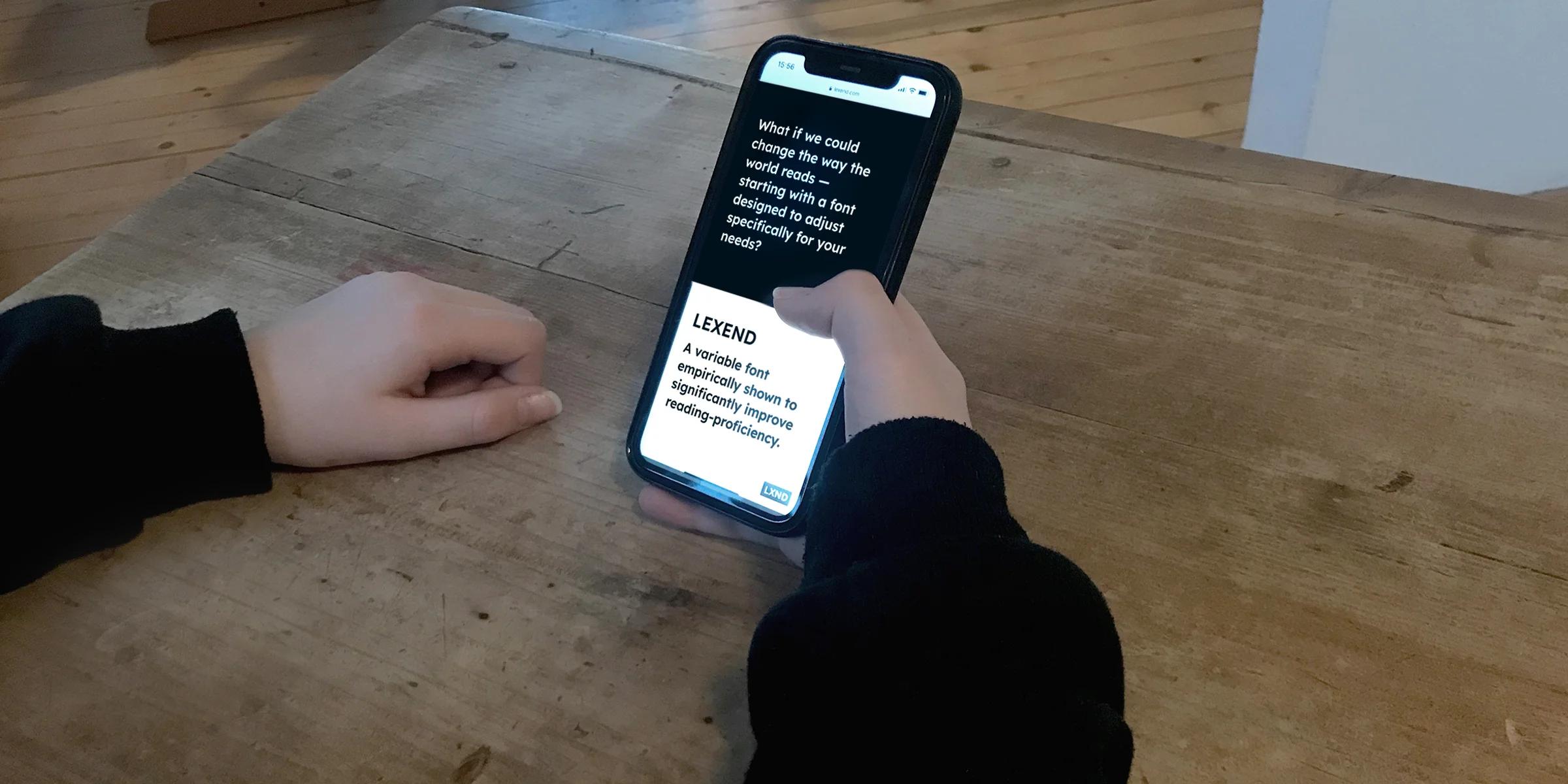
The hero image at the top of the article was made by Philipp Mühlebach.
Disclaimer: The opinions and claims contained in this article are presented for informational purposes only, and do not constitute agreement or endorsement on the part of Google or any of Google’s affiliated entities. The Google Fonts website offers a variety of fonts for users to choose from to fit their needs.