Get ready for a windfall of new axes, starting with Tilt Neon, Tilt Prism, and Tilt Warp
The most common axes used in variable fonts are Italic, Optical Size, Slant, Weight, and Width. And while you can sometimes get creative at the extremes of these axes, they’re more often used to finesse type. For example, with Weight, you don’t have to settle on what the type designer designated as the Bold style, you can tweak it to be a bit lighter or heavier so it’s perfect for you.
Variable fonts also open up many possibilities for creative expression! Google Fonts is adding a bunch of fonts to your palette with new axes to get your juices flowing.
First up are the Tilt fonts by Andy Clymer, Tilt Neon, Tilt Prism, and Tilt Warp
Initially sparked by the experience of seeing a neon sign from the side, Clymer was inspired to create fonts that allow the orientation of glyphs to be rotated horizontally and vertically. “With variable fonts, I thought it was kind of amazing how the physical form of a common sans-serif could inadvertently blend into something that looked like graffiti lettering,” says Clymer.
All three fonts are takes on dimensional storefront signage and are controlled by Rotation in X (HROT), and Rotation in Y (VROT) variable axes. The rotation is limited to ±45° so that the letterforms are always within a readable range.
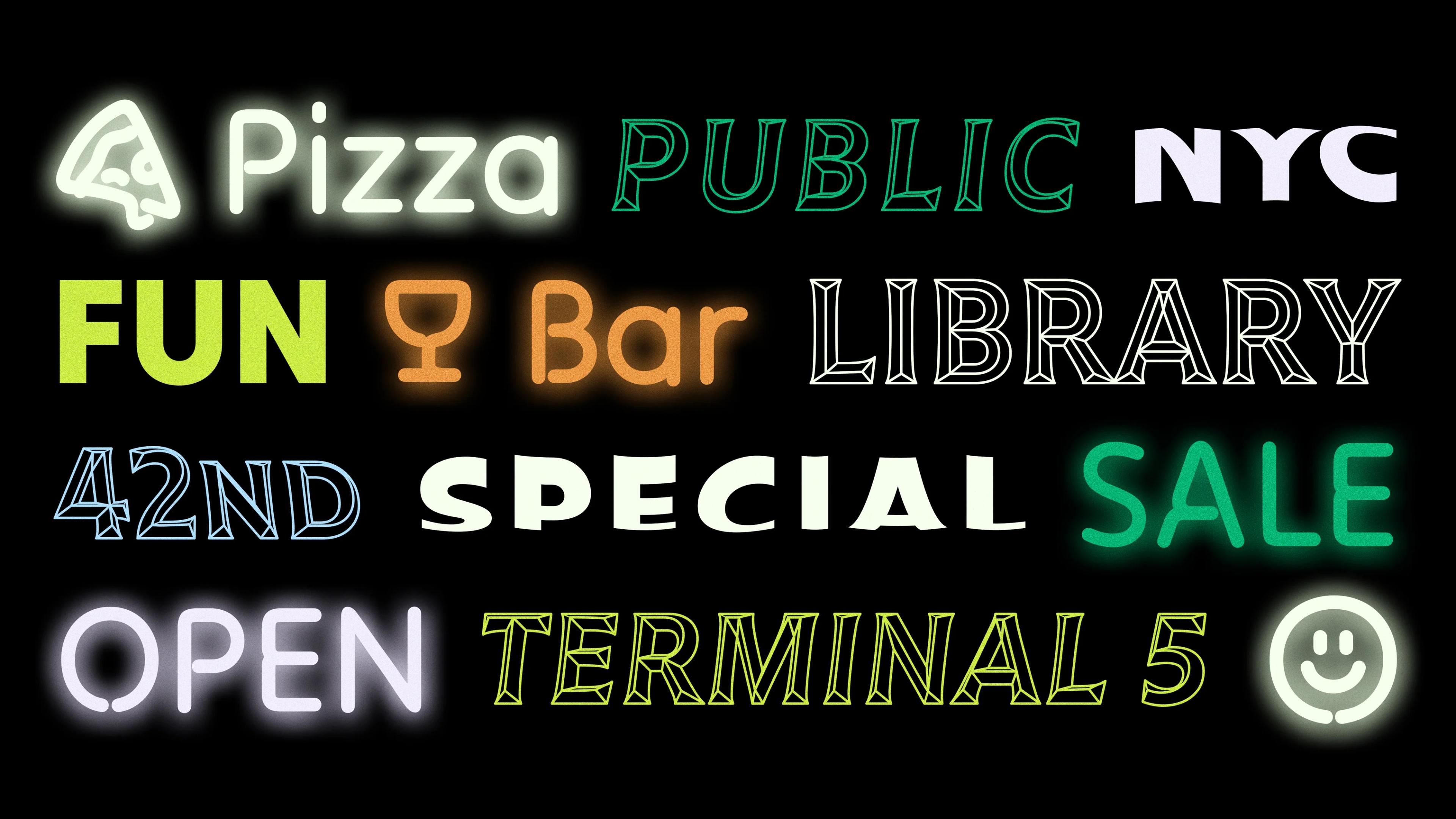
Tilt Neon
Tilt Neon references neon-lettered signs, of course. Specifically, think of the simple and ubiquitous type in the windows of mom n’ pop (small) businesses, like “Foot Rub,” “Pizza,” or—perhaps the most familiar of all, “Open.” The glyphs echo the shape of neon tubing and are constructed in the same way neon tube characters are formed: using as few “strokes” as possible.
The Neon font also contains a set of arrows and fun dingbats.
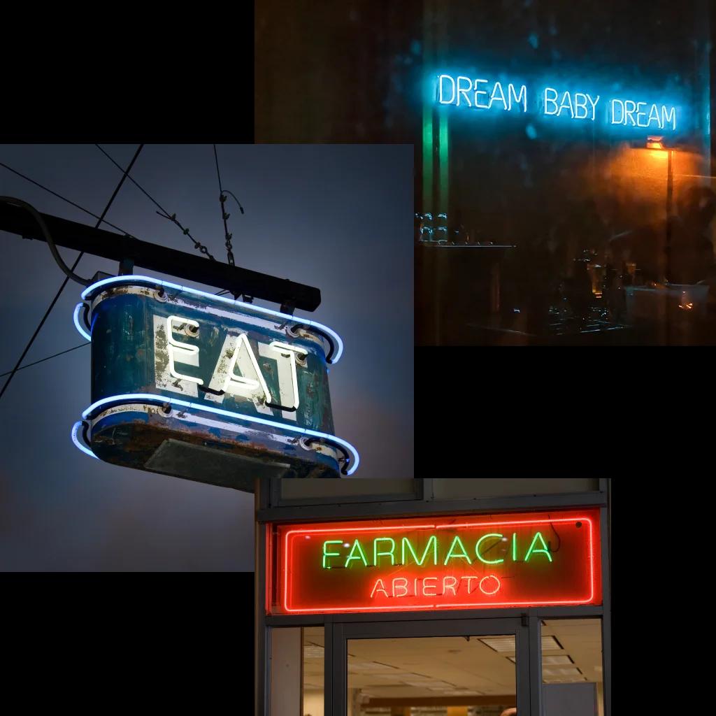
Neon signs
Tilt Prism
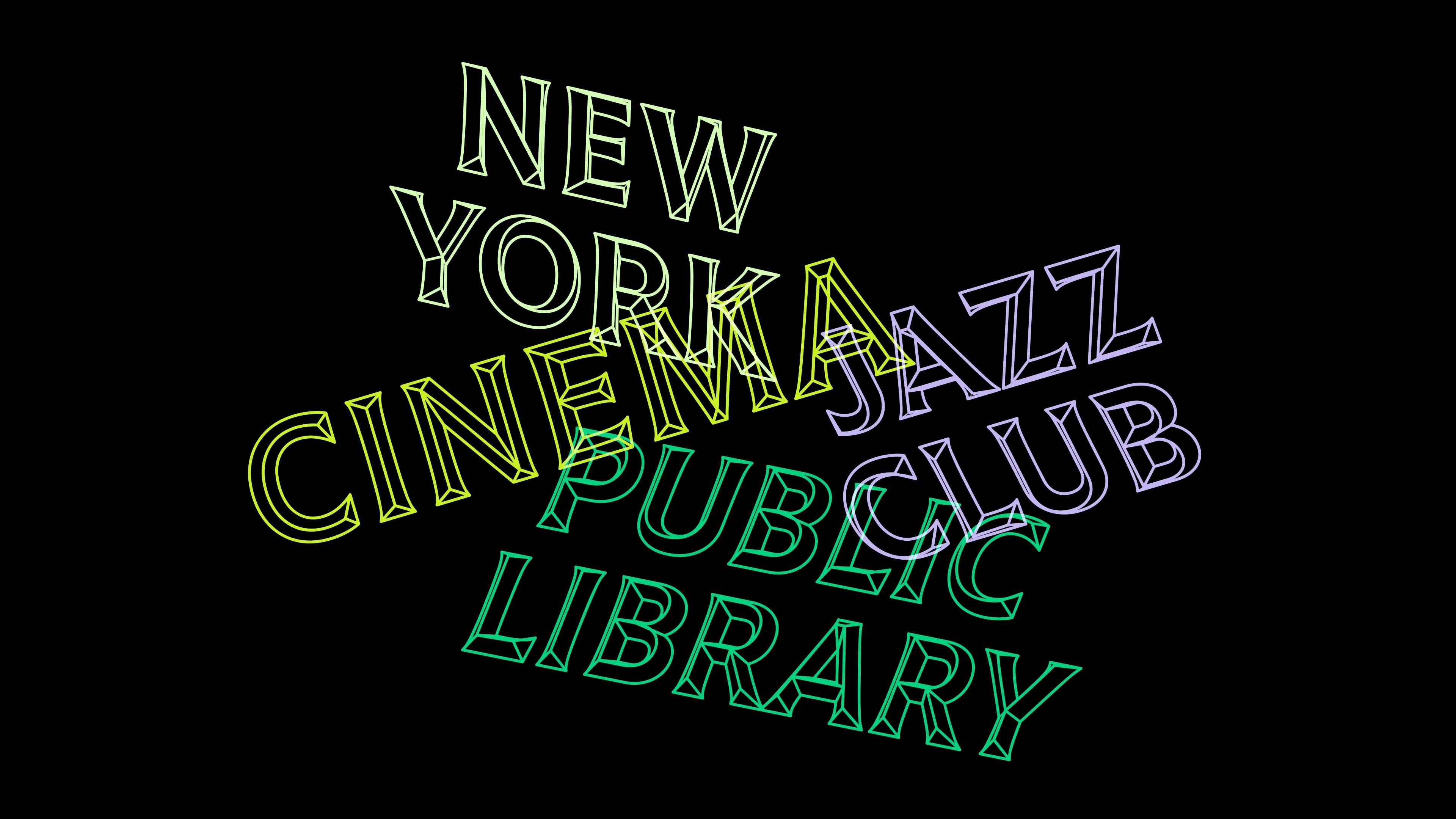
Tilt Prism
Tilt Prism is based on prismatic lettering signs—the kind that are cast in metal or or vacuum-formed in plastic. Imagine the changeable letters on a theater marquee, for example. This style has a 3-D effect even as a static font, but the rotation gives it even more visual perspective.
Prismatic signage can have an austere or grande appearance, especially when used in all-caps. But Clymer infused all three Tilt fonts with a hand-painted feel. “Sign-painters for generations have added a dimensional flair to their lettering by painting a simulated three-dimensional “prismatic” style on an otherwise flat storefront.”
Prismatic signs
Tilt Warp
Tilt Warp is Clymer’s interpretation of stick-on vinyl lettering. Imagine a “Pop-up Shop” sign stuck to the window of a temporary store. This type of signage begins its life in 2-D and inevitably peels over time. The typeface plays with this idea in its rotated forms. As you move along the axes, the type appears to peel away from you, as if the lettering was adhered to the inside of a window you’re peering into.
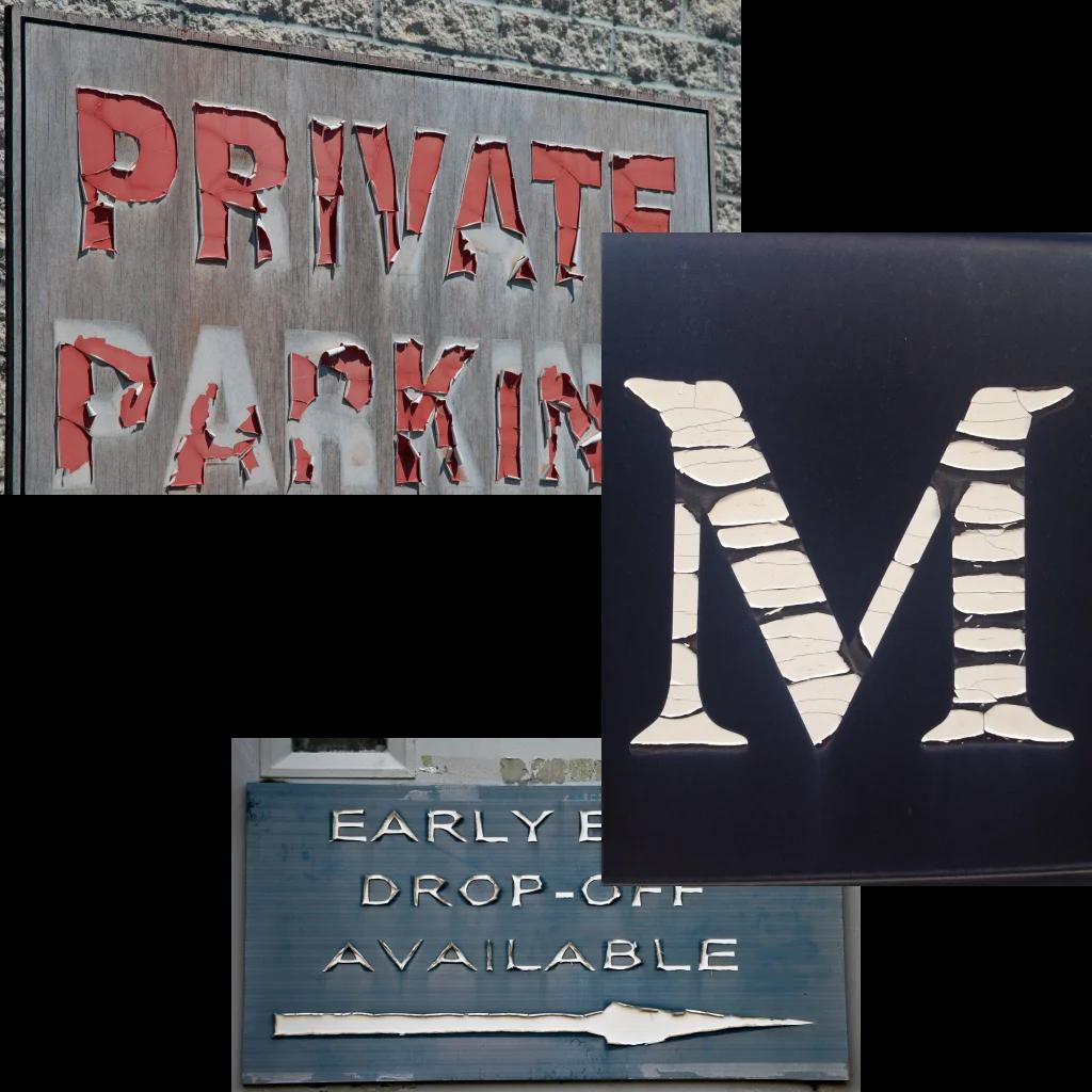
Peeling text
The Tilt fonts support 254 languages and are available in their variable and static forms from Google Fonts.
Try out the axes and download all three fonts on Google Fonts. Read the full story of its design on the specimen site.