Absolutely FAB
How the Floating Action Button became a Material Design icon
According to the Googlers who created it, Material is many things: a design system; a design language; a design philosophy; a meaningful structure under the glass of our many devices. The adaptable library of digital building blocks has grown and evolved since its introduction in 2014, but the enduring Floating Action Button—also known by its spirited acronym, FAB—in many ways still represents Material in its purest form.
“So much of Material Design was driven by the idea of making our UIs easier to navigate for users,” says Design Lead Bethany Fong, who worked on Material’s interaction design for smaller components: anything clickable or touchable that helped with a function on the screen.
The FAB performs the primary, or most common, action on a screen. It’s graphic and bold. It’s thoughtful and accessible. Here, five Googlers from the multi-disciplinary Material team share behind the scenes stories about how they imagined, then realized, this iconic component.
A system designed for simplicity
As the concept of Material started to emerge in October 2013, the team wrestled with difficult, fundamental questions about the system, and its relationship with users.
Matias Duarte, VP Design: Something we'd been struggling with was how many actions to present. How many actions are actually critical on any screen? Different phones were different sizes, and tablets could cram even more on screen.
Nicholas Jitkoff, collaborator: The whole exercise was reductive—trying to reduce the number of things in toolbars and simplify the system. Especially as we were taking on mobile, we needed to provide clear guidance so a user could understand the point of the product from the moment they saw it.
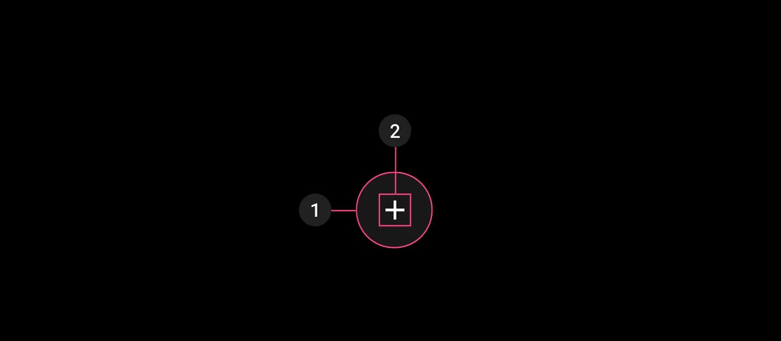
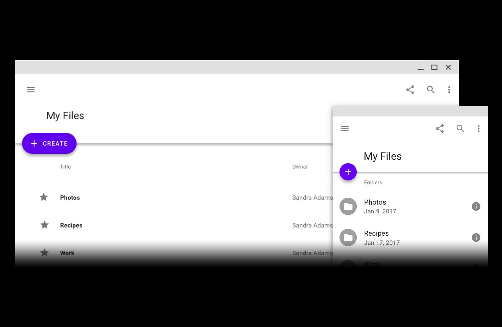
A regular FAB consisting of a (1) container and (2) icon
Matias: I remember at one point Rich saying: “We've come up with a really radical, unorthodox solution. We're not sure you're going to like it, but we think it's really, really strong. We decided we only need one primary action; everything else can be hidden.” And I thought: “That is crazy. This is fantastic. I love it. Let's do this. Let's go, really hard on this.”
Bethany, Design Lead: That thinking started to evolve towards the Floating Action Button—or FAB—which would be the most important action within an interface pulled out from the action bar. It could be a hallmark of the app, a hallmark of the brand, and very easy for the user to know they would always be doing the right thing.
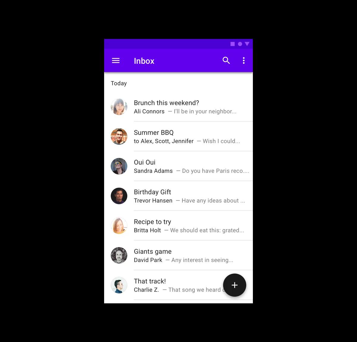
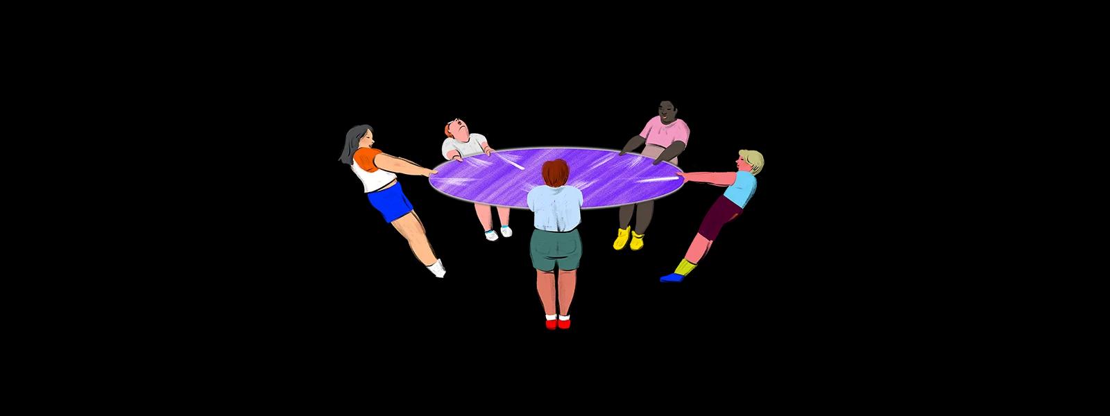
A FAB in its natural habitat
Critical collaborations
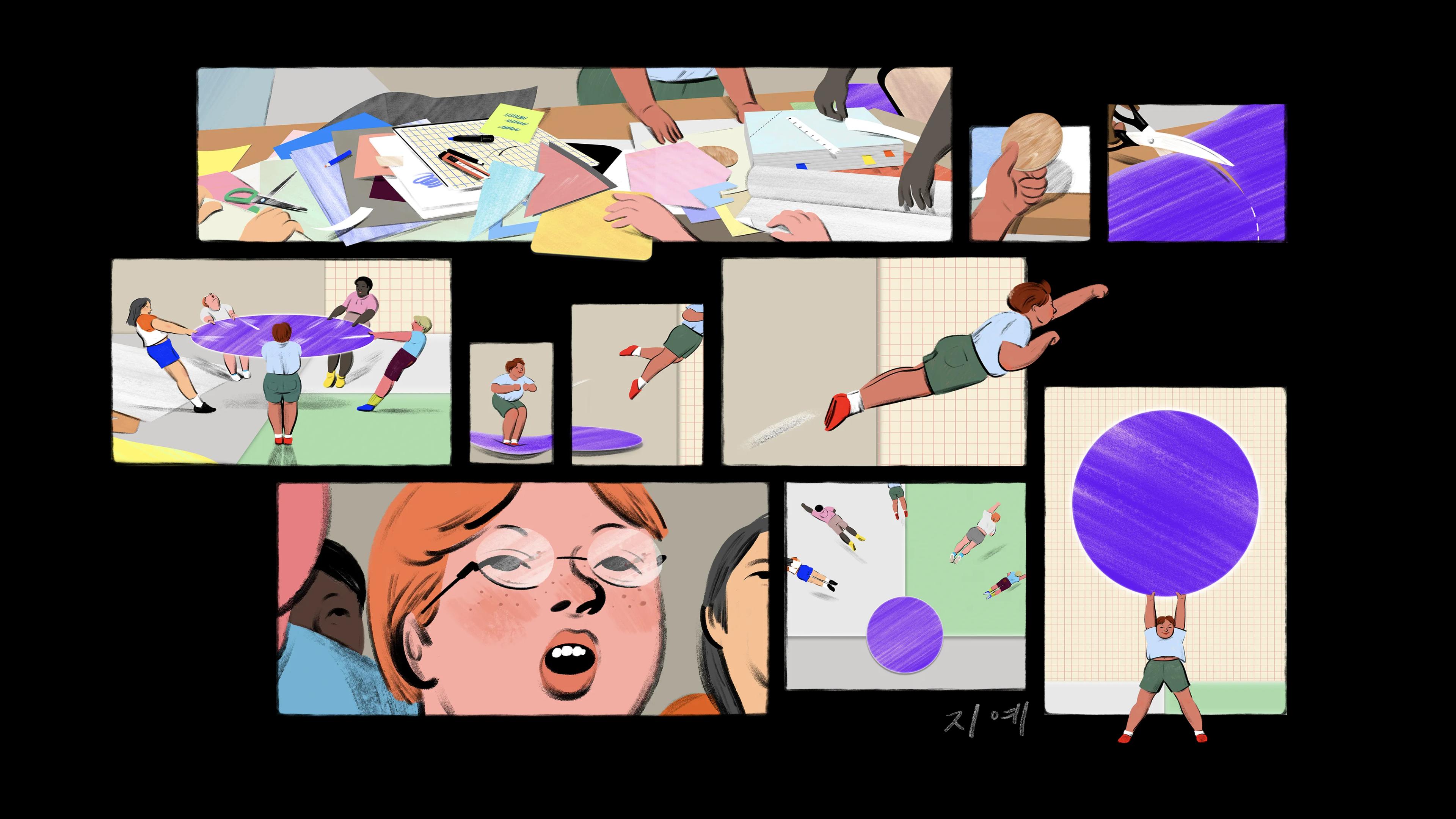
Team-wide critiques were held in person from late 2013 and into 2014—often weekly, at times almost daily—to get everyone on Material together in the same place at the same time for expansive, exhaustive problem solving. Using verbal feedback sessions and unconventional craft supplies, they began to establish the principles and tools, guidelines and best practices that would define this brand new system—including the nascent FAB.
Rich Fulcher, UX Director: Crits were critical. Early on the vibe was very much about going with what people were responding to: “We're liking this, this is registering, there's something here.”
Matias: Everybody felt like there was this possibility; anything could go and nothing was off the table. And everybody was really good about leaving their egos and preconceived constraints at the door—just approaching them with this real how-can-we-solve-it attitude.
Zach Gibson, Designer: We would print out these huge four-foot-wide by seven-feet-tall sheets every week for this central boardroom space where everyone would comment. No one was holding anything back, and I think that's why we were able to do the work that we did. Those reviews played a huge part in the velocity over the project.
Jonathan Lee, Designer: There were a few design levers that were specifically chosen to position the Material Design framework in distinctive contrast to other design frameworks. One was something in between skeuomorphic and flat, with shadows and an elevation system to help people understand where something is based in Z space. Another was the FAB.
The FAB takes shape
Once it was established that the FAB would be a functional focal point, the team began exploring how it might look, and fit into the system.
Matias: The idea of the singular action and its visual treatment happened at the same time. When we reduced it down to one button, we could make that one button a much bigger target.
Nicholas: There were variations with square FABs and a whole bunch of different shapes when we were first exploring it. Then taking it into this more visual form using brightness of color in order to draw attention to it and putting it in a place where it was physically accessible on a mobile phone. That was foundational for what the FAB would eventually be.
Matias: Making it circular separated it from the rest of the lists—which actually gave us more visual real estate to see the lists that were there.
Bethany: We already had all these beautiful grids, but one thing that was really missing aesthetically was a focal point within them. The FAB added this really restful striking place for the eye to go to along the layout. It lives very nicely on a seam between two pieces of paper and particularly nicely at the intersection of three seams, or a T seam. Because of that placement, it was natural that it would sit at the very top of the paper stack.
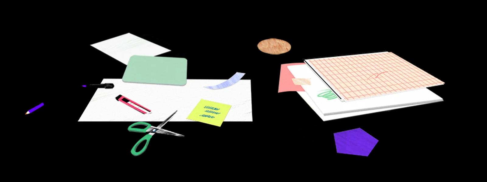
Rich: We used a little wooden disk from a craft shop to demonstrate the FAB in our first internal presentations, with an overhead projector and transparencies and little pieces of paper for different parts of the interface. We had to calculate exactly how many sheets would give the right depth and shadow.
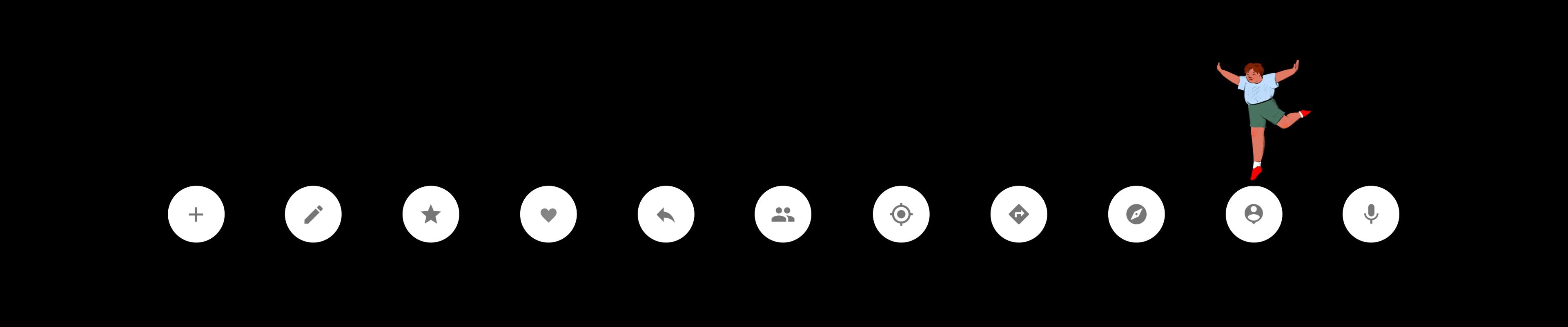
An extended FAB (left) and mini FAB (right)
An apt acronym
Eventually, this button needed a name.
Bethany: We played around with naming: Primary Button, Primary Action, Primary Action Button, Promoted Action.
Zach: We almost called it the orb, which would have been weird.
Rich: We knew it didn’t just have to just make sense to us; if we're really springing this on the rest of Google, we need to be able to tell the whole story in a concise way. So we wanted the name to evoke how this button was different from others, and how it related to everything else on the screen. We'd described its state as floating for a while, but the name only stuck when we started using the acronym: the FAB. We all liked the ring of that, and the team embraced it quickly.
Material meets the world
After nearly eight months of refinement, Material had its marquee moment in June 2014 with a public debut at Google I/O, Google's annual developer conference.
Rich: There were definitely moments where we moved from thinking “this is really important for Android” to “this is going to be big for all of Google.” And then suddenly it's: "You're going to be in the keynote at I/O.” To actually have ten minutes in a keynote to talk about our design system, where it came from, and what it meant for users was super exciting.
Bethany: I think it was a combination of the FAB plus the really nice motion design that we did around it that created the biggest splash. The FAB embodied our elevation system so well because it was a focal point, but it also cast the largest shadow because of the depth with relation to the user’s face. There's a lot of rationalization around it that seemed to resonate with both designers and developers, as well as users.
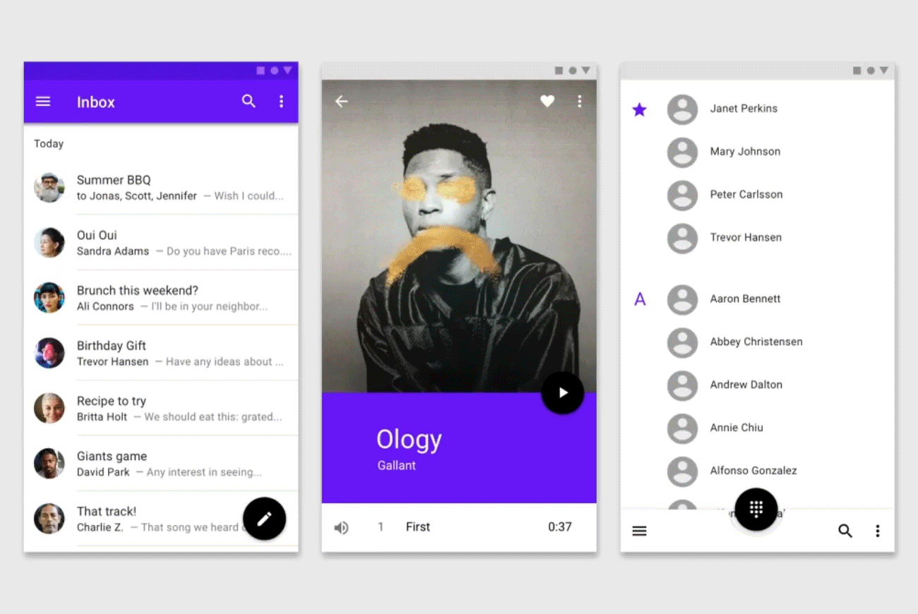
The FAB transforming into other surfaces in an app, such as (from left to right) a menu, a media player, and a dialpad
Future-proof design
Six years on, as Material adapts to support tech advancements and platform changes, the FAB remains as a clear icon of a system designed for timeless simplicity.
Bethany: There’s an ebb and flow to launching design systems. It’s not like a product that gets adopted right away, with AB tests to see if it works. You have to wait for it to actually trickle through the ecosystem, and then for people to use it and start giving feedback. It can be a really long cycle.
Matias: It was the right solution for the right problem at the right time. Having that single target that was so distinguished; it was a natural convergent evolution, and all of a sudden it was beautiful. The FAB broke the gestalt of the rest of the screen in so many different ways.
Jonathan: The FAB really helped Material Design become iconic.
Bethany: As UX designers, we are eternally at odds with poorly designed, confusing, overly complex interfaces that lead to our users feeling frustrated (at best) and making terrible mistakes (at worst). I think the FAB has endured because it's a statement of hope in software—an embodiment of a philosophy. It represents how we can give our users one action to do, one small step forward that gives them confidence in both the app and themselves. To align the FAB with a creative, generative act within an app feels deeply right to me, like we can counter all the easy destruction in this world with small acts of making. That's a lot to ascribe to a simple round button on screen, but I've had six years to think about it.