First Edition
A behind-the-scenes look at our SPAN 2015 reader
The idea
For this year’s SPAN design conference, we wanted to turn the typical conference giveaway into a thing of substance. So instead of more branded tees or tchotchkes, we decided to produce something that designers might actually want to keep (not just wear for the occasional workout) or put on their shelves (a tall order for picky decorators). But how do you package a conference about ideas and conversations? How do you channel the experience of learning about another person’s passions and process? Then it hit us: We could make a book.
You might be wondering, why make a book? Isn’t SPAN about design and technology? Aren’t they UX designers? Don’t they make software, and spend their time thinking about user flows, interactions, and multi-device layouts... Well, we do, but it turns out that much of our thinking about these systems begins with book design. In fact, Material Design is built around the principles of classic typography and grid systems—ideas that started with print design—and, of course, paper. If the proliferation and popularity of book fairs is any indication, it seems like the art of the book is alive and doing well—so we’re definitely not alone in our interest.
But beyond precedents and trends, our best reason for making a reader for SPAN, is that it provides a very natural way for us to continue the design conversation. So many of the speakers we invited to the conference have endlessly creative and critical ideas to bring to the design practice, and there’s no way to cover it all in a 40-minute presentation. By creating a reader, we get to capture the essence of this year’s conference, while also being additive. The videos, the connections, and now the book itself collectively offer an experience beyond what an individual attendee could possibly encounter.
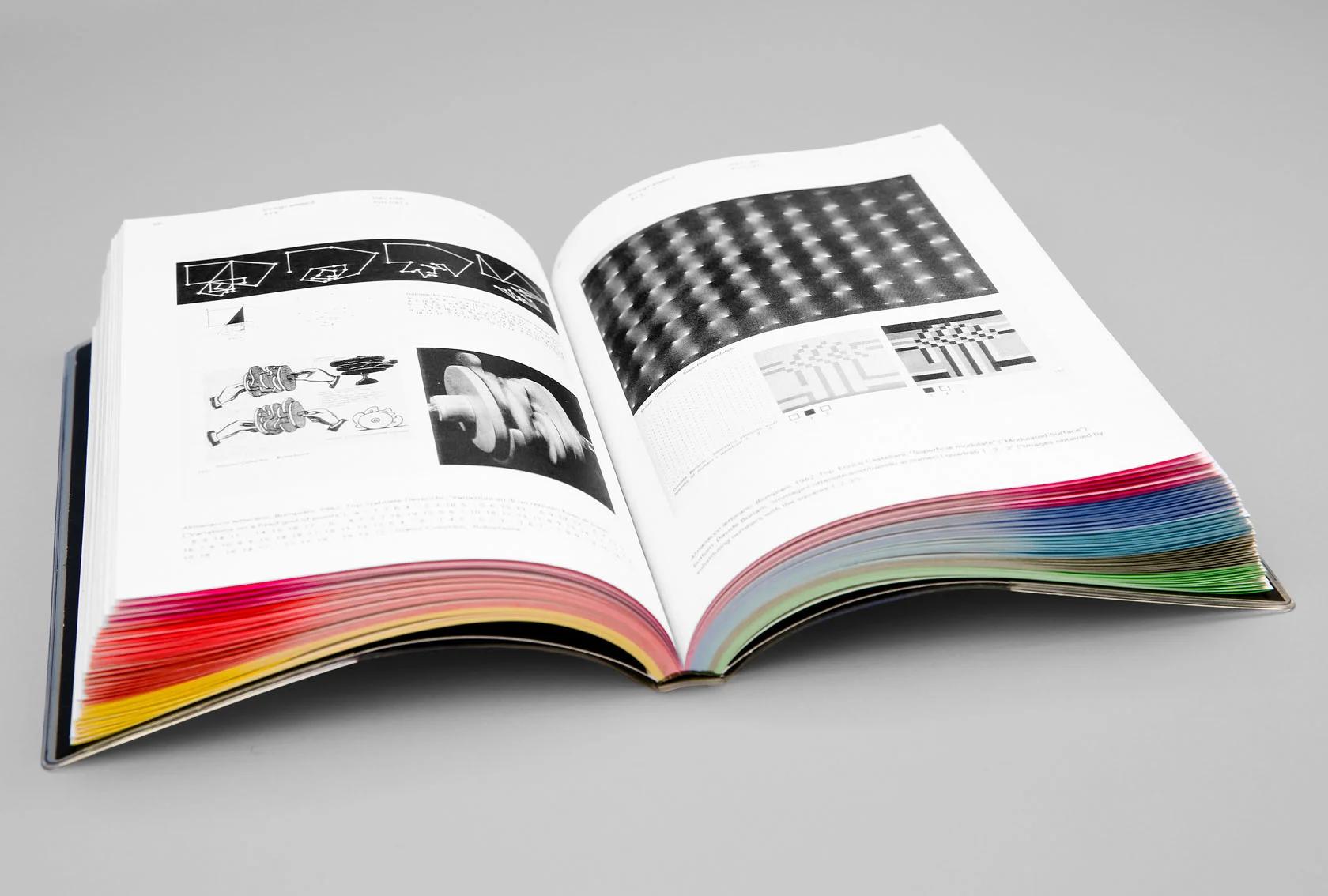
The book is printed entirely in black and white—except for vibrant bursts of gradated color on the inside of the book’s french-folded pages.
The edit
A lot of what motivated us to select our speakers was writing they had done or work they had shared in an earlier form. We culled this large body of previously published work, and added new commissions and designs, finding the right balance between long-form, short-form, visual, and conceptual submissions. Some pieces were adapted from their original formats to better fit the context of this book. Thousands of words were trimmed and reordered, and visual details were recontextualized. Luna Maurer’s Conditional Design exercises punctuate the book’s sections, offering playful and interactive moments apart from the more readerly texts. All this material was gathered, sequenced, and edited, and re-edited and again.
The artifact
Once the broad structural strokes were determined, and the nitty copy work commenced, we simultaneously began developing a design system for the book. We incorporated the visual language we’d started to develop for the SPAN conference, exclusively derived from our open-source system icons, and adapted that language for the cover and title pages throughout the book, giving each story an almost hieroglyphic introduction to the text. The more we used this system, the more we liked it, and our adaptations for the book began feeding back into the event graphics and communication collateral.
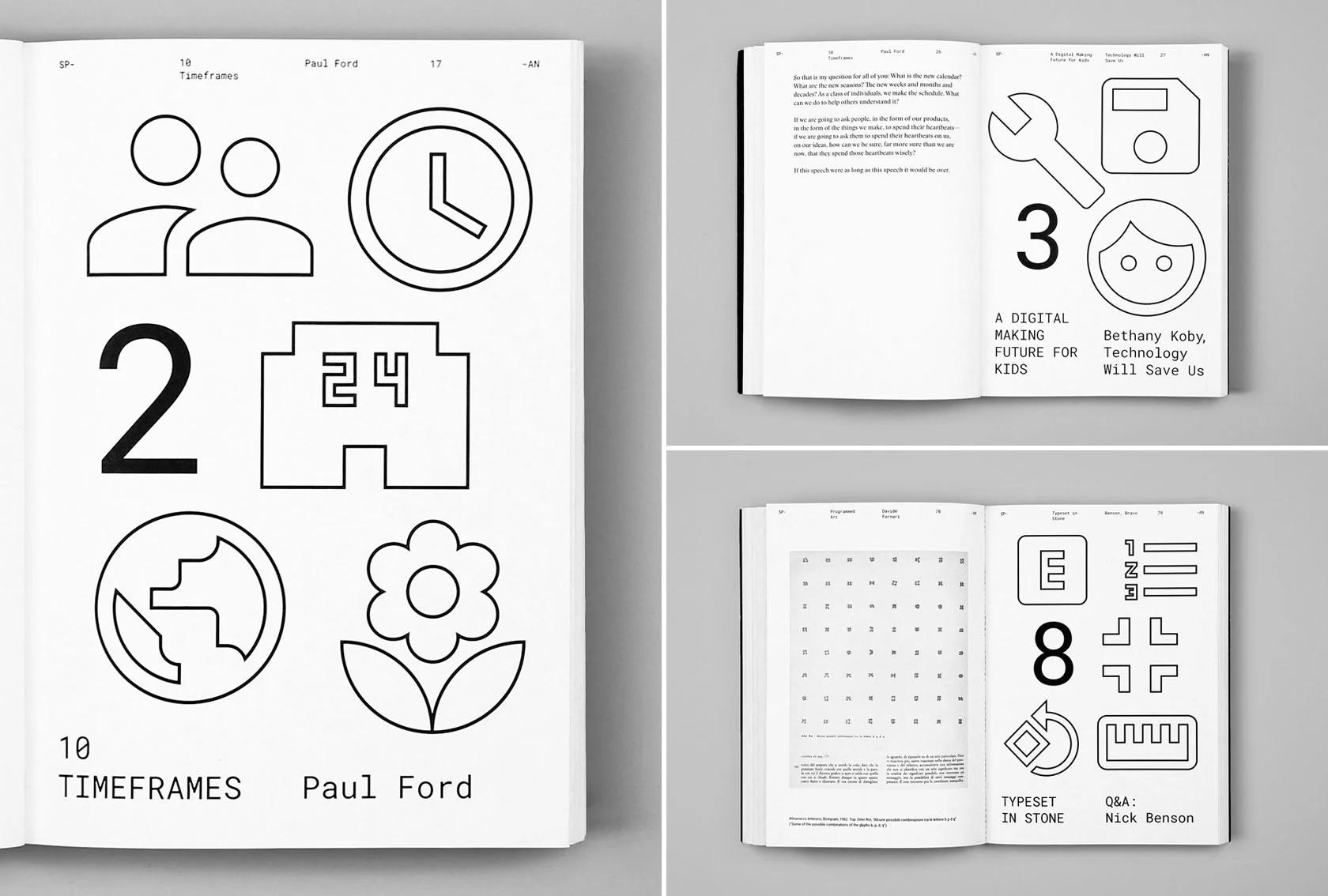
The icons used throughout the SPAN visual identity were all derived from our open-source system icons. We adapted this system on the cover and title pages of the book, giving each story a sort of isotypic introduction.
We then began determining some key design features. Echoing the Google Design website, Roboto and Roboto Mono do much of the work in the book. Roboto is used for shorter, more informal articles, while Roboto Mono is used for headlines as well as “metadata”—the headers at the top of each page, folios, etc. In addition to these, we chose to typeset longer articles in Stanley, designed by Ludovic Balland (Optimo Type Foundry). Named after Stanley Morison, designer of Times New Roman, it is based on that classic newspaper typeface for the Times of London. Balland’s update gives this classic a twist, making it look both familiar and distinctive—exactly what we were after. Unlike a typical book grid with pages reflected over the spine, we used a transposed grid, which is more like a stapled packet, or even a collection of webpages with a consistent header.
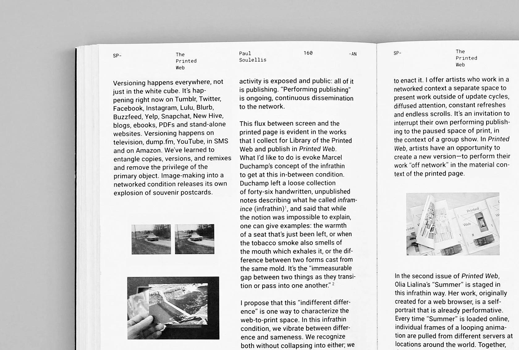
For shorter pieces, we used a two-column layout set in Roboto. The folio system that runs along the top throughout the book is set in Roboto Mono, and provides a consistent, visual anchor for the varied content.
For longer, more readerly texts, we used a single column layout set in Stanley, a serif typeface based on Stanley Morison’s Times New Roman.
Since this book is a companion piece to a real-life event, whose content will be shared online through video and photographs, we decided to print it entirely in black and white (even the photographs and graphic elements)—except for vibrant bursts of gradated color on the inside of the book’s french-folded pages, which appear at certain angles and show through the paper stock. French folds were our way of underscoring the physical construction of the book, showing the way it’s made from larger sheets of paper that are trimmed and folded into signatures, assembled, and bound. (All books are printed and assembled in some variation of this process—it’s just more common that the folded edges are trimmed off). By leaving the french folding in place, the “code” of the bookmaking process is revealed. These techniques and formal decisions helped to bring unity to the content, much like Material Design.
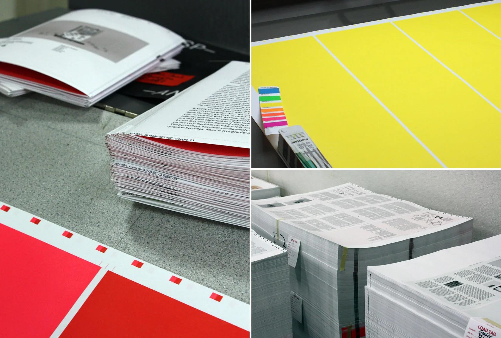
Behind-the-scenes images from the printing process at SHAPCO in Minneapolis, MN.
We chose a cold-glue process for the binding, which allows the book to be opened almost flat and paged through easily. The cover adds a final twist: a plastic sleeve blind embossed with system icons and reminiscent of pocket protectors, product manuals, and, of course, computer screens.
The adaptation
Most of these articles originally appeared in digital form; for those that appear in print for the first time, we’ve added digital versions to our Google Design publication on Medium so they are accessible to all. We look forward to adding more contributions from our SPAN collaborators in the months to come.
SPAN: Conversations About Design and Technology — Table of Contents
- Introduction
- Conditional Design 11 — Luna Maurer, Moniker
- 10 Timeframes 17 — Paul Ford
- A Digital Making Future for Kids — Bethany Koby, Technology Will Save Us
- Tooling Up — Amber Bravo, Paul Colton, Matias Duarte, Max Weisel
- WYSIWYG — Michael Rock
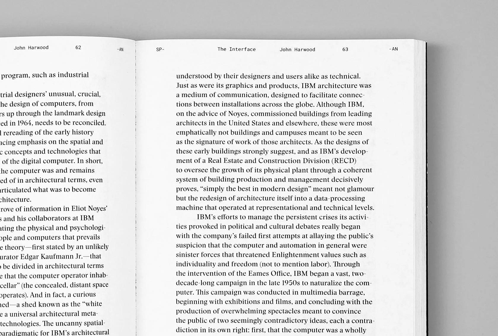
- The Interface — John Harwood
- Programmed Art — Davide Fornari
- Typeset in Stone — Q&A With Nick Benson
- Handmade Computers — Taeyoon Choi
- IIRS — Keller Easterling
- Land’s End — Ken Wong & ustwo
- Honeywell, I’m Home! — Justin McGuirk
- Various Projects, INC. — Various Projects
- Forensic Topology — Geoff Manaugh
- The Printed Web — Paul Soulellis