Expressing Brand in Material
A step-by-step guide to staying on brand while going Material
Material Design offers a system for designing functional and elegant software. How does your brand fit into the framework? We’ve created a step-by-step guide to staying on-brand while going Material.
Nobody knows your brand better than you do. This is why when we set out to create the framework for Material Design, we were sensitive to the ways in which third-party developers might leverage the system. We wanted material design to give comprehensive guidance for designing effective and elegant UIs—taking a strong position on motion, dimensionality, color, and graphic hierarchy—but with enough latitude to allow for various levels of engagement. You don’t have to adopt every element of the material design system in order for it to be beneficial to your identity system.
Whether it’s a custom font, a unique color story, or distinct voice, everything that provides stylistic distinction in a product should be celebrated and supported in the material design framework. We’ve laid out the top brand touchpoints to help illustrate the system’s flexibility and give designers and developers a road map for showcasing their brand identity.
Brand personas
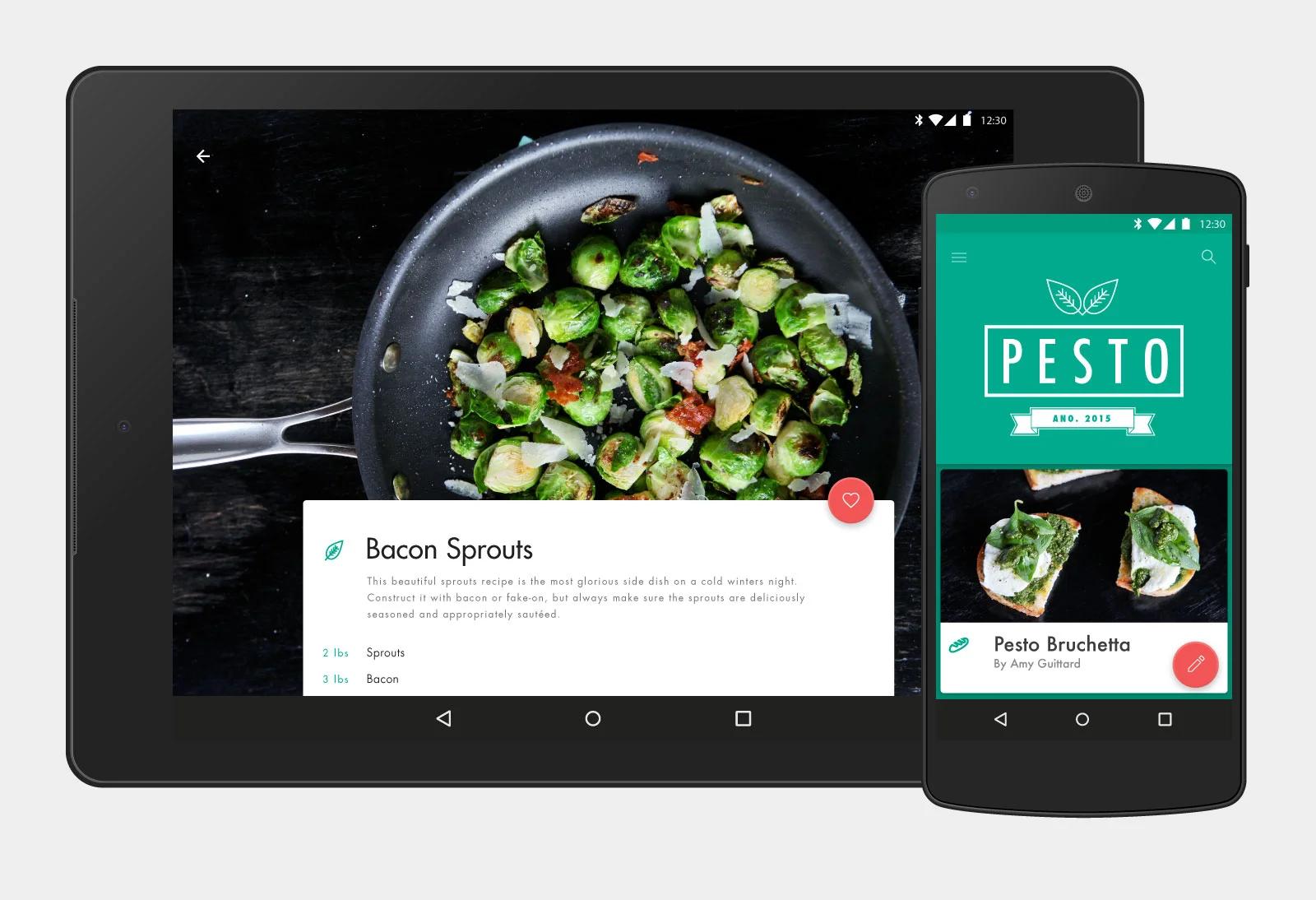
Pesto: A contemporary cooking app that helps you discover, share, and store recipes. It appeals to a younger, design-savvy set. The UI is designed to evoke the experience of flipping through a beautiful cookbook. Material Design focus: iconography, imagery, color
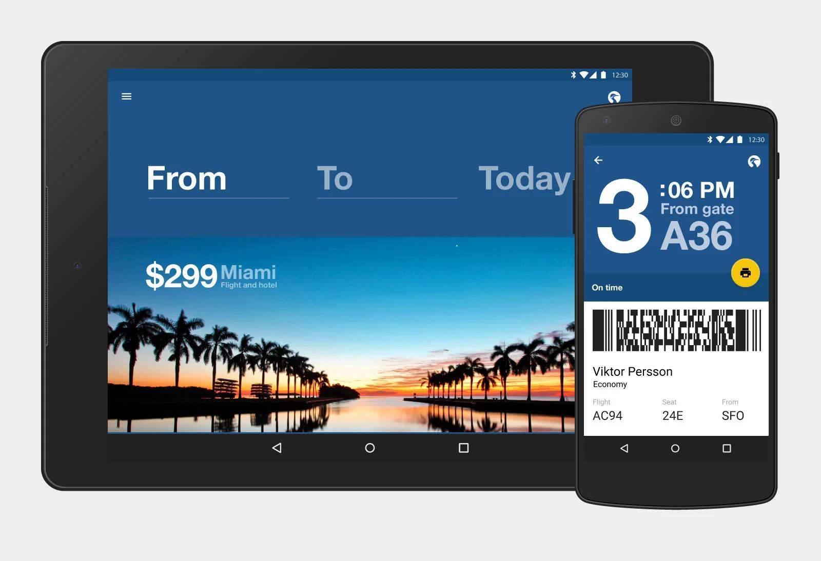
Crane Air: An app for a fuss-free corporate airline that caters to the frequent flier. Material Design focus: typography
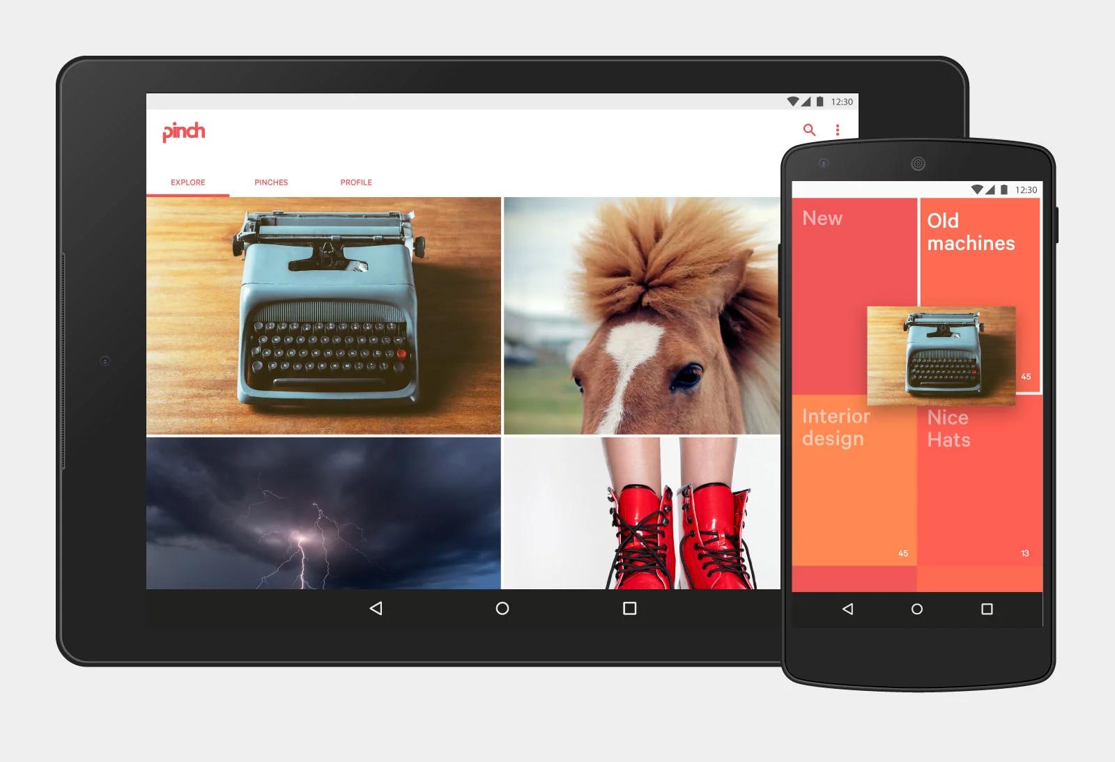
Pinch: A imagery app geared towards saving and exploring inspirational imagery and projects by “pinching” them into personalized buckets. Material Design focus: motion
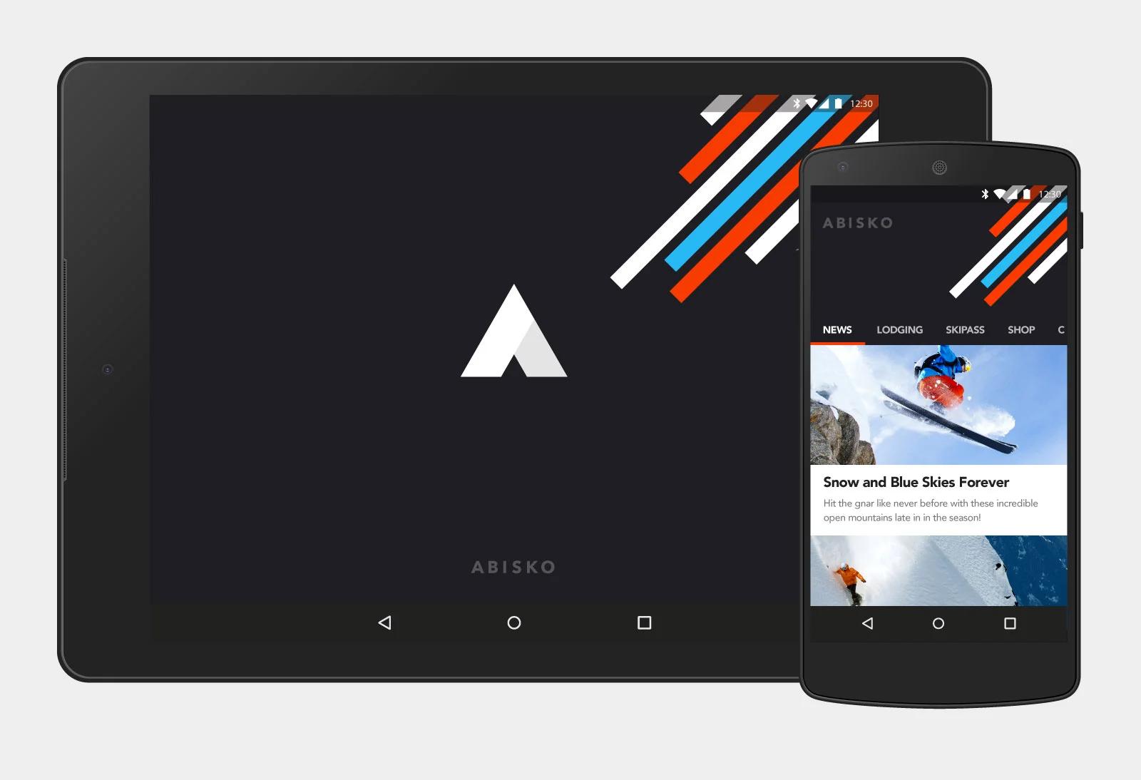
Abisko: A ski resort app that allows you to check conditions, purchase lift tickets, and book lodging, back-country, and heli excursions. The aesthetic is bold and graphic and geared toward an extreme sports and street/skate/snowboard enthusiast. Material Design focus: iconography, imagery, color
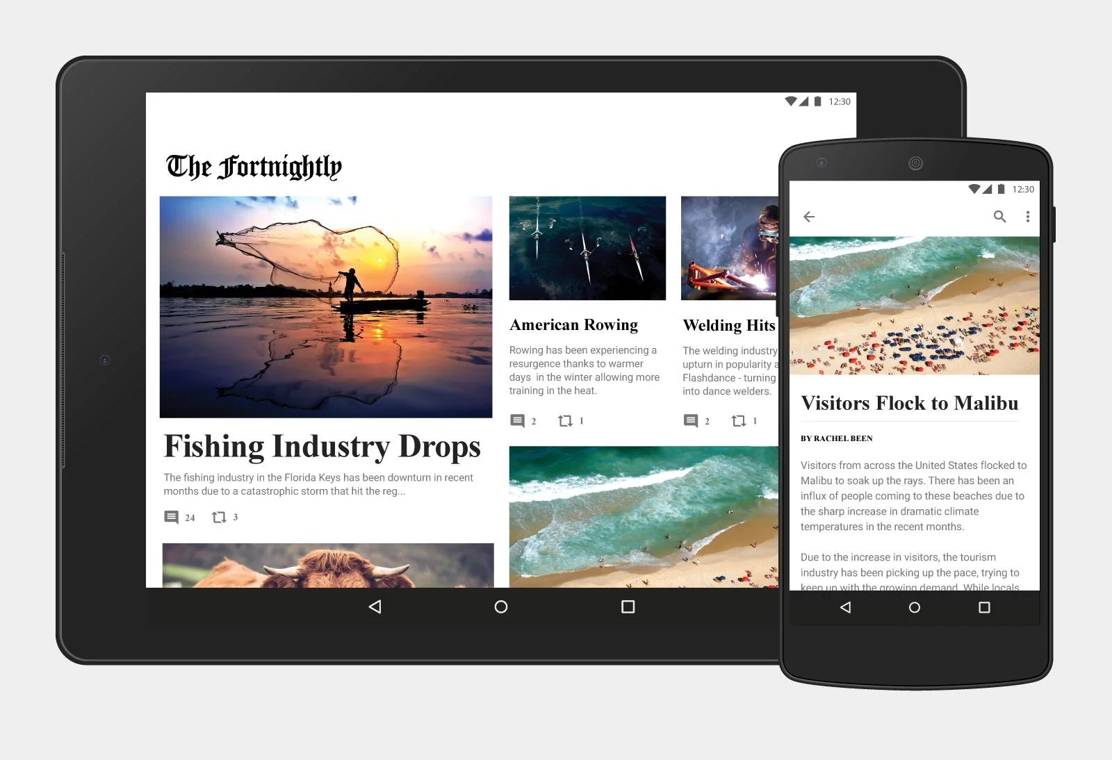
The Fortnightly: A news app that focuses on to-the-minute news and trending topics. Classic, newspaper aesthetic. Material Design focus: typography, color
Make your mark
Your logo may be the single most important graphic decision you make when developing your brand identity. It’s important to use it well. It shouldn’t dominate the UI or muddle the user’s interaction patterns. As a hallmark for your brand, the logo is best used in launcher sequences, splash screens, and briefly in app bar applications. It is a high-level touchpoint and should be treated as such in the design hierarchy.
Abisko uses the logo on a splash screen to create a visual entry point for your app. It sets the tone for the rest of the experience. Shrine incorporates the logo in the side nav, which brings the branding into the top-level navigation without it dominating the product experience. Pesto uses transition states to display its logo. It’s bold on the page load but becomes less prominent as the user begins interacting with the content.
Takeaways
-
Logos should be established in high-level UI elements.
-
Logos shouldn’t interfere with the user’s interaction patterns, e.g. a logo should never be on the FAB.
-
Logos or graphics as extensions of the mark are great for brief elements in the UI.
-
Logos can change states to be more adaptable to the experience, e.g. shrinking from the full logo mark to a bug.
Play to type
Roboto is the default Android system typeface but it is by no means the only typeface that works in Material. We believe that the best typeface is one that says something about your brand. Typography reinforces character. However, a great typeface applied carelessly across the UI will not be able to do its job well, which is why the material guidance around typography builds on the tradition of print design and focuses heavily on application—best practices for hierarchy, baseline grid, opacity, and scale.
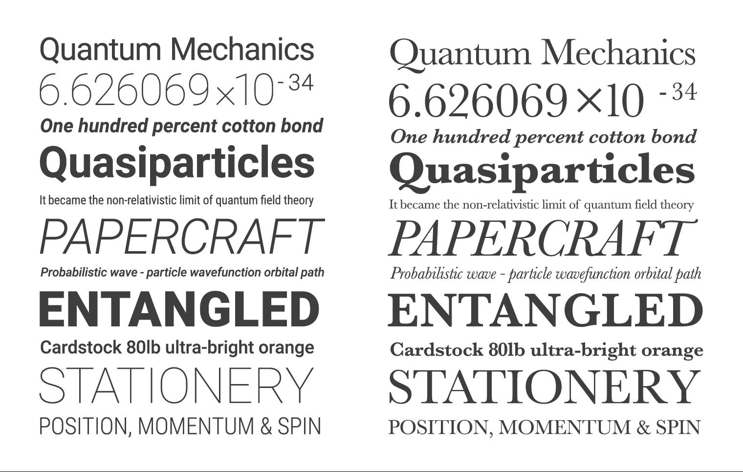
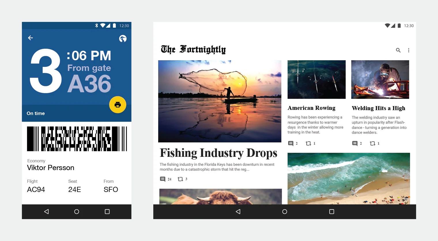
Crane Air uses strong typographic hierarchies to display key information, like in this boarding pass, which uses a large display font and bold typography. The baseline grid and scale recommendations within material design still apply, regardless of the typeface. The Fortnightly, for example, uses two typefaces within its brand to serve as a headline style and body copy.
Takeaways
-
You can use any typeface in the Material Design system.
-
Establish a rational typography system for your brand and stick to it.
-
Play with scale and hierarchy to best suit your brand’s needs.
-
Follow the Material Design guidelines for baseline grids.
-
See typography in the Material Design guidelines.
Color correct
Color is one of the most important elements of your brand identity. Just think of the blue in Facebook or the black and white theme in UBER. If you’ve developed a strong color story for your brand, stick with it. There is nothing more disorienting to a user then suddenly feeling like he or she has entered a different product space in the UI. Material Design provides a simple, smart approach to building harmonious color stories, regardless of whether you use the palette or apply your own color story to the system. The key is the way in which color is applied to the UI.
The Material Design palette, for example, starts with the primary 500s and scales from light to dark, offering a variety of carefully chosen values. The 500s are perfect for describing the dominant theme for your brand and are great for large areas of color, like backgrounds and status bars. From there, you can choose a supporting value, scaling up to a 700 for system bars, for example, or down to a 300 for secondary information. Accent colors are brighter and more saturated. They encourage user interaction by popping off the screen and contrasting with the rest of the palette. They are perfect for fabs, buttons, switches, and sliders.
You can easily use this system with your own brand color, scaling different elements in the UI to be darker and lighter based on their importance and use. Choosing a nice contrasting accent color for primary call-to-action elements in the UI, like FABs. For content-rich brands that surface a lot of color through imagery or use color extraction, consider using a more neutral or subtle color theme within your UI.
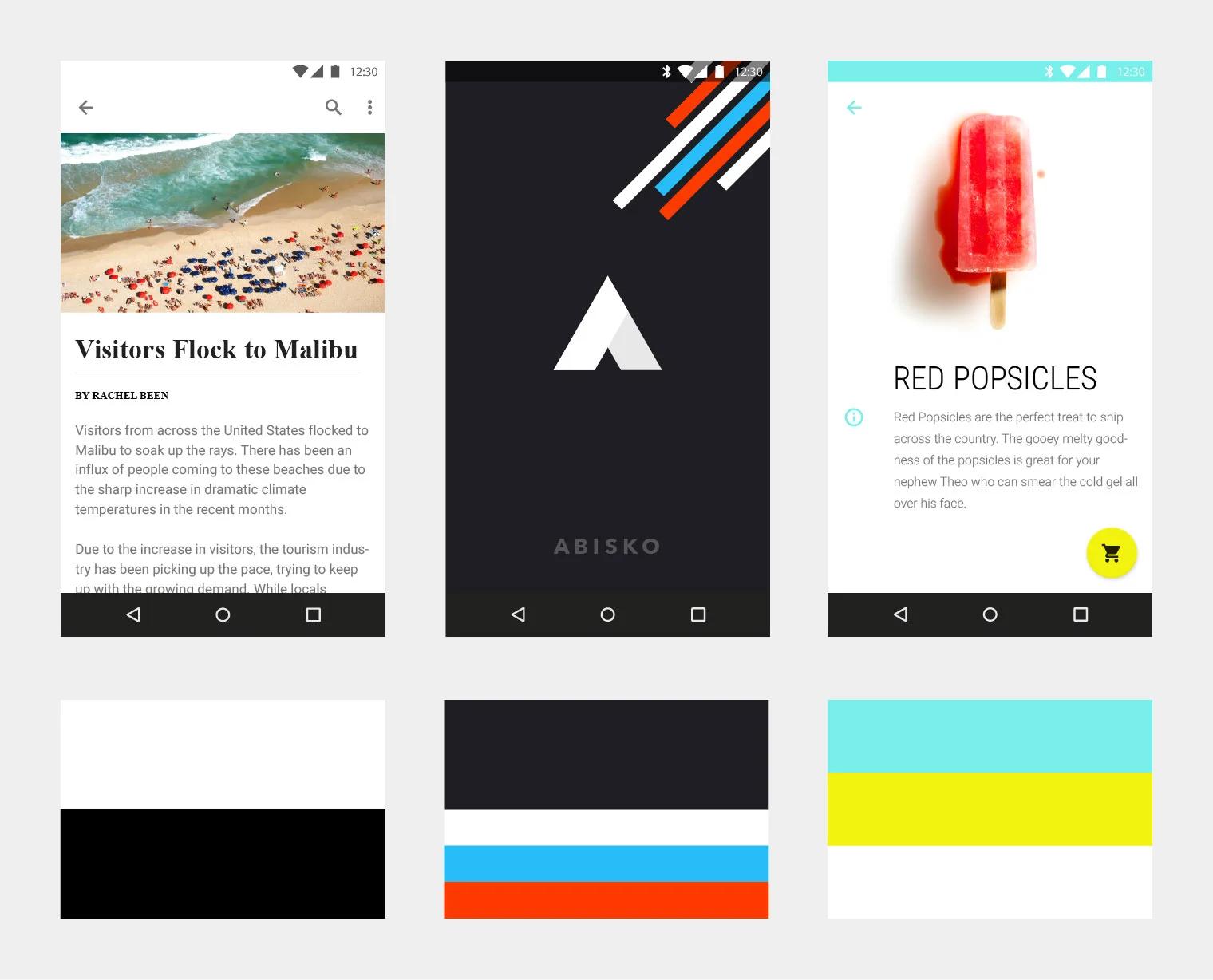
Despite not having colors in its brand identity, The Fortnightly uses the strong juxtaposition of black and white to create hierarchy and contrast. The color within this product comes from the content. Abisko’s main canvas color and the primary color is dark gray, which creates contrast with the brighter and more colorful supplementary colors appearing throughout the UI in the form of graphic treatments and UI elements. Shrine’spalette consists of two accent colors. Although the app features two bright accents, the colors are used judiciously to create a nice, balanced contrast with the white canvas.
Takeaways
-
Pick a palette and stick with it.
-
Create hierarchy using contrast to bring attention to important buttons or information.
-
Whatever your color story, look to the Material Design system for inspiration on how to apply it.
Picture your pages
Whether it’s photography, illustration, or graphic treatments, how you apply (or don’t apply) imagery in your brand makes a difference.
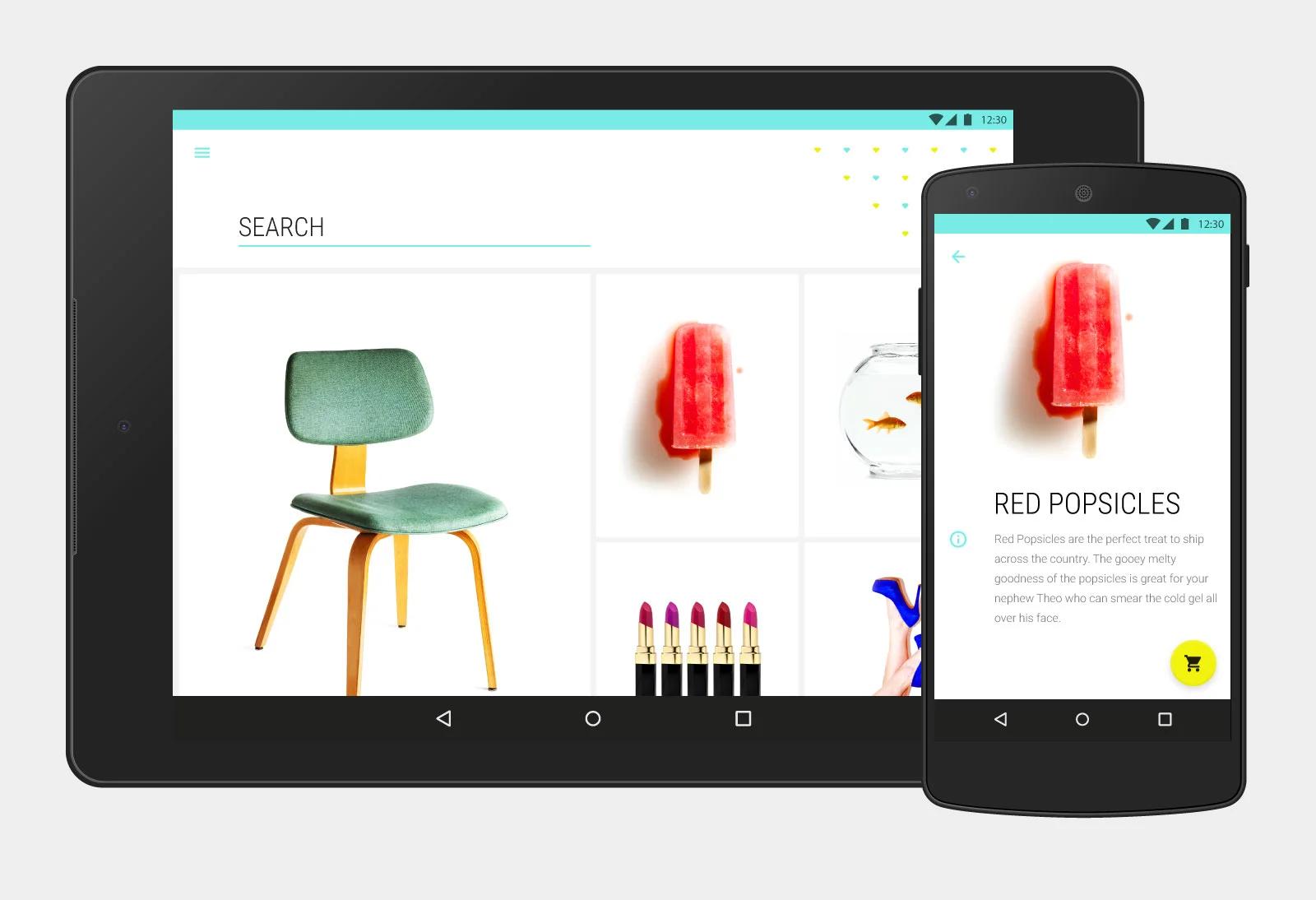
If you have the opportunity, create an identifiable language within your product. Imagery, graphic elements, and iconography should ideally family together—whether they’re stylistically similar, or intentionally diverse. For example, if you have bold, saturated graphics and iconography throughout your UI, consider using imagery that shares these qualities. If you use diverse imagery throughout your application, consider how the surrounding design elements like typography and the grid can help create visual unity. When it comes to imagery the most important thing is to create a cohesive style and place it judiciously throughout your UI.
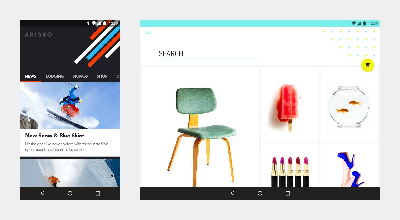
Abisko consistently uses key graphic elements, like diagonal lines, throughout the experience to create a sense of continuity and movement. The imagery within Abisko matches the energy and boldness of the graphic treatment. Shrine maintains visual consistency through the use of mostly orthographic images on a white canvas. The small patterning of the diamonds mimics the grid layout of bright pops of color against white. Since photography is the most important aspect of Shrine, the grid allows for large tiles and a majority of the real estate to be devoted to imagery.
Takeaways
-
Think about the purpose of imagery within your product. Is it informative, decorative, and inspirational? If so, create a hierarchy and a system for highlighting those qualities.
-
Think about how the visuals work together in your product. Whether diverse or stylistically consistent, make sure that elements such as photography, iconography, and graphics intentionally family together.
-
See imagery in the Material Design guidelines.
Raise your voice
Your brand voice should be carried throughout all elements of the product experience, from general copy, to notifications, error messages, and CTAs. If your product is all about personalization and caters to a young demographic, do not create notifications that sound like they’re coming from a robot. By the same token, you don’t want your product to be filled with jargon or slang that could get in the way of simple user interaction. Take advantage of opportunities to guide the user through a product with gesture and interaction patterns instead of too much written explanation. Remember that you are developing a persona with your brand. It should shine through in the language you use, but it shouldn’t get in the way of functionality.
The Fortnightlyaggregates news from the world’s most popular newspapers, therefore the bulk of the brand voice and personality comes through the editorial content. Supporting copy is clear and to-the-point, helping readers clearly understand how to share and archive reading material. Pesto appeals to the sophisticated and enthusiastic foodie. The language and information is directed at users who are savvy in the kitchen. Abiskocaters to hardcore skiers. Slang is used intermittently throughout the product to speak directly to this audience.
Takeaways
-
Use words and terms that are specific to your brand and audience to delight and create user affinity.
-
Show, don’t tell. The more you can guide the user through the product with interaction patterns and gestures (not words!), the better.
-
Don’t overuse slang or overly trendy terminology in moments that could confuse the interaction patterns for the user.
Go deep & move with meaning
In Material Design, we advocate looking at the UI in three dimensions because it provides a clear system for rationalizing information on the screen. It also helps users intuitively understand how to interact with a product. Designing for an x, y, and z space (three dimensions) can be intimidating at first, but considering how information moves early on in the process will give you room to fully flesh out unique interaction patterns and ensure optimal usability. Interaction patterns should also be considered a strong part of your brand identity. Users learn to associate motions and gestures with your brand—they become inextricable to the experience of your product, for example: “swiping right” meaning yes and “swiping left” meaning no.
Key components in the UI help establish the landscape of your product and determine the way users move through it. The FAB (floating action button), for example, places emphasis on the main call-to-action, whether it’s drafting an email or adding an event to a calendar. It’s important to think about the user’s experience when they tap on that button. How does motion help the user complete an action? How does it acknowledge information has been received—with ripples, buttons rising to meet the user’s touch, or app bars that transform when scrolling? These are some of the solutions we devised in material. They are worth considering in your UI.
Pinch defines itself through its core interaction and gesture. Shrine highlights its unique drag and drop FAB transformation through the use of bold color and motion. The FAB still represents the most important instance of interaction on the screen, yet in this example, draggable content triggers its purpose instead of depressing the button.
Takeaways
-
Use strong interaction patterns to help define your overarching brand experience.
-
Make the most applied interaction pattern the most accessible.
-
Systematize interaction and motion and make sure there is consistency in behavior throughout your product.
-
See motion in the Material Design guidelines.
Material Design lays the foundation for creating a well-designed and functional product, but we encourage you to think bigger and bolder about how your brand fits into the framework. Applying your product’s individual brand identity to the guidelines—whether it be through color, iconography, imagery, typography, voice or motion—not only brings a uniqueness to your product but extends the overall language of Material Design.