Exploring Color on Google Maps
How a minimalist approach unlocked our ability to create a more detailed representation of the world
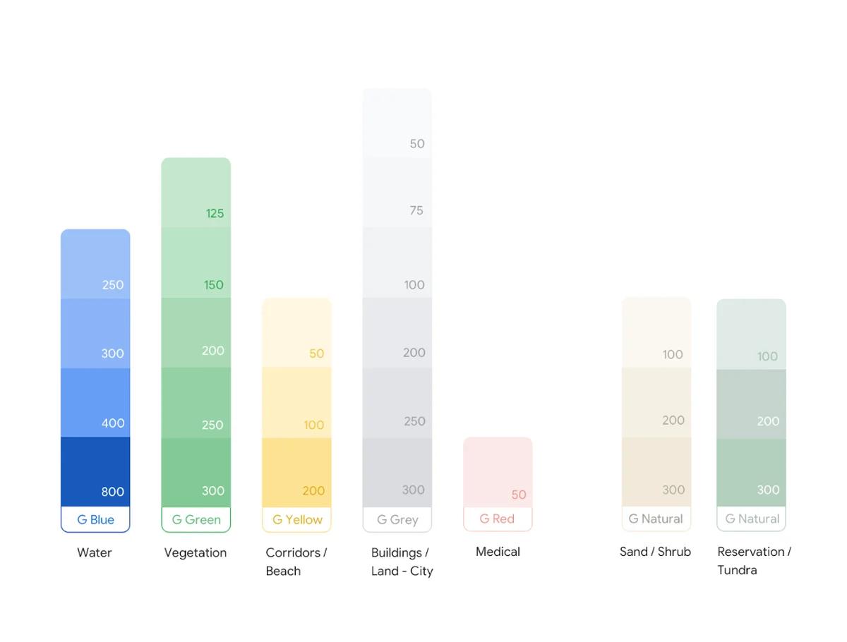
Could a new color system help simplify Google Maps, a complex data visualization of the real world? This team’s idea sparked a year-long collaboration and led to a feat that no one in Map’s 15-year-history thought was possible. They dramatically streamlined a palette of 700+ colors down to 25 major and minor tones—all while making the Map more accessible and more recognizable-ly Google.
Applied to new satellite technology, the approach has paradoxically unlocked our ability to reveal more of the earth’s details. It also creates a stronger foundation for design breakthroughs of the future.
When it launched in 2005, Google Maps served as a navigation tool to get you from point A to B. Now it can help you decide where to go in Bangalore, learn about Mount Kilimanjaro, and explore coral formations in the Great Barrier Reef. As teams further evolve content, typography, shape, and texture, success will continue to depend on rigorous, systematic approaches to change. Here, Google Maps designers join product and engineering managers to discuss how we took on color.
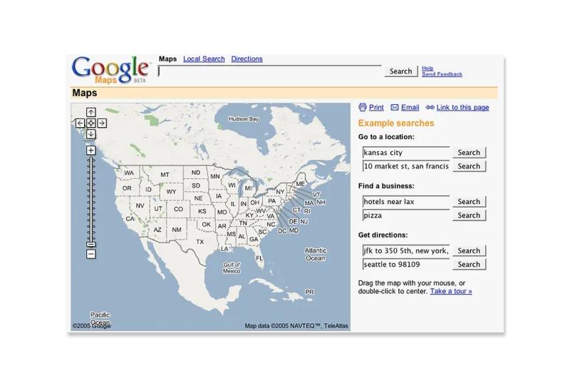
Google Maps when it launched in 2005
A myriad of colors
The original system used one color for each detail from forest bogs to shrubs, resulting in differences so subtle that it was difficult to distinguish important elements like roads, text, and borders.
Dana Steffe, Staff Visual Designer, Google Maps: The color work started by exploring our hypothesis on whether we could reduce the palette down to a smaller number of swatches that align more closely with Material Design, while retaining all of the rich details of the Map.
David Cronin, UX Director, Google Maps: One of the challenges with legacy systems is that parts of it may be undocumented. In this case, we needed to look for color patterns in the code itself. The team started by attempting to fully understand the range of colors that had been implemented over the years. When I saw the inventory, I remember my jaw dropping because there were so many colors.
Sang Han, Creative Director, Google Maps: Legacy systems tend to have a lot of complexity so the team’s focus on simplification had myriad benefits. The new color system helps our users better understand the world around them, while aligning it to the Google palette sets us apart and builds brand equity. Because the system is easier to update, it also positions our team to keep moving the brand forward.
The new Google Maps color palette reduces complexity and aligns with Material Design
Dana: I had just transferred to this team from Material Design and a lot of my job there was thinking about how we improve the velocity of designers and teams: How do we make something really easy to understand and use? Fresh eyes lended themselves to being a bit naive about how complex the system was. In this case, that was good because I approached it like: ‘Of course we can do this! I think? Maybe!’
Exploring a new system
The Google Maps team experimented with distinguishing map details, improving accessibility, and reducing the range of colors.
Diego Perez, UX Design Manager, Google Maps: We started with a couple baby steps. Last year, we were looking at forests on the Map and had the realization that we had four different colors to represent pretty much the same thing and thought: ‘If we condense those, does the Map still work?’ It was a relatively small release, but it armed us with confidence to be able to take on the grander exercise.
Michael Davidson, Engineering Lead, Core Maps: I’ll admit that I was pretty skeptical, but also excited by the possibilities. I’ve worked in this space for quite a long time and had a sense of the complexity. Hundreds of colors were all there for something. If we could succeed at getting the number of colors down to a manageable number, it would make future releases much easier.
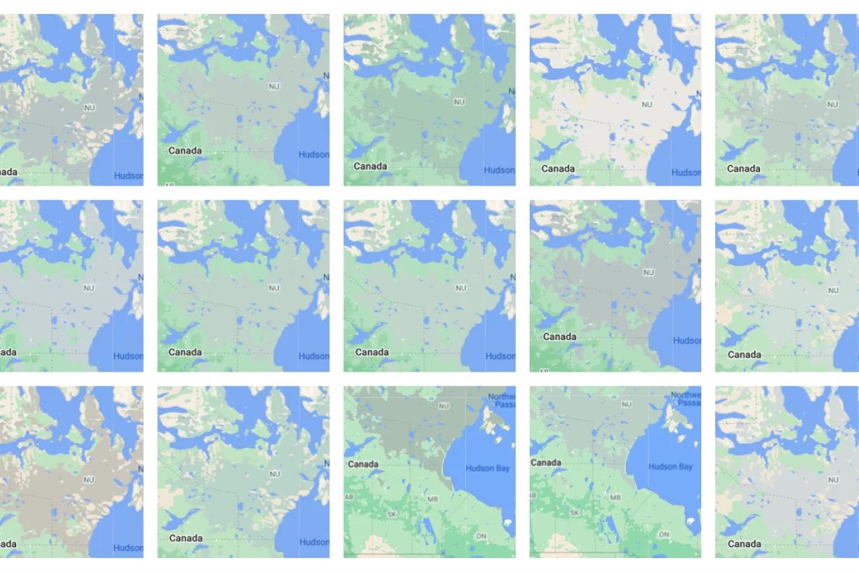
Before & After: United States
With subtle tones and transparency effects removed, bold colors now clearly distinguish map details
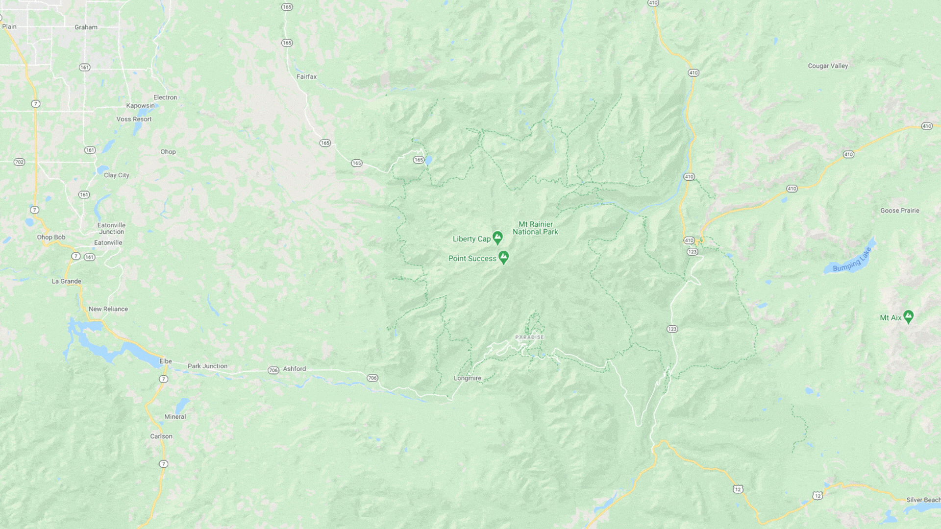
Mt. Rainier National Park
People can even see snowy peaks on the map!
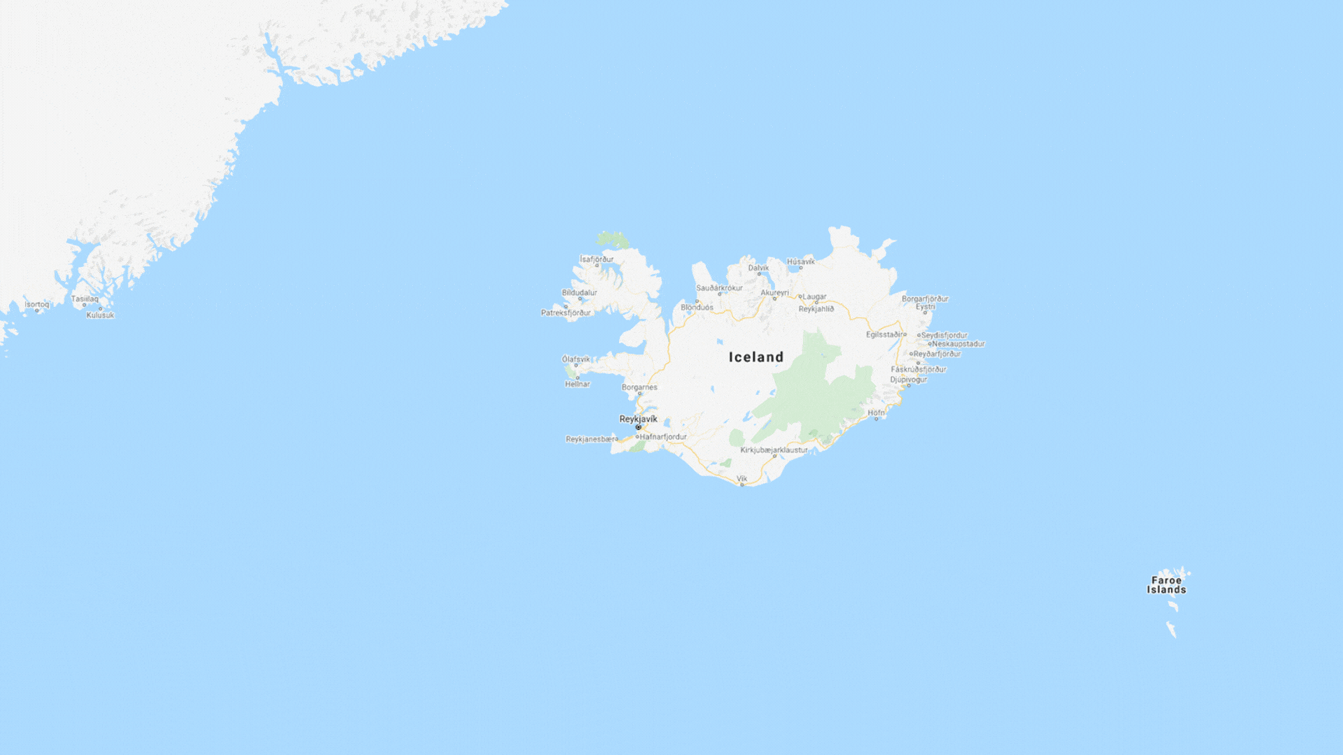
Iceland
It’s easier to understand the diverse topography of different regions
Tibet
Regions with vast shrub and desert landscapes reveal more of their texture


Matt Simpson, Staff UX Designer, Google Maps: We started by asking why these colors were the way they were. It questioned the underlying assumptions, which allowed us to free up the design system. We were able to do more with less.
Sarah Needham, Senior Interaction Designer, Google Maps: I had never thought about cartography until I joined Google Maps, but have an architecture background and there are a lot of similarities in how we construct space. What made this collaboration really magical was our conversations around what types of questions we were trying to answer and when: What are we trying to help users learn about the world? How do we entice them to explore the Map a little bit more? That’s how we started to refine the hierarchy to communicate that there’s more to find out.
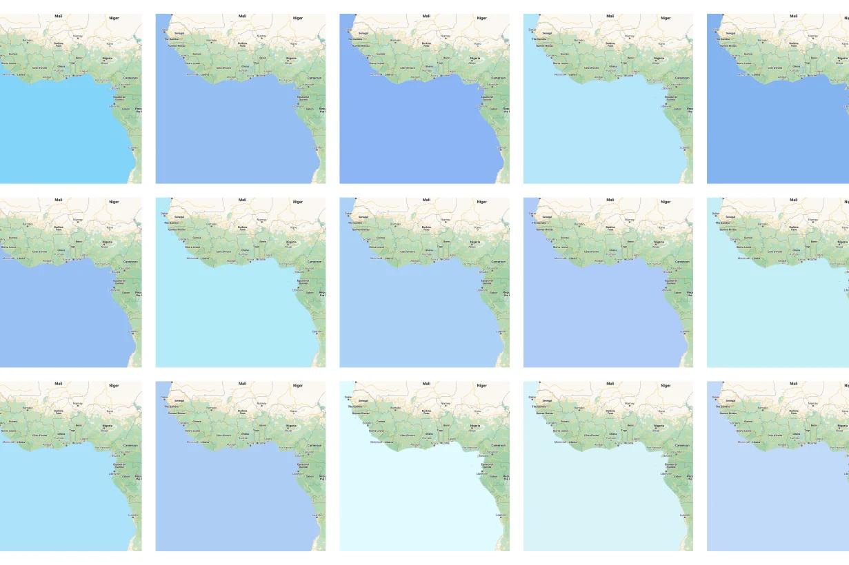
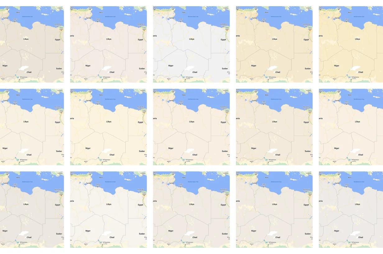
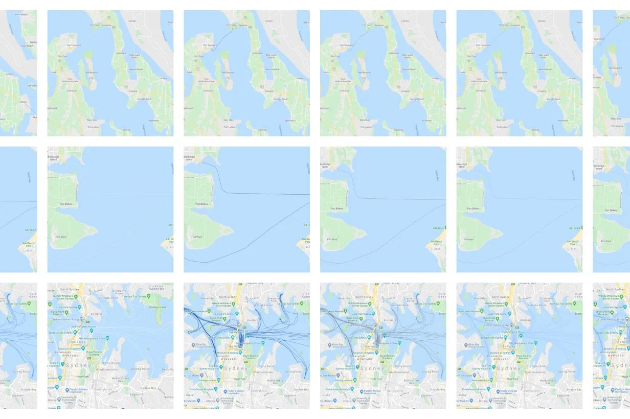
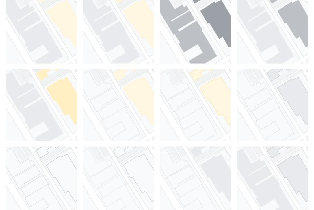
The design process included hundreds of sketches, like these explorations for water
Arid and desert sketches
Ideas for ferry lines
Urban grey study
Tundra range
Reef explorations
Technical serendipity
A well-timed update took advantage of the color system updates, adding even more detail and granularity to the map.
Sujoy Banerjee, Product Management Lead, Core Maps: Around the same time, our Natural Features project was underway to bring more richness about the real world into the Map and show what an area actually looks like and feels like. We have this satellite imagery. How do we get a little bit of that intense detail to trickle up in a way that’s still easy to comprehend? The colors made these new natural features pop off the Map. When we were testing the new version, I kept using it for my personal use because places were just so much more beautiful. The new features would not have been nearly as noticeable without the update to the colors.
Michael: It wouldn’t have launched in the old color scheme. It was a great chance to see: Well if we radically simplify, we can actually understand what we’re seeing, we can understand the contrast between elements, we can work on accessibility, and really comprehend everything that’s going on, even though we’re adding more detail.
Matt: When we previously looked at the role of contrast and accessibility on the Map, we had a spreadsheet of the top color pairings at different zoom levels, and it was still a pretty overwhelming list. This certainly simplified that a lot.
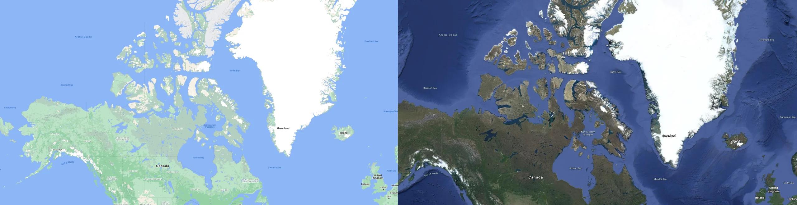
Tundra updates reflect real-world tonality picked up by satellite imagery
Going 100% virtual
When the team went fully remote, they adapted with new ways to collaborate and gather research.
Dana: When COVID happened, our team was already remote: Matt and I are in San Francisco, and Sang is in Mountain View, and many others are in Seattle. We felt comfortable brainstorming virtually. Things became interesting when we started to validate what was working and what wasn’t. Instead of a bunch of designers critiquing color on boards, we used satellite tools, and found imagery of places around the world to try to get a sense of the real thing. Tundra is a great example where it’s misleading to think huge swaths of land are white because of snow. What is the color beneath that? It’s actually rock.
Sarah: The power of building demos. Simplifying allowed us to build and iterate very quickly. So it was rapid fire: ‘Please look at this demo we just built, how does this color feel, are we communicating what we think we’re communicating?’
Diego: The engineering team helped build some custom tooling that allows us to look at specific parts of the world and stress test. Touching again on accessibility, we had a tool that let us gauge the most common color relationships, for example land over water, or specific types of text over greenery. That way we knew what to optimize. It’s effectively math that binds everything together.
Respecting our sense of place
Building for global populations meant honoring the emotional connection that people have to places near and far.
Dana: The most intimidating part of this is the weight to accurately represent people’s worlds. How do you do that well, and how do you do it globally? If you’re choosing colors for desert, or forests, we all know that these regions don’t look the same everywhere.
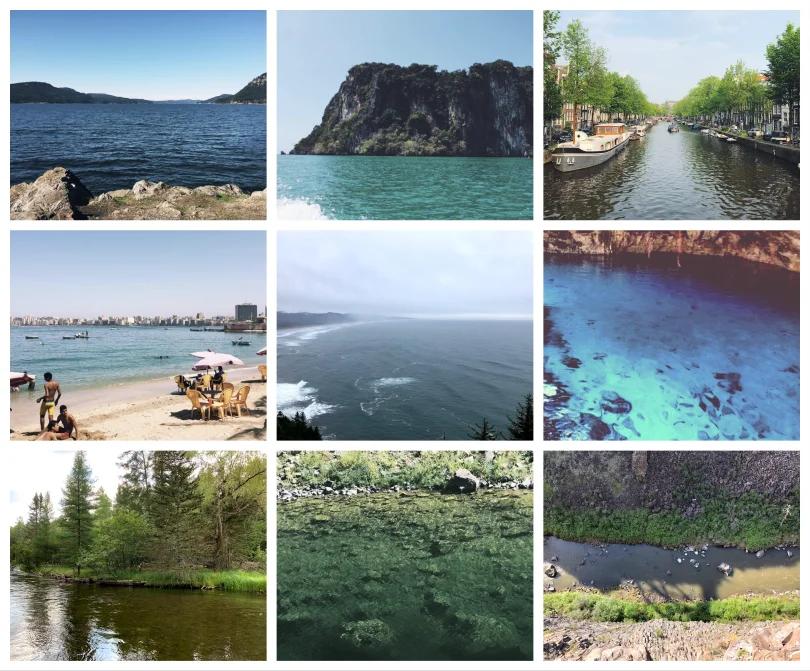
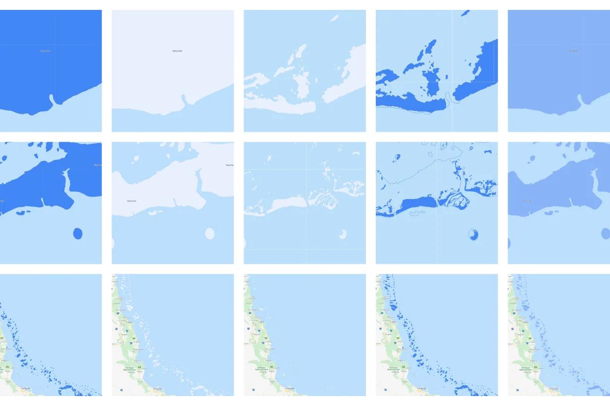
Designers shared personal photos to help compare water around the world
Sujoy: The fact that we work at such a global scale means that it’s complicated. It takes time to make sure we’re getting things right. It’s also exciting to be able to build something so ambitious. It’s nice to have a tool that lets users go look at the rest of the world and realize how beautiful it is and what diversity there is there.
Michael: That was definitely a fun part of testing it: Picking a place I had never seen before and zooming in to see how green Central Asia is, or what the Sahara looks like.
David: This work captures the best of Maps: It helps you understand things about the physical world, the way someone far away might look at a paper map and imagine snow-capped peaks and far off forests. It better depicts the world we live in, and adds meaning.
Lead Visual Designer Dana Steffe talks about the personal nature of color
Looking to the future
Simplicity makes the new system more scalable, accelerating the team’s ability to build new and timely features—and setting the stage for the future of Google Maps.
Michael: As an engineer, I think we’ve already seen dividends paid by the simplification of the palette, like the COVID layer we just launched. We were able to go in and put this important information on top. I expect the benefits to just continue. This was also a true collaboration between design and engineering, and it really showed us that you can’t isolate those things. You can’t just say: ‘Oh, well the designers are going to pick colors and we’ll just let them do that…’ It hopefully provided a model for how we can do things like this in the future.
Sang: The team here has opened the door to possibilities. You hear a lot of times when you go to a new company: ‘Don’t mess with that,’ right? You’re gonna tip the domino. Now it’s clear, nothing’s too hard for this team!
Matt: I’m really excited about the visual and information hierarchical space we've created. We have this clean, effective, evocative canvas we can build upon.