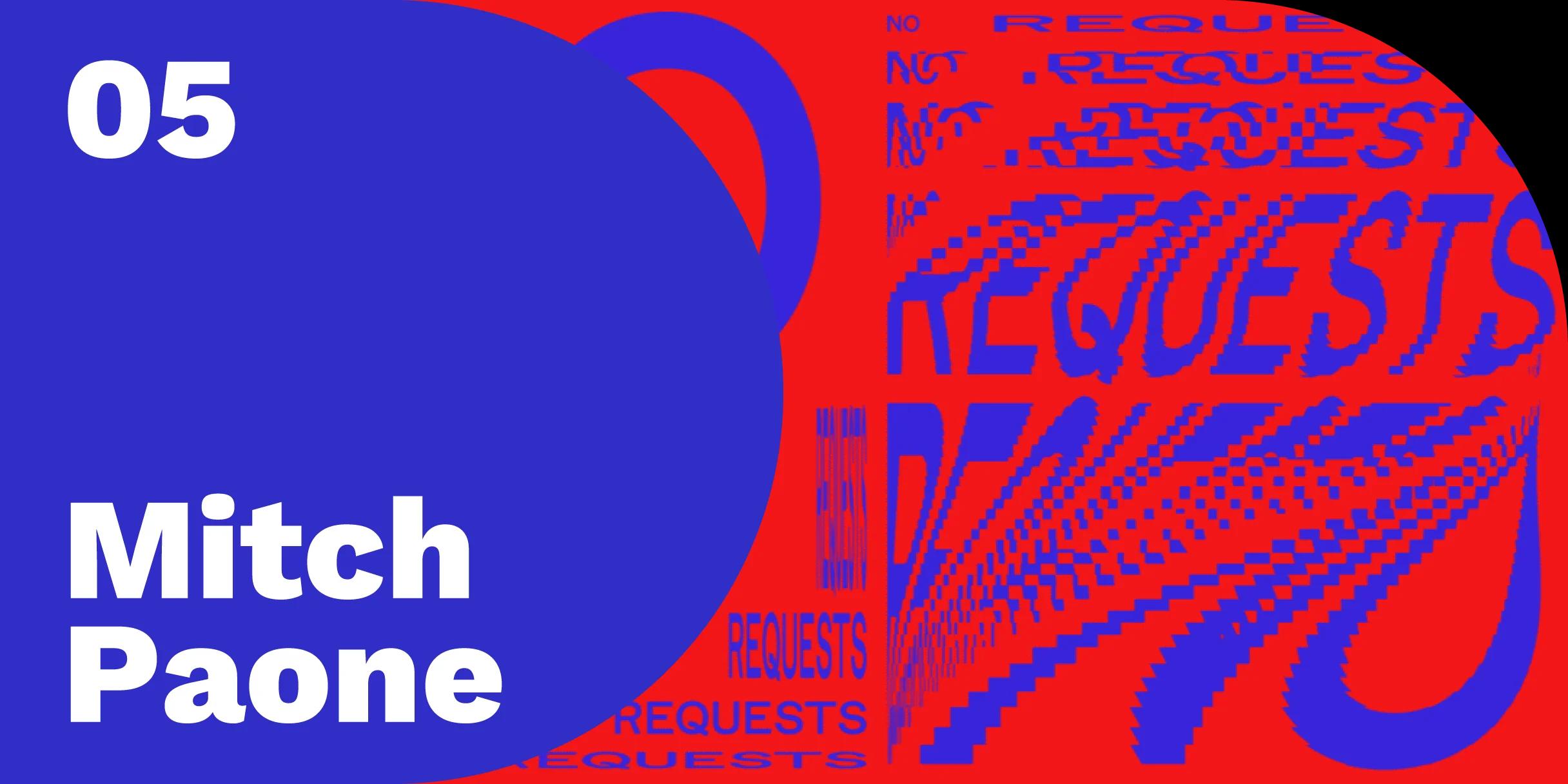
Design Notes, Episode 5
DIA Principle and Creative Director Mitch Paone on the parallels between jazz and design practice
Design Notes is a show about creative work and what it teaches us, hosted by Google’s Liam Spradlin. In the fifth episode, Liam speaks with Mitch Paone, Principle and Creative Director at DIA Studio, about creating a jazz solo out of the creative process, using a beginner’s mindset to unlock new possibilities in design, and the difference between intuitive and analytical creativity.
Listen to Design Notes, Episode 5 Google Play, iTunes, Pocket Casts, Deezer, RSS
Highlights:
On working at DIA “We share. We make. It’s about as democratic as it gets ... basically what I’m saying is we’re creating a jazz solo out of the creative process.”
On the power of typography “A typeface is an identity, period. If you look at any identity, really, the one thing that you're going to interact with the most content-wise is the text.”
On motion and kinesis “We think about time and animation as no different than scale, form, or repetition. So we're layering in film principles and pulling that into the design process—there’s the keyframe expression, the framework, the type spaces, the layout. You create a generative system and the work executes consistently, but it feels like it's moving or evolving.”
On design systems “The beautiful thing about jazz is, if you know the song, regardless of how I play it, people still recognize it. The melody is there. The structure's there. These are the parameters that define an identity in music, and they’re also defining parameters in design. You can create a huge identity that has this connective web of rhythmic changes and colors, but people will know it's all part of the same thing.”
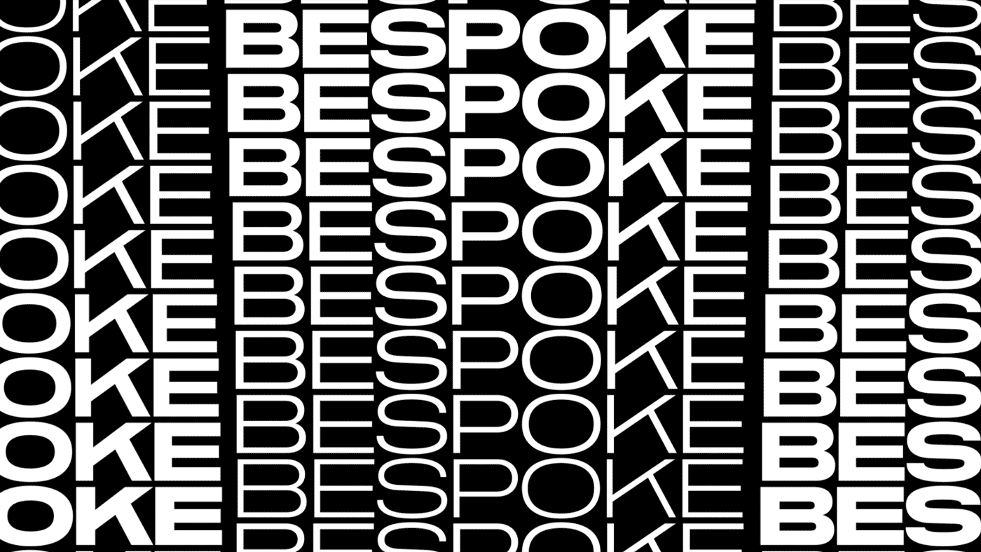
DIA Studio created a custom typeface for the boutique retouching company Bespoke.
Handy links for this episode:
- Fillmore posters: A series of psychedelic rock posters, commissioned by Bill Graham, that promoted shows at San Francisco’s Fillmore Auditorium between 1966 and 1972.
- Brand New School, Psyop, Logan: Motion firms Mitch worked at early in his career
- Swiss designer Ludovic Balland also works under the name Typography Cabinet
- Read an interview with Swiss graphic designer Giliane Cachin for the Swiss Design Awards Journal.
- Futurism: an artistic and social movement of the early 20th century that emphasized the constant change and dynamism in the world around us.
- See more of DIA’s experimental work and kinetic typography on Instagram.
- Download a PDF transcript of Design Notes, Episode 5
How to listen and subscribe:
- Google Play
- iTunes
- Pocket Casts
- Deezer
- RSS
Coming soon: The sixth episode of Design Notes was recorded at SPAN 2017 in Pittsburgh. Guest host Aaron Lammer speaks with designer and professor Molly Wright Steenson about pattern languages, the important similarities between architecture and AI, and the publication of her recent book: Architectural Intelligence: How Designers and Architects Created the Digital Landscape.
Have feedback for Design Notes? Tell us what you think.