Design from iOS to Android (and Back Again)
A practical guide to designing across platforms
Designing and developing between platforms is a lot like traveling through different countries. You go through the same motions—sleeping, eating, sightseeing, regardless of where you are—but the customs of the country you're visiting dictate how you go about doing them. In some countries, it’s ok to push people into the train, or eat a burger with a knife and fork. Similarly, if you developed your product first for iOS, you shouldn’t simply expect that you can port it into Android without issue, because your app will feel lost in translation. It’s important to understand the idioms and behaviors of each platform before you start design and development. That way your users will be able to use and easily understand your app on the platform that is native to them, and you will have the most clear and true version of your product — no matter where it’s used. This guide will walk you through some practical tips for moving from iOS to Android (and back again) without suffering a cultural divide.
Get acquainted with Material Design
Material Design is a new approach to cross-product, cross-platform design that uses tangible surfaces, bold graphic design, and meaningful motion to help define the way software should behave. It is also the default visual language for Android 5.0+ devices, so learning the principles of the system will hugely benefit your project no matter where you start developing.
The Material Design guidelines offer comprehensive guidance, but we’ve isolated a few key themes to pay attention to when you’re coming from iOS.
Surfaces & depth
iOS conventionally uses a blur effect to indicate depth, but you’ll want to focus on a considered use of elevated surfaces and shadows in Android. These qualities apply to objects in material design and help create a spatial model that will be consistently applied across apps.
Interaction & motion
Material Design places a lot of emphasis on user-initiated motion and touch response. When you touch an element, in addition to the touch ripples that emanate from your finger, buttons can rise in elevation (essentially, their shadow grows) to “meet” your finger. This “magnetic” reaction is a departure from common touch feedback styles like color change or dimming on iOS and across the web. This magnetic reaction is authentically digital.
Furthermore, both touch ripples and magnetic reaction smoothly transition between the default and pressed state, rather than using two discrete images. This is a great example of the notion of visual continuity in material design on an almost microscopic level.
Layout grid
A convention from graphic design that’s ubiquitous in both Android and material design is the strict adherence to a grid system. Everything aligns to an 8dp grid (see DPs below), creating a consistent visual rhythm across apps. For example, buttons are often 48dp tall, the app bar is 56dp tall by default, and spacing between elements is in multiples of 8dp.
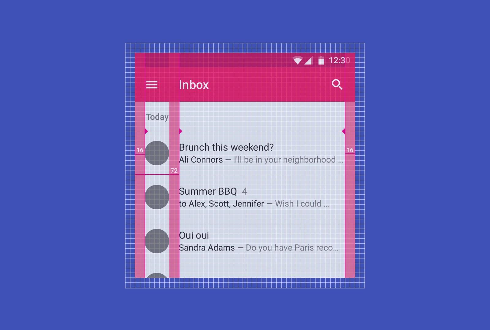
Additionally, text and other elements often left- or right-align to keylines, which are akin to the vertical rules that define margins in a magazine or book. The standard keylines for phones are 16dp and 72dp, but these can be customized to fit specific app needs/challenges.
Typography
Type plays an immensely important role in Android and Material Design. Roboto is the default font family for Android, and includes a number of weights as well as a condensed variant. However, just like with iOS, you should incorporate your brand’s typographic palette into your app. Make sure to test your fonts on a couple of Android devices, since Android's font layout engine and rasterizer are different from the one in OSX and iOS. Sometimes the same typeface will look better in one font format than another, so be sure to sample each OTF and TTF for the typeface. Finally, typography uses a slightly finer baseline grid of 4dp, so line heights should be 20dp, 24dp, 32dp, 36dp, etc.
So what’s different about Android?
Now that you know a little bit about material design, let’s talk about how Android is different from iOS and other platforms.
Use density-independent pixels (dp) and design in vector at 1x
On Android, the key unit of measure is the density-independent pixel, often abbreviated DIP or DP. If you’re coming from an iOS or web design background, DPs are essentially equivalent to points on iOS or CSS pixels. Measuring and sizing things in DPs ensures your designs have a consistent physical size across devices of varying density.
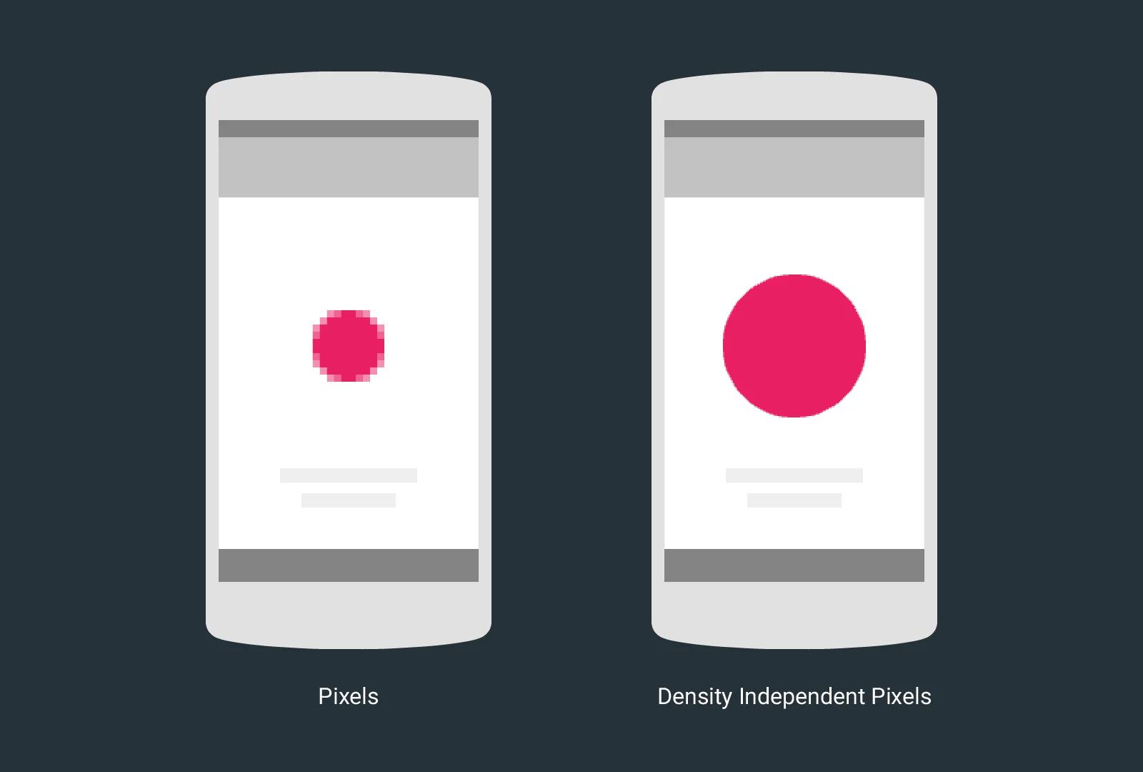
The definition for DPs on Android is simple:
1dp = 1px @ 1x (where 1x on Android is 160dpi)
Designing everything from layouts to icons in DPs using vector software like Sketch or Illustrator (or using shapes in Photoshop) makes the math a lot easier and doesn’t sacrifice any of the visual quality you normally get from raster images. When it comes time to export things like icons or other static assets, export for the key densities listed below.
Note that Android will scale your assets down or up for you, so you don’t always have to provide one for each bucket. Developers also have a bunch of tools at their disposal for automatically generating downscaled versions. Additionally, Android 5.0 has built-in support for vector icons and there are many tools out there that obviate the need for exporting per-density icon assets. For more on units of measure and density, check out the recommendations in the material design guidelines and Sebastien Gabriel’s Designer’s Guide to DPI.
Apps vs. activities
Under the hood, an Android app is just a collection of “activities”—each activity is normally a single screen in the app. Activities are connected using “intents.” For example, when you press a button in activity A, it can trigger an intent representing “launch activity B”. Sounds straightforward, right? What makes intents really powerful is:
- Their ability to work across apps (like enhanced versions of custom URL schemes for native desktop and iOS apps)
- They can be generally defined and even return information to the previous activity (e.g. “launch a photo-taking app and give me the photo”)
For example, suppose you’re building a messaging app. It’s common to allow users to send images in these kinds of apps. Your first inclination might be to design a camera screen, along with a photo gallery picker, and possibly even a photo editor. Fortunately, intents make it so you don’t need to reinvent the wheel, and better yet, they give the user the choice to use whichever camera app, photo picker, or photo editing app they have installed. The flow would be:
- The user presses “send photo” in your app. It triggers an intent representing “take or choose a photo”. Most camera apps on Android support this intent in their “take a photo” activity.
- The user gets taken to their camera app of choice. After taking the photo, the camera app might show them an “edit photo” option. The camera app can trigger an intent representing “edit this photo.”
- The user might be presented with a list of apps that can edit photos and the user may choose one. After editing the photo, they can press “OK” and be directed back to your app. The photo-editing app passes back the edited photo to the camera app, which then passes back that photo to your app.
- Your app takes the edited photo and sends it off in a message.
Many of the App Extensions provided in iOS 8 have equivalents on Android that are implemented using intents. For example, to allow apps to share a photo or piece of text with your app, simply ensure the “compose a message” activity in your app supports intents representing “share this piece of text” and “share this photo.”
Intents also allow you to replace websites with their native app equivalents. For example, if an item detail activity in your app says it can support intents representing “view www.example.com/item/*,” clicking on a link like that in a web browser will allow the user to choose between visiting that page or seeing that item inside your native app (and possibly save their preference).
The system status bar, navigation bar, and physical buttons
On Android, users always have access to system Back, Home, and often Overview (formerly Recents) functions. The system controls for Back, Home, and Overview can either be presented as hardware keys or as a software-rendered button bar at the bottom of the screen called the “navigation bar” on Android (not to be confused with navigation bars on iOS, which, like app bars on Android, house app titles and actions).
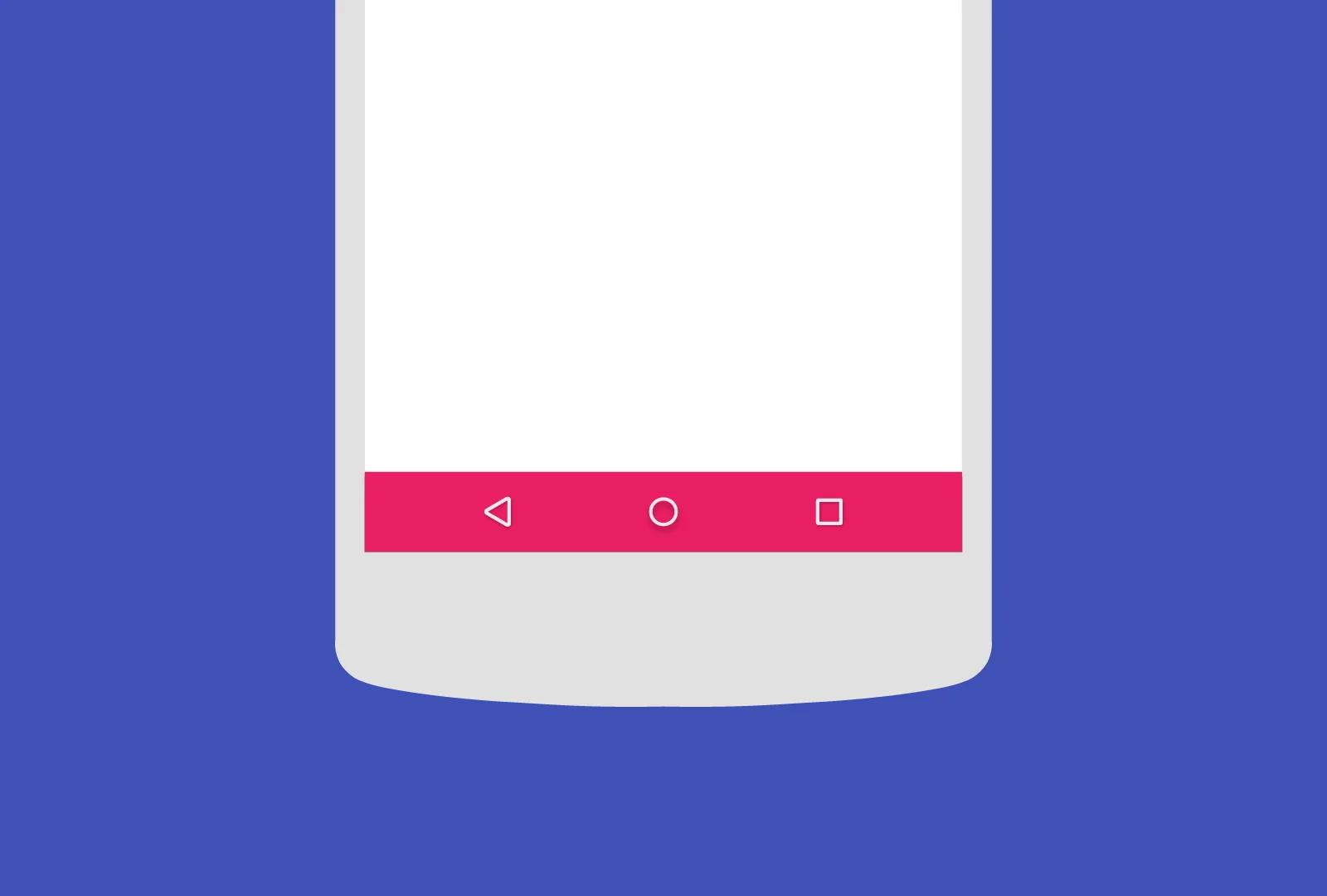
Android devices also include a persistent status bar, providing access to notifications and information about the local time, signal strength, battery level, and more. Android will account for the software navigation bar (if present) as well as the status bar, automatically reserving that space and reducing the portion of the screen available to your app. For example, on a Nexus 5, while the screen is 360x640dp, the navigation bar in portrait mode is 48dp tall and the status bar is 24dp tall, so your app has 360x568dp space to present content. While you can hide the status bar (and even the navigation bar in limited situations), it’s best to leave the system UI present and allow users immediate access to those system functions. Android 4.4 and 5.0 introduced new features allowing you to draw behind the system UI to present your app content more immersively. Finally, you’re guaranteed to have hardware volume keys, so in most cases, you won’t need to include volume controls in your software UI.
The system Back button
The system Back button will be always available on every Android device, either as a physical button or on the screen in the system navigation bar. As a designer, you rarely have to define functionality for the Back button. You normally don’t need to customize Android’s automatic Back button behavior. By default, pressing Back closes the current screen and takes you to the previous screen, even if it was a part of another app (e.g. if another app opened your photo editing app using intents). If you’re at the first screen in your app, pressing Back takes you to the user’s home screen. Pressing Back from the home screen doesn’t take you any further back. Note that the Back button is distinct from the Up icon that appears in your app in detail screens. While Back navigates users temporally, Up navigates up the app’s hierarchical structure, and should never kick the user out of the app, even if you entered from a different app. Keep in mind that the text to the right of the Up button isn’t related to the button like it is on iOS. If that text is present, it should represent a title for the current screen.
Bottom tabs
On iOS, it’s common to use a bottom tab bar to switch between views in the app. The bottom navigation material design pattern includes best practices for adopting this navigation structure on Android, including implications for the Back button, scrolling and swiping behavior, and visual styling.
It’s also common on Android to use a tab bar at the top of the screen. A top tab bar is preferable in a number of situations:
- If swiping between tabs is desirable (avoid swipe for bottom navigation)
- If another element such as a music player’s ‘now playing’ bar requires the bottom area
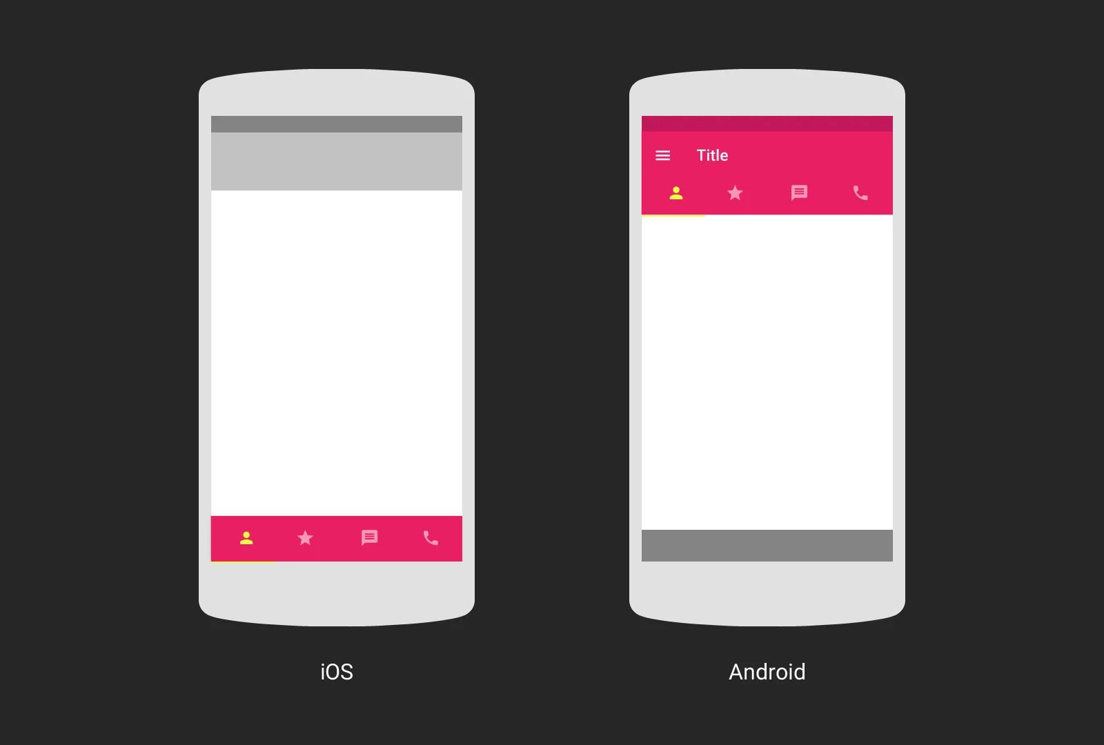
Finally, keep in mind some of these key differences between the two approaches:
- Bottom navigation bars can persist across category and detail screens, while this is highly discouraged for top tab bars
- Bottom navigation bars always represent the top level of the app’s information hierarchy, whereas top tabs can be used for any level
- A navigation drawer generally contains additional top-level targets when used with bottom navigation bars, while top tab bars are always subordinate to items in the navigation drawer
Gestures
Offering touch gestures to operate your app is a great way to make the experience fast, fluid and delightful. You should always be mindful of user expectations for gesture-based interaction on a platform. On Android, most of the common gestures have very standardized behaviors, so users will expect your app to support those. There’s an entire section in the material design guidelines covering gestures, but it’s most important to get a couple of the key gestures right.
Horizontal swipe is ubiquitous on touch devices. Unlike iOS, on Android, swiping horizontally within a tab must switch tabs—it’s a key expected behavior. Outside of tabs, swipe is often for carousels or to dismiss elements from a collection, such as removing an item from a list. It’s uncommon to offer horizontal scrolling on Android; snapping to page boundaries is more common.
As for the vertical axis, continuous scrolling is preferred on Android, and snapping to page boundaries is somewhat discouraged. Material design encourages using scrolling techniques like pinning to optimize layout at various scrolling positions. For example, the app bar may slide away as you scroll down and reappear as you scroll back up.
Swiping from the left or right edge of the screen is also a common gesture. Unlike iOS, where left-edge swipes take you back one screen, Android reserves edge swipe for two behaviors. First, if there’s a drawer to the left or right of the screen, such as a navigation drawer (or “hamburger menu”), swiping inward from the side of the screen should open the drawer. Second, in case you have internally swipeable content within a tab, swiping from the edge should change tabs.
One final gesture to consider is long-press. On Android, long-pressing an item should either select it, begin dragging the item, or do nothing. Avoid using long-press for contextual menus, or less expected behaviors like shortcuts to other functionalities. Because long-press is a somewhat hidden gesture, its behavior isn’t normally apparent, so it’s especially best to stick to platform norms. If you really need to expose contextual actions on items, use an onscreen affordance like the overflow icon and popup menu.
Takeaways
- Android uses DP units, which are basically points in iOS or CSS pixels. 1dp = 1px @ 1x (or 160dpi)
- On Android, apps can integrate deeply with other apps, obviating the need to reinvent the wheel for things like taking photos or sharing content to social media.
- Android provides a system Back button in addition to Home and Overview for task-switching.
- When deciding between bottom navigation and top tab bars, consider information hierarchy, persistence across category and detail screens, and swipe behavior.
- Long-press should either select an item, begin dragging it, or do nothing. Don’t use long-press for unexpected behaviors.
Android design in practice
Now that we’ve covered some of the core differences in Android, let’s look at some best practices and pragmatic tips.
What size should my artboard be?
One of the most popular questions designers have when starting out is what size artboard to use. While there isn’t a set of exact sizes that would cover all Android devices, the table below should be a good starting point. And as a general rule, designing for the 5” phone and 9” tablet sizes will get you most of the way there.
What about stretchable UI elements?
Android includes built-in support for stretchable images (for things like custom buttons), similar to iOS’ stretchable image constructs. On Android, these are called “nine-patches.” Unlike iOS, Android nine-patch images contain pixels along the perimeter indicating stretch, padding and optical boundary information:
Because nine-patches include this extra information, their filenames must end in .9.png to differentiate from regular PNG files.
Nine-patches are less commonly used these days since material design’s simple shapes (e.g. flat rounded rectangles) can be described directly in code. However, they offer a ton of flexibility for custom UI elements. If you’re using them to build stretchable UI elements, remember to provide corresponding nine-patches for a variety of densities, to make sure your UI elements look crisp on any screen. There are tools that let you simplify the creation of nine-patches across different densities such as the Asset Studio.
Old versions of Android
A common concern when designing for Android is variability in platform versions, and the differences in the visual styling and UI framework available across these versions. For example, while Android 5.0 introduced first-class support for shared element transitions, these aren’t available in early versions of the platform.
You may immediately think you need to design two versions of your app: one that’s built for material design and Android 5.0, and another for earlier versions. While it’s certainly possible to use this approach, it’s not necessary.
In reality, designing (and developing) for earlier versions of Android isn’t all that challenging. For most elements of Material Design, there’s a very clear, often canonical path for how it can be implemented across OS versions. For example:
- Essential UI components like toolbars, navigation drawers, tabs, FABs, dynamically colored form controls, etc. are available across platform versions using support libraries like AppCompat and the Android Design library.
- Most content elements like type, iconography, and imagery aren’t tied to any specific platform release, and can be easily implemented across platform versions.
- While many newer transition and animation features, like animated vector drawables, circular reveals, and shared element transitions are only available on Android 5.0, you can often fall back to simpler transitions like fades, slides, and scales, to tell a similar story. This doesn’t require building a completely separate app — just special casing smaller pieces of functionality.
It’s essential to engage in a dialogue with your developers early and often to discuss how best to approach each aspect of your app for earlier versions of Android. Rarely should you need to do special-case design work for previous platform versions.
Designing for Android tablets
Unless you want to do something completely different for tablet users, you don’t need to design a completely separate app. Instead, you should design a single app that makes the best use of space on phones and tablets.
The key to successfully optimizing for larger screens is adaptability. Android tablet screens range from 7” to 12” diagonally, so you can’t just constrain yourself to one size in one orientation. Just like with responsive web design, you should instead think about how your app should lay out based on different available screen widths. More specifically, think about each of your major content elements and ask yourself questions like:
- How wide until these lines of text run too long (more than ~75 characters per line)?
- How wide until image aspect ratios or layout become awkward?
- How wide until full-width buttons get too wide?
The answers to these question should help you uncover natural breakpoints in your contentthat trigger the introduction of larger margins, image sizes, font sizes, or additional content or navigation panes. This approach will lead to a more versatile UI than if you base your design decisions purely on device form factor. It’ll also make it easier to support both portrait and landscape orientations for tablets, which is very much an expectation of Android tablet users.
Once you’ve understood your natural content breakpoints, there are a couple additional things to keep in mind when coming to Android tablets from the iOS world. Unlike Apple’s iPads, most Android tablets have a 16:9 screen ratio (the Nexus 9 being an exception). This means that while fullscreen video always looks great, your slightly shorter landscape layouts may require some vertical scrolling, and your slightly narrower portrait layouts may not fit as many content panes as you originally thought. Again, content-based breakpoints are your best friend here — always think first about the content and second about screen size.
For more on designing for Android tablets, check out the layout structure, app structure, and whiteframes resources in the material design guidelines, as well as this oldie-but-goodie article.
Takeaways
- Design your app once and optimize the design for tablets and older versions of Android — don’t design separate apps for each configuration.
- There’s a clean, canonical path to implementing material design across all versions of Android.
- Use the list of common artboard sizes when doing wireframing or mockups.
- Android offers 9-patches that work like iOS stretchable images but with stretch information built into the graphic itself.
Next steps
Designing for Android with Material Design isn’t all that different from designing for other mobile-focused platforms. There are a small set of core platform standards, along with a comprehensive set of meticulously documented guidelines and recommendations. But more importantly, there’s a whole lot of room for creativity and innovation. Material Design is meant to be flexible and open-minded, focusing on the fundamentals of interaction and visual and motion design across products and platforms, so that designers can express their ideas freely. While you’re thinking up your next great app, take a look at some of of these examples of material design on Android. And let us know on Google+ or Twitter when you’ve published your work!
Further reading