Control and Simplicity in the Age of AI
How Google Clips found the right balance between familiarity and functionality
“A designer knows he has achieved perfection not when there is nothing left to add, but when there is nothing left to take away.”— Antoine de Saint-Exupéry
In creating great products, designers strive for elegant simplicity and clarity of purpose. But if simplicity was the only goal, complex programs like Sketch or Photoshop—the tools experienced designers use daily—wouldn’t exist. The tradeoffs between simplicity and the complexity of control are context-dependent. The right amount of control is necessary to fulfill specific tasks or to personalize what’s otherwise a lowest-common-denominator experience. Then along comes AI, presumably changing this dynamic entirely. In a world where AI can make decisions on par with humans, many of the controls we use on a regular basis can be automated or rendered irrelevant. For example, apps like Google Photos don’t have the fine-grain expert control of Photoshop, but instead offer simpler “auto-enhance” features. The potential is that humans can focus on what matters, only taking manual control when the machine fails or needs help. Well, not so fast. When designing Google Clips, a camera that uses AI to help take pictures of people and pets, we learned that not only is the right balance of control and simplicity still relevant, it’s more important than ever.
The prediction business
To achieve the ideal balance of user control and simplicity, it’s important to understand how the AI actually functions within the camera. With the goal of capturing moments the user will find interesting, the key factor isn’t deciding what’s interesting—it’s predicting.
My colleague Aseem Agarwala recently wrote about how Clips actually works. He describes what’s happening inside the camera and how a combination of factors were used to derive a predictive “interestingness” score. The score represents the degree of confidence that a given moment, captured by the camera, is interesting to the user. In designing the algorithm, we had to strike a balance between precision and recall. Do we include only the moments the algorithm is very confident are “interesting” (precision)? Or do we include everything that might be interesting, in order to provide full coverage (recall), knowing that some less accurate predictions will make it through?
Predicting interestingness in photographic content is an educated guessing game. It’s not a matter of right versus wrong, but a balancing act among all the features that make for interesting clips. In the end, the human and the machine collaborate to get the best content, rather than relying entirely on the camera’s predictions.
Finding comfort in the familiar
When we started user-testing Clips, we discovered that “a camera that takes the pictures for you” was not a concept people could immediately understand. First, we needed to ground people in simple, familiar concepts as a means of introducing something fundamentally new. Think of this as a “cognitive budget.” As in, there’s only so much room in your head for new concepts, so everything else needs to be comfortably familiar.
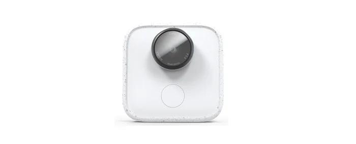
Clips has a sense of “camera-ness” imbued by the protruding lens, shutter button, and other visual details.
The best example is that Clips looks like a camera. It sounds obvious, but it wasn’t at first. Our prototype hardware didn’t have the hallmarks of what people think of as a camera—the protruding lens, the inscriptions, the shutter button, simple on/off indicators, LEDs that flash when recording—all things that signal: “This is a camera and should be used like a camera.” Our early research found this lack of familiarity strained the cognitive budget, making it hard for people to grasp what this new type of camera actually did. But when we redesigned the hardware so that Clips could be read as camera-like, it became easier for people to understand that it captured images automatically.
Our original interface design concept was part movie and part camera, but we found that it was confusing to users.
Earlier versions of our software experience also stretched the bounds of familiarity. The UI was a hybrid of a movie player and a smartphone camera, which attempted to create a beginning-to-end story, a sort of pre-edited movie from which we asked users to extract the stills or videos they wanted to keep. People were unsure whether they were meant to keep the whole movie, or pull a few snippets out and throw the rest away. An unfamiliar workflow and concept made the idea of trusting this new type of camera that much more difficult.
Levers of control
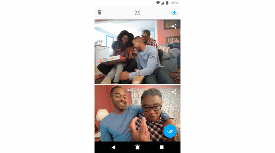
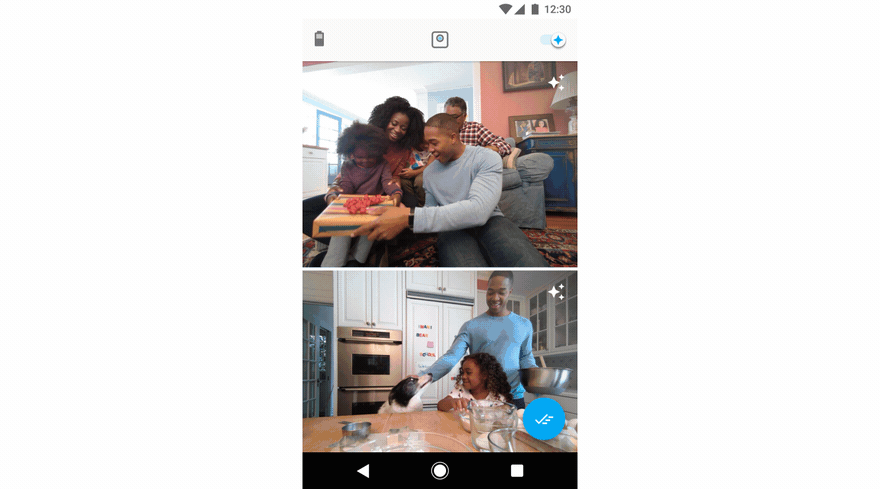
In balancing the precision/recall tradeoff, we learned to include more content than the user would typically keep, to provide enough coverage for any given recording session. This meant that choosing which clips to keep (and which not to) became the key decision a user has to make. In turn, we leveraged another familiar mechanism to make this the core of the Clips UI: swipe right on the clips you want, swipe left on the ones you don’t. And because we wanted to make decision-making as quick as possible, clips play when you scroll to them in your stream and display full-size with no cropping. That way, a user doesn’t have to navigate away from the main screen in order to make a decision.
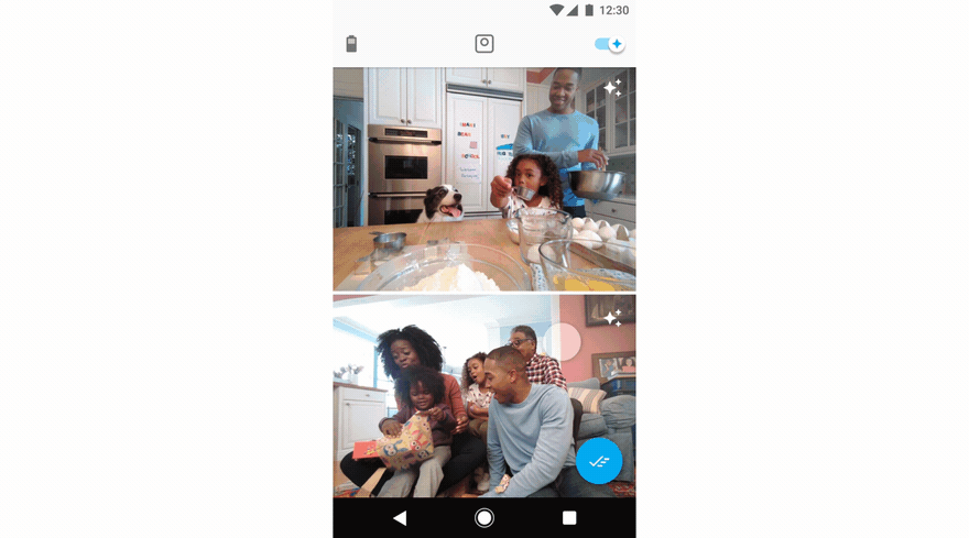
Using familiarity to provide control: swipe right on the clips you like, left on the ones you don’t.
We also built a set of fine-grain controls for what we think of as “last mile” actions. For example, perhaps there’s a single-frame micro-expression that captures the essence of your kiddo’s personality, or maybe the clip ran past the part that truly represented the moment. The camera’s predictions get you most of the way, but providing fine-tuned control avoids frustration when a clip isn’t quite right. This bolsters a sense of agency over the ultimate output.
For finer editing, users can navigate one level deeper in the UI to access single frame images, video trimming, and different file types.
Finally, we learned that people prefer the peace of mind that comes with taking full control over the camera when needed. Again, we used a familiar concept to help humans collaborate with the camera to get the best content. Both Live Preview, a viewfinder accessible through the Clips app, and the camera’s physical shutter button, allow users to capture clips manually, just like they would on a traditional camera. While this ostensibly compromised our mission of helping people step out from behind the lens to be more present with their loved ones, simply having it available helped alleviate the concern that the camera might miss something important.
By using Live Preview, users can manually capture a clip from inside the app by touching the “shutter button.”
An honest conversation about settings
Our preference for simplicity in design can lead us to assume that user settings add unnecessary complexity. But the best controls are actually the ones that consider context, in deciding when to allow the user to intervene on her own behalf. And settings are just another tool in the designer’s toolbox.
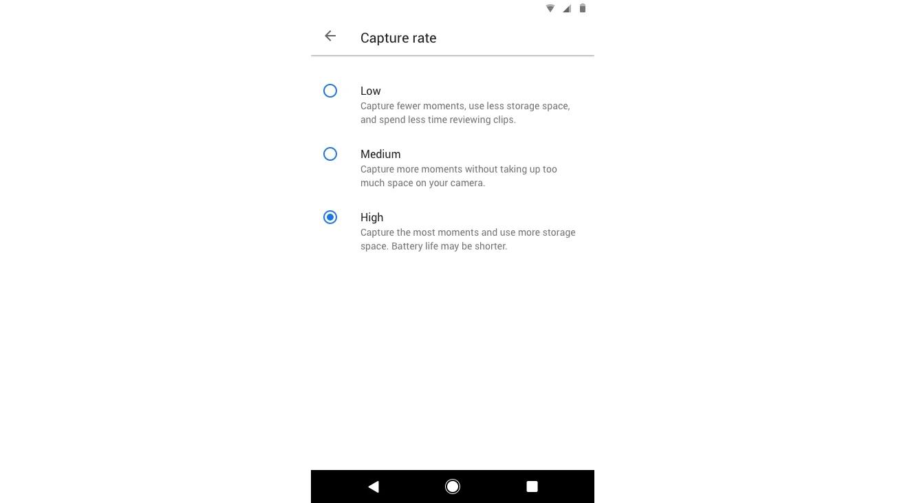
Capture rate settings—low, medium, or high—let users decide how much content their camera will record and keep.
In the spirit of human-camera collaboration, Clips provides a judicious group of settings that allow users to get more out of the camera. We’ve found we have a certain type of user: those that would rather not worry about what the camera is capturing during a session, and are happy to look back through lots of content after the fact. For these folks, we’ve just released a new high-power capture rate that changes the balance of the camera’s precision and recall algorithm—it biases heavily for recall, ensuring that all the most interesting clips will be captured (while acknowledging that it’ll let in some content that’s less so).
This control over how the camera functions allows our users to think of the Clips camera as a tool. They can use Clips to get what they want, rather than being forced to trust it as a “magic” artifact that’s meant to choose the right thing regardless of context.
Removing control in the right places
Dispelling the sense of artificial intelligience as magic is another important element of designing with AI in mind. The Clips camera was designed to work best with people and pets; that’s what we learned users want most, and that’s where we focused the algorithms of the camera in making the best predictions about what’s interesting. But we also learned, as is so often the case, that people don’t always use the product in the way its designers intended.
We found through research that without any guidance, our users would put the camera in any and every situation expecting it to capture great content because, well, it’s “intelligent,” right? One user set up the camera while he washed the dishes and somehow expected interesting results. Instead, he got back a mundane loop of himself scrubbing a sheet pan.

One early Clips user recorded himself washing the dishes. It turns out that pan scrubbing doesn’t make for captivating photography.
Without any direction about what their new AI-powered camera was capable of, or when to use it to get the best content, our early users were left without an intuitive understanding of what Clips was actually best at capturing.
We realized that for users to get the most out of the camera they needed to be nudged in the right direction. In addition to pointing the camera at interesting subjects (like kids and pets), simple framing techniques make a big difference in the quality of the output. We chose to deliver this guidance throughout every touchpoint of the product, from the industrial design of the camera itself to the packaging and the app experience. During setup, the camera takes a few minutes to update. We take advantage of that time by showing users simple, illustrated instructions, like how to: turn the camera on and off, use the manual shutter button, and frame subjects.
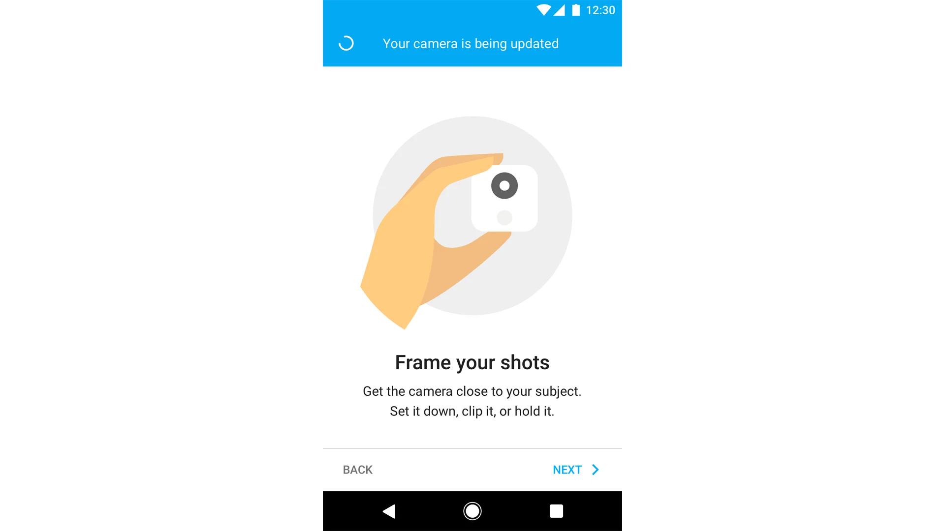
During setup, we demonstrate simple usage techniques by illustrating concepts like getting close to the subject, or pointing the camera at people and pets.
This reinforcement, through design and user experience, adds up to something that’s less magic and more intuitive. And primes people to use the camera in a way that’s going to be successful and beneficial.
It’s right when it seems obvious
The final product provides a clear benefit for people without giving them a false sense of simplicity. Instead, simplicity is achieved through clarifying concepts, leveraging the familiar, and stripping away the idea that AI is magic. Control is leveraged through a variety of UI mechanisms and settings, that allow users to collaborate with the camera to get the very best shots of their kids and pets.
Designers often feel most confident in their choices when the solutions seem obvious, but in the age of AI, arriving at a seemingly simple solution actually takes many, many steps. Deliberately working along the simplicity/control spectrum is one tool designers can use to build AI-powered tools that better align with human needs.
Gabe Clapper is a UX Designer in the Research & Machine Intelligence group at Google, and the design lead for Google Clips.