Catching up with Erik Spiekermann
The type legend on his new book, a big birthday, and variable fonts.
Type design legend Erik Spiekermann has teamed up with Google Fonts to make the new edition of his book “Stop Stealing Sheep” available to all under a Creative Commons license.
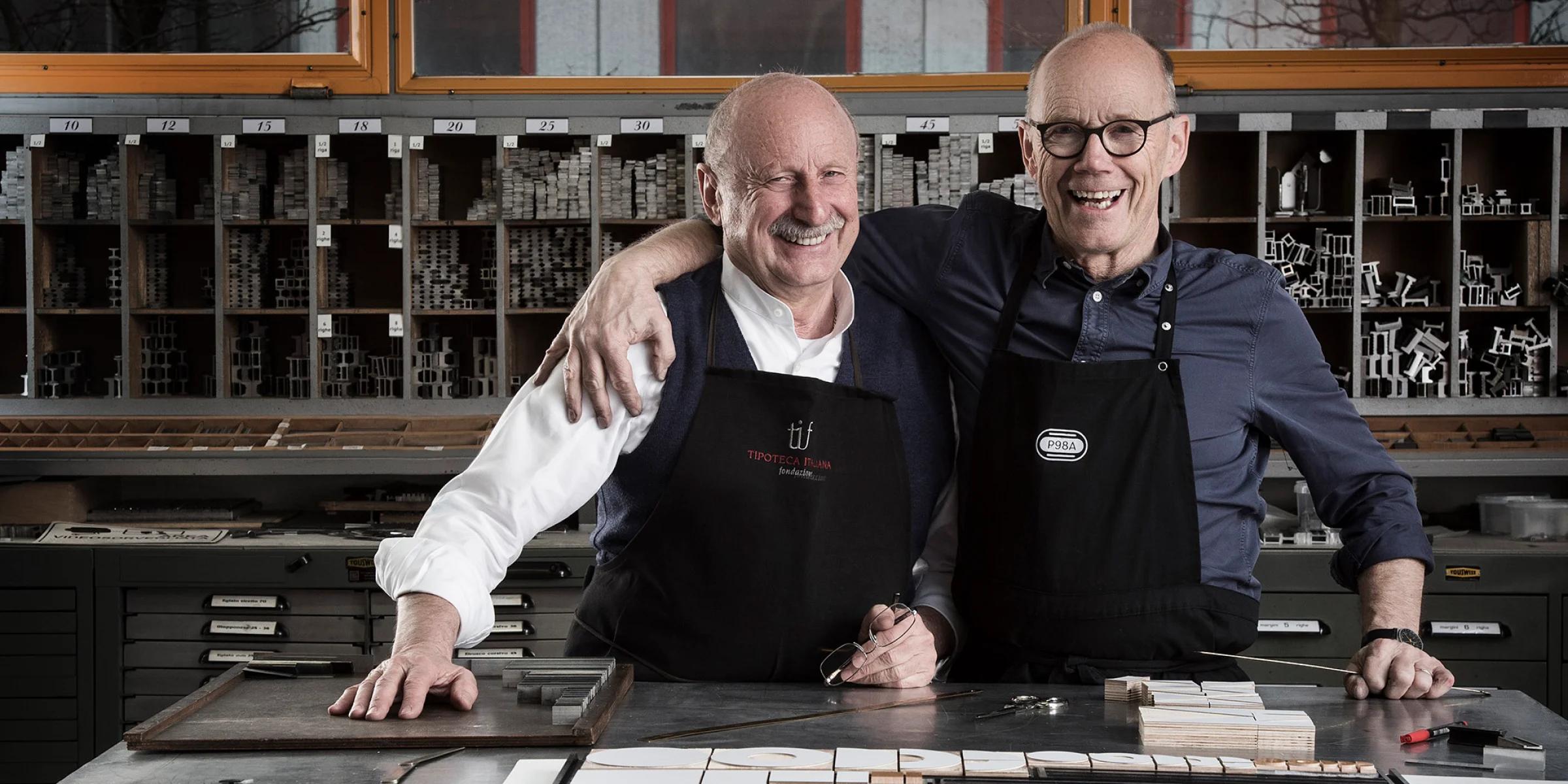
Erik Spiekermann has just returned from Italy, where he was picking up the first print run of his latest book from the printers. But he didn’t just go for the books, he was also “avoiding celebrations” for his 75th birthday.
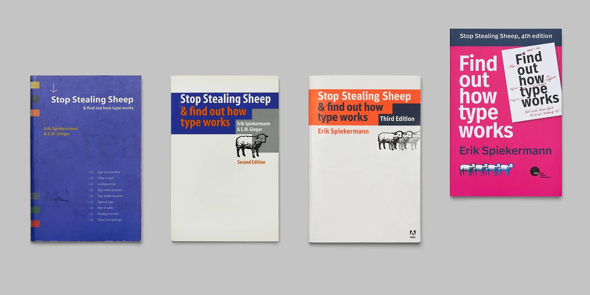
One of the most well-known and influential type designers of our time, Spiekermann has achieved much in those 75 years. And he has the awards and honorary doctorate degrees to prove it. (OK, it’s just one honorary doctorate, but still.) You might know him for having designed FF Meta, co-founding Fontshop, or perhaps from his iconic book, “Stop Stealing Sheep and find out how type works” (PDF, 23 Mb).
The brand new edition of ”Stop Stealing Sheep and find out how type works” is now on Google Fonts and is open to everyone under a Creative Commons license.
The first edition of “The Sheep Book,” as it’s often called, was released by Adobe in 1993 as a ‘common-sense’ guide to typography. Since then, it has become required reading for type design students across the globe.
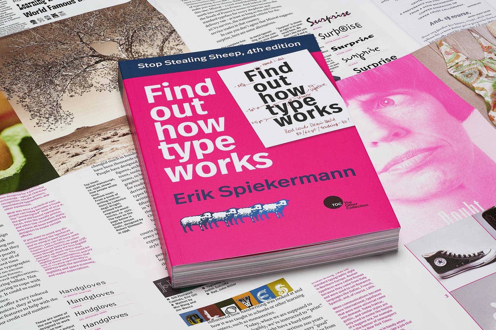
Now, the design classic is updated once again. In this 4th edition, Spiekerman improves the design of the book itself and adds new content—most notably, an entire chapter about variable fonts (with help from our very own Dave Crossland). And, for the first time ever, the entire “Stop Stealing Sheep and find out how type works” is being made available in PDF for everyone, under a Creative Commons license and downloadable directly from Google Fonts!
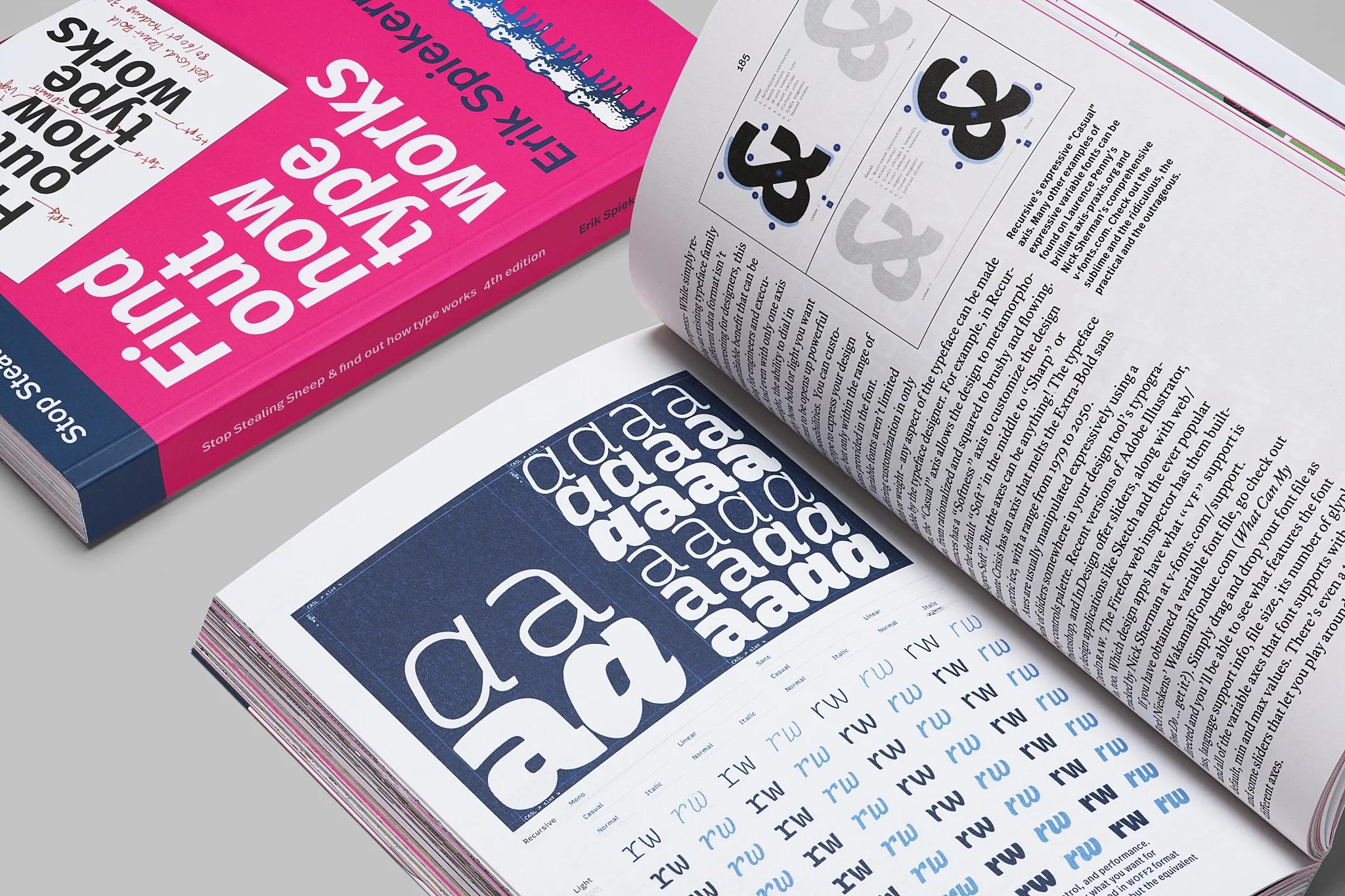
In addition to being completely redesigned, the 4th edition has updated content and a new chapter on variable fonts by Dave Crossland of Google Fonts and Jason Pamental.
We sat down with Erik to talk about the new edition and to see what else he’s been up to.
Happy belated birthday!
Oh, thank you. It’s a significant one. It was scary.
So should we get started? Why did you decide to release a new edition of this book?
Well, there's the technical advances. When we put out the last edition (was that about 10 years ago?), web fonts were kind of just starting. I mean, they'd been around for ten years already actually, but they still hadn't really been accepted. You could upload a font and you could put it in the website, but it was difficult. The data was tremendous, like 2 ½ megabytes, and all the developers said, "Oh no, my God, we don't want those web fonts. They're slowing down the pages." So everybody was still using Times Roman, and Arial, and Georgia. (Actually, Georgia is quite good on screen).
So real web fonts are much smaller. You have more choices and they’ve become really good. The hinting is better. And it’s easy for any designer to embed them. To host them is not an issue anymore. You used to have to have your own font server! Not anymore. And screens have gotten so much better. Essentially, the quality on screen from a resolution point of view is as good as paper. There's no excuse anymore to just use Arial.
At the same time, there’s the development (which we mention in the book) that pretty much every large corporation now has a corporate typeface, whether it’s Paramount, or Mercedes Benz, or Bosch, or whatever. I’ve done all these corporate fonts because they realize, partly, it makes them unique from a branding point of view. But it’s also easier to distribute them to all your suppliers and everyone who works for you.
All that stuff I find really exciting. Type has become much more mainstream than it ever was.
Of course, the other thing is, typography is probably more important than ever. We read differently, but what is the internet? It’s reading. OK, you have YouTube and TikTok and what have you, but there’s still a lot of reading. And because there is so much out there, it’s become more important for brands to distinguish themselves.
So, with all that, I figured it was time to bring my book up to date. Honestly I was embarrassed about the old book being around.
Let’s talk variable fonts. In this edition there’s an entire chapter dedicated to variable fonts (with contributions from our very own Dave Crossland!). Do you think this is a technology that’s transformative, in the way web fonts or movable type were?
It totally is—it’s transformative. It will take another five or ten years, like web fonts did. We always think it's gonna be quicker. Look at 3D printing. Ten years ago, I thought we'd be 3D printing everything by now.
So it’s going to take a little while, but variable fonts are certainly here to stay. They’re a great invention both from an aesthetic point of view—you can have fun with them—and from a practical point of view; you can have 24 weights and it’s 16 kilobytes. It’s ridiculous. They get small enough to fit on my old—my first Macintosh with those little diskettes. We’re back to kilobytes! It’s amazing.
So how do you think variable fonts technology will be transformative? What’s the impact it’ll have on the world?
The best thing is that you can optimize stuff for the screen, so that nobody can complain about it being illegible. There's no excuse anymore. If your type is too thin, or you don't fit enough characters per line, it's your own fault. You can reduce. You can compress it a little bit. Condense it a little bit to 97% and readers won't notice a difference, but you might get that extra two characters in and avoid a line break. And if it's too thin, increase the weight just a bit. The reader won't even know, and the system won't even know; it just goes up in weight.
If you have bad eyesight like I do, you can choose to have bigger type, and it’ll adjust for you. Do you read long sentences? Do you scroll all the way down, or just look at snippets? We can optimize for all of this using variable fonts. So again, there's no more excuse for illegible, or bad-looking, or not-branded, type, on any screen. I think it's a fantastic development.
We've had this in paper for 500 years. If I print a book, or the newspaper, I know the format, right? With digital, the format is always changing. But variable fonts can adapt.
Clearly you see the importance of embracing the new. What’s something you learned recently? Is there anything left to learn?
Well, there’s something I learned a long time ago and was recently reminded of in my typesetting, metal typography workshop. As children, we learn by touching things. In English, you say you're “grasping” it. The German expression is even better. We say "begreifen” (“to grip”). It means, something you've touched you will remember better than something you have not touched.
[Digital natives come to my letterpress workshop and learn that] you have to touch the white space. The white space is physical. You have to put it there. Like Lego, you have to connect everything. It is like when I bake: I like to bake, and I don't measure things. I know what the dough should feel like. I know whether I've got to add more butter, or oil, or flour, or whatever, and I can't explain it. I feel it. I learned from my mother that if the dough runs off the spoon “this” way, then it's perfect. This is the sort of thing you learn when you're doing letterpress metal type. It looks right. It feels right. And you don't post-rationalize it. You can cut things up. You can throw things away. You can mess things up. That physical interference is something that we've been missing and I think it's coming back. Visual communication is going back to its roots. It's being seen more as a craft. Working together, crafting words, crafting things… The last few years have all been us producing as much [stuff] as possible and now we're thinking, “wait a minute.” I'm kind of hopeful for our craft of communication that we are slowing down once again.
Your book has become a reference for type experts, but the initial brief from Adobe was to make a book for beginners. What would you say now to someone new to typography?
What we do in visual communication is quite complex, but I like to consider the joyful part of [our job]. We all need to spread more knowledge, because there’s not enough of it out there. It’s quite enjoyable, and it’s incredibly important. And we need it now more than ever.
”Stop Stealing Sheep and find out how type works, 4th edition” (PDF, 23 Mb) is published and open to all under a Creative Commons license on Google Fonts.