Catching up with Creative Fellow An Huynh
How does a company the size of Google evolve its visual language and respond to change? How do individuals stay inspired and retain their voices in brand systems or when working on collaborative teams?
For An Huynh, 2022 Rare with Google Creative Fellow, these are just some of the tough questions his host, Material Design Creative Director Andy Stewart, asked him to tackle on day one. (No pressure, right?)
In the last week of An’s fellowship, we sat down to talk about his time with Material Design, and to hear about the thinking behind the experiments seen here that play with Google’s identity.


GD: Andy, how did you come up with the prompt for An’s first project: “Imagine the Future of Google’s Brand”? Kind of lofty for week one on the job, no?
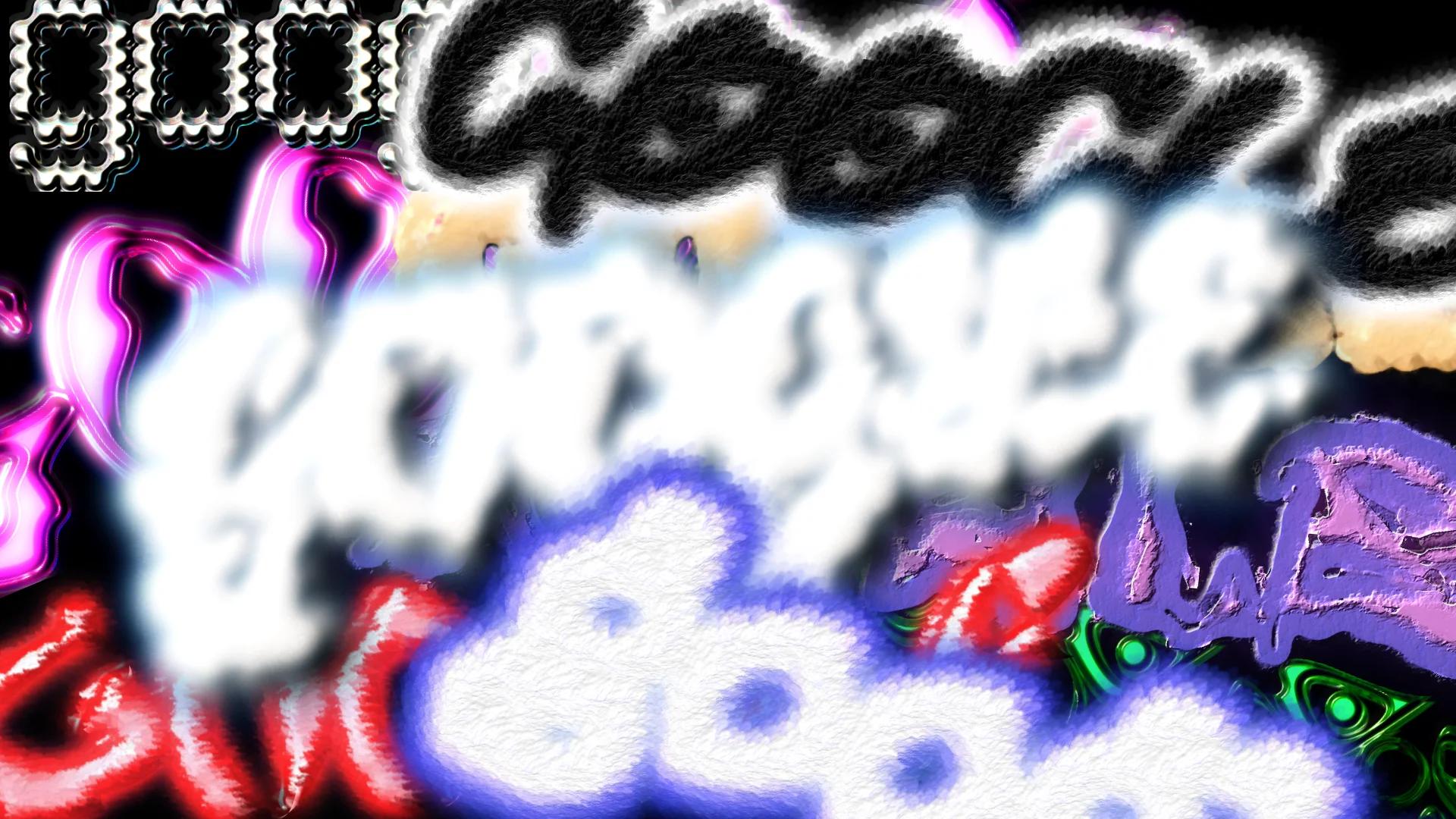
ANDY: For An’s project I wanted to put down what seemed like the hardest thing someone could try to talk about – and Google’s brand isn’t something you get to play around with too often. I kept the brief open because one of the goals of the fellowship is to make space for emerging talent. An is a new voice on our team, so my role was to enable him to both challenge himself and also retain his own identity in the context of our team.
Sometimes the scope or ambition of “starter” and intern projects are overly limited by our assumptions about a person’s experience. I wanted to create projects that any full time designer might also be asked to think about.
An, I saw you have an opinion and I appreciate your point of view – I wanted your take on what the future should look like, without softening it.
GD: An, what was your initial reaction to the project?
AN: First I sat there thinking…what do you mean? My approach was to honestly answer and respond to the challenge through abstraction. So the visuals are pretty abstract and in a way unreadable – the future is murky in that way, and I wanted to keep it free. I worked off themes I heard in my conversations with Andy and my teammates who reacted in ways that encouraged me to keep pushing on Material Design’s boundaries.

ANDY: An was responding to a lot of developments and conversations around Material You and that made it natural to push on the colors and textures he’s using. I didn’t want An to try to channel Google’s brand as we know it today.
GD: An, what was your process like – where did you begin?
AN: I got to experiment a lot, and I started by playing around with different programs, rather than starting from Material’s design standards and guidelines. I started with painting and neon colors – styles you wouldn’t expect from Google today. The textures that came later are a kind of way to apply Google brand colors like a spray paint. Towards the end I was flipping things around, hanging things on other words. I wanted it to be fun…I think you can tell I had fun making this.
ANDY: I remember early on in a fellowship meeting there were people talking about your generation, Gen Z…That was another thing you had to navigate here. I didn’t want your point of view categorized or limited through that lens of “what Gen Z thinks,” or for other cultural stereotypes to be the thing that validates your work.
The work itself is more like a stream of consciousness...it’s not “branding” in the usual sense, but more like a series of thoughts and ideas. So in reality this work doesn’t benefit as much from framing as a “Gen Z perspective” – I read it more as An’s perspective.
Day-to-day our teamwork is very directed around deliverables and collaborative decisions… I really wanted to see what can happen if you don’t limit an individual perspective at the outset of a creative project.
AN: Ultimately I wanted to make it possible to question things since abstraction demands some act of interpretation… Even if this project is about my opinion or perspective, I think it’s also intentionally inviting others in as well by staying open to new meaning…which is the kind of brand I’d like.


