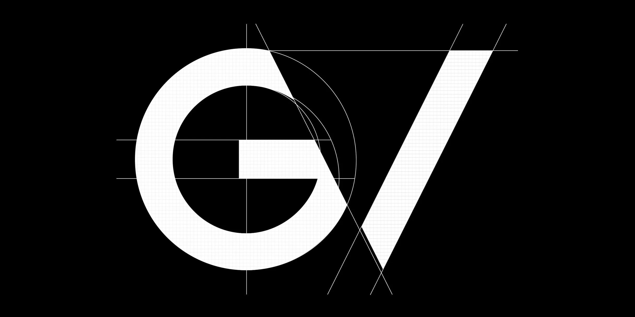
Brand New
GV launches a new identity system (and takes their own advice)
At GV, we’re comfortable with risk. We provide venture capital funding and advice to bold, new companies who are pushing the boundaries of what’s possible by improving lives and changing industries. So when it came time to change the name of our firm from Google Ventures to GV late last fall, we saw it as the natural next step in a multi-year effort to evolve our brand.
Branding can be a huge undertaking for startups—we know because we work with them everyday and make plenty of mistakes. But there’s also a lot to be learned when things go right. In our case, the evolution felt organic (everyone called us GV already), and because our end-of-year summit was only a few weeks away, we had a hard deadline to keep the design work on track. We knew it wouldn’t be easy—in our experience, creating a new logo and visual identity rarely is—but what we didn’t anticipate is how important (and at times challenging) it can be to listen to your own advice.
Get help
With our full-time design and marketing teams at GV, we’ve helped dozens of companies through branding and naming projects. The chance to apply that expertise to our own brand was undeniably exciting, and I was hopeful we could design everything in house. But Daniel Burka, our visual design expert, was quick to point out that finding outside help would give us the perspective and bandwidth to produce something truly great.
It shouldn’t have come as a surprise because this is the exact advice we give to startups: If you want a world-class brand, gather a diverse team with deep talent. We also often advise companies to hire a design agency with brand experience. By shifting my vantage to think about the project more objectively, I knew Daniel was right, and I immediately thought of asking Google’s Material Design team for help.
We collaborate with the Material Design team periodically, and we were impressed by two of their most recent projects: the launch of Google’s new logo, and the development of the Material Design system. Once they signed on as our diverse experts, the real work could begin.
Prioritize
When you’re developing a visual identity, there’s no room for dithering. When everything is important, nothing is important. And even if you’re working with the most talented designers, you can’t outsource prioritization. The crisper you can get in defining your goals, the better the results will be.
As with any project, we started by helping the Material Design team better understand our world—specifically how we see GV fitting into the venture capital landscape. Daniel began the conversation by reviewing our existing brand, and forecasting how our new brand would differ; Laura Melahn, from our marketing team, shared research on how other venture funds express their values; Bill Maris, our CEO, described how he wanted to see GV continually grow and change as a business.
While reviewing our goals—modern, trustworthy, technical, approachable, the list went on and on—we realized we had more than twenty. Brendan Pascoe, a project manager from the Material team, pushed us to focus. “All of this can be a part of your overall brand,” he explained. “But there’s only so much a visual identity can communicate.”
Brendan was right, we needed to prioritize.
To narrow down your ideas without wasteful argument, I always recommend the note-and-vote process. It sounds so simple—quietly write down your ideas, self-curate, silent vote—but it works. In less than an hour, we had whittled our list of 20 down to two, clearly defined core goals.
We invest in companies in order to help them succeed, and we often work with businesses during difficult periods of growth. That sense of partnership and trustworthiness was what we wanted to communicate most with the GV brand.
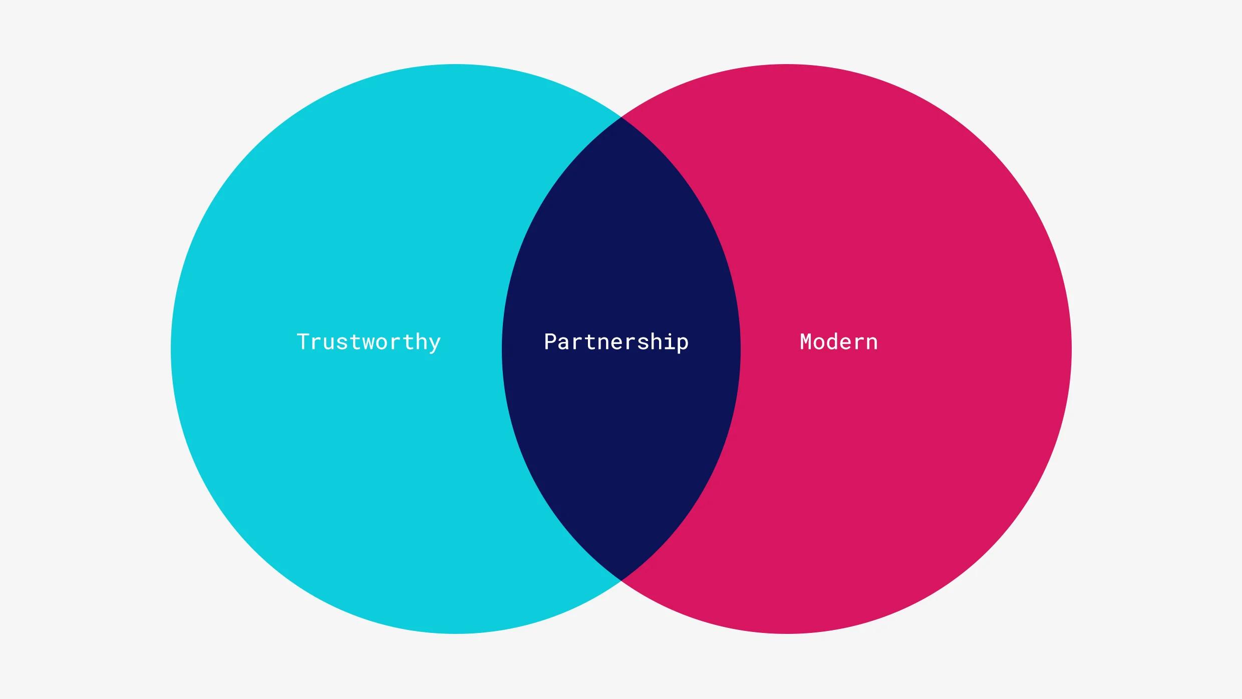
Narrowing down our core values helped us streamline and focus our design process.
Explore and narrow directions
Most design critiques start with talkative or high-status individuals telling everyone what they think. But we’ve found the best decisions happen when the judgement of everyone in the room is incorporated, and each design is evaluated on its own merits. So when we meet to share and critique we always follow one simple rule: no explanations until after all ideas have been considered by the team.
After several days developing concepts, our team was ready to come together, share, and discuss. With close to 40 concepts pinned up for review, John Zeratsky, a design partner at GV, suggested we begin with a dot vote. Dot voting is a technique we use in every sprint to narrow down a wide range of options without wasting a lot of time talking. Everyone is instructed to (silently) place a colored sticky dot on any concept they find promising.
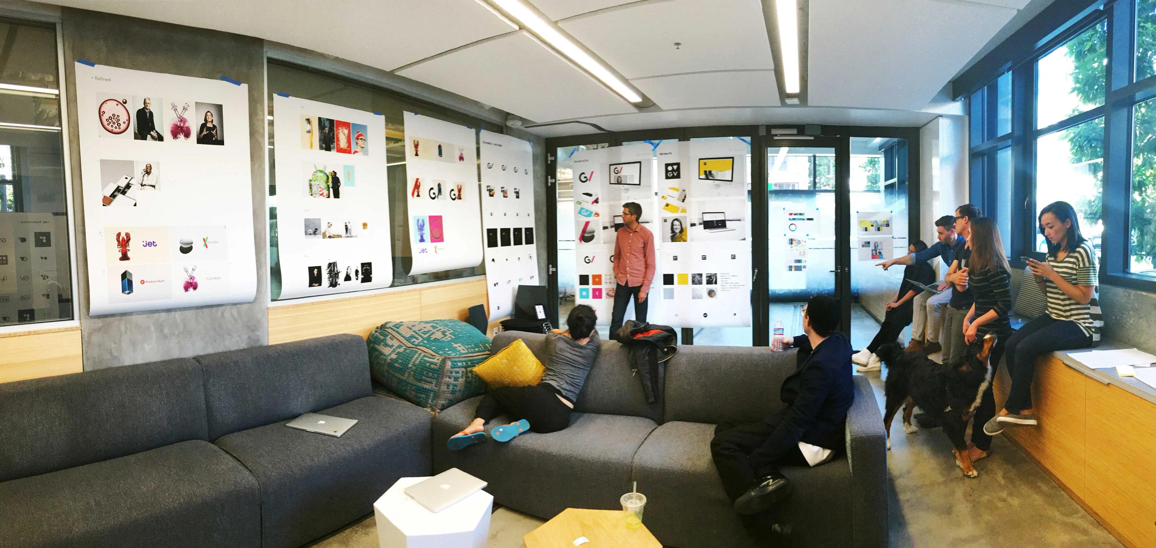
The team used a simple note-and-vote process to cull their direction down from 40 directions.
Fifteen minutes later, our direction was clear. While some concepts had zero votes, one, by Viktor Persson and Sehee Lee, was swarmed with brightly-colored dots. We worked together to refine the idea further, rendering GV in various weights and combinations, from abstract and geometric, to more simple and straightforward. This concept became the seed of our final logo.
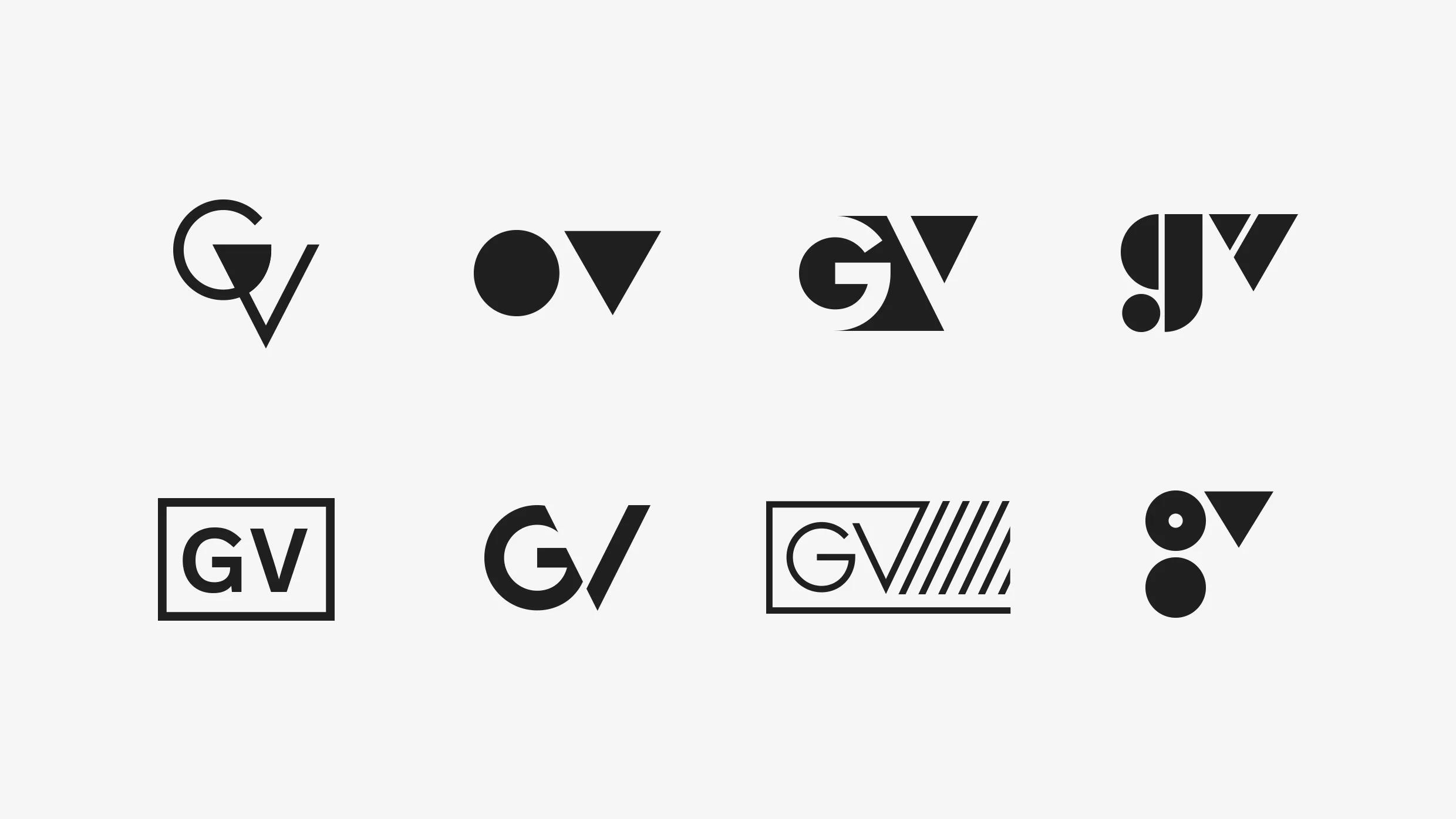
An array of early directions sketched out by the team.
Refine the elements
Rachel Been, a visual designer on the Material team was the first to suggest a dynamic color system for the brand. Instead of using a single color, the identity could inherit colors from GV’s portfolio companies to illustrate our partnerships: Slack pink, Kobalt red, Jet purple, and so on. At events, we could use the brand color of a portfolio company to welcome a CEO on stage, on our website we could pair GV’s identity with our investments, and on a business card, investors might notice that the GV brand matches on of their own investments.
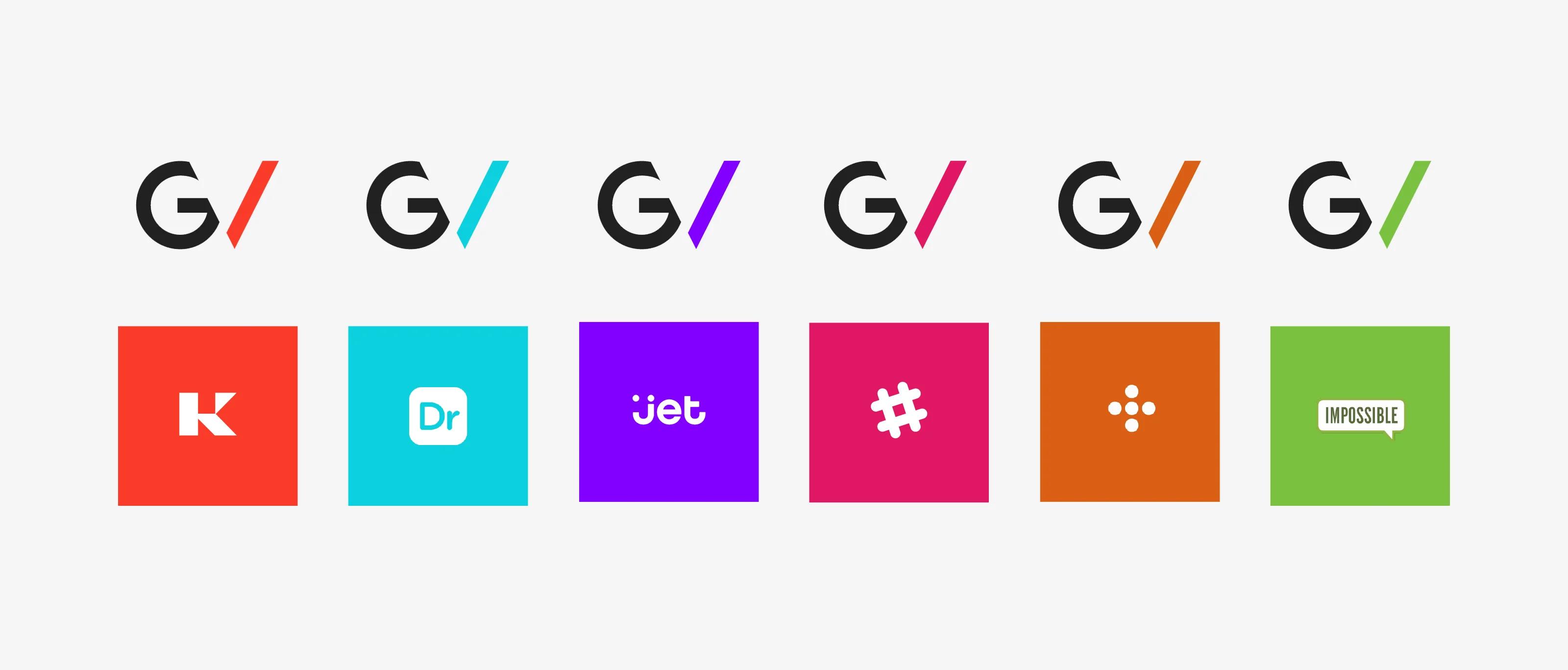
The dynamic color system allows the strong GV logo to adopt the color of the various portfolio companies it represents.
It’s important to note that we only worked on these refinements after we had explored and selected the most promising idea. Designers work this way naturally—explore, narrow, refine—but sometimes a similar workflow is hard to maintain throughout a project. Try designating a team member or project manager to keep things on track.
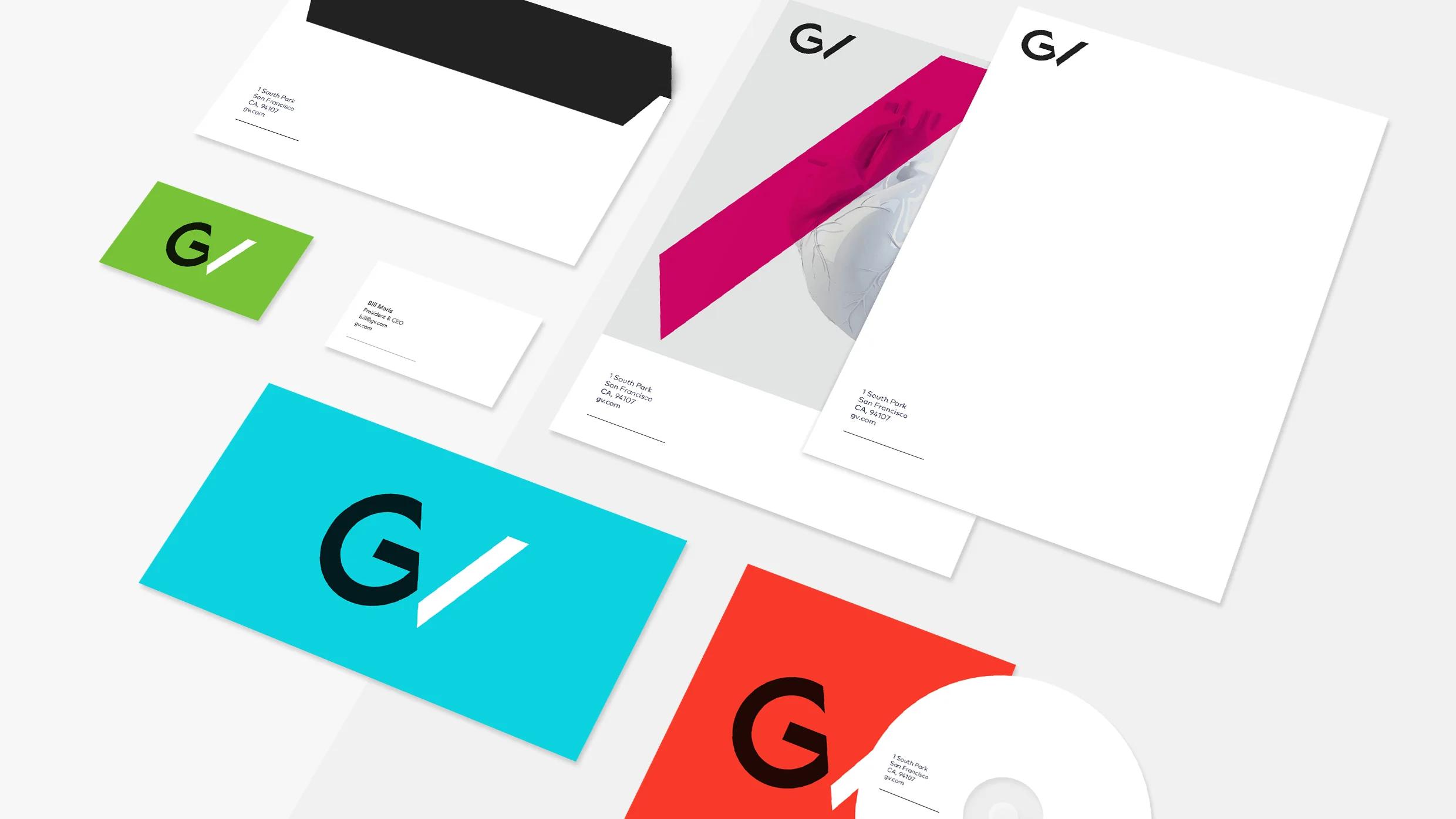
Once we had our direction, we focused on refining it through typography and color. These elements allowed us to look both trustworthy and modern, while giving equal weight to the partnerships between GV and its portfolio companies.
Plan for the future
A brand isn’t built in a day, during a single press cycle, or with the launch of a new website. A brand is built over time, over the thousands and thousands of interactions you have with your customers. Some of those interactions are big, like our recent announcement to focus on life science investments, while others are as small as a thank-you note, or a thoughtfully prepared cup of coffee.
After a few weeks of intense work further refining the GV brand, we decided on a quiet launch. No big press announcement, no fanfare, but instead a simple, low-key gathering around my dining room table on a Sunday night. Why? A new brand is not big news to our audience. While the launch was a huge deal for us, we also understand that startups, founders, and everyone else have a thousand other important things to focus on. What matters most is that their unique brands are represented with integrity and style.
So when it’s time to launch your brand, relax and remember that you know your brand best. Take the time and thought to really create a system that honors your core goals. Plan carefully for the future, because you’ll be building your brand for years to come.
Takeways
-
Start with the right people. Find a diverse set of experts to shift your perspective and help you think objectively about your brand. Even talented teams benefit from asking for assistance.
-
Prioritize. Decide on your messages, values, and goals before you create any concepts. A defined focus is essential.
-
Explore and narrow directions. Many designers work this way, but it can be difficult to maintain a similar workflow on deadline. Choose or appoint a project manager who will keep you honest.
-
Plan for the future, not the launch. Invest heavily in a name, logo, and visual identity that can serve as a foundation for years to come.
Want to learn more about the GV design process? Order Sprint: How to Solve Big Problems and Test New Ideas in Just Five Days by GV partner Jake Knapp.