Asana: Productivity with Personality
Making to-dos more doable with color and character
Functionality is at the core of any successful project-management tool. But when Asana set out to redesign their mobile and desktop applications, they chose to push the UI beyond utility to build a more energizing experience. Project managers and workers use the app’s clear, visually focused interface to assign tasks, stay on top of deadlines, and effectively communicate. Asana’s true personality shines through dynamic infusions of color, motion, and playful animations of fantastical creatures. Combined with an intuitive interface, these delightful details ultimately support collaboration, engagement, and a team’s ability to get things done.
Color energizes interaction
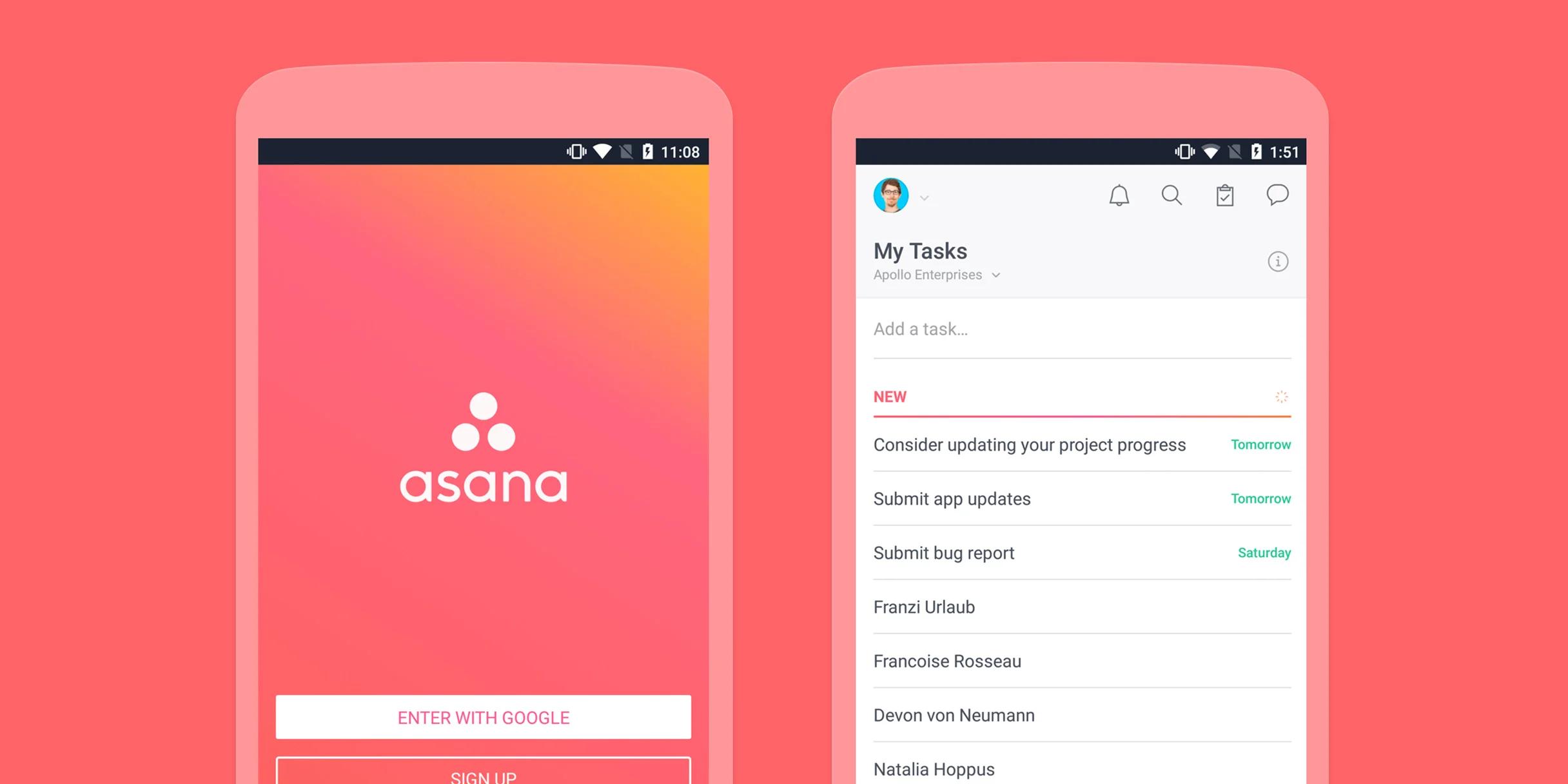
Asana’s designers and engineers focused on crafting an uncluttered interface and building a productive and efficient experience. Users first enter a field of white space. A minimal app bar offers the ability to check updates, search, view projects, and join conversations. Below, lists of tasks are arranged in rows. The strategic use of vibrant colors injects personality and a sense of reward, enhancing the otherwise tidy UI. Sourced from a company rebrand, these bright hues are deployed sparingly and punctuate key moments of interaction: during onboarding, switching between color-coded projects, and marking a task complete—which reveals a bright gradient. Asana Designer Paul Velleux believes these color choices help motivate their audience:
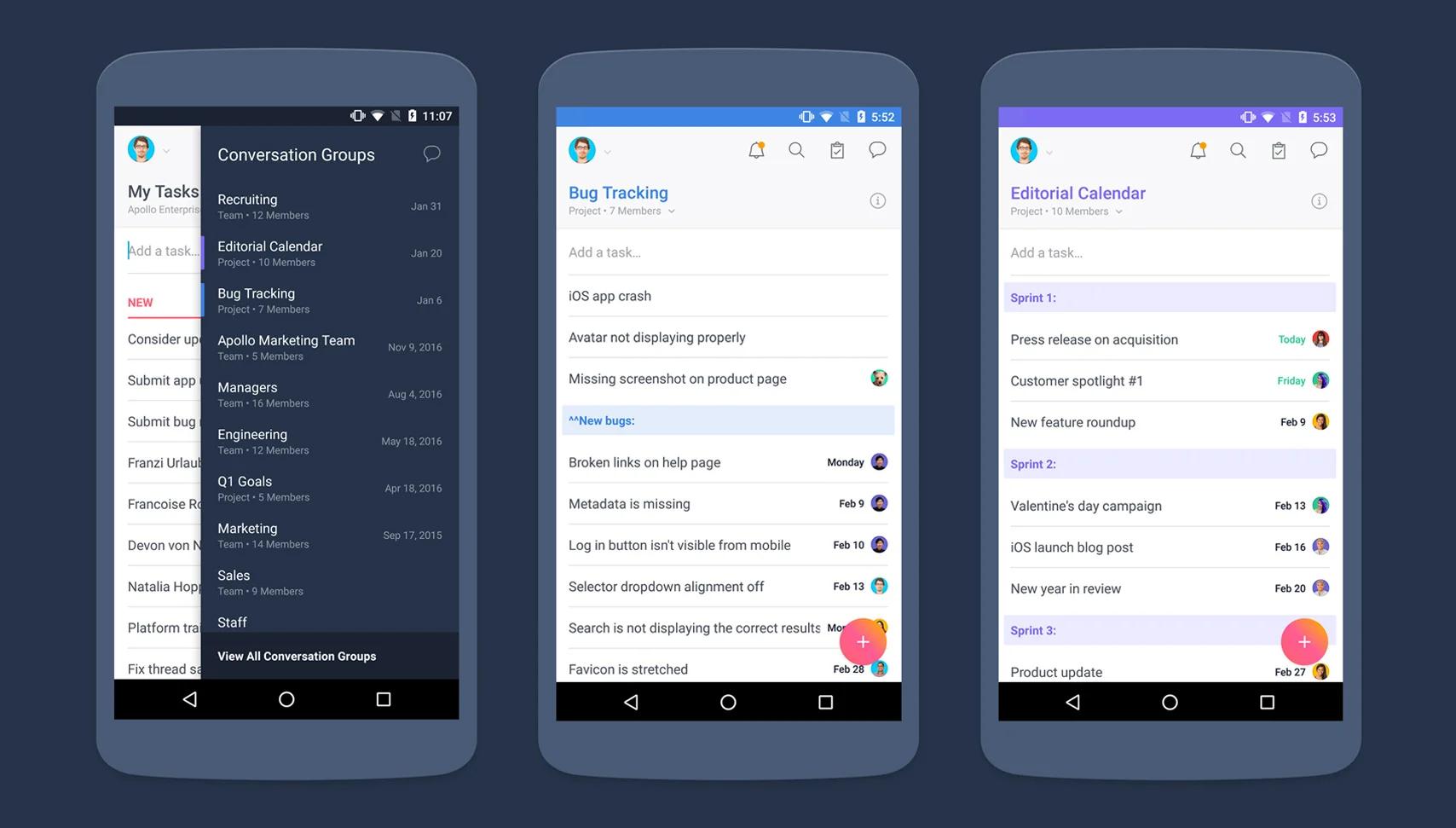
Color helps define the app’s hierarchy: High-level drawers for Projects and Conversation Groups are dark blue, while task lists are predominantly white. These lists can also be individually color-coded to visually signal the switch between projects.
Defining a unique visual language
One of Asana’s most prominent and successful design elements—the multicolor floating action button—pushes the standard flat-color Material Design guidance. But the bold choice fits with Asana’s visual identity, particularly the bright floating dots in the logo. Throughout the app, the “glow” effect on the FAB is used as an overarching visual motif expressing vitality and personality. It’s present when users create a task and when teammates “heart” an item or communication. At first, the design team felt they were taking a risk by bending the Material Design standards, but according to Product Manager Sarah Chandler, the debate helped them more deliberately apply the guidelines. The places where the app deviates from Material Design were made in the service of supporting the brand, improving usability, or standardizing the design across platforms.
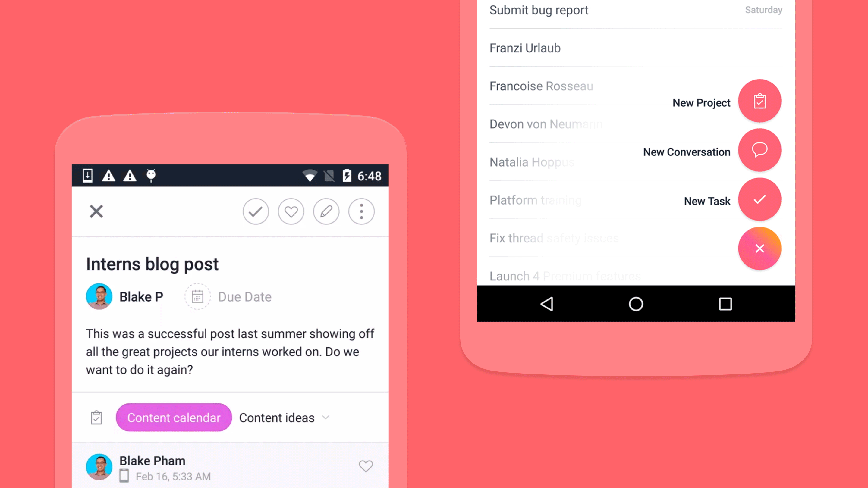
The glow effect is used as a visual motif throughout the app, as a custom animation that’s triggered when a user “hearts” a conversation or task (above left), and as a soft white gradient that expands beneath the FAB to improve legibility (above right).
Playful animation rewards accomplishment
Creative customizations like the glow effect are threaded subtly throughout the product. But the most user-cherished elements are animations of a unicorn and narwhal that surprise users by flying across the screen after a task is marked complete. The whimsical illustrations don’t appear with every finished task, and the surprise sparks a moment of delight. Asana’s narwhal and unicorn have become beloved badges of accomplishment that users proudly share on social media.
Celebrating recognition and a growing base of users
Asana was named one of the 10 Best Apps of 2016 by Fast Company and recently won a Material Design Award for brand infusion. The redesign was covered in publications like Business Insider, TechCrunch, and USA Today, which noted its efficient and simplified interface. In the first months after the app relaunch, Asana saw a spike in new-user signups, as well as increases in actions like commenting, creating tasks, and completing tasks. User response continues to be overwhelmingly positive—in a recent survey, Asana’s customers reported that the app makes them 45 percent more effective (on average) and increases clarity, responsibility, and accountability on their teams by more than 80 percent.