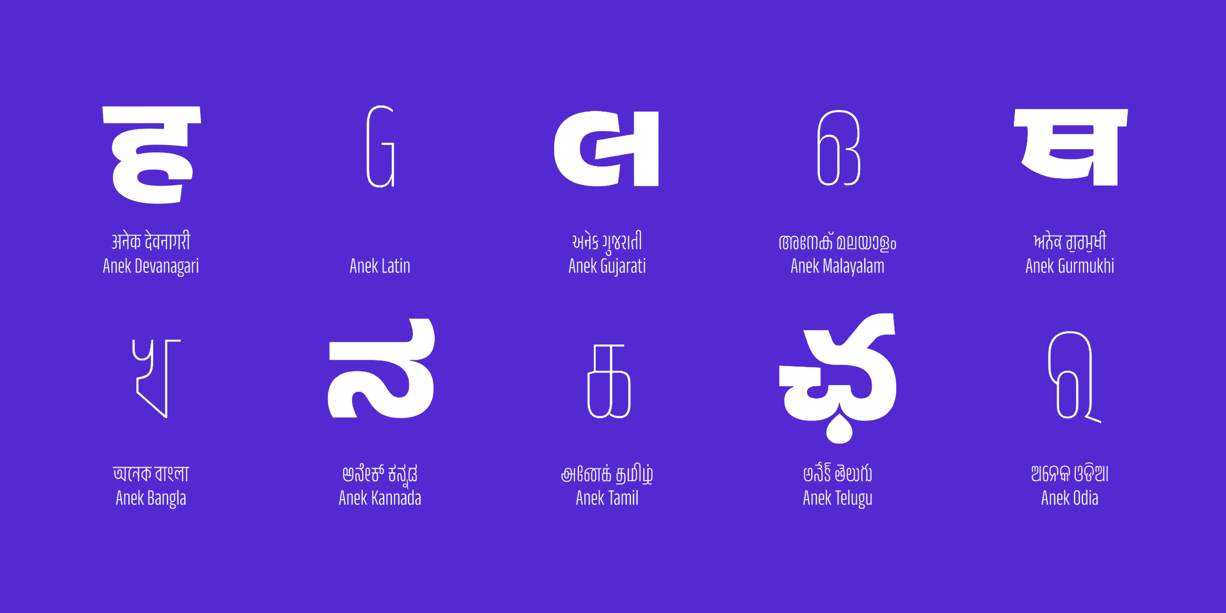
Multiple scripts for multilingual India
The award-winning Anek variable font
The Anek multi-script typeface for 9 Indian languages and Latin was made through a collaboration of 12 type designers working across 8 cities in India.
How did Ek Type win two type design awards (the TDC Certificate of Typographic Excellence and the D&AD Graphite Pencil) for their Anek multi-script typeface?
There were two key factors to their success:
- Teamwork: The team of 12 collaborated democratically.
- Equality: Giving equal value to each of the nine Indian writing systems (scripts) and Latin, while maintaining both common visual features and script-specific characteristics.
Teamwork during lockdown
Getting 12 people to collaborate while speaking in three languages (English, Hindi, and Marathi) and spread out in eight different Indian cities (Mumbai, Pune, Kalyan, Hinganghat, Baroda, Bengaluru, Bharampur, and Pali) is not an easy task.
Ek Type established a collaboration structure that fostered teamwork, while also giving designers the liberty to be creative.
The team consisted of Maithili Shingre, Yesha Goshar, Kailash Malviya, Aadarsh Rajan, Sulekha Rajkumar, Vaishnavi Murthy, Omkar Bhoir, Mrunmayee Ghaisas, Mahesh Sahu, Sarang Kulkarni, Noopur Datye, and Girish Dalvi.
Ten people focused on one script each, while the other two members worked on font engineering and project management. The designers focused on the script that was most familiar to them.
Via three- to four-hour weekly video calls, team members annotated drawings with emojis, arrows, text, and other marks in their video conference platform. In between calls, the team collaborated online. The team made design decisions based on majority or unanimous votes.
Before the pandemic, most of the team had worked together at the Ek Type studio in Mumbai. Remote work created some unforeseen benefits. “Everyone had the time to venture in different directions, not getting colored by what the others were doing,” said Noopur Datye, co-founder and type designer at Ek Type.
Many first, not Latin-first
Although the team was spread out, they shared the same goal of creating a unified font family.
The word “anek” means “many” or “multiple” in several Indian languages. The Ek team chose “anek” for the font family name since the fonts have an especially large set of weights, widths, and scripts: Bangla, Devanagari, Gujarati, Gurmukhi, Kannada, Latin, Malayalam, Odia, Tamil, and Telugu.
Instead of starting with one or two base scripts, the team created all of the typefaces from scratch, designing all 10 Anek scripts simultaneously.
According to Datye, it’s common for typefaces in Indian writing systems to be matched to a preselected and previously made Latin typeface.
“International corporations come to India with their own custom Latin typeface or visual language based in the Latin alphabet. They want their Indian branding in different Indian scripts to have a similar look and feel with the Latin,” explained Datye.
Multiscript typeface design has many challenges. The image below shows how complicated it is to create a harmonious feel for a multiscript family, where the scripts have different ascenders and descenders for vowel signs and conjuncts. Note how some scripts require taller ascenders and descenders than others.
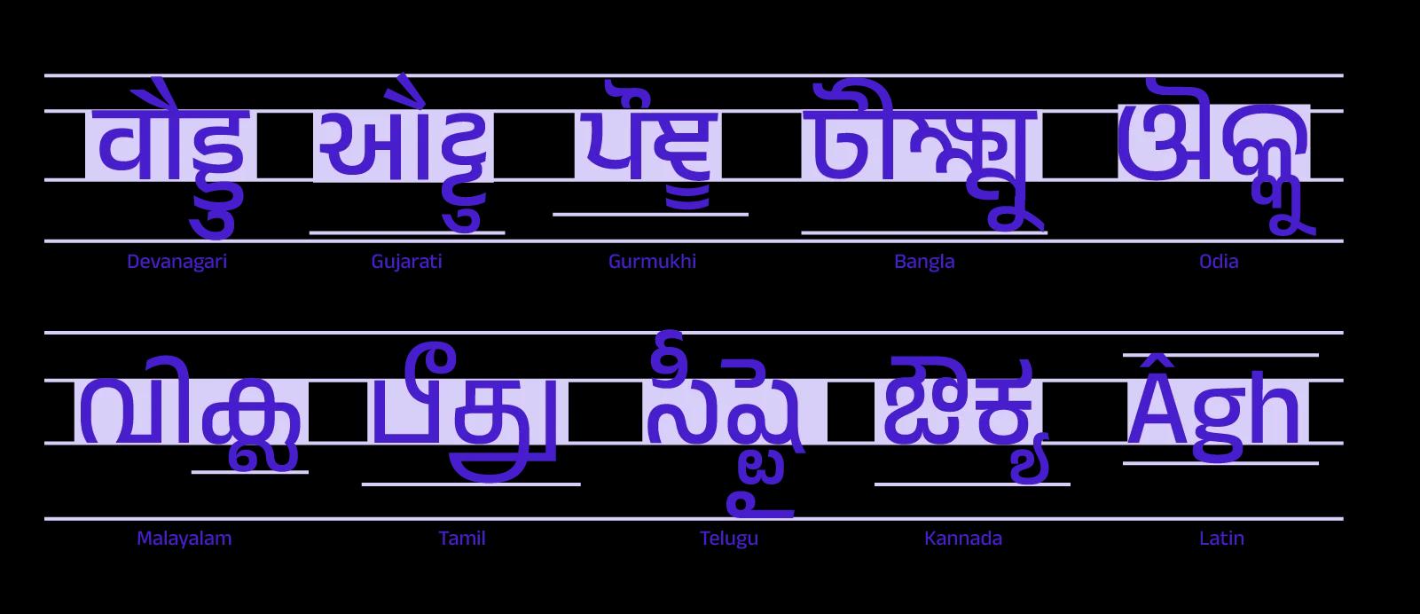
The nine scripts have base characters in the center, with vowel signs and conjuncts that come above, below or next to them.
Common features
The Anek fonts have a unified look because many of them share similar visual features.
The most important overarching features are circles and circular shapes.
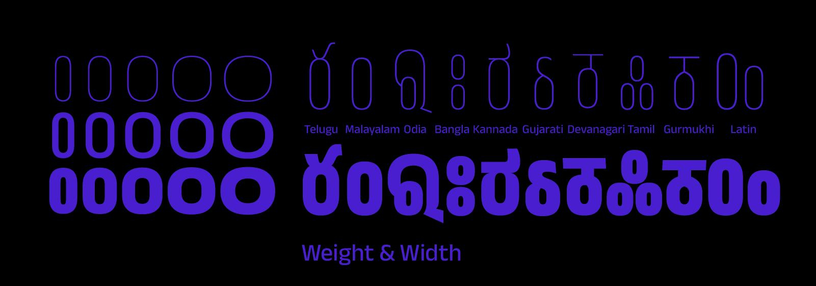
Circular shapes in different weights and widths of Anek
Other common features include the weight and width range, robust letter structures, and delicate joineries (where two strokes join or intersect one another). The sharp terminals, sloped headlines, angled joineries, sharp knots, and pointed letter structures made some of the letterforms look sharp.
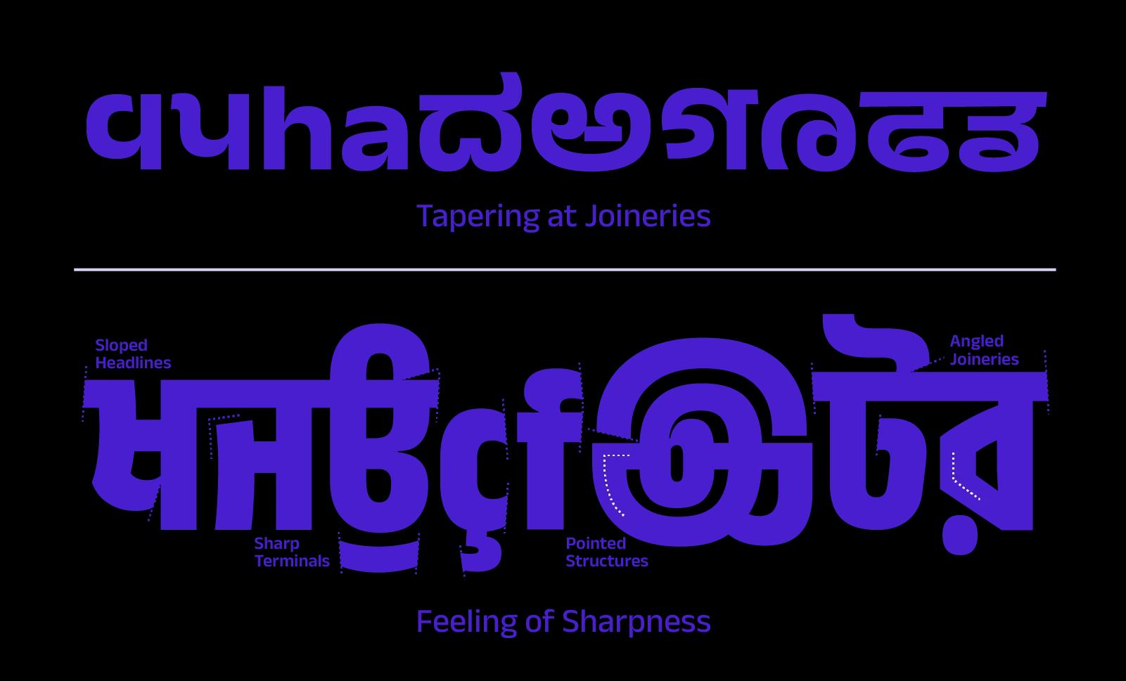
Tapering at joineries and sharpness at terminals are common features across the different Anek scripts
The circular and semi-circular forms above and below letters, and dots within letters, are also shared features across the Anek family.
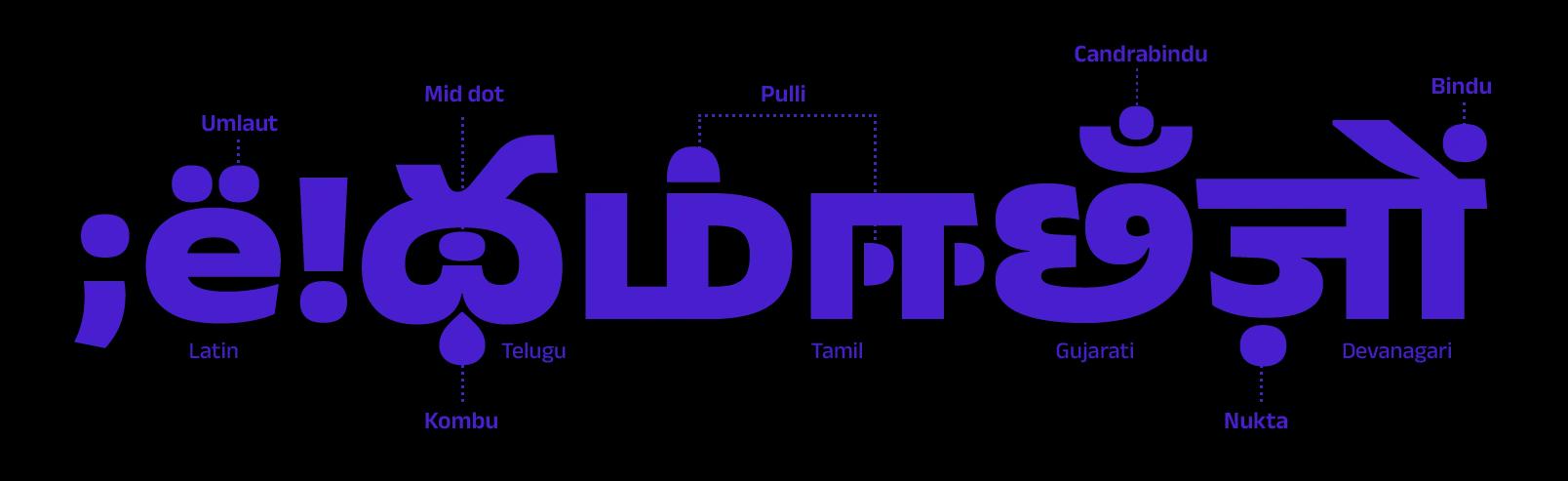
Circular or semicircular forms for the Anek umlaut, dot, bindu, nukta, pullis, and kombus.
Specific features
“The design of each script borrows from its own typographic culture and reflects the designers’ perspectives. Yet the different scripts live together on the page in visual harmony,” explained Datye.
The designers had space to create individual characteristics for each script, that give each font its own identity.
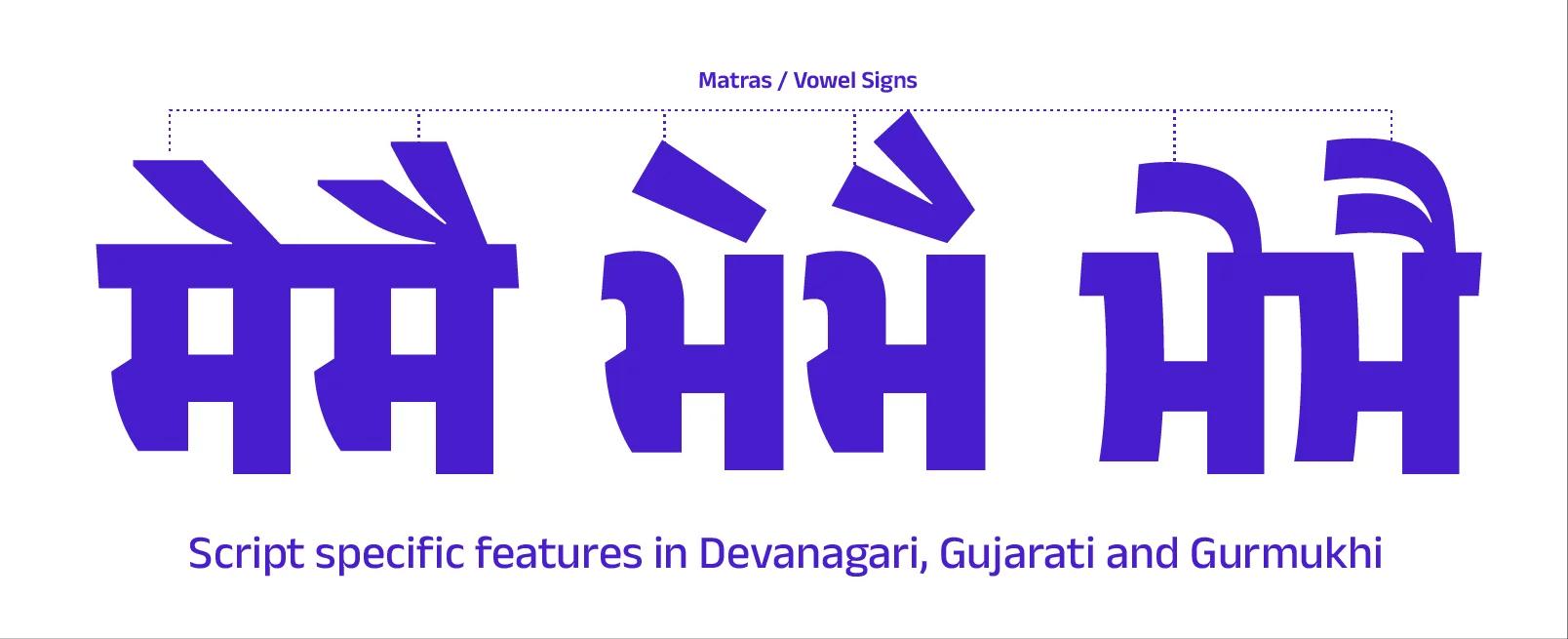
Matras (diacritics) in Anek Devanagari, Gujarati, and Gurmukhi
The matras (vowel sounds or diacritics) on top of the letterforms contribute to the different textures of some scripts. While Devanagari matras are sharp diagonals, the Gujarati matras reflect the style often seen in hand-painted street lettering. The Gurmukhi matras are similar to body size typefaces, and become thinner closer to the top of the letter.
In an approach heavily inspired from street lettering, several of the Tamil letterforms take on compact shapes as they become more narrow, while some others merge with an increase in weight and the pullis (dots) change from circular to semi-circular.
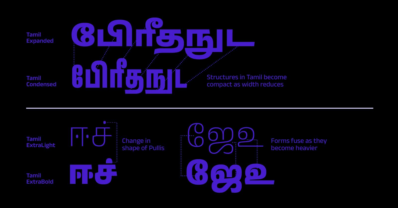
Script-specific features in Anek Tamil Condensed and Extra Bold
Anek Bangla’s curves morph into flat lines as they become narrower, and the terminals curve slightly inwards in expanded forms.
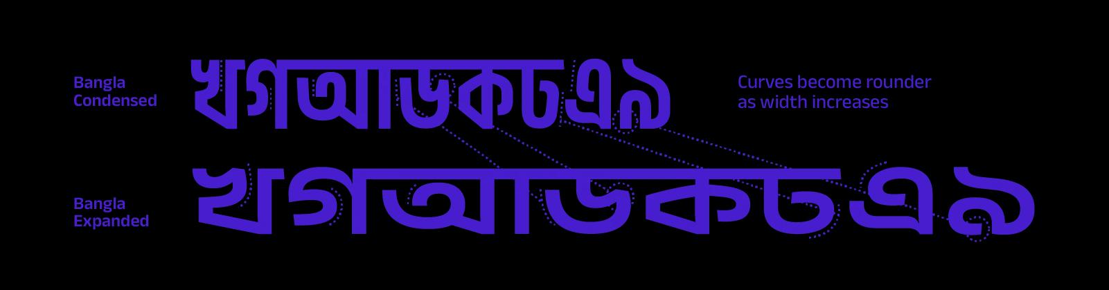
Script-specific features in Anek Bangla Condensed and Expanded
Variety
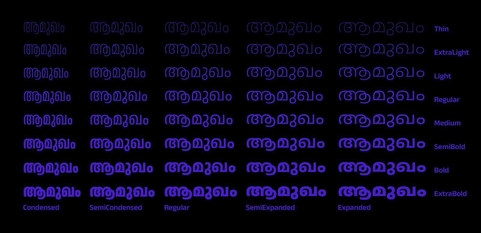
The Malayalam word “āmukhaṁ” meaning “introduction” in 40 weights and styles of Anek.
In addition to the shared features and individual characteristics of each Anek typeface, each font family also offers an especially large variety of styles. The collection ranges from bold weights with striking visual features to elegant lighter ones, from condensed structures to more relaxed and expanded ones, and from impactful styles to mellow and clear ones.
Anek is one of the few Indian variable display fonts with such a large set of weight and width styles. Each script has 40 styles, making a total of 400 named instances across the typeface.
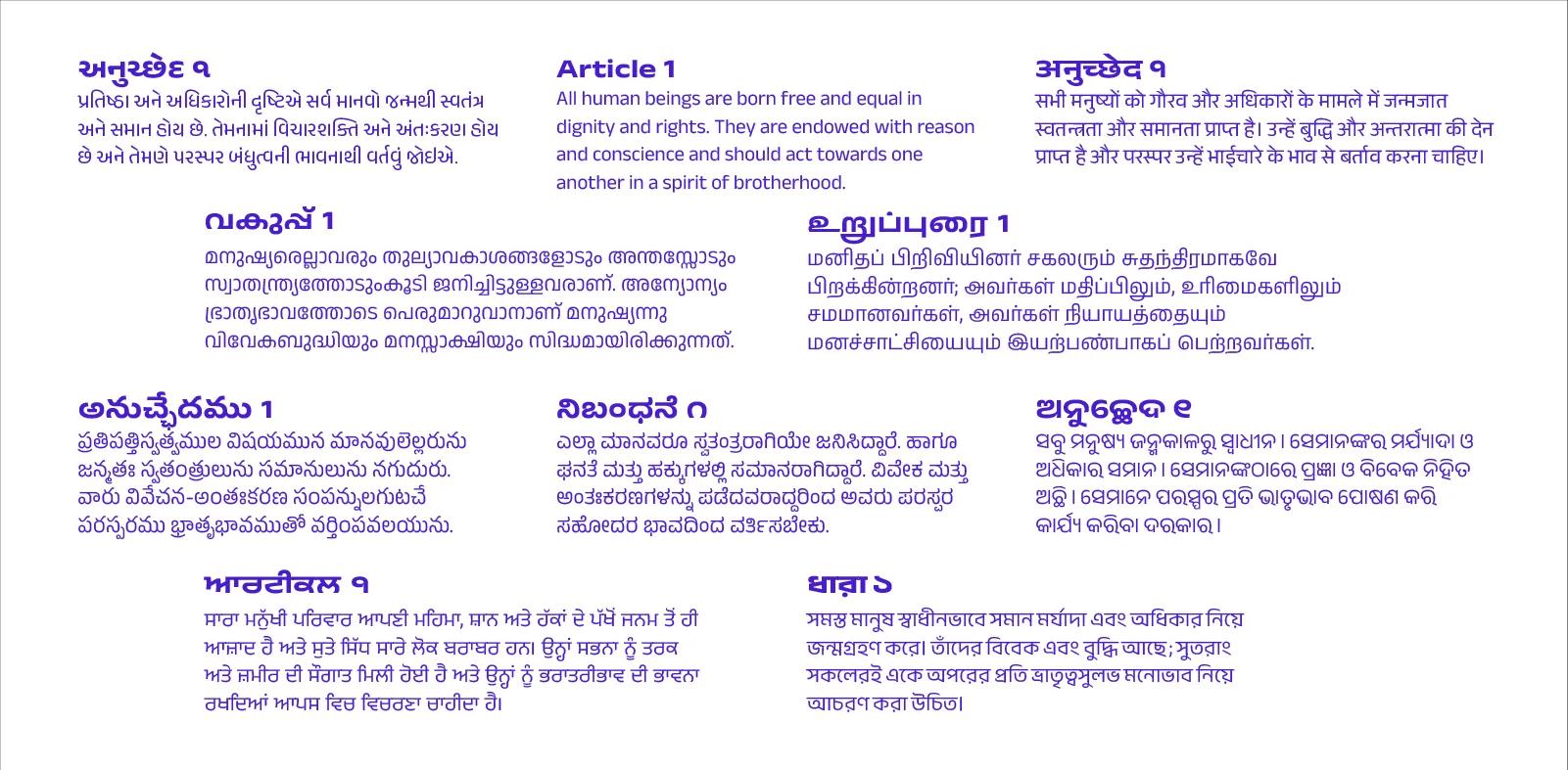
Article 1 of The Universal Declaration of Human Rights in Anek fonts (from left to right, top to bottom) in Gujarati, Latin, Devanagari, Malayalam, Tamil, Telugu, Kannada, Odia, Gurmukhi, and Bangla. The titles are in Expanded Bold and the text is in Regular.
Communication in India often involves multiple languages and scripts. With Anek’s 40 styles and weights, businesses or organizations doing pan-Indian public service announcements, advertisements, and other campaigns have a large variety of fonts to use within the Anek typeface. With Anek, designers and makers can create document templates that can easily be switched from one language or writing system to another while keeping the typographic voice consistent and stylish.
Anek is available on Google Fonts in 10 writing systems (Bangla, Devanagari, Gujarati, Gurmukhi, Kannada, Latin, Malayalam, Odia, Tamil, and Telugu), each with eight weights (Thin, ExtraLight, Light, Regular, Medium, SemiBold, Bold, and ExtraBold) and five widths (Condensed, Semi-Condensed, Regular, Semi-expanded, and Expanded). Anek Latin supports almost 300 languages, including all European languages, Vietnamese, and some African languages.
To see all of the width and weight styles in the family, play with the sliders in the type tester on each typeface’s individual specimen page (linked above).
Full contributor bios:
For more information on Indian writing systems, consult:
Note: Since there is a great wealth of history and complexity in Indian scripts, this article only provides a short overview of some of Anek’s features.