Airbnb: Communicating Clarity and Charm
How a trusted travel app plays host to a growing, global community
Convincing thousands of people to open their homes to strangers is no easy feat, much less creating a thriving community of travelers around the world. When Airbnb set out to design their app, they wanted it to be as welcoming and helpful as a gracious host. Using Material Design principles, the company took a direct approach to communication, creating a visual language that’s clear and understandable to its diverse user base. This conversational interface has garnered Airbnb over 84,000 five-star reviews and a Material Design Award for focused efficiency in 2016.
Unifying UI across platforms
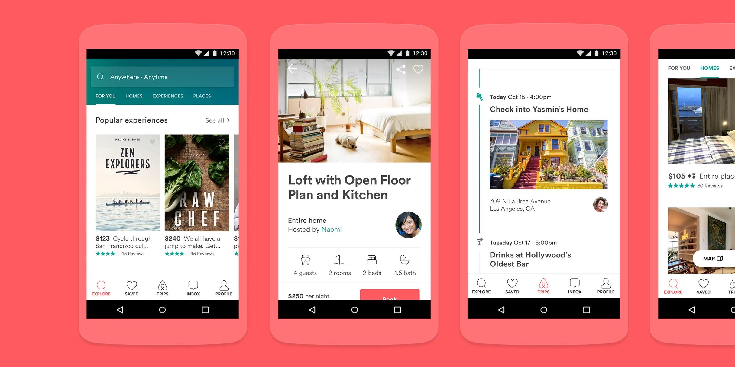
Airbnb started by defining a set of core characteristics to guide their design. In order to appeal to travelers and hosts from any region or native language, the app had to feel unified, universal, conversational, and iconic. This meant streamlining essential tasks, and ensuring that each design element fit into a larger system. Airbnb replaced the left navigation bar on Android with the bottom navigation bar that now exists on both iOS and Android, to better unify the cross-platform experience. Karri Saarinen, Design Lead at Airbnb explains how the switch served to reinforce the company’s vision:
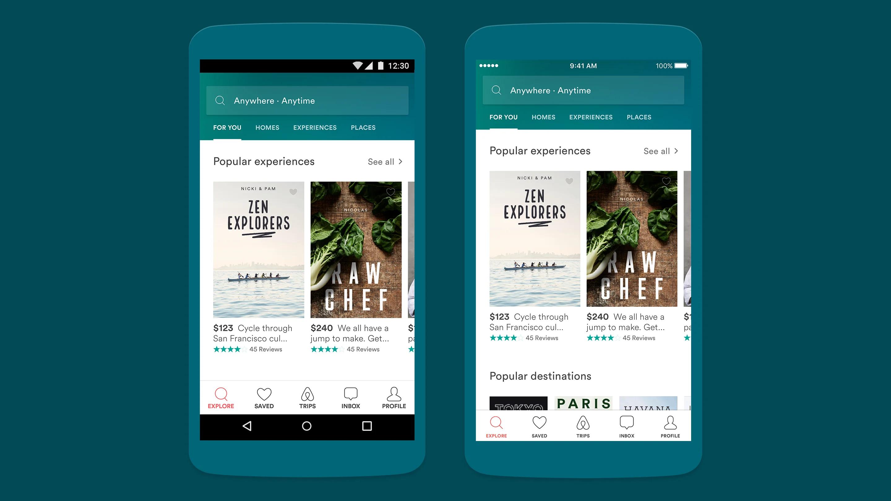
The bottom navigation bar is present in both the Android and iOS versions, making it consistent and comfortable across platforms. Frequently-used destinations, such as saved listings, previous trips, and messages are always available along the bottom bar.
Type and motion make communication clear and conversational
A stripped-down approach to system icons, buttons, and layout delivers a welcoming and accessible experience regardless of a user’s language or location. “A lot of our app is very typographic,” says Saarinen. Rather than rely solely on potentially ambiguous icons, the design team leaned on text and translation to facilitate communication between hosts and guests. Variation in type sizes throughout the layout helps users quickly decode content hierarchy, while the emphasis on written words creates clarity when communicating across the app’s 27 available languages. The use of the sans-serif typeface Circular, conveys a friendly and warm character.
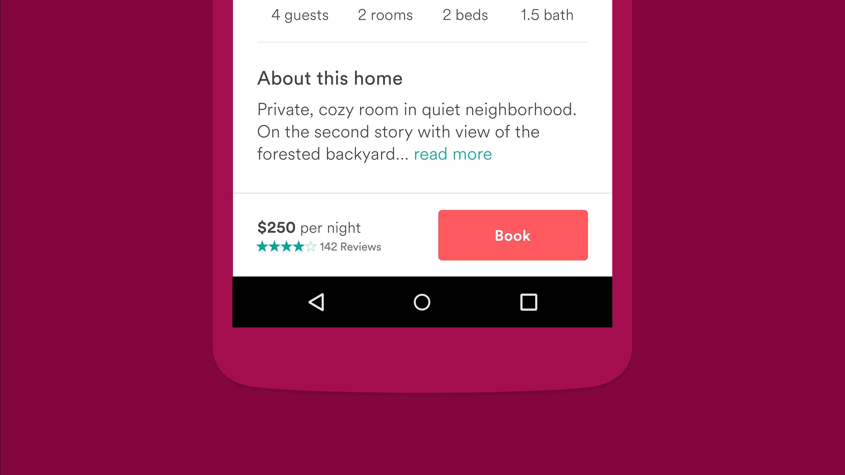
“Book” is a primary function in the Airbnb app. The use of a raised button for this action visually underscores its importance and adds dimension to the layout.
Motion helps express the app's conversational tone, and is a way to communicate with users and bring the product to life. Implementing motion to quickly respond to prompts, reinforces the guest-host exchange and gives users visual feedback to aid their search. Parent-to-child navigational transitions, a pattern which visually signals the move from a high-level to a detail view, create a more coherent user experience. Airbnb also utilizes shared element transitions to animate imagery and guide a user’s focus. Photographs animate and enlarge on tap, anchoring each listing with a clear image of the space. Saarinen likens it to browsing a glossy travel brochure.
Using imagery to build a distinctive voice
Host-supplied photography is crucial to the Airbnb experience. Whether it’s a rustic home in the high desert or an urban loft, rich imagery gives users a window into each destination. Letting photography lead gives the UI a bold and uncluttered appearance, and makes navigating from listing to listing easy and comfortable.
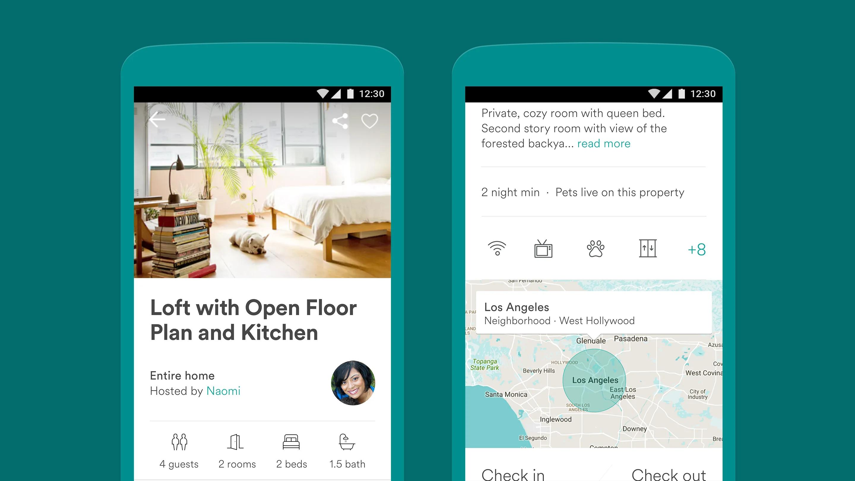
An emphasis on photography and ample white space helps people focus on essential information.
Award-winning design with approachable charm
Airbnb’s devoted global following clearly appreciates the app’s simplicity and ease of use. Named both an Editor’s Choice and Top Developer in the Google Play Store, the app has a rating of 4.3 stars, more than 138,000 reviews, and recently won a Material Design Award for focused efficiency. Airbnb’s designers used Material Design as a framework to clearly express their brand, creating a friendly and focused app that appeals to travelers and hosts around the world.