Why Google Needs Art Directors
… according to Google art directors
A cadre of art directors are rethinking the kinds of images seen across Google’s digital products, pushing the envelope by working with exciting new illustrators and photographers and making their work a part of the company’s visual ecosystem. We spoke with three of them—former magazine photo editor Emily Blank and former print designer Jefferson Cheng, who shape the look of photography and illustration across Google’s products, and Shannon May, a former newspaper illustrator who worked on visuals for Messaging and is now art director for ads—about navigating this new frontier and creating a visual language that makes Google look and feel like Google.
Amber Bravo: What do you see as the through line—the values, parameters, or qualities—that you’re starting to establish as art directors charged with making Google products look like Google? How do you push the boundaries of what kind of art belongs in our ecosystem, while avoiding the purgatory of everything looking the same?
Jefferson Cheng, co-runs the Material Design Imagery Program**:** We don’t really prescribe a one-size-fits-all style for all of Google. One of our main principles when making decisions is keeping things Googley, which essentially means being intelligent and optimistic.
Emily Blank, co-runs the Material Design Imagery Program**:** For one of our design sprints we went to the Walt Disney Museum in San Francisco, and I thought it was so fascinating how through a variety of visual, stylistic elements, you can always tell a Disney movie from another animated film. Still, each movie had its own message, its own creative vision. Something similar is happening right now at Google: We’re creating these suites of imagery to amplify products belonging to several teams, but when they share a quality they fit into a larger story, like a book of chapters.
Shannon May, Art Director and Creative Producer for Ads**:** But, to your point, you do have to continually pull this lever to find that special weirdness, because otherwise everything does end up looking the same. A lot of other companies look to larger companies like Google or Apple for inspiration and trend-setting. This can water down our visual voice, so it’s our job to keep evolving it, to keep it distinct. For our Stickers program, which runs within messaging apps, we worked with artists from all across the world. What’s great about that is we engaged with artists in different regions and countries, to speak to the specific themes we wanted to communicate.
Jefferson: When Emily and I look for artists for a wallpaper or product education, if they haven’t worked for the tech industry, it can actually be a plus and yield interesting results, as they aren’t habituated to a certain tech style or way of working.
Shannon: Right—when you’ve been working in tech or in editorial, you often already know the rules and you’re not trying to break them.
Emily: We were working with one artist recently on the photography of a product that had to run on an all-white background. In addition to successfully delivering on the brief, she also included her colorful take on it. Even though we couldn’t use her iteration at the time, it’s that type of unexpected autonomy to explore various directions that helps us push the boundaries continually.
Jefferson: That creates a chance for the style to evolve. It also helps to just challenge the medium, right? Historically, all product illustrations were done in vectors. Now, Emily and I are also trying photography as a form to mimic illustration, and we’re getting pretty awesome results.
Shannon: It’s a collaborative effort—you’re reaching out to artists, saying “We love what you do, make something cool for us.”
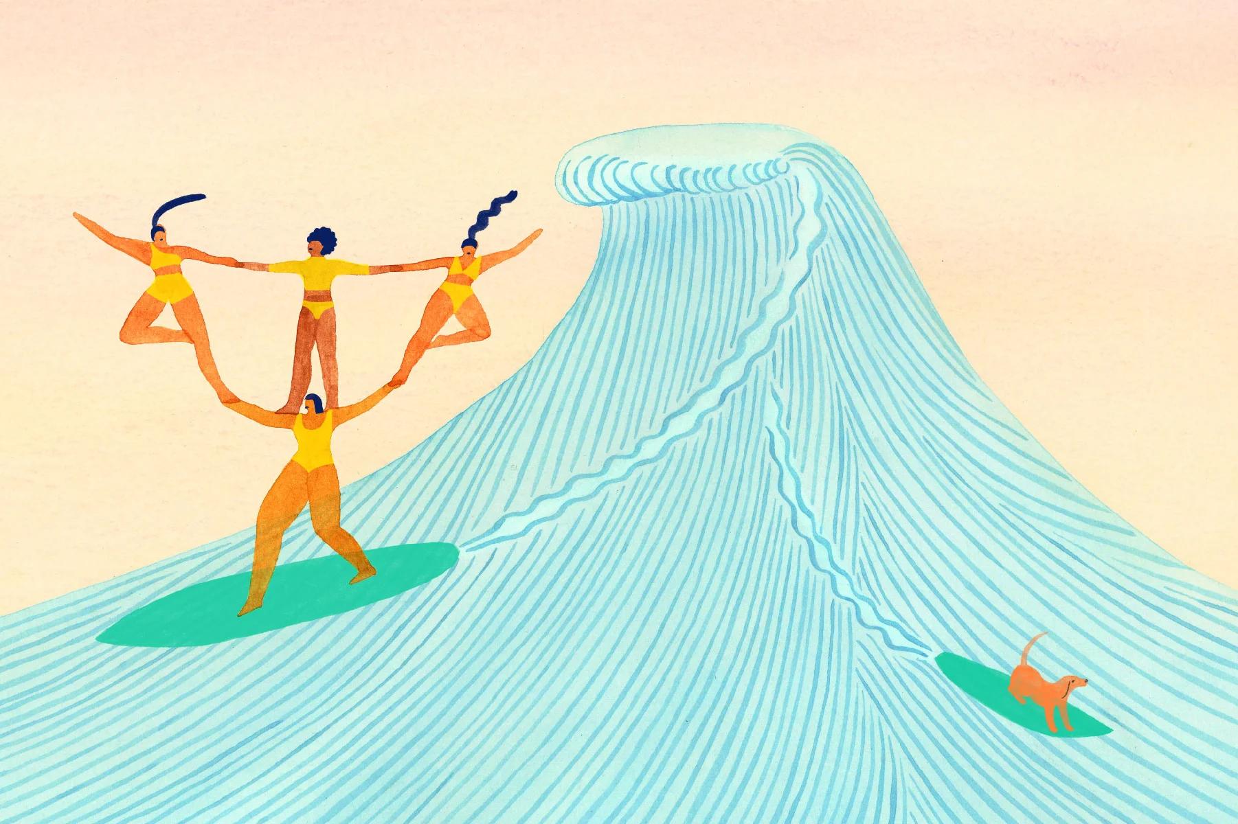
One perfect wave by Monica Ramos for The Canvas Project
Art direction: Emily Blank and Jefferson Cheng
Shade by Ana Popescu for The Canvas Project
Art direction: Emily Blank and Jefferson Cheng
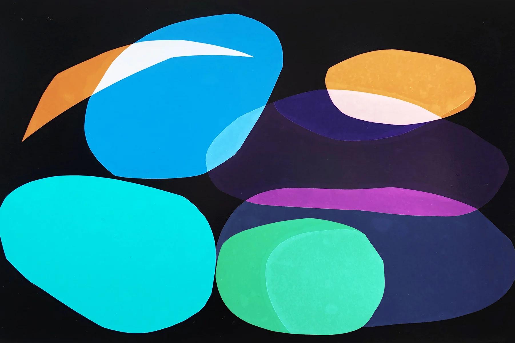
Orbiting stones I by Liz Nielsen for The Canvas Project
The Canvas Project
Got the juice by Monica Ramos for The Canvas Project
Art direction: Emily Blank and Jefferson Cheng
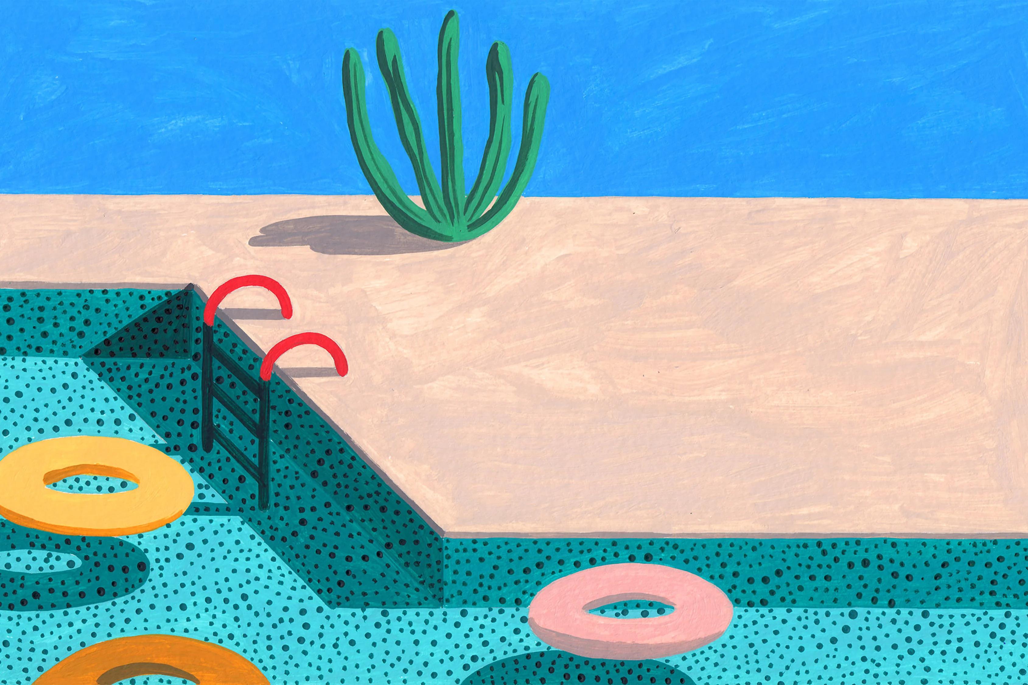
Pool by Ana Popescu for The Canvas Project
Art direction: Emily Blank and Jefferson Cheng
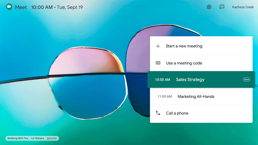
Bobbing with you by Liz Nielsen for The Canvas Project
Art direction: Emily Blank and Jefferson Cheng
A sampling of Google Meet wallpapers in situ
The Canvas Project
Amber: That artist-affirmative approach is a way to engender trust. What are some other things that you’ve found useful in helping artists who might be skeptical or uncertain about working with a tech company?
Jefferson: For our briefs, we just give keywords to play with. We don’t do mood boards. Also, the way we engage with the artist is different: It’s always just Emily and me at first, not an entire product team, which can be overwhelming. That first meeting is really important to make a potential artist feel like you’re working with—
Shannon: —a human, and not a giant corporation. Google feels less like a big corporation, and more like a bunch of people trying to make things together.
Amber: Even with that, in your role, do any of you feel a duality in bringing in the artist and making them feel comfortable, but then having to go and sell the value of what they produce to a larger team?
Emily: That’s why we prefer to keep stakeholders involved throughout the process, and why we’ll show sketches before we go into any photo production. It’s more challenging to make significant changes after the shoot is done, and we want everyone on the same page so the collaboration can run smoothly. And then it’s a nice surprise if the artist does something extra on set, or a happy accident occurs; we can show it as an additional option that they did on their own, just on the fly.
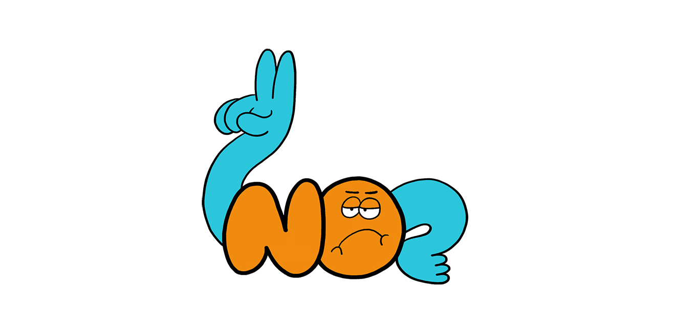
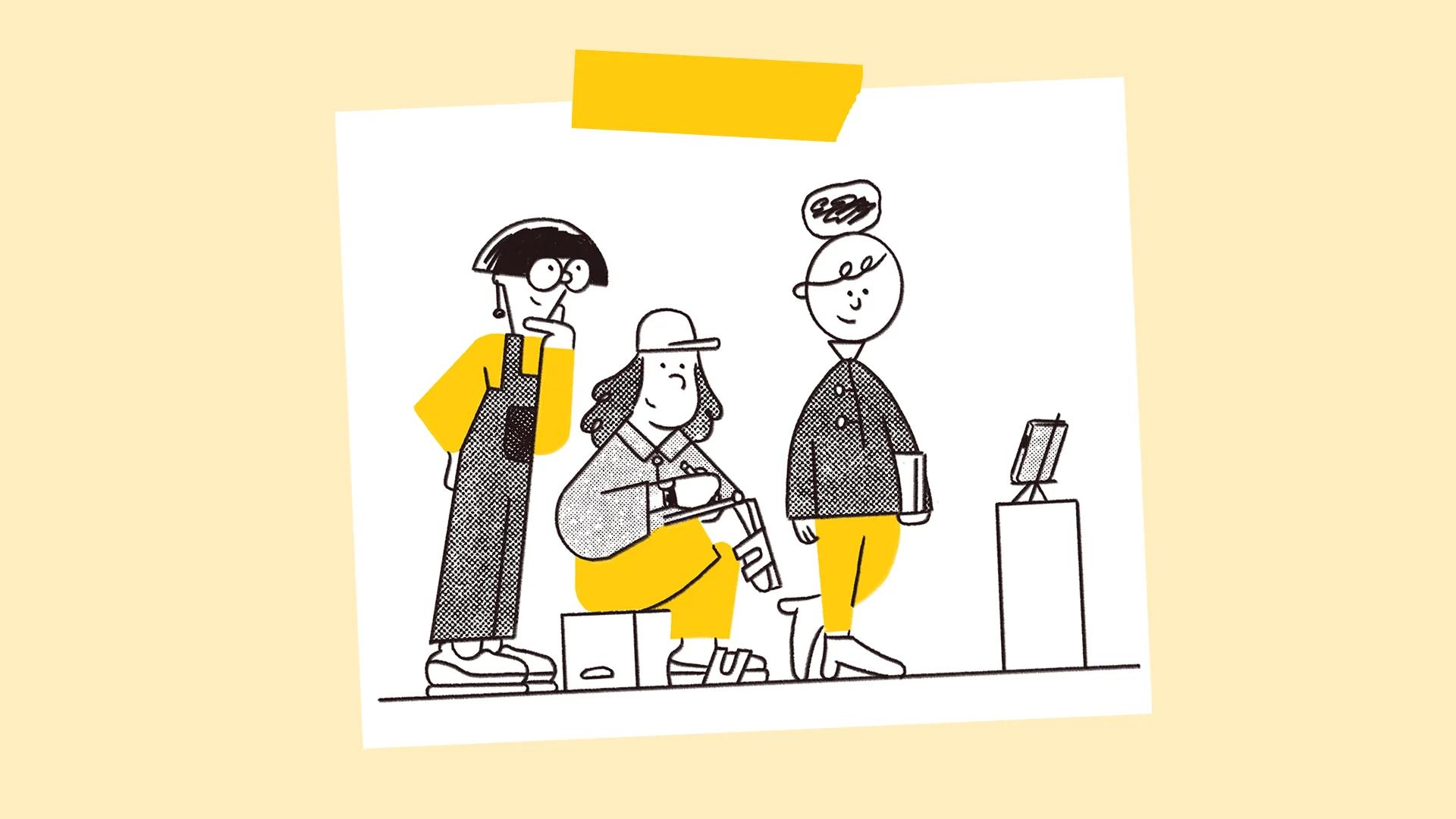
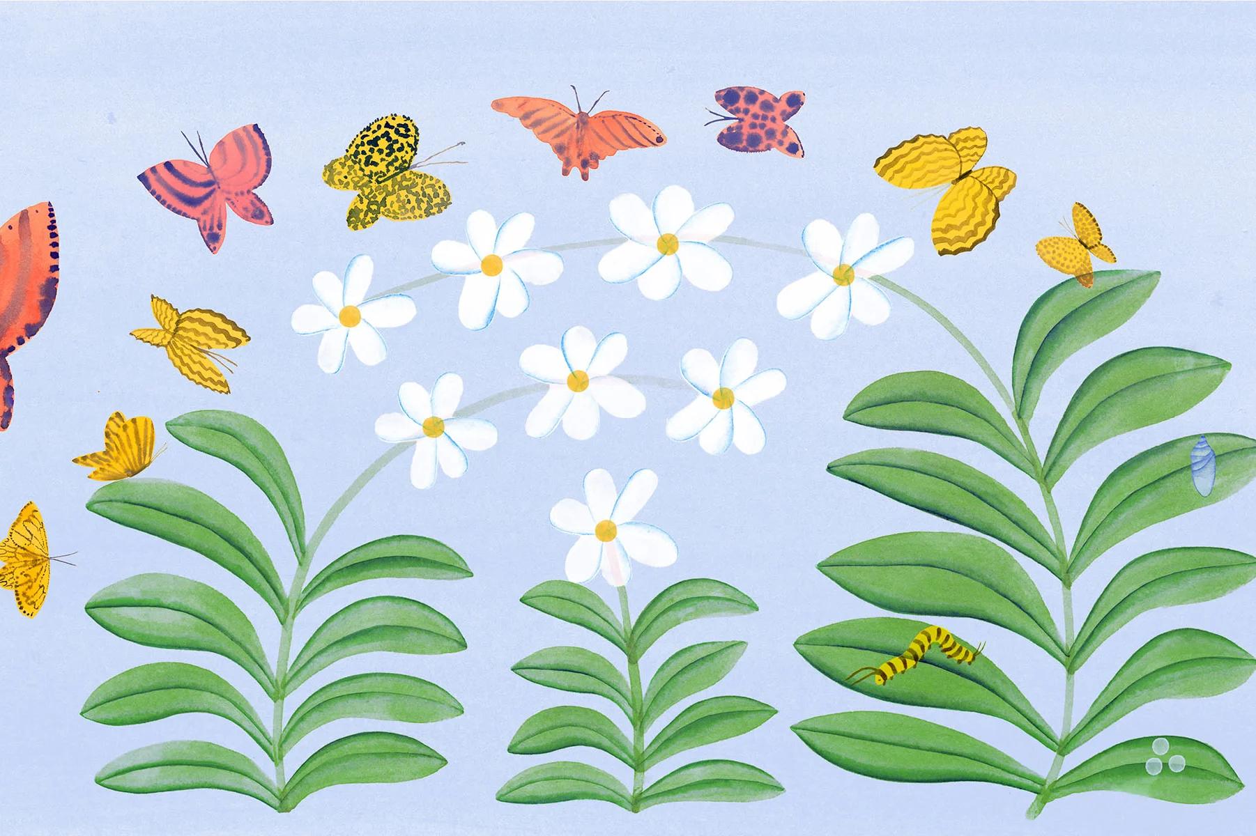
American Sign Language (ASL) sticker by Jessica Flores
Art direction: Ryan Sands
Shannon: I sometimes find that there’s a challenge in having team leads involved early in the process because not everybody shares this visual language. So when you show some people the sketch phase, you can’t always easily extrapolate what it’s going to look like and people get really bogged down in the details because they don’t understand the process. My job is to educate and take them on a journey, to be like, “I promise this is going to be okay, and no, it’s not actually going to be a pencil drawing.”
Jefferson: Whenever we talk to stakeholders, it’s always helpful to give them a history of the artist and tell them, this is what they do, this is how their work looks. It helps to sell something in sketch form.
Shannon: It builds empathy for the artist, too, as a human versus just an end product. One thing that we had to fight for in the Stickers’ UI was having the artist’s name represented. We wanted to make it really clear that this is the artist’s expression, it’s their work, not Google’s.
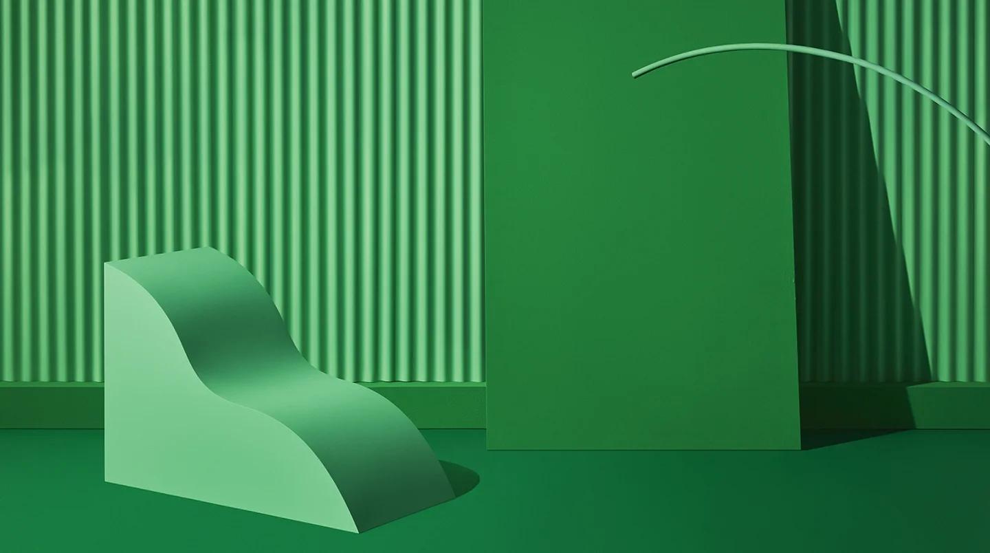
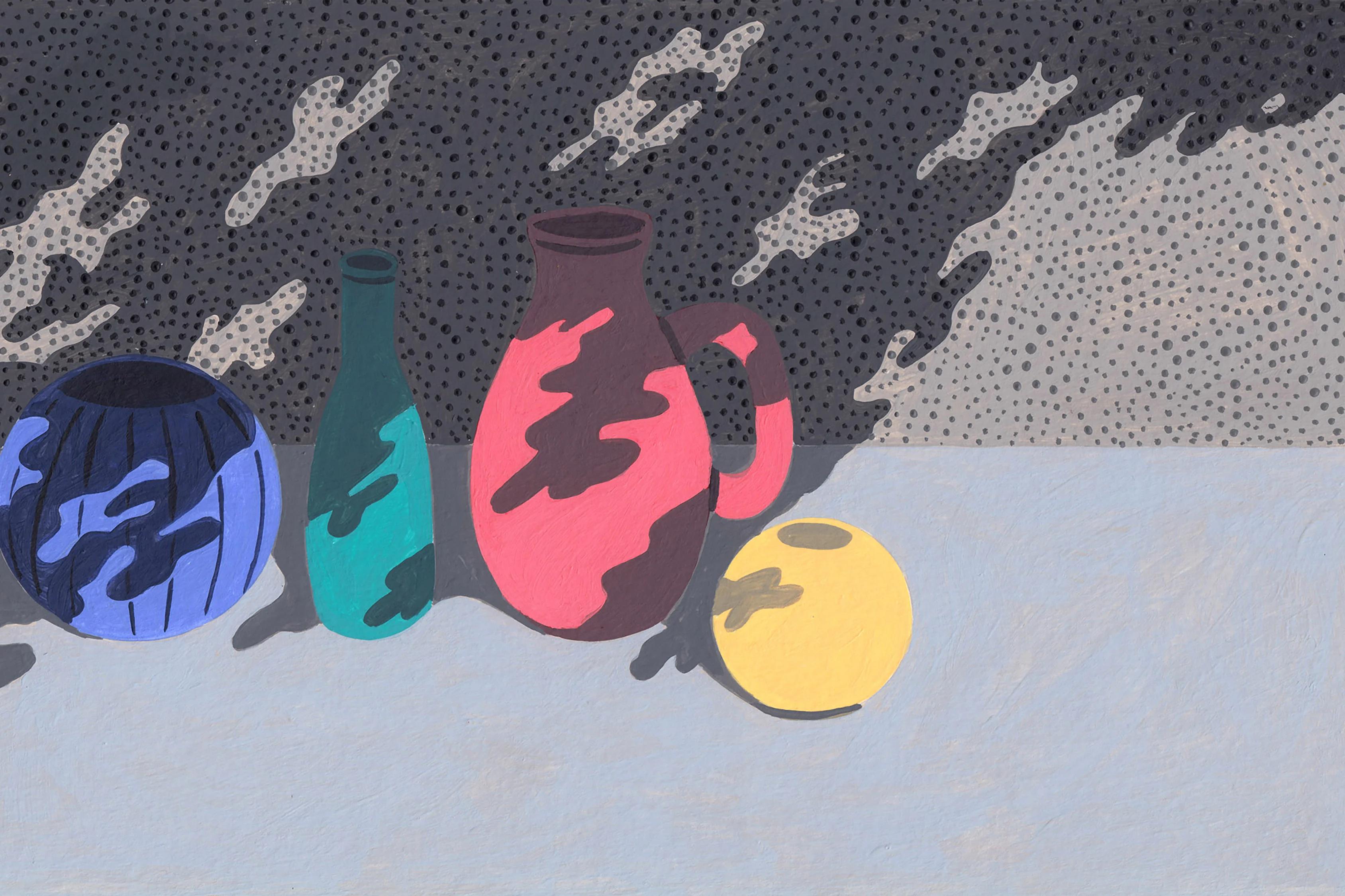
Monochromatic still life sets for Google Shopping
Photography: Virginie Gosselin; Art Direction: Steve Czech
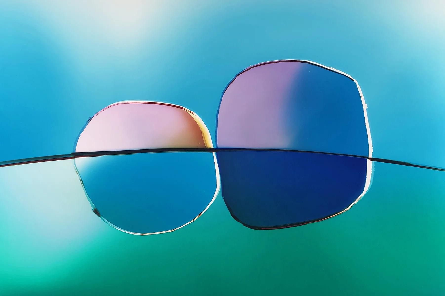
Emily: We’re working with an artist now, Liz Nielsen, whose work has a glossiness to it that a lot of the photographers we’ve worked with haven’t had. It’s really different for Google.
**Jefferson:**When I saw that work, it reminded me of a cracked digital screen. That’s what attracted me to it.
Shannon: Like it has a cold mechanical feel, but it so clearly has a human’s involvement? That’s where something becomes more Googley, right?
**Emily:**Granted, not everything makes it to the final stages. And that’s okay, it’s something I value at Google: We have a margin of error and we’re expected to execute and do well, but if there’s something that doesn’t work, we go by a “fail fast” mentality. We are not discouraged by mistakes—it’s an opportunity to learn by trial.
Jefferson: One advantage of imagery is how it’s ambiguous and subjective. I think there’s potential in capturing the audience’s sense of wonderment instead of laying out all the answers. We want to take advantage of that space.
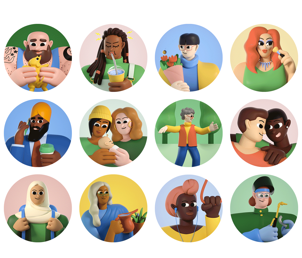
The Avatar Project by Janet Mac and Patrick Dias
Art direction: Emily Blank
Shannon: It’s interesting that you say imagery is ambiguous—I find that imagery helps to add clarity.
Emily: I do wonder if people trust photography over illustration. I always hear, especially at Google, that photography is supposed to represent something, whereas illustration is a metaphor.
Shannon: Well, the message of a Sticker has to communicate really clearly and immediately, because these are very ephemeral things—people send them quickly in text messaging. It has a fast pace, so it can’t be ambiguous, actually. The characters need to be legible at a small scale, but at the same time, we wanted them to feel really lovable; we thought a lot about commissioning artists with a sense of humor.
Emily: Do you think that the Stickers you created will ultimately have the same path that emoji have had, where they’re considered classics? The Museum of Modern Art even bought the first emoji collection.
Shannon: I’d like to think so. We want someone to hear their own voice, or see themselves represented in the Stickers. And we treated them like regular illustrations—like artwork.